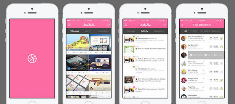
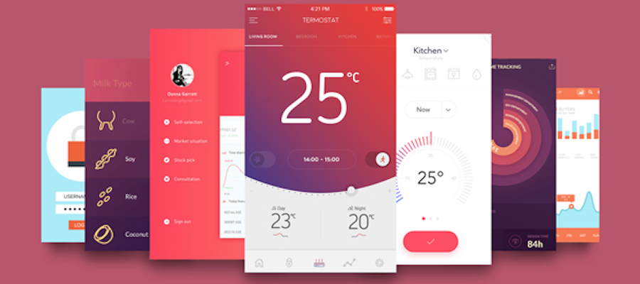
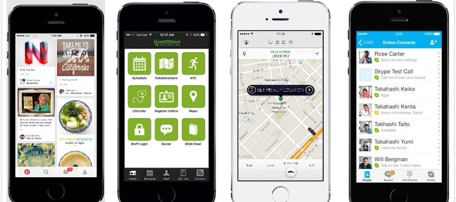
If you compare mobile app to a human, the homepage would be the face. The homepage is the area that people notice at the first glance and decide their basic judgments about your mobile app. The mobile app homepage design is the door to a successful product, and a good start is half the battle.
Since 26 percent of mobile apps are used just once, the first impression is essential to tell your customers that you are worthwhile being used for a long time. If you can’t please the eyes of critical users on the homepage and provide a good user experience, your mobile app has already failed. Therefore, if you want to create a good user experience design on the app homepage and draw the users’ attention, you need to answer these questions:
Users firstly see the interface, and then the content. At this stage, a good design, which is in line with the brand and has a rich content, will give your users a deep impression. Every mobile homepage needs a logo right at the top. A perfect logo explains exactly what you do. Whatever products you sell need clear exposure on the homepage. The best way is to clean up the homepage, focusing users’ eyes on just a single image and text piece that explains it all.

In order to further attract users to use the mobile app, it matters how your app can solve problems, which is closely related to the functions/services your app provide. Only when the users can use the product to solve the problem and think that it’s cool, will they go on with it. At this stage, the demonstration of the core functions and a good interactive experience are particularly important.
In addition, the subdivision of users and services are also necessary. For example, you may run a hair salon, but do you serve both men and women? What kinds of services can you provide and can customers buy hair products in the salon after getting their haircut done? You need to let your product features hit the users’ eyes.

The aim of a mobile application homepage is to guide the user, rapidly present content, and its own wonderful content and accurate classification will stimulate the user's desire to further use. For pretty avid users, a homepage is a collection of information. Users want to know the recent activities and notifications as soon as they land on the homepage and can see good content recommendations. Therefore, the content recommendation and instant update will make users feel satisfied. You should figure out what your customers are looking for in your mobile app. Are they interested in finding your store locations? Is there a way for customers to receive monthly coupons through pushing notifications? A mobile app should also include properly titled tabs and buttons to immediately show what your app contains.
Whether it is content or diversion-based applications, a mobile app homepage design that can achieve the above points will give users a good experience. Of course, at any stage, when the content reaches an order of magnitude, a searching box and bottom navigation can be convenient for users to reach the page you want to go.
The overall layout and plan of the best mobile app homepage also need to be designed according to the positioning of the product. The most common diversion-based app homepage example uses the form of the grid, which simplifies the content presentation of the home page. It’s not used as a real consumption scene, but only plays a role of diversion; if the homepage is used as the main consumer scene, then it is suitable to be designed as a waterfall flow page, and the user can do as much as possible on the homepage of their desired interaction and consumption scenarios. It can reduce the jump of the level; social app, of course, should use the dialogue list, and its homepage is used as a major interaction and consumption scenario; map navigation apps, such as Uber, need to present intuitively users’ location with help of LBS on the homepage.

How could there be a 5th question? Hmmm... Of course, of course, here is a little ad: the use of appropriate prototype tools will make your work more with less, so I recommend to everyone a great prototype tool, Mockplus, which supports rapid prototyping, fast interaction and team collaboration and hence brings you a fun design experience, making your mobile app homepage design better.
 Mockplus RP
A free prototyping tool to create wireframes or interactive prototypes in minutes.
 Mockplus DT
A free UI design tool to design, animate, collaborate and handoff right in the browser.
