Mobile UI interaction is the power to maintain the vitality of the product.
Good interaction can help users quickly get feedback, cognitive layout and enhance the sense of experience and immersion. Here I collect the 12 excellent and creative interactive works for your inspiration of product design.
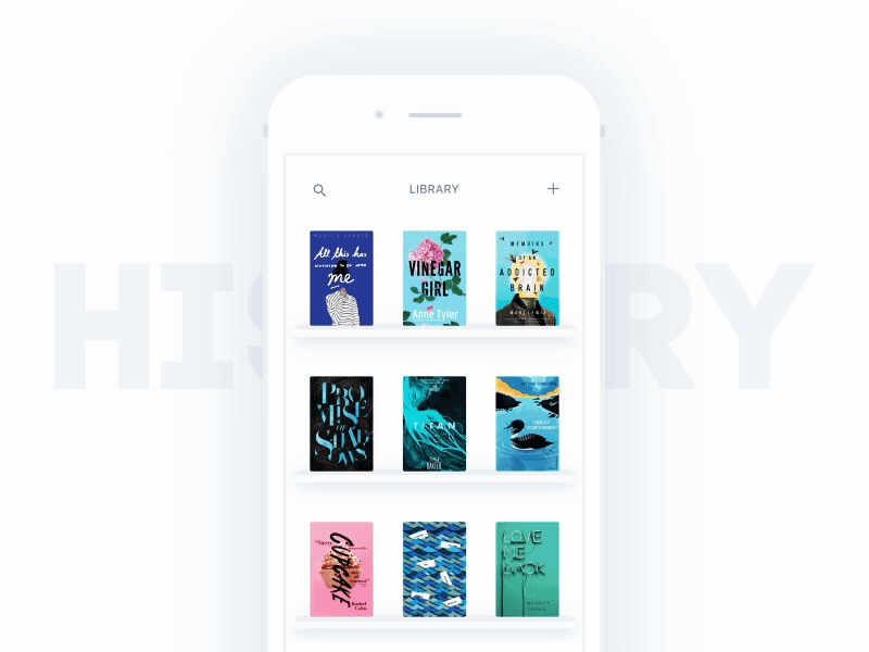
This APP concept promotes people to think about the way of reading on the phone. You can choose a book by clicking and sliding title, then the cover will pop up. When you read, you can still slide to select books and are free to switch to other titles.
The interaction design simulates the experience of real reading, with accustomed interactions like sliding and clicking, creating a classic and elegant reading experience.
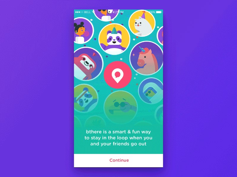
Its landing pages are colorful, lively and lovely, which is a unique UI design example. It provides users with an excellent experience instead of tedious APP landing pages.
Through the dynamic chart transition and background color switching and some independent micro-animation elements (including wheelbarrow exhaust), Bthere efficiently delivers the brand's enjoyment, which also improves the user conversion rate and time on page.
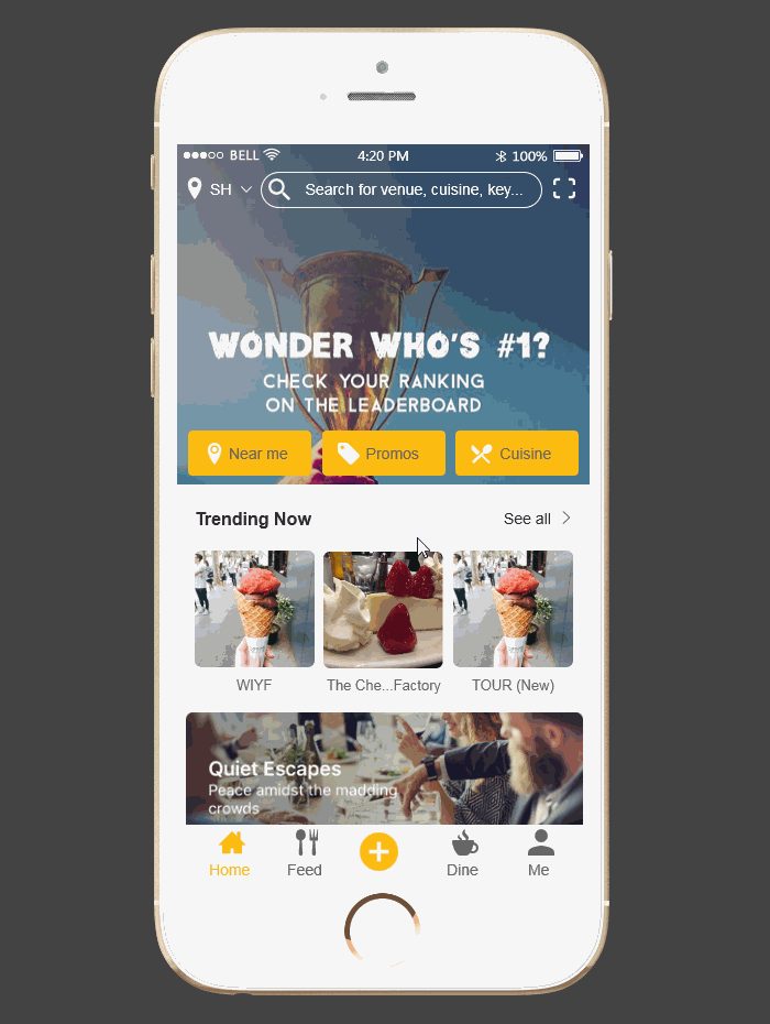
When you travel to a new city, filling your stomach is the most important thing. Bon App! may be your best choice. You can check out the best local food, explore the food salon and share your own experience.
This APP prototype made by Mockplus switches its content naturally and smoothly. When tasting the food, you can click the release button on the navigation bar on edge of screen, instantly record suddenly flashed inspiration. On the food recommended page flow with intuitive structure, you can quickly access to the restaurant's specific information and pictures.
Download link: https://www.mockplus.com/sample/post/bon-app
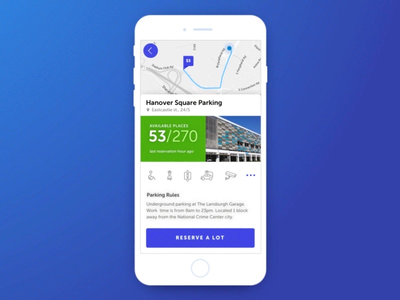
Parking in the big city is always a very troublesome thing. Finding the parking lot efficiently is very urgent.
This APP will provide you with the nearby parking location and bills. When you click on a position, you can find the number of remaining parking lots, but also provides a way to make an order instead of being to a locked door.
As for the interaction, the bright spot of this app is showing an information card after selecting the parking point, quickly drawing the best route, adding the number of parking points, and pushing picture and information of parking point.
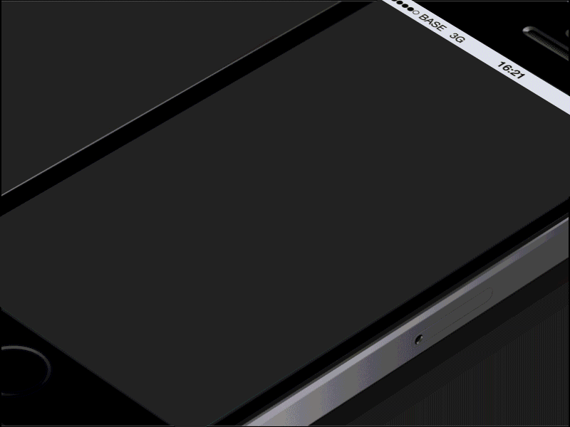
This APP focuses the user's attention on the process of navigation, finding the music becomes smoother and smarter. In addition, this interactive way also enhances the use of immersion, which is a very creative music player.
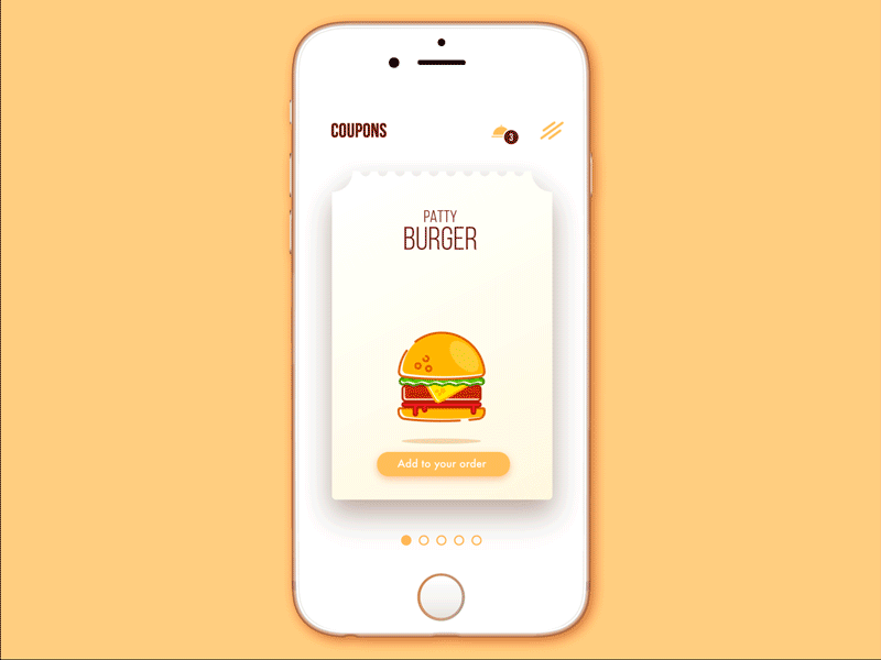
Food is always the best way to let us close to the world. This APP's interaction also conveys this information. By providing coupons and discounts in the cafe, customers can immediately use the electronic coupons to buy favorite food with this app. By adding interface animation, the overall interaction becomes lively, full of vitality, and also adds some micro-interaction, full of fun.
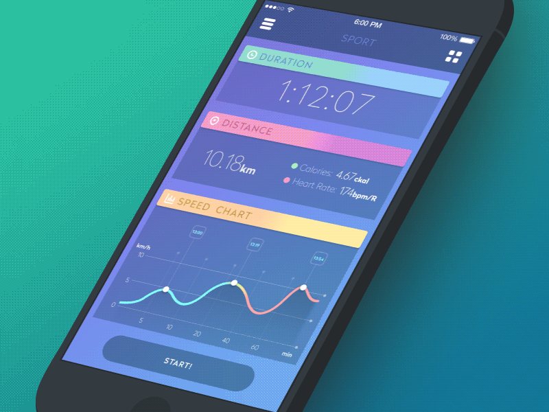
More and more people use mobile devices when exercising to save data and track progress. Sports applications are currently very popular.The structure is very simple: the side menu and the main content. The menu moves from the left to right to show the basic options.
The main feature is opening the side of the menu when the content of the "rubber effect". Opening the side of the screen menu, you can also display all the details of the content. Color matching is very fresh and bright, to encourage users to further operation; animation in a slight sense of bounce, making the application full of sports style.
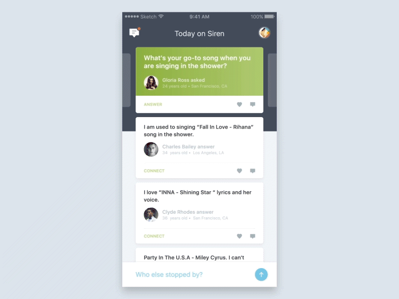
This APP uses a lot of different interactive animation, when you slide to the left or right. Moving the different delay elements have the effect of fluctuations, which provides users with additional feedback on the overall structure and process of the main page. In addition, this application also uses contraction elements to expand the interface of the interactive area, while ensuring that key information is always displayed.
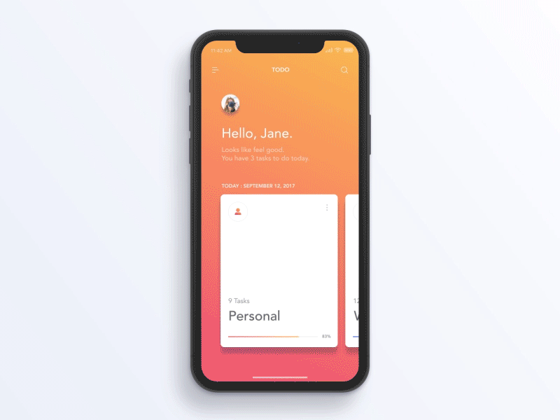
This shopping APP fully utilized the design language of iOS 11, which makes a beautiful card view. Interaction is clear and natural, content distribution is concise. For the new changes and design guidelines in iOS 11, you can also have a look at this article:
iOS 11 UI Kits Freebie & What’s New UI Design Changes in It
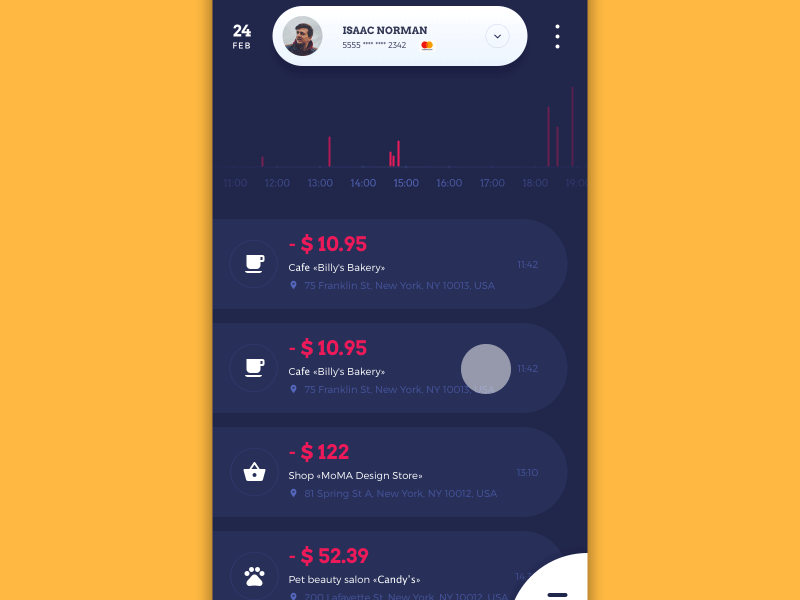
Time is money, this word will never be out of date. This financial APP allows users to manage consumption and revenue, which can create a database to track the financial flow and changes in order to obtain a comprehensive statistical information. GIF show smoothly the interaction with current changes in the financial situation, and pop-up daily limit tips, which is special.
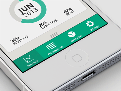
This APP navigation interaction takes full account of the layout on the small screen device. The user can drag the bottom of the screen to show the folding navigation. 3D folding effect has the rich sense of technology.
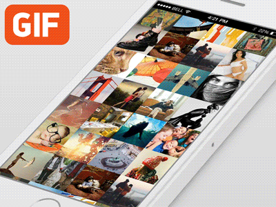
This application is based on the concept: just a few clicks, the user can get before added and tagged pictures; just one touch, you can choose the desired picture type. The whole process reminds me of the desktop image search, this operation can be achieved on a mobile device.
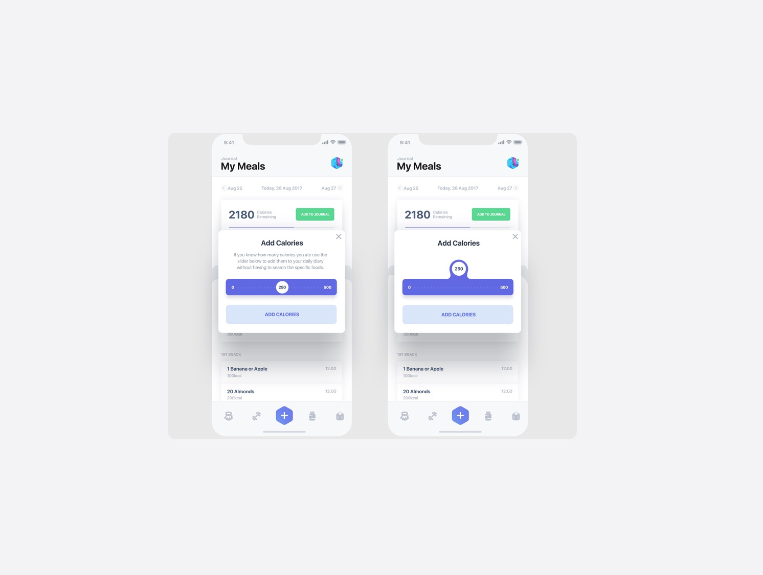
Here's a cool fluid slider that the designers have designed for this project. The idea was to have a minimal slider design with the value inside the slider that also allows you to see it when you drag the slider hence the value offset animation on tap.

This is a concept, not an original flow.
Welcome to the world of trips. The designer wants every trip you take to feel magical. So you no longer have to follow the maps, wait in the lines, and take photos of all the same sights. Now, you can access unique experiences, incredible homes, and local favorites — all from one app.
![]()
In a routine full of diverse tasks, mobile apps have become a great help. The designer shows the UI concept for one more: here are some interactions for a watering tracker reminding users to water the plants as well as tracking the watering stats for every plant.

Wishing you a healthy Monday with this motion concept.

Here is a concept of 'Pull to Refresh' interaction for the Zeta App.

This designer came up with the small preview of interactions for avsc. tasklist page,which has a clear UI interaction.


The animation is simply to lead where the eyes should focus on.
Do these works give you a full inspiration for your interactive design? One thing needs to be clear is that all the purpose of the interaction in the product is to enhance the user experience, too fancy and complex interaction may be counterproductive. If you want to recommend more mobile UI interaction, please note in the comments.
 Mockplus RP
A free prototyping tool to create wireframes or interactive prototypes in minutes.
 Mockplus DT
A free UI design tool to design, animate, collaborate and handoff right in the browser.
