Mockplus has rounded up another collection of the top 40 modern website design examples and templates for your inspiration.
It highlights creative design ideas from many different types of modern website best practices, such as the ecommerce, restaurant, corporate, portfolios and so on.
Let's check them one by one to see what you can learn and copy to improve your own website.
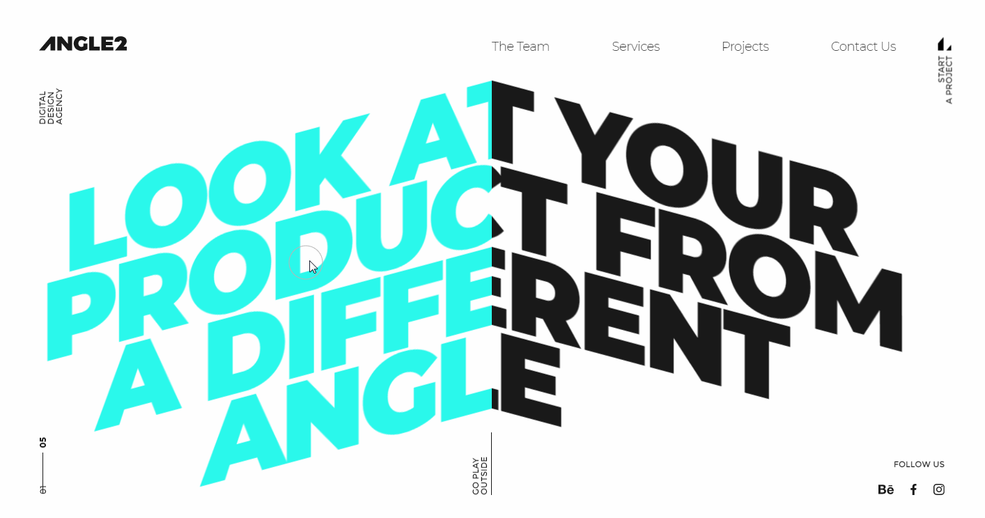
Angel Agency is a small Ukraine-based design agency. Its online portfolio website has a modern yet immersive look. It stands out for very playful cursor animations. When hovering on the text designs on its home page, the texts in two colors will flow from left to right or from right to left as the mouse cursor moves.
Such design ideas have become very trendy in recent years. You will find them easy to use if you want to freshen up your own designs.
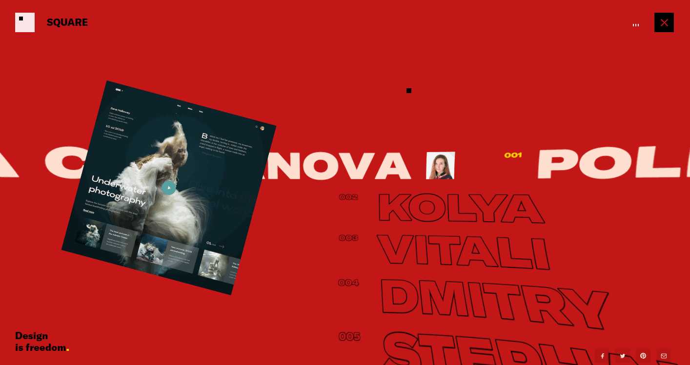
Square is a modern, game-like project website that gives website designers a chance to show off their design talents and get feedback. It uses many creative -even a little bit geeky - scrolling effects to create a striking yet rocking website. Its navigation menu also has many playful scrolling effects to guide users as they browse around the site.
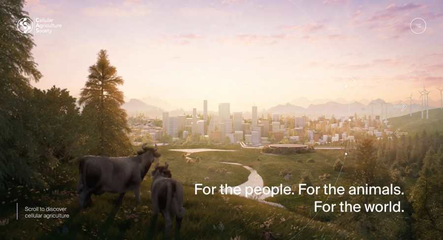
Cellular Agriculture Society is a cool futuristic website created for an international nonprofit organization. It features very rich transition animations and impressive dynamic scrolling effects that help illustrate its organization cultures and information in a very engaging way.
If you want to use distinctive scrolling effects to make your site stand out from the crowd, this would be a great example to learn from.
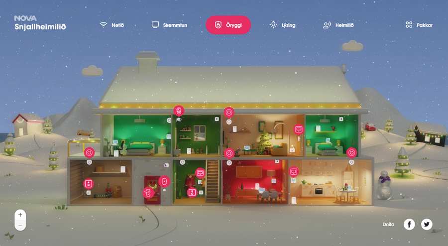
Nava Smart Home Sales is a modern interactive holiday sale page made for the Nava Smart Home. It has an immersive, game-like design that allows visitors to click different home devices and view device details instantly on the right panel.
The 3D animated page design really sets this site apart from the competition.
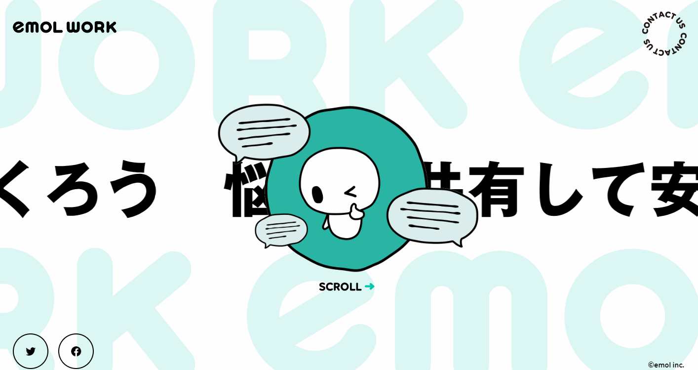
Emol Work is a modern yet cute online mental health platform with a user-friendly horizontal scrolling. It features a cute mascot. The designer has customized the mascot with rich expressions and emotions to explain everything about the site. This creates an enjoyable experience which really makes an impact on visitors to the site.
In fact, in recent years, vivid mascots have been a popular feature on websites as they are seen as an easy way create a brand. Take a look, it’s an idea that might be worth thinking about for your own website.
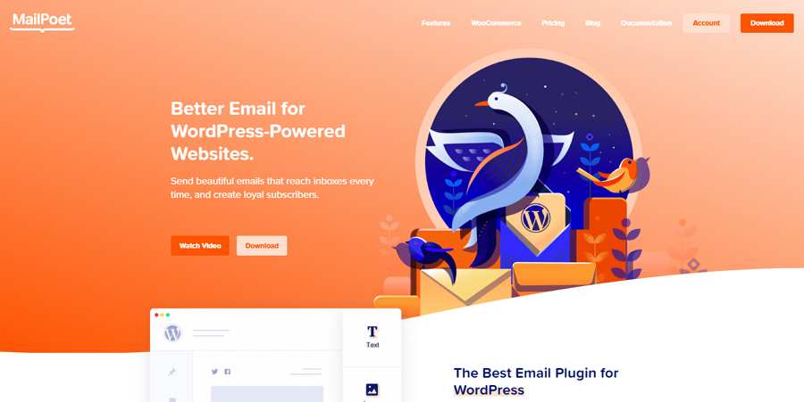
Illustrations spice up your website and promote your brand quickly. So, custom illustrations become very hot and have been regarded as one of the most important elements for designers to brand websites and enhance UX.
Mail Poet follows this trend and uses beautiful, colorful illustrations throughout its website, engaging and impressing its visitors. It's a valuable lesson: custom illustrations can really improve your website design.
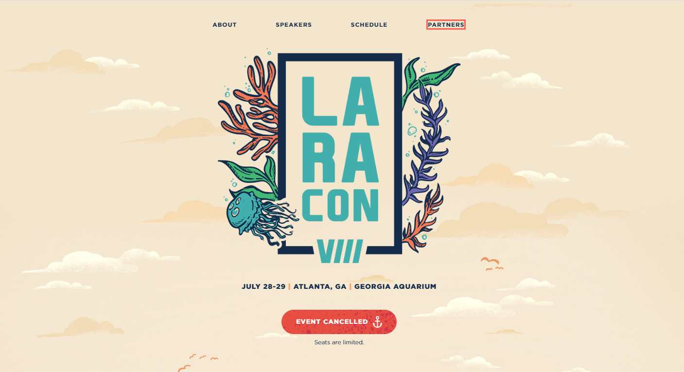
Laracon Event is a modern and interesting event project website for an annual gathering of people who are passionate about building amazing apps with the Laravel web framework. It uses custom illustrations to create an incredibly wonderful world beneath the sea. A variety of smart micro animations also liven up the entire website effectively.
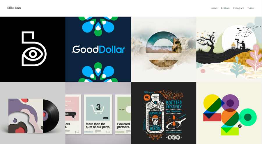
Mike Kus is a minimalist modern portfolio website made by UK-based web designer, Mike Kus. It follows the popular website design trend of using symmetric grids which create clean and neat layouts to display design projects. When you click on a project in the grid, the relevant project details will show up instantly on the right. This is a really good idea for simplifying the project viewing process.
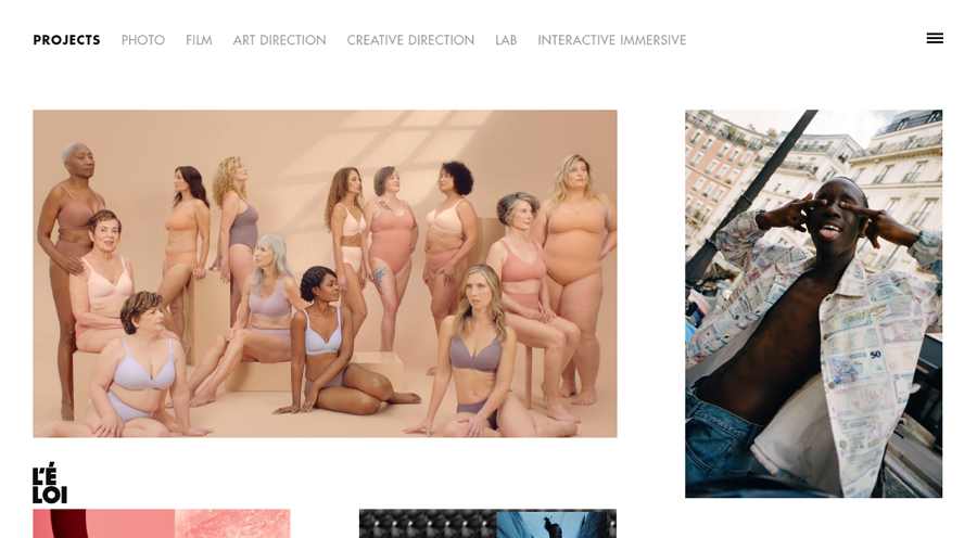
Leloi is a minimalist production studio website that uses trendy asymmetric grids to showcase different projects. The clean grid layout, rich hover effects, animated project images and floating navigation bar help make a very modern and personalized website.
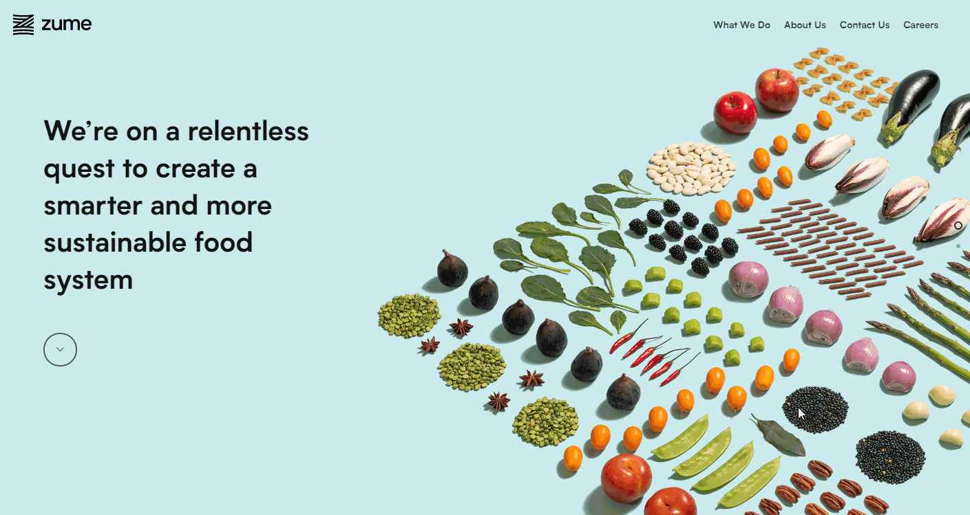
Zome is a modern website that provides innovative solutions for growing, transporting, and packaging food in a sustainable and green way. The home page uses a high-quality full-screen hero image carousel to project its brand and describe its services. These give the site an attractive and high-end feel.
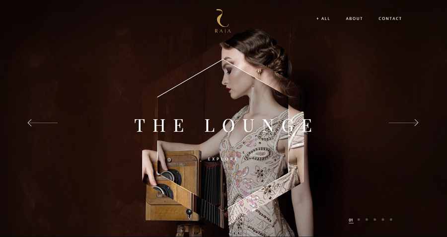
Club Raia is a modern elegant website made for the luxurious KTV. Its home page also uses a very high-end full-screen hero image carousel to introduce information on KTV. With cool hover effects and a creative geometric mirror-like design in the middle of the page, this website has a very luxurious, mysterious, even irresistible look.
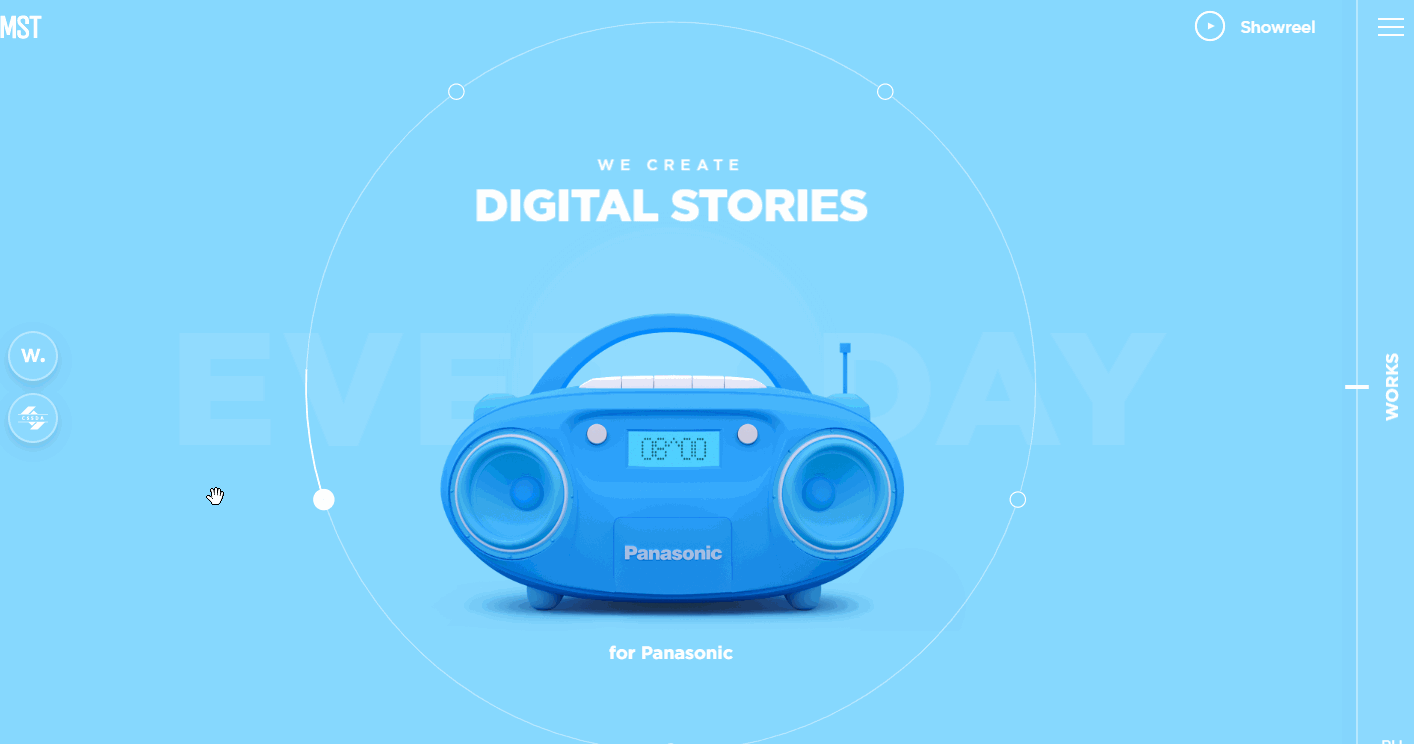
Bright and bold colors have become one of the most popular website design trends in 2020. Many website design teams, agencies and designers use bright and bold colors to improve the visual appeal of their websites.
MST Agency follows this design trend and uses rich bright colors to beautify the overall look and engage users. The minimalist design style and special web layout are also worth learning to improve your design.
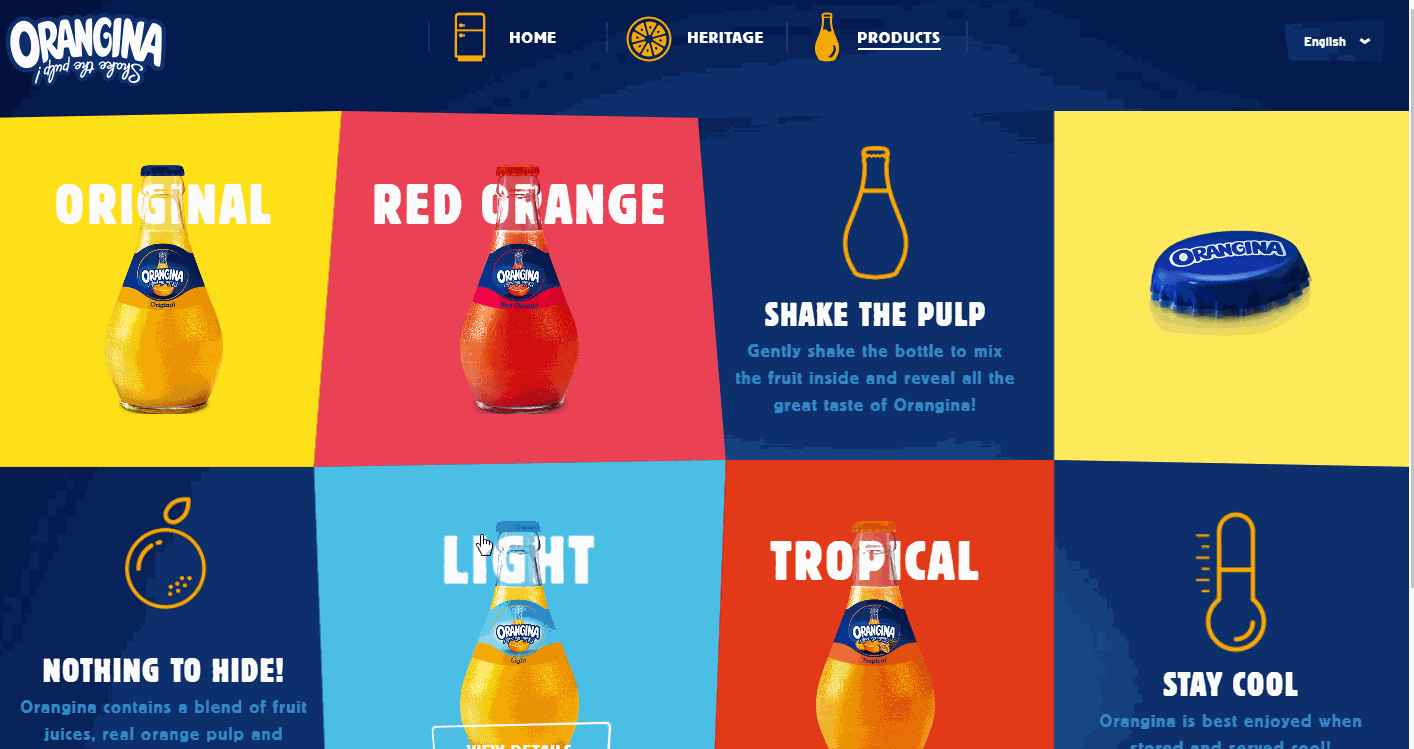
Orangina is a modern yet colorful beverage website that sells drinks with unique flavors. It also uses rich bright colors, like red, blue, orange, yellow and so on, to give a lively and healthy feel. The creative design of the site's layout and its vigorous hover effects are a great way to grab—and keep—visitors' attention.
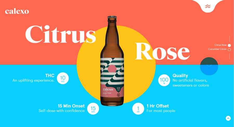
Calexo is a modern and colorful drink website selling high-quality fruit juices. The most inspirational part of this website is its bright color scheme and unique page layout. Many fantastic hover effects, micro animations and interactions help enhance UX.
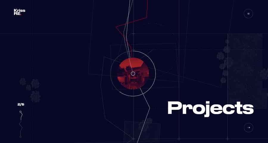
Kriss RE is a very cool modern online website for a design-centric real estate developer. It features a trendy storying telling design that enables website visitors to follow a line path and read the developer information step by step.
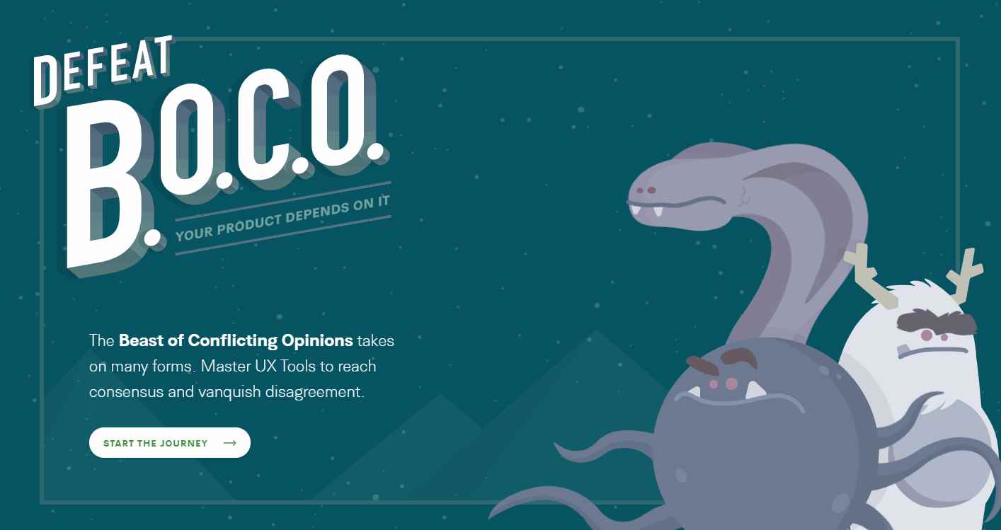
Defeat BOCO is another modern and storytelling portfolio website with an appealing illustration design style. Everyone entering the website is automatically taken to an interactive digital journey and learn about the holistic user experience design process behind.
If you want to create an illustrated storytelling website, this website is a perfect example to get inspiration.
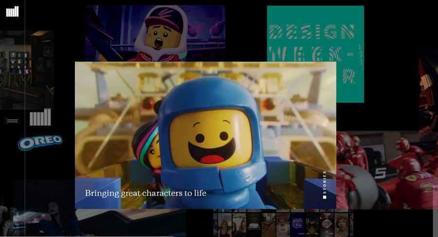
The Mill is a cool futuristic portfolio website from United Kingdom. Unlike the common portfolio websites that use clean and neat grids to display design cases, this website directly uses vivid videos to showcase design projects. Moreover, while viewing, they will also move automatically and slowly from right to left, giving users a very awesome movie watching experience.
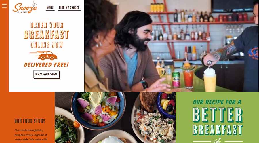
Snooze AM Eastery Restaurant is a modern restaurant website with a fresh magazine style. It uses rich card designs, unique magazine-like fonts, videos and high-quality photos to promote the hot dishes and services. The custom typography, layout and bright color scheme also help attract users quickly.
You can also check more website layout examples and ideas to improve your design.
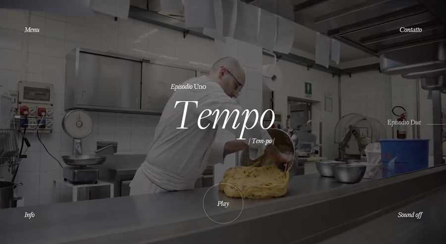
Pasticceria Adami is a modern, minimalist restaurant website that uses fullscreen video backgrounds to show customers how they make dishes with full passion.
In fact, these days, such fullscreen video backgrounds are widely used in website designs so as to increase the overall visual appeal. Why not following this idea to improve your website as well?
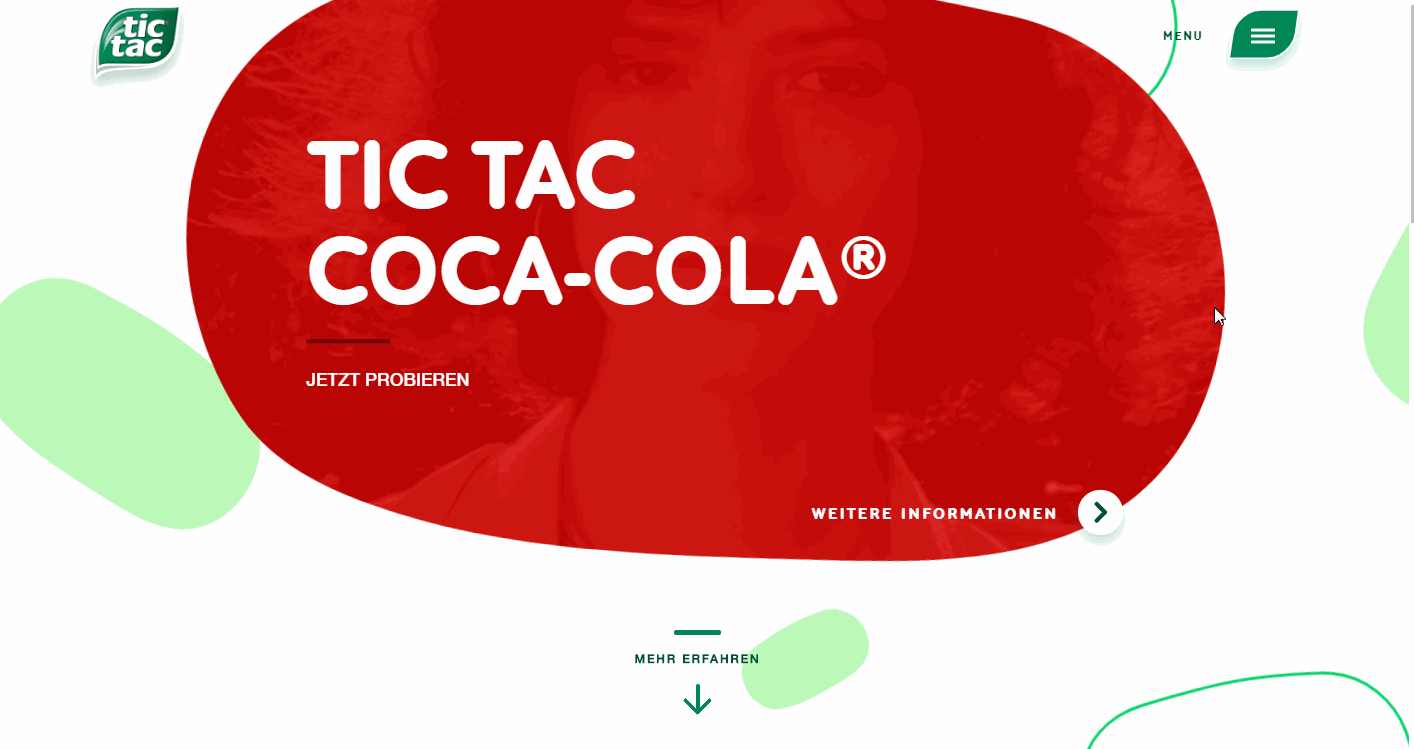
Tic Tac is a modern yet very fresh snack website that uses interactive shape designs to display different products. While scrolling down the website, the products will gradually appear. When you focus on a product, the related video and text introduction will also be activated.
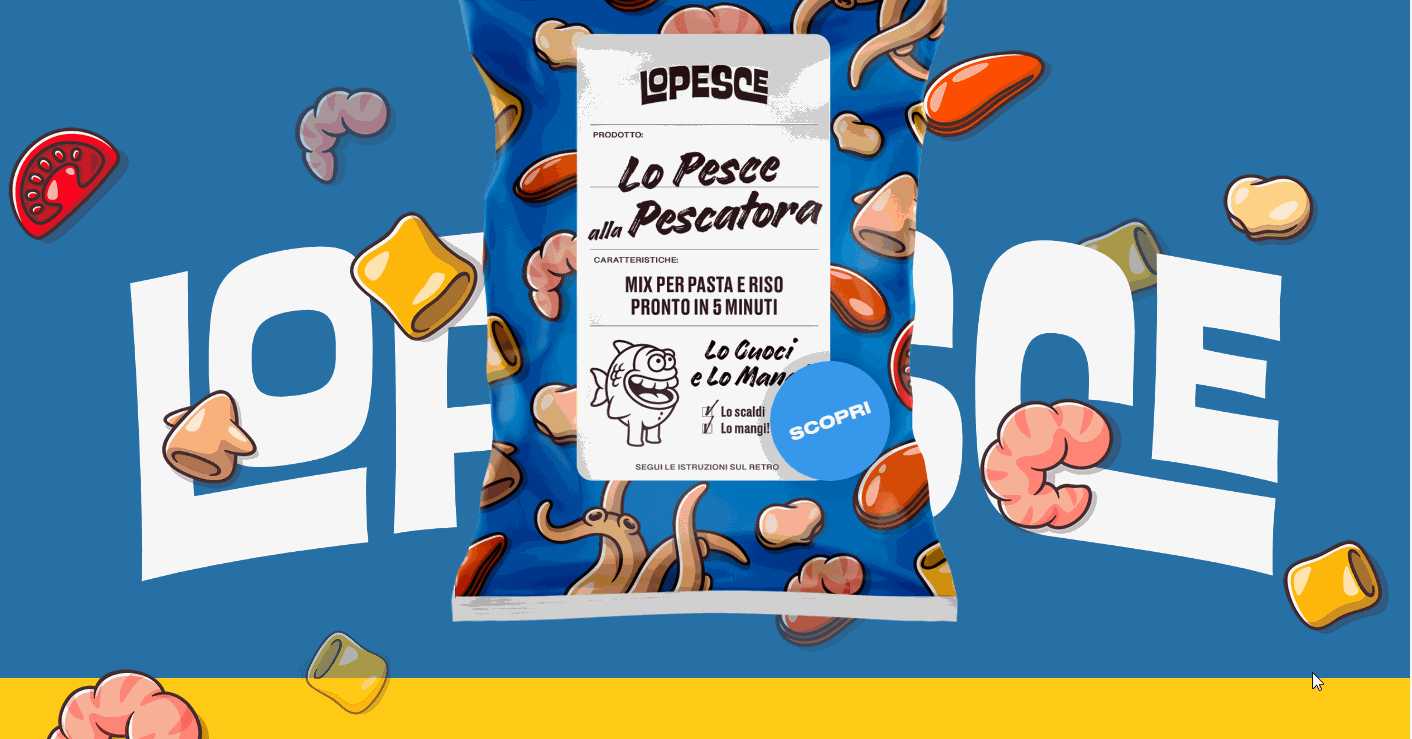
Lo Pesce Product Page is another modern snack website that uses very cool parrallax scrolling. As you scroll up and down the site, the products, introductions, and background colors will change gradually, creating an immersive visual experience.
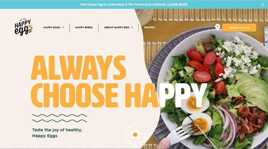
Happy Egg is a modern and playful website that sells free range eggs online. When you visit the site, you are immediately struck by its bright appearance and interactive landing page. The cool, almost liquid hover effects are very creative. The design of the notification about the Coronavirus outbreak is also very considerate.
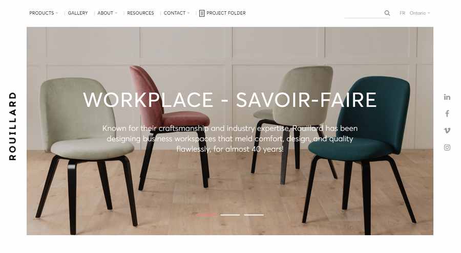
Rouillard is a modern, clean ecommerce website that provides innovative solutions and contemporary products to workplaces in North America.
It uses an image carousel featuring popular heroes and asymmetric grids to present its designs and ideas.
To create a perfect ecommerce website, this would be a good example.
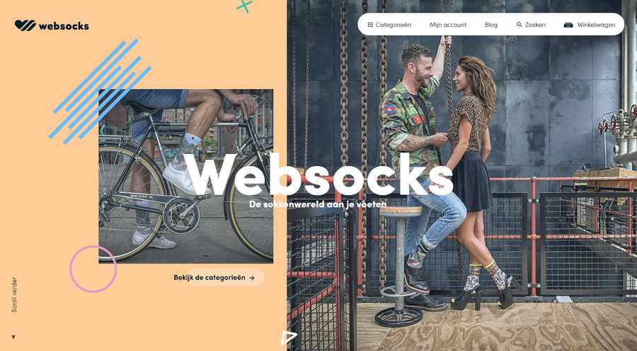
Websocks is a fashionable ecommerce website selling socks. It is a perfect example of how to combine photos and simple hand-drawings.
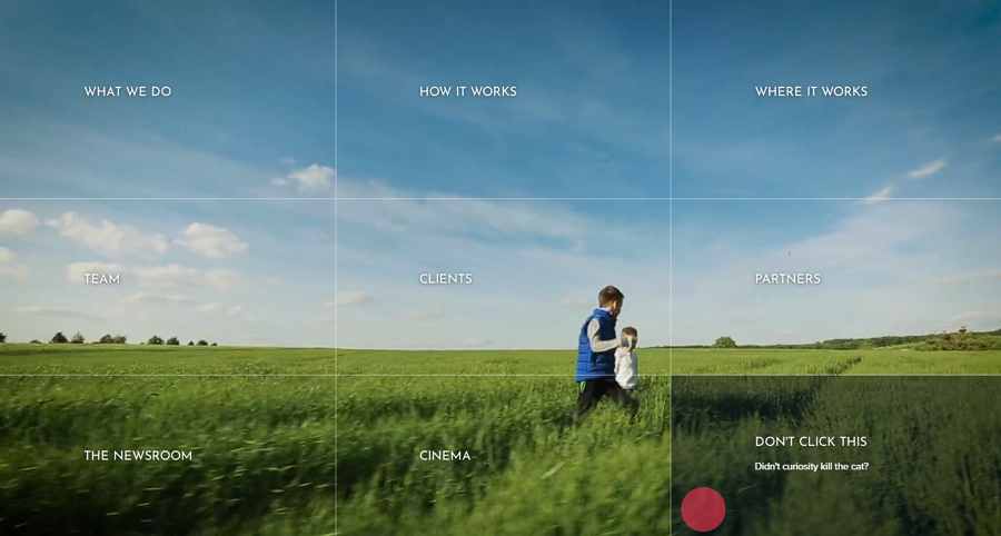
Afiniti is a creative corporate website that enables visitors to navigate around using interactive grids. The full-screen video background livens up the entire site.
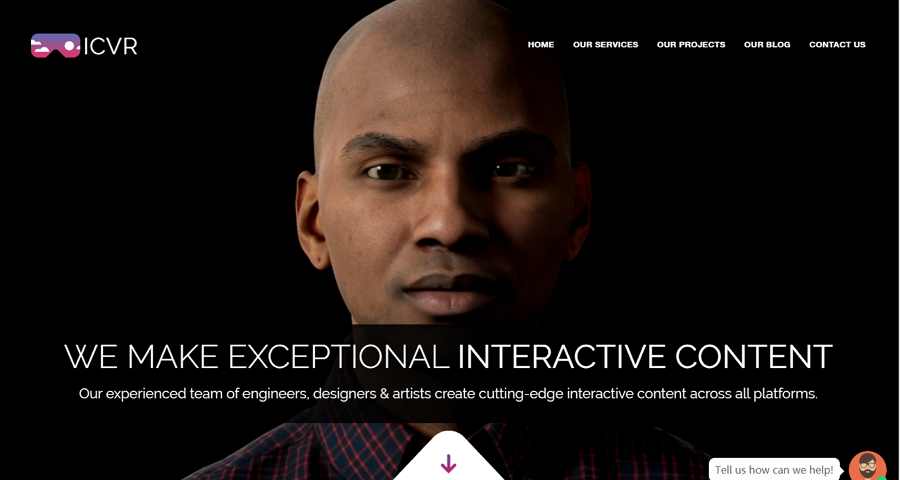
ICVR is a cool VR corporate website that uses creative VR video backgrounds to engage users.
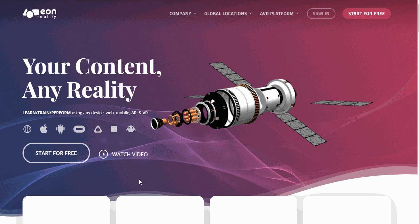
Eon Reality is another futurist VR corporate with cool 3D objects. The interactive landing page is also another example that is worth checking out. There is a lot to admire and learn here.
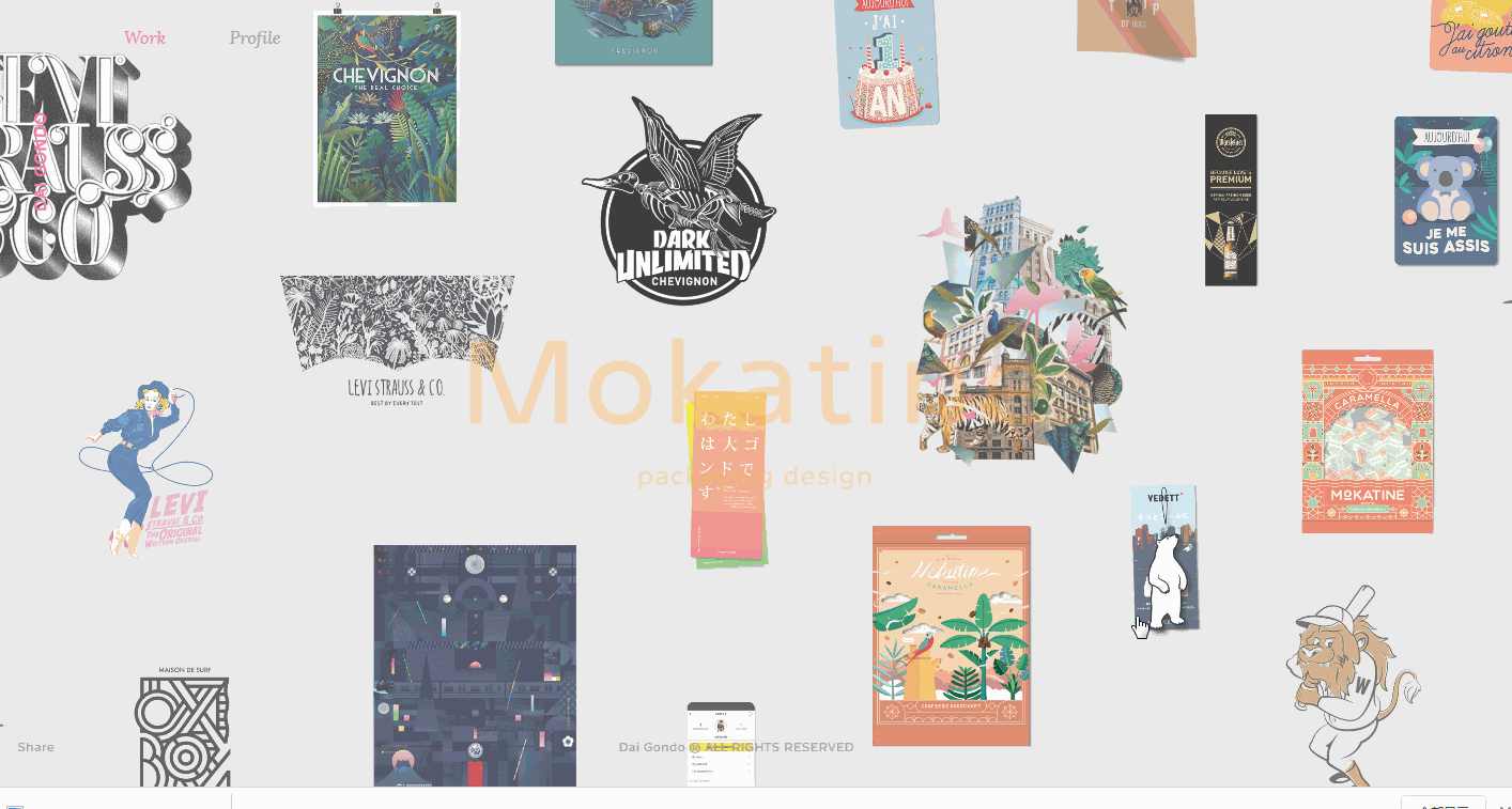
Dai Gondo is a creative designer portfolio website that showcases all design projects on the background. Visitors can easily drag the background to navigate the desired project. As you hover over something, it will come into focus and the project information will appear.
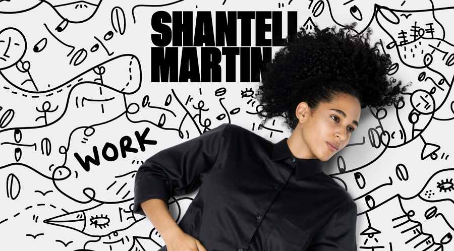
Shantell Martin is another perfect combination of photos and handdrawings. The hover effects also make the handdrawings much more interesting.
And then, after these inspirational modern website examples, we've also collected 10 of the best modern web design templates for creatives, like you:
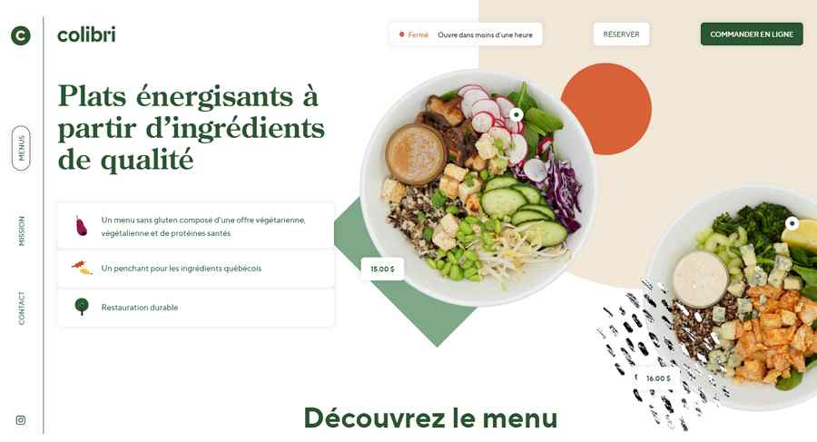
Restaurant Colibri is a green and modern restaurant website template with fresh layouts. It provides intuitive navigation bars, smart tab bars, neat dish card designs, rich hover effects and so on. It is a good tool to create a food or drink website with a freshening tone.
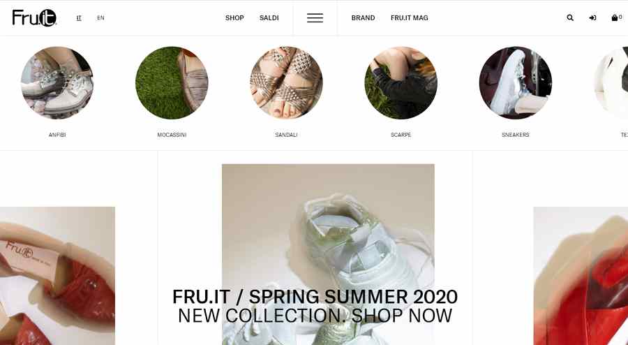
Fru It is a modern shoe ecommerce website template that uses horizontal navigation bars to help visitors find different types of fashion shoes. The overall minimalist design style is another key point you should consider while selecting a template.
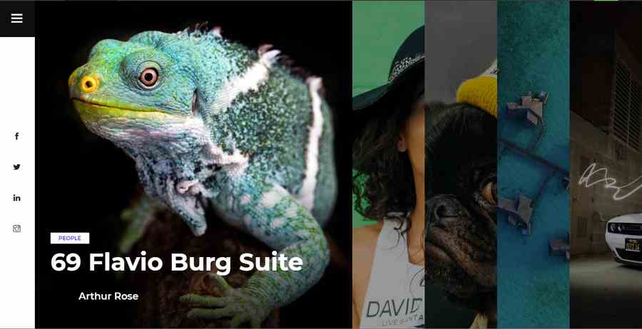
Tulen is an incredible free fullscreen photography website template. It stands out from others easily with its accordion-like home page displaying different photo works. It is a perfect tool for both amateur and professional photographers and designers to create an impressive portfolio website.
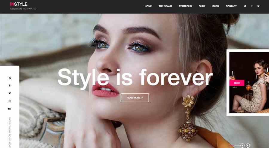
Instylr is a free modern and high quality fashion brand website template that uses cool fullpage hero image carousel on its landing page to capture visitors' interests quickly. It is fully responsive and perfect to create a fashion, clothing or cosmetic website.
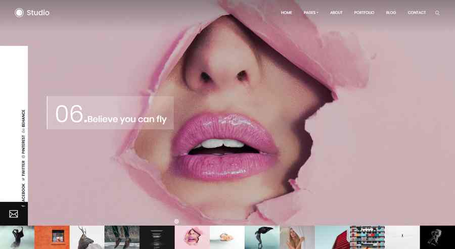
Studio is a free modern studio portfolio website template that features an excellent slideshow at the bottom for visitors to navigate the design works or projects easily. You can straightly edit it to showcase your best works or projects with ease.
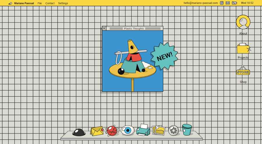
Mariano Pascual is a gorgeous portfolio website having an illustration style. All the related design projects, images and even buttons are shown with custom illustrations. It is very interesting and enjoyable to explore all its pages, functions and even every detail. So, it is a nice tool to create a modern personalized portfolio with a good visual appeal.
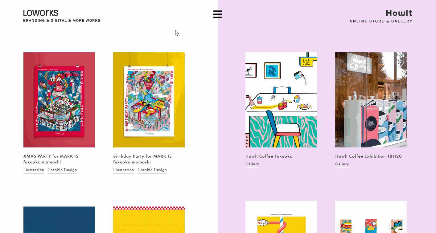
Loworks is a modern illustrated website for a design company. All its design projects are listed in two columns which can be scrolled up and down separately.
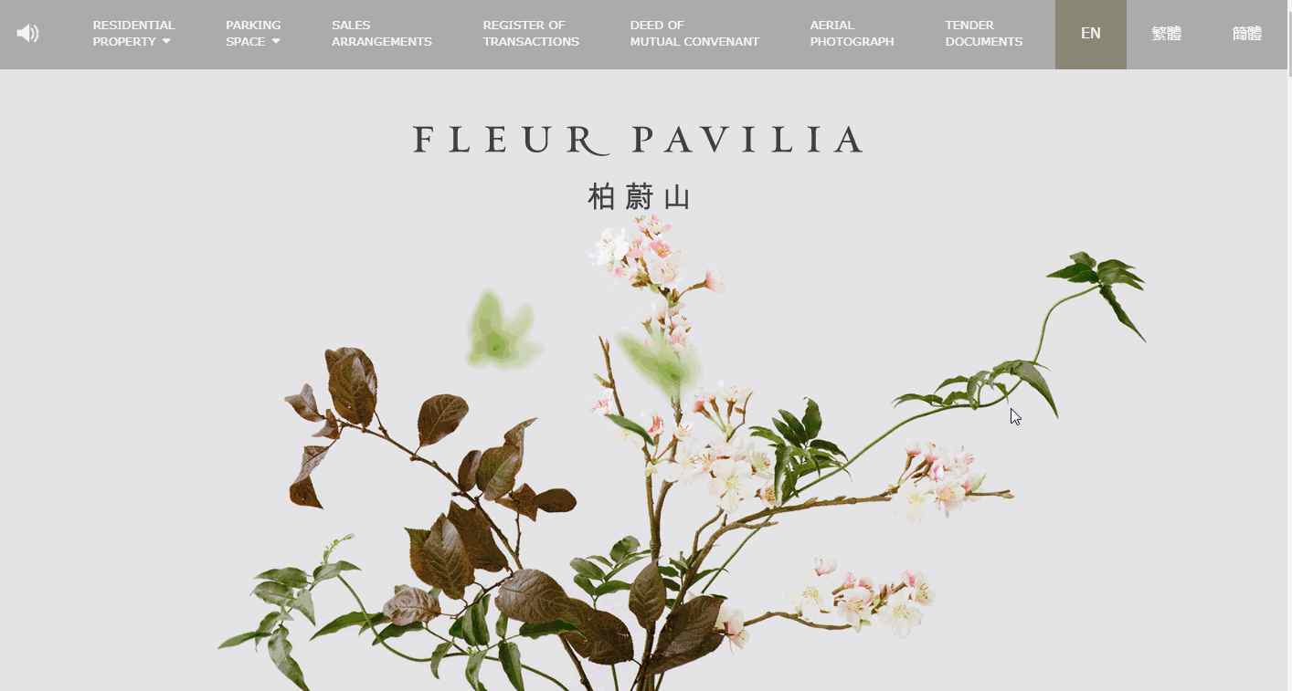
Fleur Pavilia is a modern and fresh real estate website template. Unlike other real estate website that straightly lists different housing units and information, this template uses floating flowers and plants with thoughtful interactions & graceful parallax to invite users to explore the website and housing.
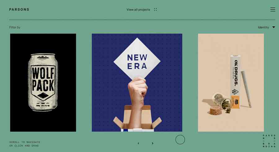
Person Branding is an art-gallery-like website template made for a brand strategy and design studio. It uses an impressive horizontal scrolling to help visitors navigate different design projects, just like visiting an art gallery in person.
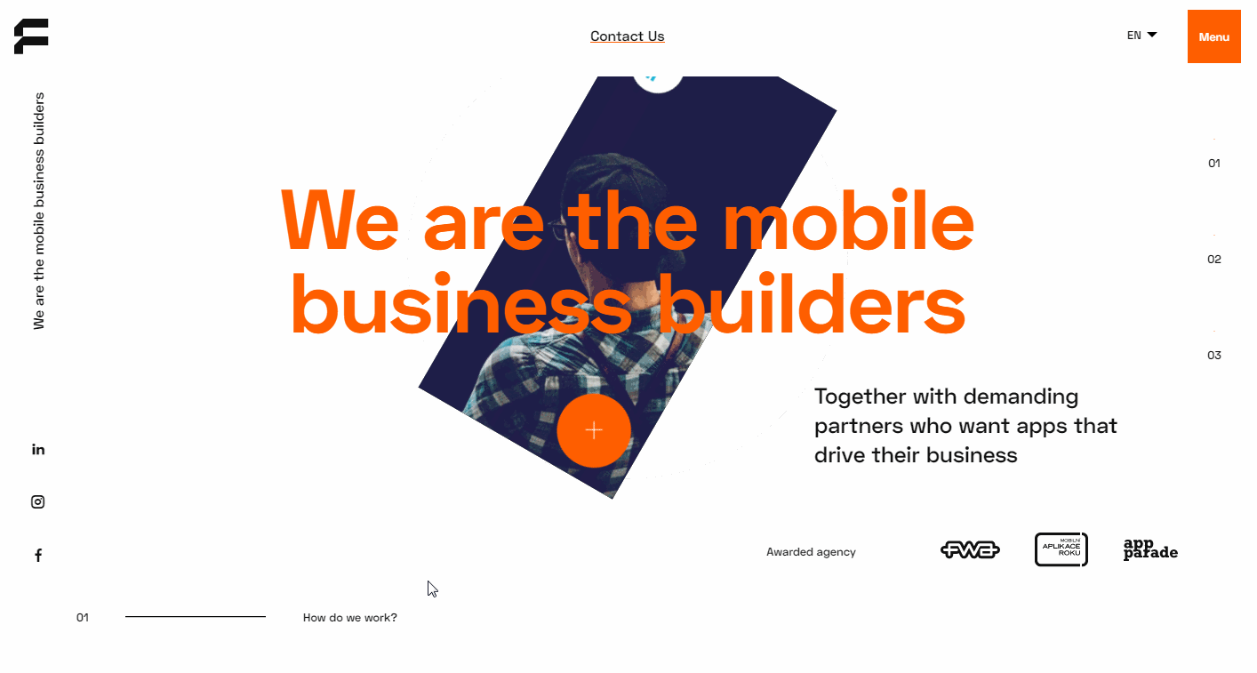
Futured is a minimalist interactive website made for a mobile business builder. It has a very eye-catching image carousel on its landing page. While hovering on the image, the shown image and information will also change instantly, which brings users a very different and immersive experience.
We've got three tips for you:
The best and most creative website design examples and templates can be good resources for you to get inspiration. And the top 40 modern website examples and templates above can help you save much time and effort.
After getting some inspiration from these examples and templates, you will surely need a handy website design tool to visualize your ideas and iterate them again and again personally or collaboratively.
Mockplus, as an all-in-one online product design platform, is a perfect tool for you. It enables all product team members (such as designers, developers, product managers and other stakeholders) to work together on the same modern website project online in one place.
With Mockplus, you can easily prototype and iterate your website designs, share and get feedback, test, iterate and even handoff them to developers with auto specs, assets and code snippets. It streamlines your entire design process.
In this online design platform, product managers can even easily write PRDs online and add document and prototype references to further explain website details.
To create a perfect modern website, testing is a key point as well. Before releasing, you should translate your ideas into interactive prototype, and test it many times to find all possible issues early on. Even after the release, you should also go on iterating the design according to users' needs and test them again and again.
Website design best practices always help designers get inspiration to create a distinctive design easily and quickly.
We hope these 40 of the best modern website design examples, templates, and design tool can help you build an impressive and successful website with ease.
 Mockplus RP
A free prototyping tool to create wireframes or interactive prototypes in minutes.
 Mockplus DT
A free UI design tool to design, animate, collaborate and handoff right in the browser.
