We’ve got a riddle for you.
What do you get if you combine images, texts, and other design materials?
The answer is, of course, Mood Boards!! A beautiful visual presentation that wows clients and users alike.
Now starting the journey from some simple physical boards and after rigorous bouts of improvement, digital mood boards are trending these days.
So what’s the use of these digital mood boards?
It’s the best way to check or improve the looks and feel of a new UI/UX design before going into the complexity of your projects.
You’ve got us now!
This brief guide will focus on the 20 best digital mood board examples while showing you how to create one as a UI/UX designer.
Let’s start with the basics first, and then we’ll jump into those mood board examples.
The word "Mood Board '' refers to a classical collage of images, typography, color pallets, icons, and other material samples that show the visual presentation of a particular idea in a somewhat attractive way.
So how can we use a mood board? I mean, is there really a need to go through all this trouble of making a good mood board?
Yes! Of course, there is. Mood board is used by many creative professionals like set designers, fashion designers, and especially UI/UX designers.
And concisely, the mood board not only allows you to express your ideas beautifully but also enables you to hone those visual ideas in a stepwise manner.
Now that you know what a mood board is let us briefly show you the components which make up a first-class mood board.
The first thing you have to include in your mood board are images that are related to your topic and perfectly convey your idea.
Is that all?
Of course not! Go beyond those static mood boards and add some videos or animated GIFs to your boards.
If you want to make a mood board that clearly describes a particular idea and attracts clients and users, then you have to focus on choosing the correct color pattern. Add color swatches at different places or use different color combinations.
Next comes the text. You can write descriptive text below your pictures or add classical quotes or proverbs to improve your mood board. You can even highlight the text for some unique touch to your mood board.
Selecting the best text font for your mood board is also pretty important. You can completely change the look and quality of the text font that suits the users.
Now we can’t forget those classical patterns and shapes, can we?
Adding a suitable shape or a pattern has also been helpful in leveling up a mood board. On top of everything, you can add simple textures to further sweeten your mood board.
Icons and logos have much more practical uses than you think. Just add them in a solid color or multi-color design anywhere they fit well and considerably increase the decor of your mood board.
After knowing these mood board elements, it’s time to move forward and look at 20 outstanding and notable mood board examples we have compiled after scouring the internet.
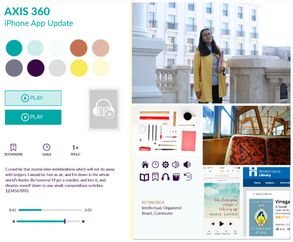
The first mood board example that acquired the top rant in our list is a mood board of an application, Axis 360. This mood board is an excellent collage of images and text with a perfect choice of colors.
All the images are arranged on the right side, while the creator focused on using typography, logos, icons, button styles, and color swatches on the left side. Overall, this mood board is a simple and perfect example to kickstart the design of a website.
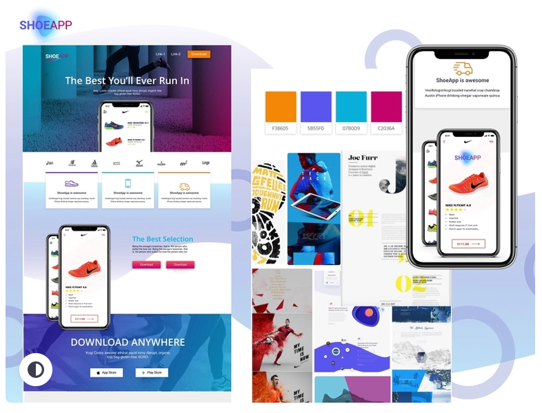
This SHOEAPP Mood Board is an excellent illustration of an online shoe application to encapsulate the brand and feel.
The colorful look that contains images of the user interface of the app is combined with multiple circular shapes in the background. Overall, this mood board powerfully conveys the style and functionality of the app with surprising simplicity.
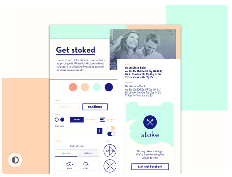
This Dating App Mood Board is a great example of a minimalist mood board. Images, logos, text, and button styles are used in a sophisticated way with two color schemes.
There’s a “Link with Facebook” button on the bottom right that can be switched with other options, and different text fonts can be used to further sharpen the mood board.
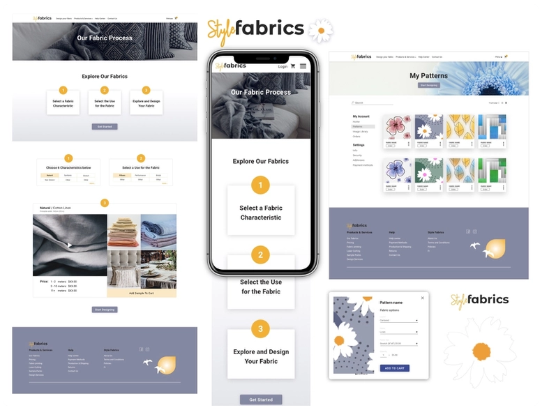
Now we’ve arrived at the Style Fabrics Mood Board. This mood board is packed with multiple ideas that will work best not only for clothing-related mood boards but also for other types of mood boards. The color scheme used in this mood board is not so bright, but still, the simple white background easily attracts the users.
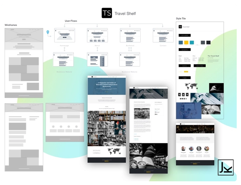
Travel shelf Mood Board is a practical website mood board and what we especially like in this mood board is the light color scheme.
This first-class mood board can also be used as a template where you can change the Travel Shelf images and the logo with any other app to instantly make a simple and excellent mood board.
But there's also a flaw, and that is the lack of descriptive text, which is definitely a must if you want your mood board to be meaningful and more inspiring.
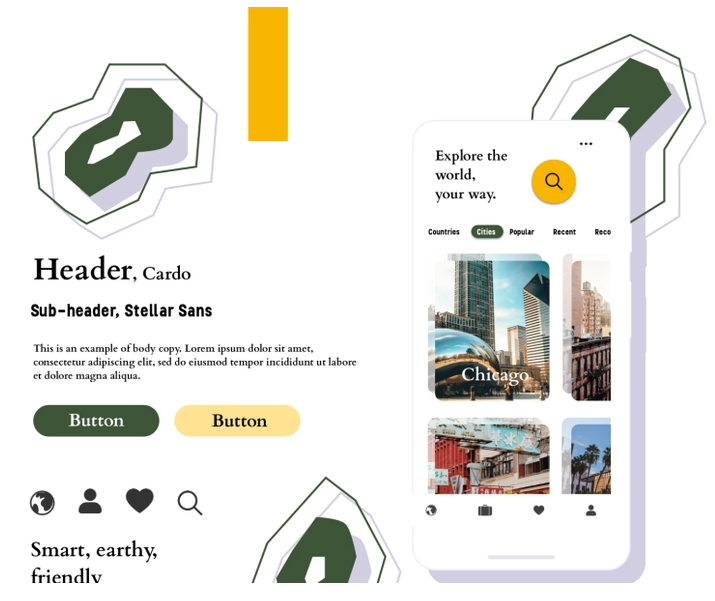
Now, this Trip planner App Mood Board is a template that shows the application's user interface on the right side while having typography, button style, or icons on the other side, creating an almost perfect balance of all the components. On top of that, the color palette and eye-catching shapes that are scattered all over the place also make an attractive look.
And after that, we also fell in love with the precise choice of color pattern that produces a classical view.
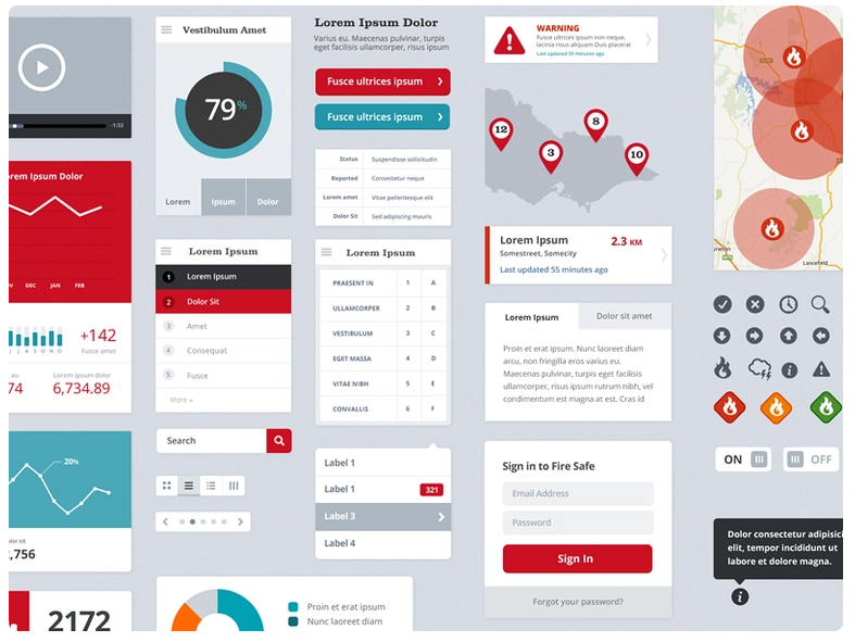
This mood board has been specially made for exploring different user interfaces of an application or website. The pattern, font, and overall aesthetic of this UI Pattern Exploration Mood Board give a perfect idea about every single view of the application. Moreover, everything is arranged above a simple grey background, so it doesn’t get complicated at all.
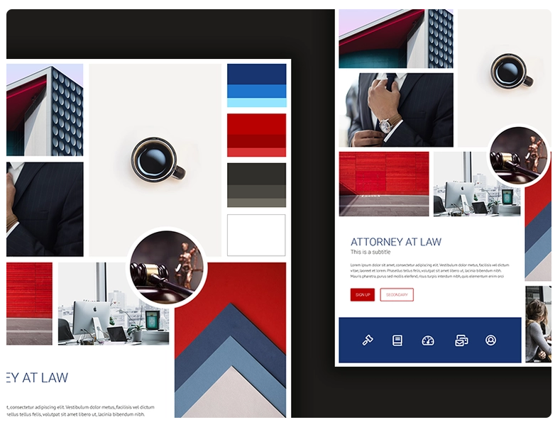
This Attorney at Law Mood Board is a pretty good example of a minimalist mood board. Multiple images are arranged over black background in such a way that it perfectly describes your purpose while maintaining a sophisticated look.
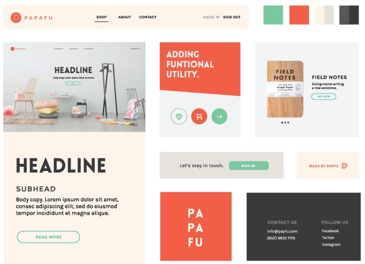
This Papafu Mood Board is actually a template that does an excellent job of showing how you can make a top-notch mood board without any hassle.
On the left side, there's the main image with the title and the description of the idea. While on the other side are other related images, notes, and icons. Lastly, the bottom right portion contains a block with the contact information about the website or application in question.
Everything is just so beautifully arranged.
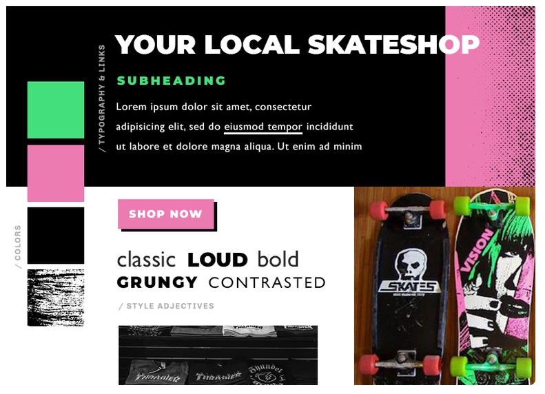
This Skateshop Mood Board is supposed to convey the attractiveness of skateboards. And the creator does well by placing imagery on the bottom part while having headers and descriptive text on the middle part.
The combination of white, black, pink, and green colors is matched with the color design of the skateboard in the image to create a smooth look.
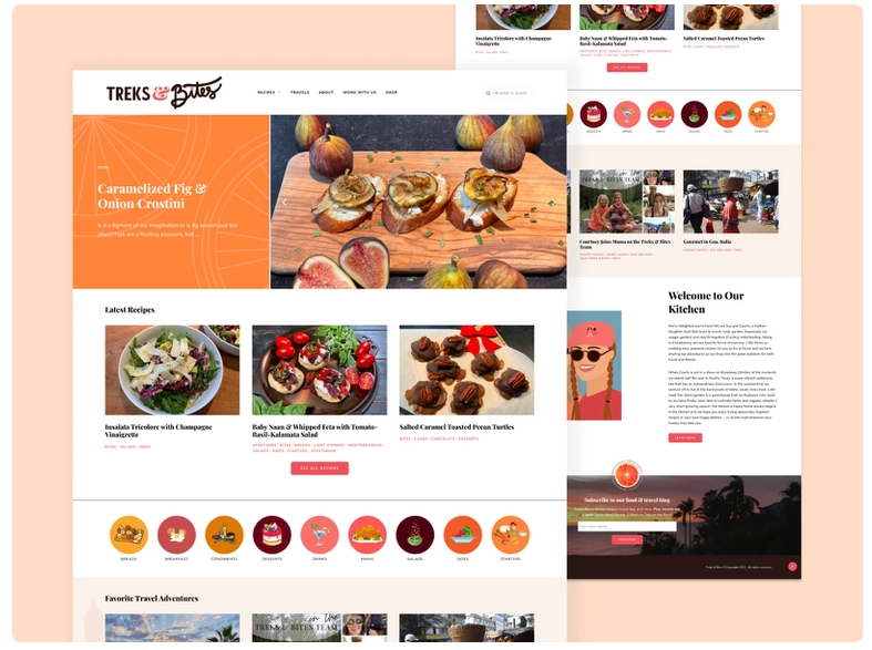
Now we have arrived at a mood board that brilliantly shows the interface of a food website and makes its functionality more precise and easy.
And the images of UI are attached over a peach-colored background that matches the food app interface, and this further intensifies the look and feel of this Food App Mood Board.
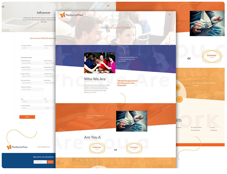
The next inspiring mood board is the Social Flies Mood board. The distinctive feature of this mood board is the precise and beautiful use of different shapes and patterns.
Moreover, the combination of white, orange, and blue colors makes an outstanding user interface for the web page.
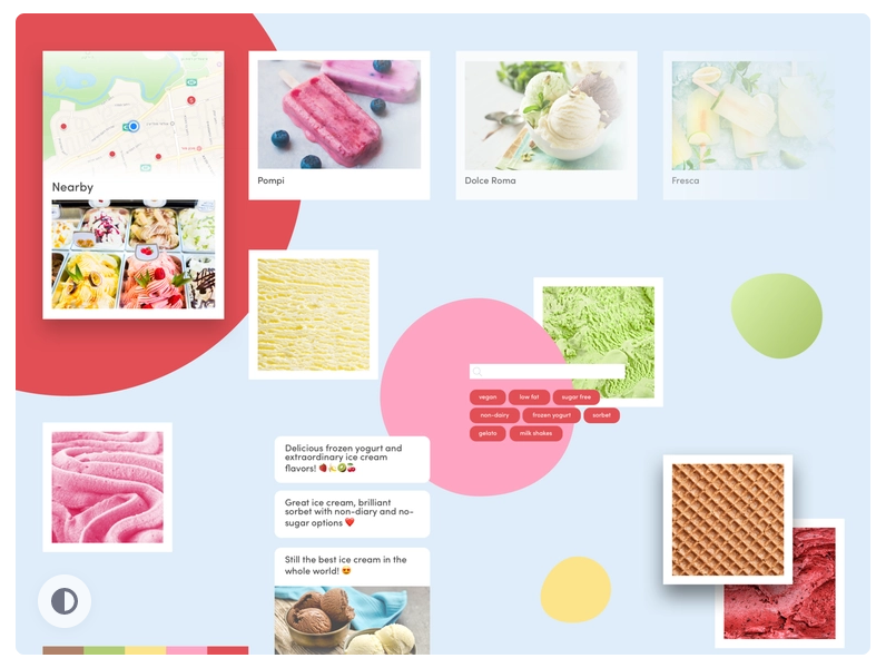
Creamland Mood Board is a colorful amalgam of images and texts that inspires its viewers to visit a close ice cream shop right away.
Different colors are used, which refers to the different flavors of icecreams creating a perfect look for an ice cream mood board.
But still, many patterns, icons, or some descriptive text can also be added to further modify this mood board.
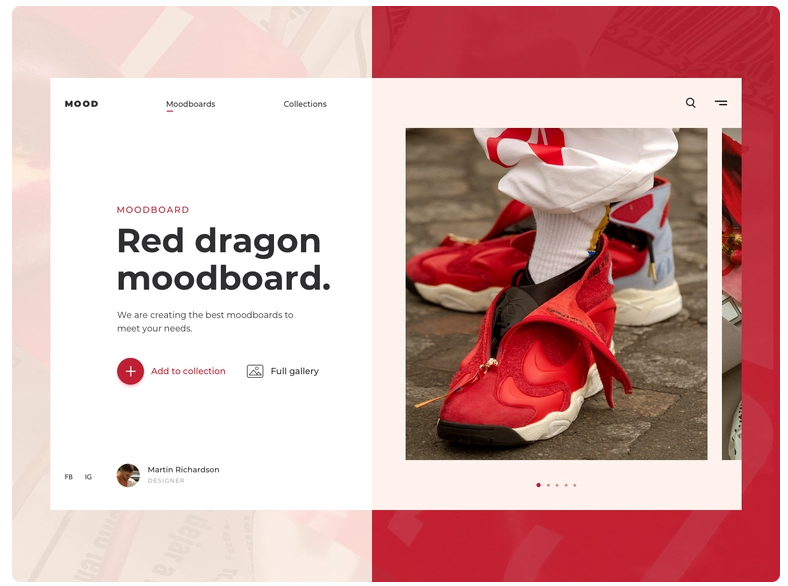
In contrast to the earlier mood boards, this unique Red Dragon Mood Board shows a perfect example of some online selling stores. The color scheme is clearly defined with two colors, and it makes a striking match with the product on display.
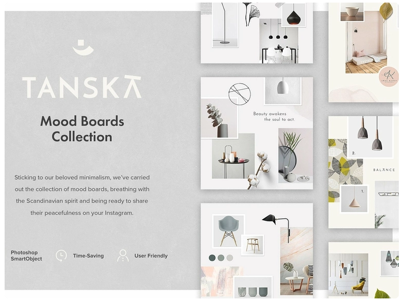
Now Tanska presents some elegant mood boards with a perfect demonstration of interior house decor. All these images are arranged on a beautiful grey background, and a simple text format is selected to maintain simplicity.
The Tanska Mood Board Collection contains multiple mood board templates emphasizing light shades.
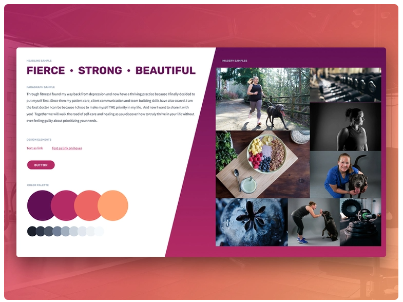
This colorful mood board is also one of the best examples that readily attracts users. The basic idea behind this template is a fitness routine. The images selected also conveys the idea of exercise as well as diet plans.
Then there is the descriptive portion on the left side with wisely selected precise words that are perfectly suited to the Fitness Website Mood Board.
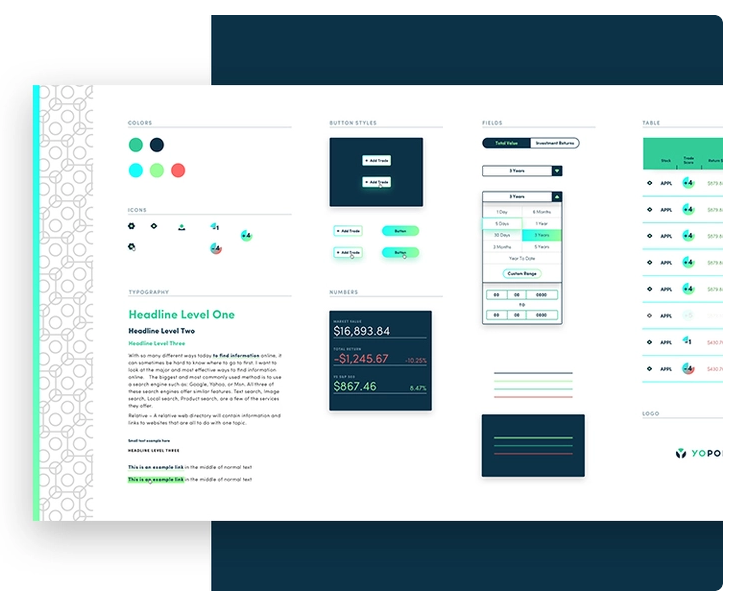
Yo Portfolio Mood Board has also caught our eye in the quest for mood board examples. What we like about this specific mood board template is the simplicity with which all the images and descriptive texts are arranged.
The white background that is used with a vertical design on the left side makes a classical base for the mood board.
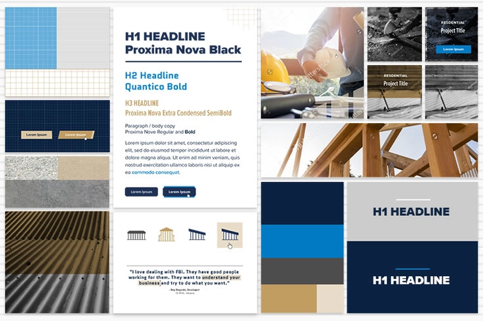
The next inspiring mood board example is a Construction Website Mood Board. It’s basically a template in which, instead of randomly spreading images, the creator arranged all the images in an orderly manner. The main header and other descriptive text are placed in the middle of the mood board.
That’s not all; the “H1 headline” is again used on the bottom right to further emphasize its importance.
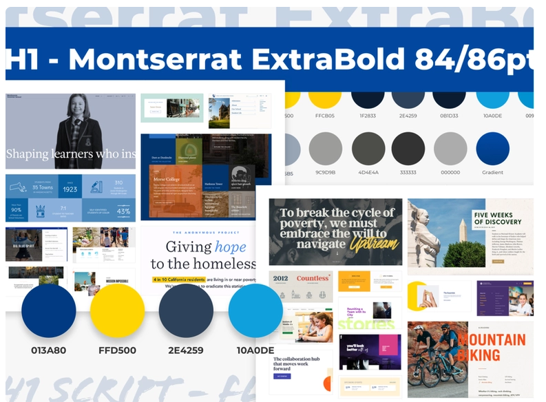
Unlike the previous example, the Summer at SEM Mood Board doesn’t look sophisticated. But this complicated look has a particular charm of its own,
The mood board is mainly created around the blue color, but other shades and distinct yellow color is also used to produce some contrast.
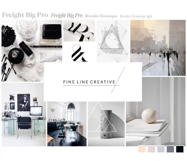
We have arrived at the last mood board example of our hand-picked list. The contrasting palettes of white, black, and grey colors make this Fine Line Creative Mood Board stand out from the other examples.
Meanwhile, the classical arrangement of images with the header at the center also intensifies the beauty of the color scheme. And then comes the choice of text font, which can also make some differences.
Now that you have seen all these inspiring and eye-catching mood board examples, I bet you are interested in making mood boards for your application or website, especially if you are a UI/UX designer.
Therefore, we are presenting you with a bonus tip.
And in this bonus tip, we’ll show you how to skillfully make a classical mood board.
So let’s move forward without any further delay.
Making a good Mood Board can really give you a headache if you don’t know any suitable tool and what to do with that tool.
But now, you don’t need to worry because we are going to show you an incredible mood board-making tool that even supports UI mood boards and how you can use it to make mood boards in a stepwise manner.
Mockplus is a browser-based UX design platform that empowers fast design, prototyping, and a smooth, collaborative workflow.
This tool contains robust features that will enable you to make an incredible mood board within minutes. Here are the steps you need to follow for making a mood board with Mockplus.
So, where should we start? From ideation, of course!
Just like every other design process, you need a concrete idea or concept for making a mood board. You can explore the internet to get some inspiring ideas, or you can just scroll up and go through those 20 mood board examples again and select the one you like the most as the direction of your project.
After you have selected a particular design in your mind, the next thing you need to do is to gather a lot of raw materials for your mood board.
But what is the raw material in this case?
Images, videos, GIFs, and audio related to your topic and idea are the main raw materials you need. Everything else will be provided by Mockplus to further sharpen your mood board.
But before you move forward, keep in mind that you need a large amount of these materials to make sure the final mood board that will be created is as good as we need.
Once you have collected all the related material, it’s time to visit Mockplus.
Go to the official website of mockplus and hit “Get Started for Free.” Once done, you need to “sign in” using your Mockplus, Google, or Lark ID.
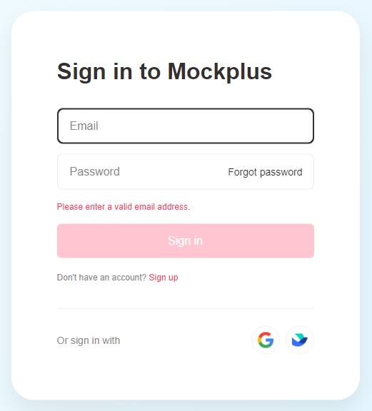
After that, just start a “New Project” and add different images to your project until a perfect combination is formed.
You need to try different combinations so that you can get a better result. Then the topmost toolbar contains all the necessary things you may need alongside your images. Add textures, shapes, and other design materials from there and see which one fits your mood board.
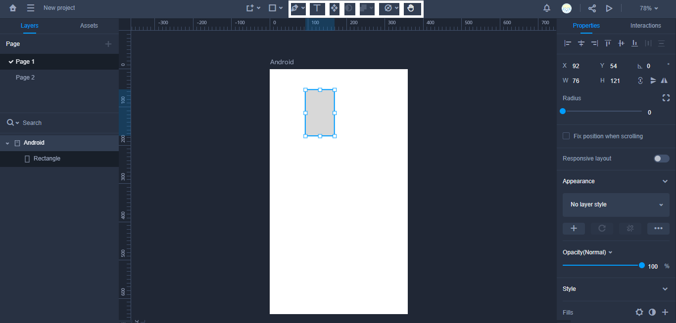
Now it's time to further deepen your mood board. Use some classical GIFs, videos, and audios that are related to your idea and add them to your mood board.
Now that a tentative mood board has been formed, we are nearing our final product.
What we need to do now is reorganize all the materials so that a precise look is formed that matches perfectly with our requirements.
So is that all? Aren’t we missing something very important?
That’s descriptive text, folks!!!
First of all, you have to select text font and then add the main title and other headers to your mood board. Then you have to add some other explanations of images, proverbs, or other words that will boast the meaning and quality of your mood board.
Now you may think the mood board is completed, and that’s to be expected because you have done everything you can. But, believe me, two heads are always better than one.
Show your mood board to your colleagues or your client (that is if you are working for one) and get their feedback on it. They may find something lacking, or they may have some better ideas about your mood board. And if you like their ideas, keep on making improvements on the mood board.
Finally, give yourself a pat on the back because you have finished creating your mood board.
But it doesn’t mean it’s the ultimate product without any flaws. There’s always a gap somewhere, so keep your door open for further improvements in the future.
Hopefully, after going through all these 20 mood board examples, you are inspired enough to create a mood board for your website or application. Just follow the simple steps described in this guide and quickly make an outstanding mood board with Mockplus right now.
And if you have some comments or thoughts, make sure you leave them in the comments section below.
 Mockplus RP
A free prototyping tool to create wireframes or interactive prototypes in minutes.
 Mockplus DT
A free UI design tool to design, animate, collaborate and handoff right in the browser.
