Hans Christian Andersen once said, "Where words fail, music speaks." As an integral part and one of the most common means of expression in human life, music has always followed us and has been an excellent source of inspiration. With the popularity of mobile phones, listening to music has long become a typical pastime for many people.
As a result, the demand and market share for music apps have maintained a rapid and steady increase. So, it's essential for designers to learn about and evolve with the latest trends and design concepts in this particular sector. However, it's pretty time-consuming to look for new and quality music app designs on the Internet. In this article, I have rounded up and hand-picked a collection of 20 of the best music app designs to help you create your own new and original music app design. Let's check them out!
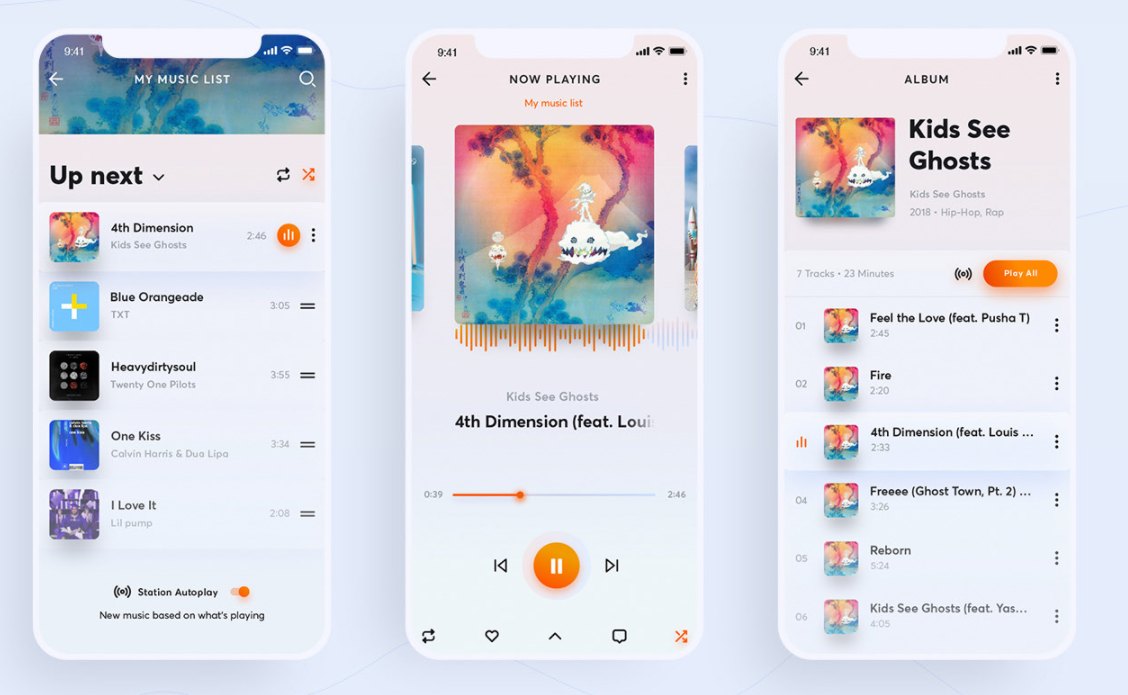
SoundCloud App Redesign Concept is from the Ukrainian girl Inna Shalatonova. As a popular music and podcast streaming service, SoundCloud provides you with easy access to discover, upload, and listen to your favorite music. The redesigned app has a clean, fresh, and simple look. The adjustment of the structure is worth mentioning. The set of tasks that users must do to complete some processes is also reduced to as few steps as possible. As opposed to dark mode, the interface has a mix of glowing colors with different shades of dark and deep colors. This gives the design a lively, relaxing, and light-hearted feel.
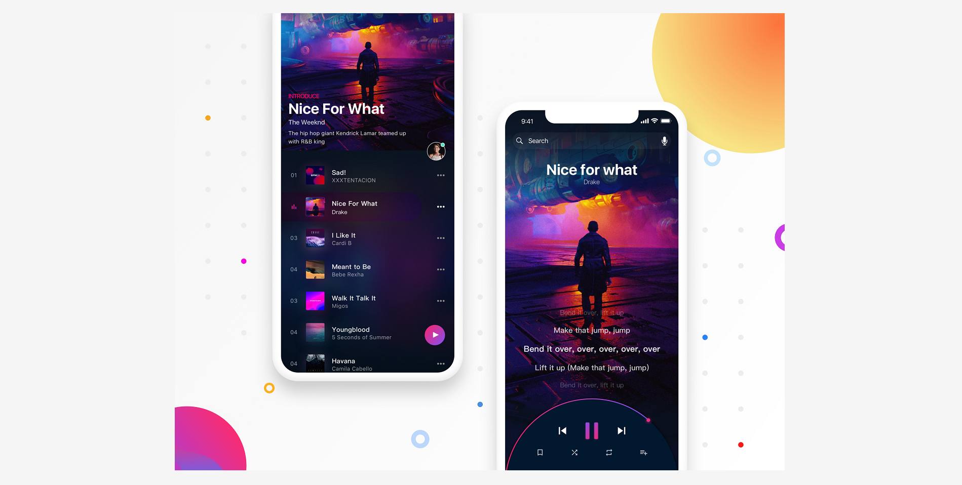
Sensuous Music is from the lovely Chinese girl Aimm. The music app is also called Perceptual Music. It has a clean and minimalist style. The interface is attractive and looks stunning. The bright color scheme is consistent and gives the design a bit of ultra-modern and cyberpunk vibe. There is not a lot of text on the interface. All you can find are some intuitive icons. The designer has also taken Voice User Interface (VUI) into account.
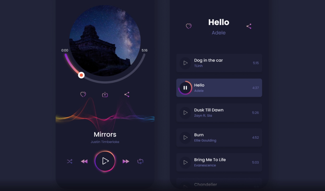
Music App Design is from the Vietnamese designer Tung Nguyen. It aims to create a simple yet fulfilling experience for music lovers by removing complex features. The use of dark elements gives the app design a modern and futuristic feel. The stylish color scheme of black and shades of pink is wonderful. What makes it stand out is the ambient effects on the play button. The use of gradients on the interface makes the transitions smooth and creates an elegant and mysterious ambiance.
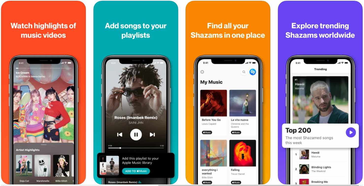
Shazam App Design is intended to connect users with the music and televisions around them. The app offers a clean, intuitive, and straightforward interface to connect users with music and information. The main page includes the Shazam symbol in white, and two interlocking U shapes tilted at an angle. The layout is clean, bright, and refreshing. Navigating through this app is fun with seamless illustrations and to-the-point CTAs. The bright and exciting color scheme adds a playful touch to this app.
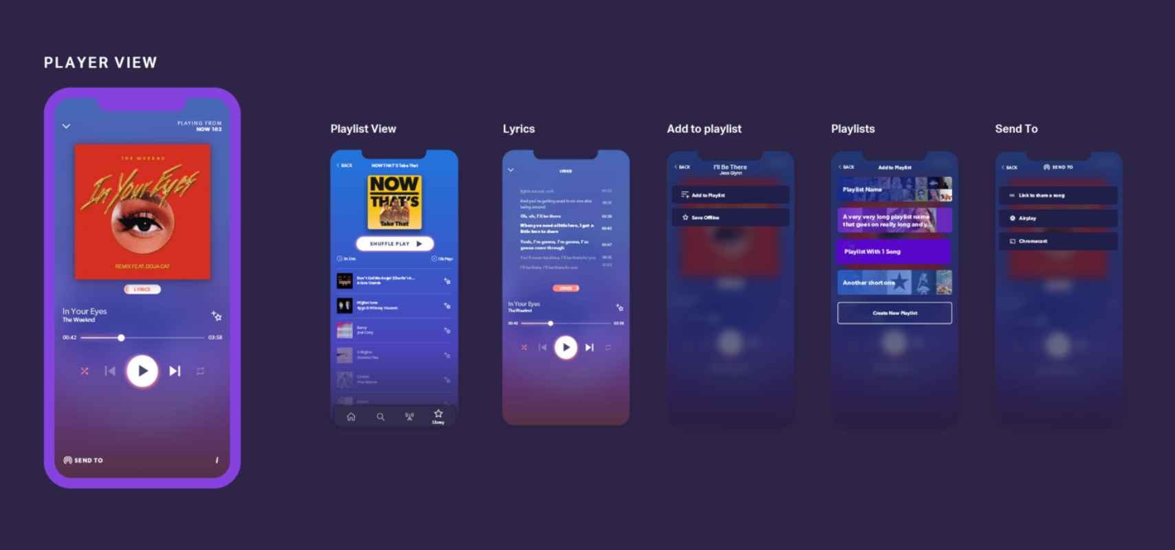
NOW Music App is from Enee Design Ltd, a Cambridge-based design company. They were brought in to give the app its own visual identity that sat within the app's brand. Actually, the whole design process of this app is a great case study for those who are tasked to design a music app. The first thing they did was to rebuild the logo. They remodeled and textured the original logo from scratch. You can definitely learn a lot from the font choice, color scheme, components, and iconography.
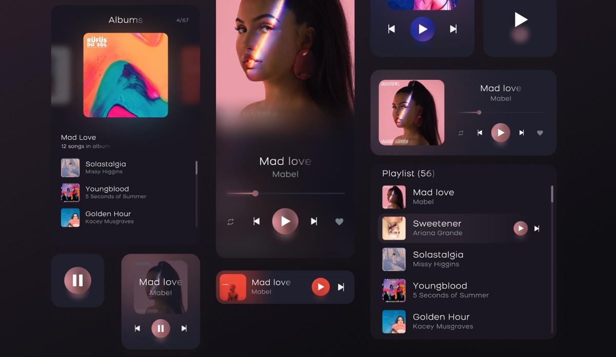
Figma Music Player App is a clean, modern and beautiful design from the Ukrainian designer Diana Shurman. Built with care and perfection, the interface is simple and tasteful. It satisfies the users' basic needs and removes the complicated functions. The color scheme includes dark and deep colors. This gives the design a special attractiveness that expresses personality and modernity. All the screens are also well organized and named as per their content. Besides, all components and screens are easy to customize. They are fully editable and pixel perfect.
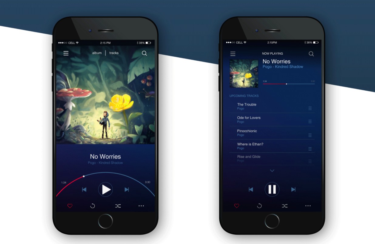
Music App UI has been created by the American UI/UX designer Christian. The goal was to design an interface for a mobile music app. The designer wanted to create an app that allows the user to easily rearrange tracks and set tracks to ‘skip’ if they don’t enjoy a particular track in an album. He also experimented with the concept of creating a scroll bar that fits the curvature of the users' thumbs. The color palette is primarily made up of blues with touches of violet and magenta.
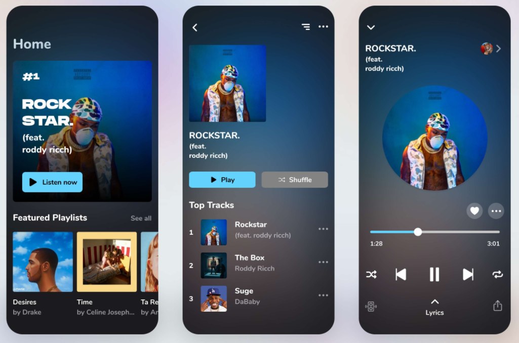
Music App UI Design is from the Vietnamese designer Tung Tran. The app is geared towards music which is popular currently. It is an excellent music news information app. The design has a modern and minimalist style. It also has a balanced and well-organized layout. The designer has put both symmetrical and asymmetrical elements in the interface. There is no part of the interface that is heavier than the others. This creates something special and provides a memorable experience to users.
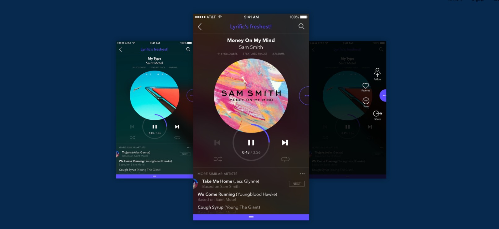
Lyrific iOS Music App Design is from the Bulgarian designer Dimiter Petrov. It's a pitch project with the purpose of creating a name and concept for an iOS music application. The interface is quite simple and intuitive for listening. The main screen uses mostly round shapes and the inspiration comes from classical music media such as vinyl records, CDs, and so on. At the same time, the colors of each screen are designed to change depending on the artist's album cover, which brings additional personalization.
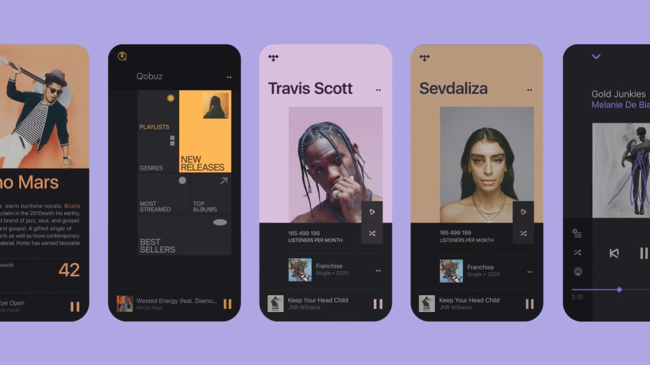
Naim Music App is an awesome music app design from the Russian designer Slava Fedutik. The layout is great. All the images are presented nicely with the right spacing. The colors are consistent and match well with each other. Together, they give a leisurely and comfortable feeling. The interface looks sleek and clean. It provides simple yet full control over the music. It does not have extra text or buttons. The base icons are enough to direct users. It's clear that the designer has a case for simplicity.
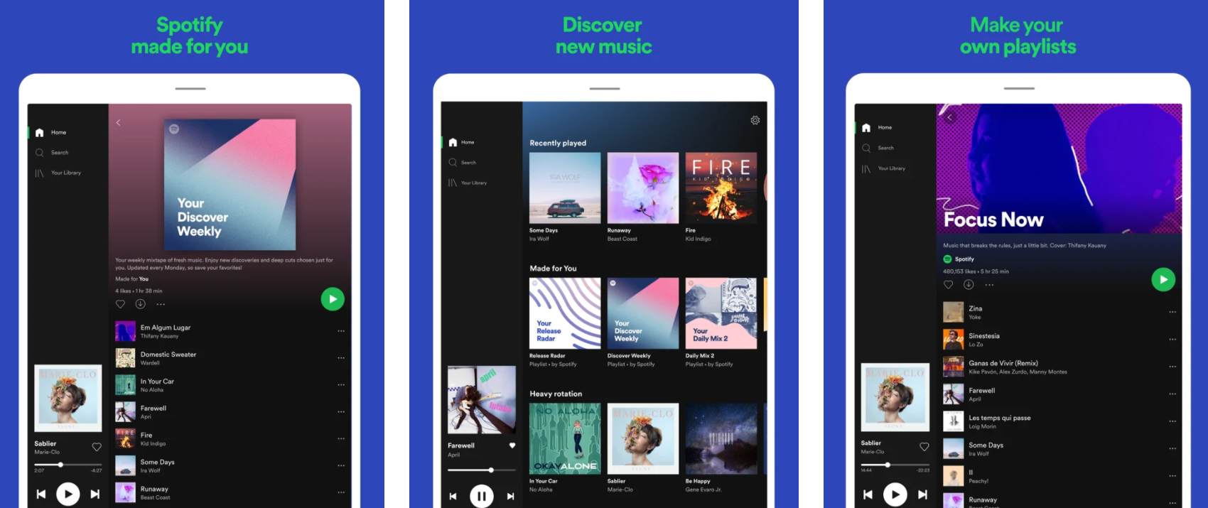
Spotify is one of the best pioneers in the music-streaming space. The interface for iPad is clean, elegant, and modern. It's fun and easy to use with an extensive catalog and good device compatibility. There are features that help you search for any track, artist, or album and listen for free. You can also make and share playlists. It's one of the best examples on the market that you can check if you want to build a solid all-around music service.
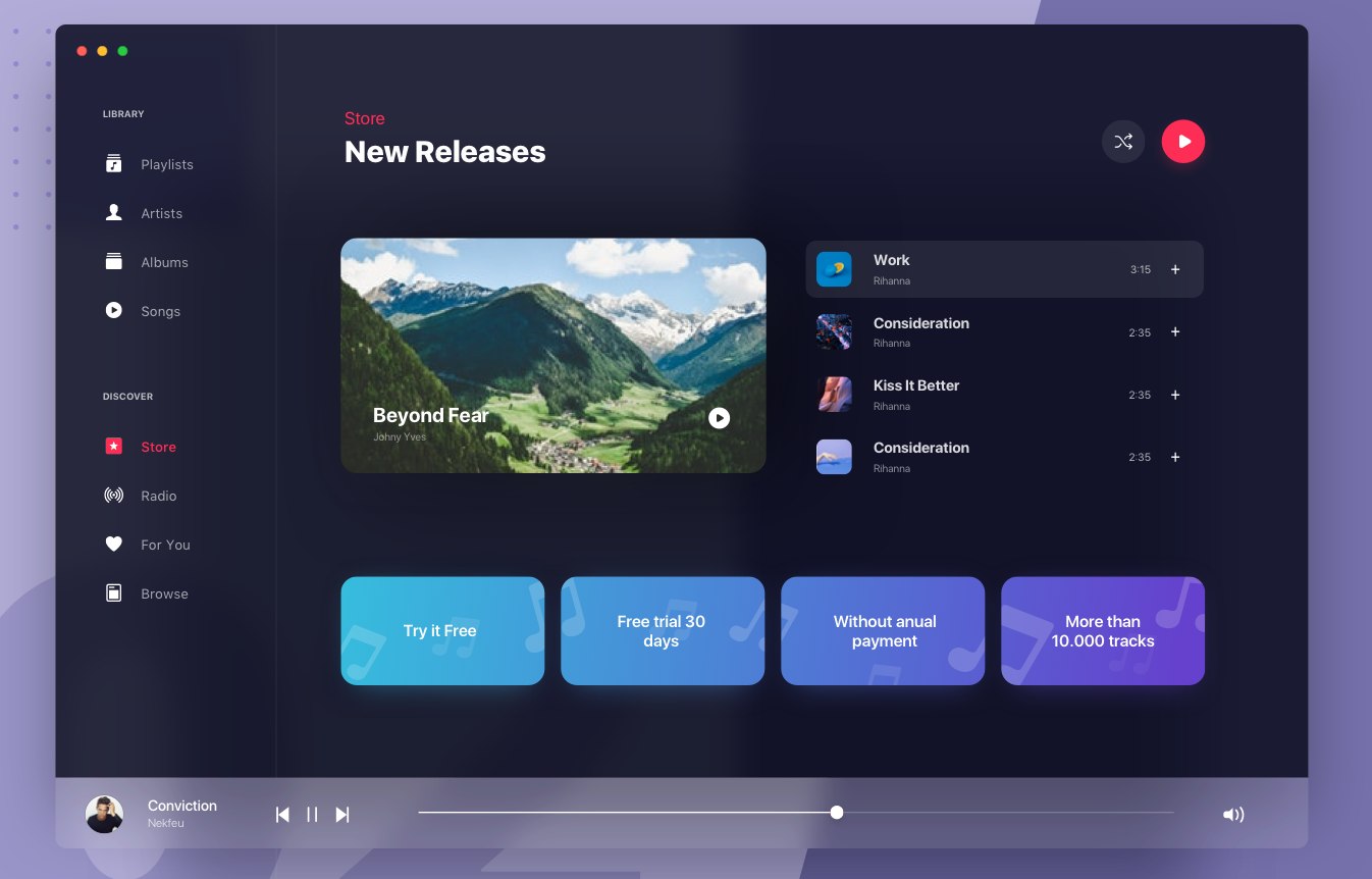
Apple iTunes Player Mini Store is from Aurélien Salomon who is a member of Orizon, a UI/UX design agency. The designer has made the Apple iTunes Player more user-friendly. This approach helps users understand how to use it right away, unlike the existing iTunes which is a bit chaotic. The interface looks rather neat and clean. There are no extra lines, colors, or icons. All the elements match well and achieve a great balance. The color scheme is consistent. The method of combining white fonts with a dark background is also worth noting.
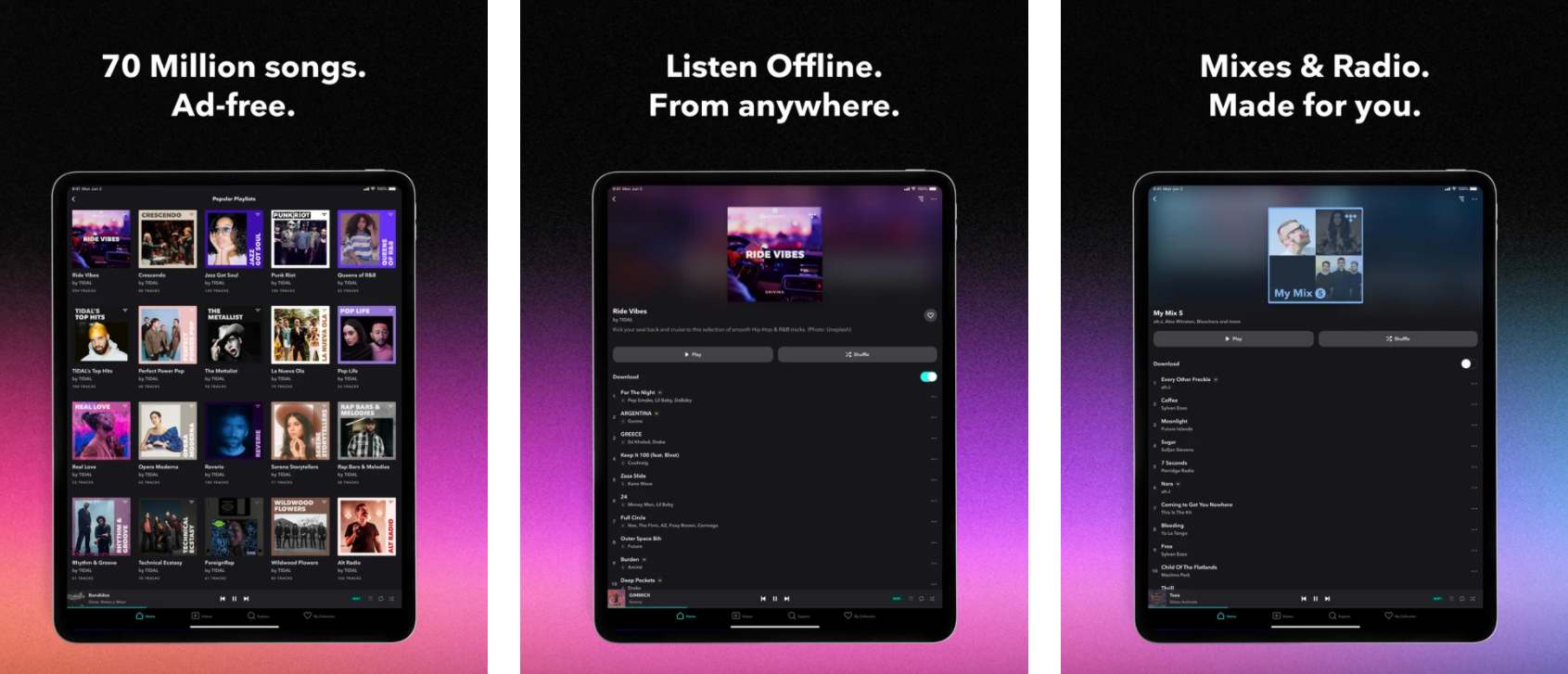
Tidal Music is a popular music streaming service. The interface for iPad has a special appeal for users. It's delicate, futuristic, and symmetrical. There are a lot of different features, such as MQA tracks, 360 Reality Audio, and Dolby Atmos. All of these are intended to help users enjoy music the way the artist intended with a lossless audio experience and high fidelity sound quality. This is a mature and standard application which designers can check to find inspiration.
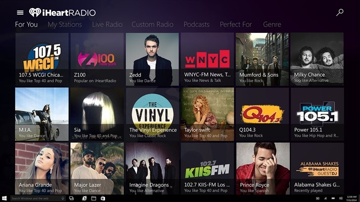
iHeartRadio is rising music streaming app that brings various radio stations, including Rock, Pop, Hip-Hop, Country, R&B, in one app. Based on a very simple and minimal layout, the interface has a dark color scheme. This gives a fresh user experience. Besides, the speech recognition feature also allows users to control the app using their voices with Cortana. A menu bar at the bottom of the screen helps users navigate in an efficient manner. The overall information architecture is simple and clear and still maintains full functionality.
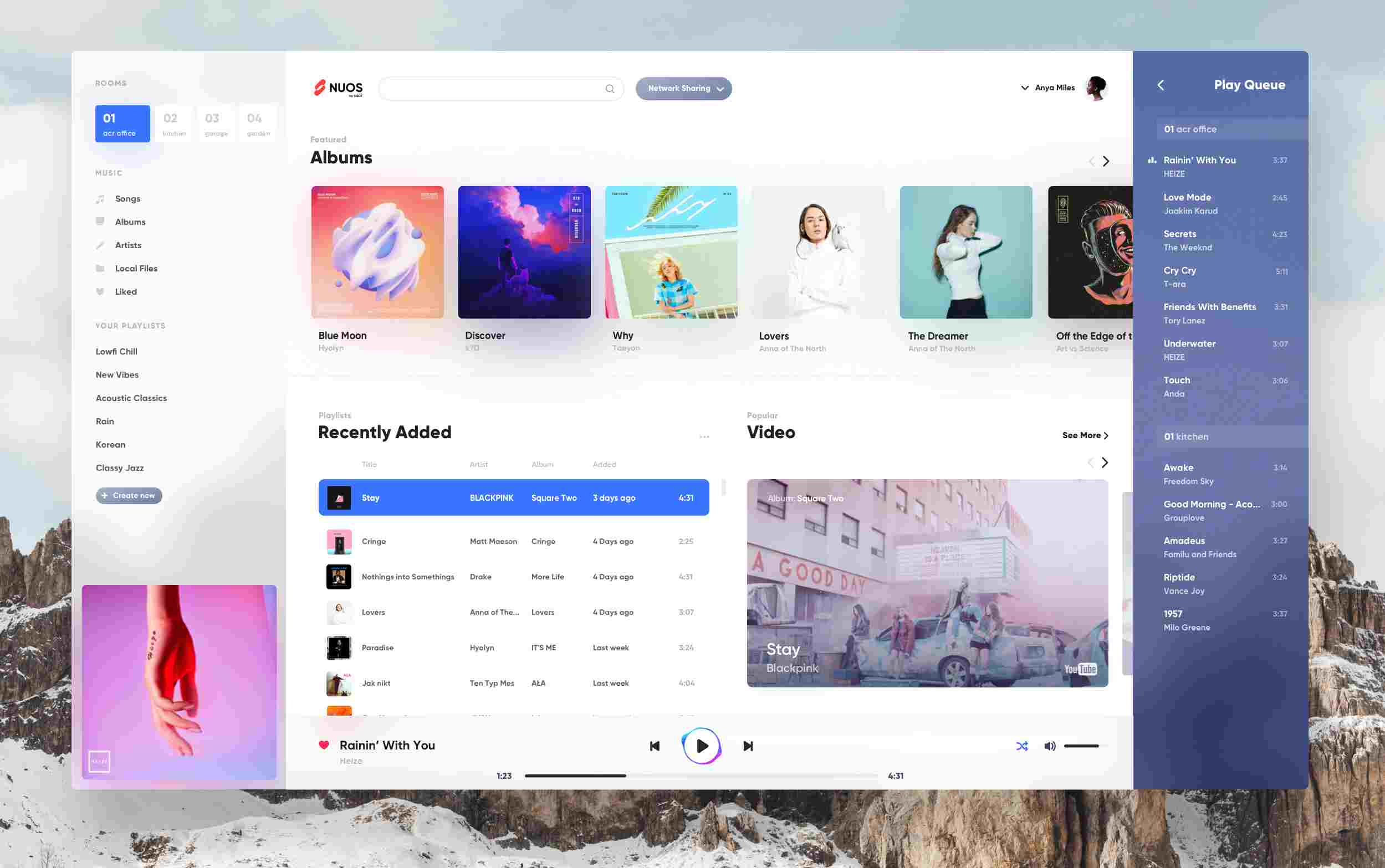
Nuos is from the product designer Wojciech Zieliński. It's a visual exploration for an upcoming desktop app. The designer got inspiration from Apple. The interface is clean, neat, and well-arranged. A balance is achieved as nearly all the elements are symmetrical. What attracts me the most is the colored circle around the play button. While the combination of shapes, layout, colors, corners, and shadows is awesome, the track on the left has a blue background. The color doesn't match with the rest of the interface. Besides, the fonts are a bit too small.
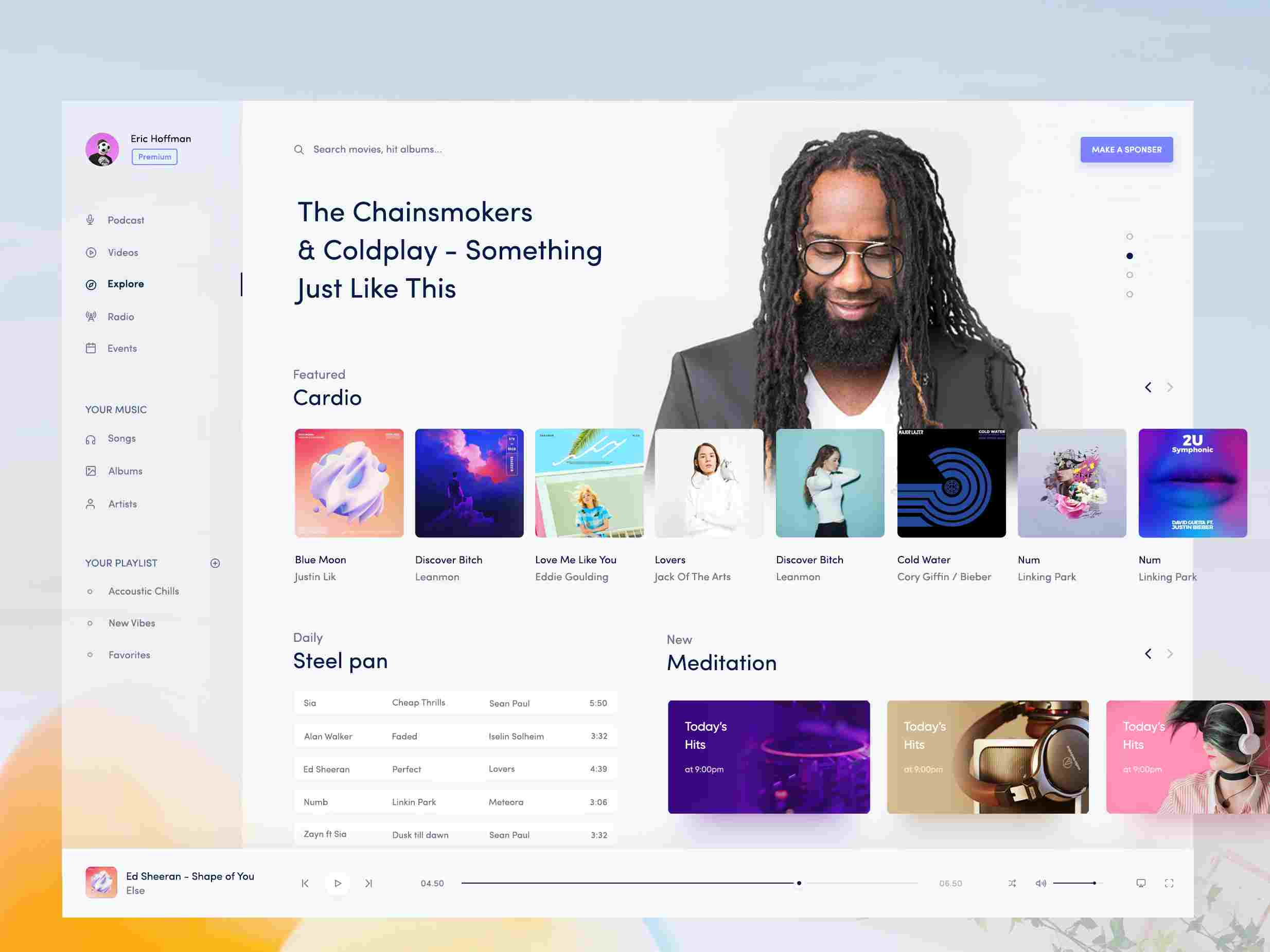
Music UI Desktop Design is a concept for a music UI design from the prolific UX/UI designer Masudur Rahman. This excellent design has nice colors and a minimalistic style. It has a fresh and clean interface and light-hearted style. The overall layout and arrangement of different elements are relatively good. But, the interface lacks enough balance. The menu on the left is a bit weak as opposed to other parts of the page. Besides, it would be better if the fonts had a large size with clearer contrast.
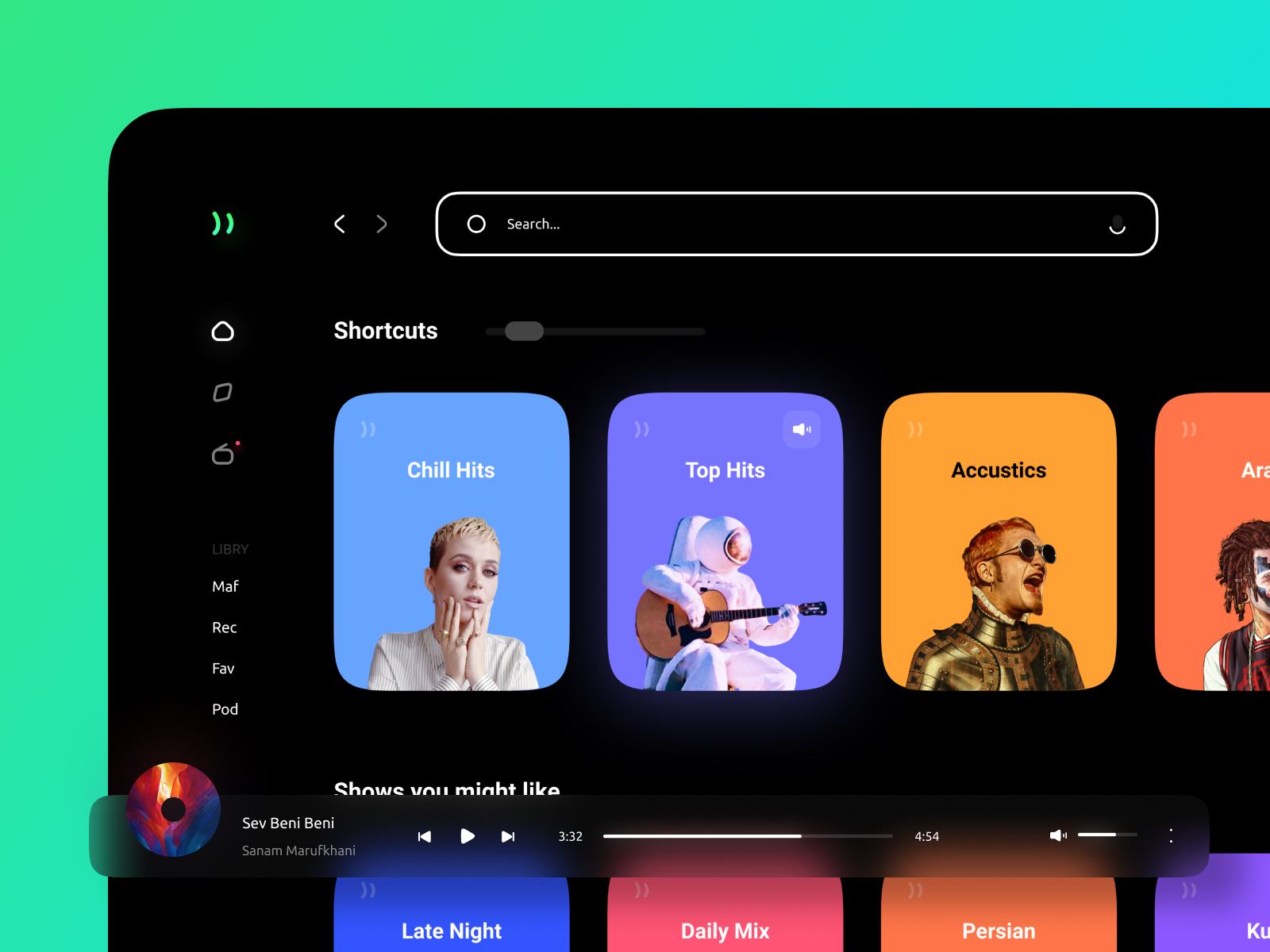
Music Streaming Desktop App is the concept for a music streaming service from the designer Sajjad Mohammadi Nia. It's visually appealing and looks neat and nice. The dark background has a great visual impact when combined with bright and luminous images. The icons look soft and fluid. Due to the specific corner radius of those images, it creates an immersive sensation and a slightly tender, liquid, and feminine feeling. It could provide a unique listening experience to those who enjoy different music styles.
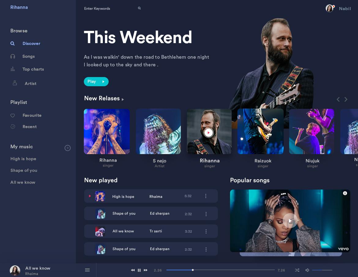
Music Player Dashboard Design is from the Bangladeshi designer Nabil Mahmud. It has a dark style and the interface looks nice and clean. There are 8 different sections designed to show the main features and basic information that is related to the songs and playlists. The left menu is vertical while the elements on the right side are virtually horizontal. The combination of symmetrical and asymmetrical elements gives the design a new and fresh look. One thing this design needs to improve is the player at the bottom. It's a bit small and lacks attention.
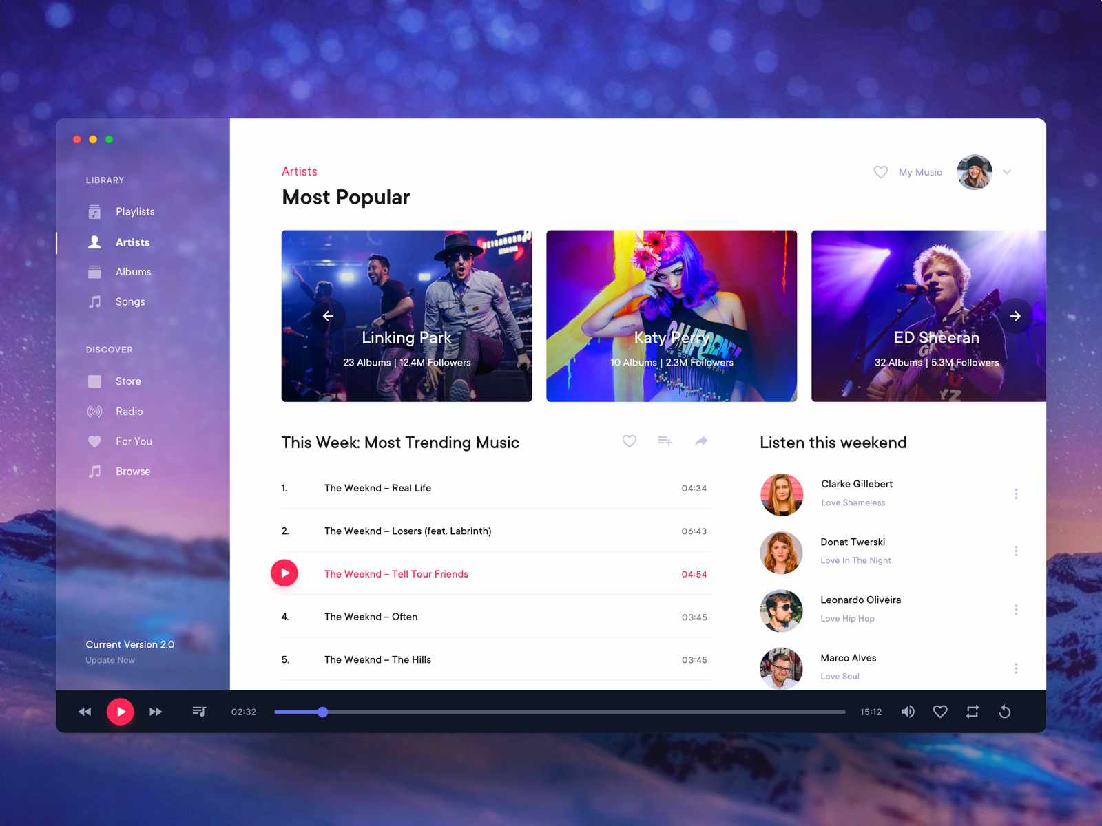
Music Player Desktop Application is from the designer Surja Sen Das Raj. This design has a quite strong visual impact on users. The white background at the center has a sharp contrast with the rest of the screen. This is good and acceptable, but the color scheme is a bit boring. What attracts me the most is the blurred background on the left side. This is a good technique which gives the interface a floating, flexible, and mysterious feel.
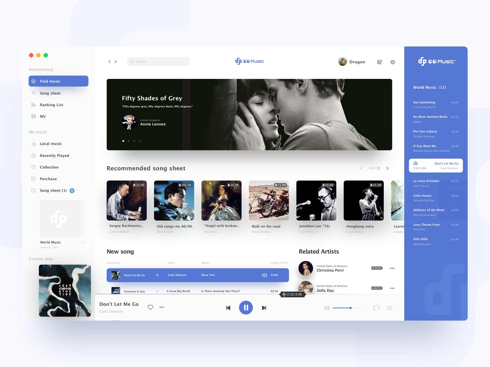
DD Music Blue is from the designer Dragon Lee who believes that 'Less is more, concise is rich'. As a result, the design looks clean and simple and has a delicate and minimalist feel. The combination of colors and white space is awesome. The usage of gradients and different shades of blue are very nice. The various icons on the left menu are also matched with their respective text, which makes the interface clear and easy to understand.
Wrap up
There are a large number of music app designs on the Internet and it may be difficult and time-consuming for you to find the right ones that suit your projects and get your creative juice flowing. These 20 music app designs are intended to help you identify the features that a good music app design should have and present you with different styles to make a great design. If you are planning to design your own music app, we hope that this list of the 20 best music app designs will be able to take your creativity to the next level.
 Mockplus RP
A free prototyping tool to create wireframes or interactive prototypes in minutes.
 Mockplus DT
A free UI design tool to design, animate, collaborate and handoff right in the browser.
