First impressions count for everything. We only get one chance to make a first impression. That’s why we put so much effort in creating good onboarding. A ton of great books and articles was written on how to onboard new users - how to make them understand product’s benefits so they become loyal customers.
However, there’s less information available on how to treat users who want to end the relationship with our products. But good offboarding experience is equally important for your users. Properly finished relationships have an opportunity to create a really good impression for people and turn them into ambassadors of your brand.
In this article, I want to talk about a concept of offboarding and provide a few practical recommendations on how to create excellent user experience for people who wish to finish relationships with your product.
Offboarding is the process a user/customer goes through in order to finish relationships with a service.
There are many situations in which a user needs to offboard. The most obvious reasons are:
Bad offboarding can impact a customer’s view of the entire experience. According to Daniel Kahneman, people tend to judge their experiences based on the most intense feelings they have (positive or negative). If they have terrible offboarding experience, this will stick in their head as an impression of using a product, no matter how good the overall experience was.
Before we review best practices of user offboarding, it’s important to define different kinds of offboarding. On a high level, there are a few common types of offboarding:
Some services provide monthly subscription fee for their users. In some cases, users might need to stop using the service for a while (for example, they might need to travel in the area where they won’t have a reliable network connection). For such cases, it’s good to provide an option to pause subscription — the services shouldn’t charge any money after users activate this option; still, they should be able to enable subscription any time they want.
Pausing an account means that the user can no longer use the service but the service stores all users data so if the user decides to come back at some point, they will be able to do it without any extra effort. One good example of this model is Audible, an online service which provides access to audiobooks. It allows users to pause their subscription for a specified period.
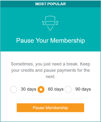
Audible allows users to pause a subscription. Users know that when they return to the service after 60 days, the service will have all their data.
Cancel subscription works for services that provide free and paid access simultaneously. One good example of this model is Medium, a popular blogging platform. Medium offers Membership for its readers. If a user decides that s/he no longer wants to be a member, they can cancel a subscription and become a regular user.
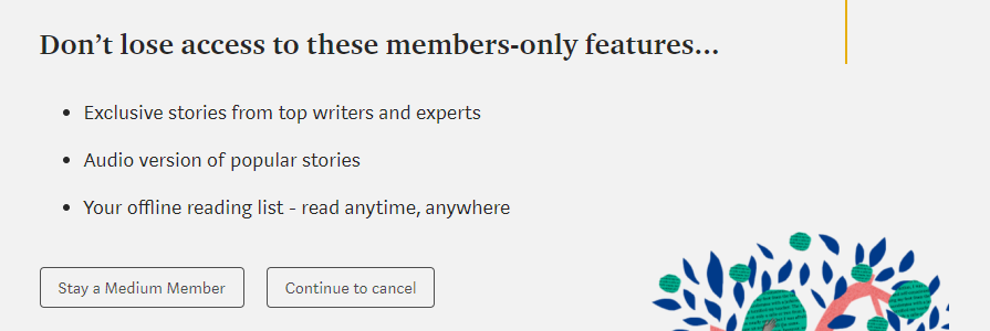
When users cancel a subscription, they still will be able to use the service, but they won’t have some privileges.
While account deactivation and account deletion might sound similar, they are two different options. It’s essential to understand the difference between them. The difference lays in a way a system work with user data. When users delete an account, a system should erase all user’s personal information and all user-generated content. In most cases, deactivating the account is better than delete because in the former case you’ll be able to recover your data later. If a system is built around user data (e.g., social network, personal blog), it worth providing both options and let users decide what choice is right for them.
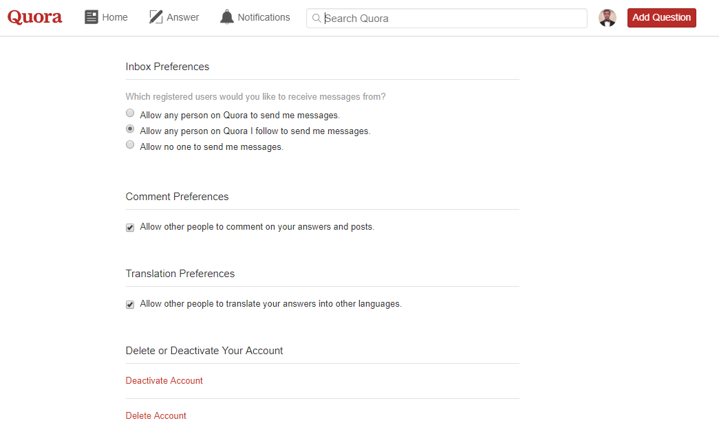
Quora provides two options for users - deactivate the account and delete the account. This makes users think what they want to do.
Perhaps the most common mistake product creators do is not providing an option in the user interface to cancel subscription/deactivate/delete user account. As a result, when users want to offboard, they have to do it using other ways of communication (e.g. go through a complicated process of sending emails or even calling a company).
It creates a really terrible offboarding experience. The more barriers users face, the more frustrated they become. Remember the last time you’ve tried to cancel your subscription and won’t be able to do it in-app? Most probably you won’t recommend such service to anyone.
Hiding the “Delete my account” button is another common mistake among many product designers. Of course, no one wants to lose their users, and it might be tempting to hide negative options somewhere deep into UI. But there’s a serious issue with such approach.
If users really want to unsubscribe/cancel, they will find the way for it no matter how careful you hide it. But the outcome, in this case, will be much worse because users will spend much more time on this operation. As a result, this can hurt a product’s reputation.
Thus, avoid the temptation to hide the negative options. When you design your apps or websites, always put users in control — let them decide what they want to do. Make the cancel or unsubscribe button visible.
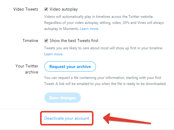
Make it as easy and painless as possible for your users to cancel their subscription. Twitter provides ‘Deactivate your account’ option in the Settings screen
It should be crystal clear for users what will happen when they cancel or opt out. Tell what happens when users complete the action:
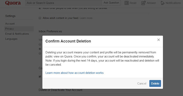
This dialog box is shown when users decide to delete Quora account. The message makes it clear that if the user wants to restore the account, all they need to do is to log in again within 14 days.
If users sign up for your service using their mobile devices, they should be able to cancel the account with the same device.
Triggering an action by accident is a very common situation. When it comes to triggering potentially dangerous activities such as account deactivation, it’s essential to show a confirmation dialog. Ask users to confirm this action.
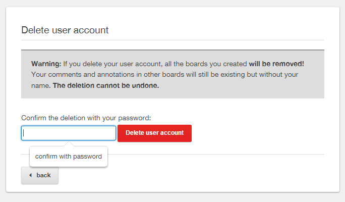
A user has to confirm the action by entering her password. This dialog provides a final warning of the consequences of deletion.
Offboarding is a right moment to ask users for the reasons why they decided to leave. Create a short list of reasons with ‘other’ option and a text field for the explanation, and show it to users when they deactivate their account. The information you receive will help you to learn about your users, their needs, and help you create a better experience for them.
But make sure to make this step completely optional. Remember, user feedback is a gift from your users, so don’t try to force them to provide it.
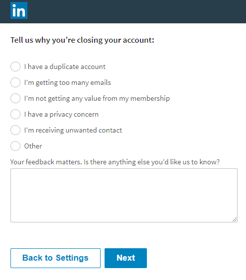
Ask users for their cancellation reason. LinkedIn shows the feedback form that asks users to tell them the reason behind the decision to close the account.
Product team should have a goal to humanize the offboarding process and make it a natural part of the user journey.
Creating good offboarding starts with knowing your users. You need to identify reasons why your users might want to unsubscribe/delete account. Brainstorming with your team/real-world users and analyzing results of surveys can help you find out the reasons.
It’s not enough just to define reasons of cancellation; it’s essential to create a flow for cancellation. It’s possible to use user stories to describe what exactly users should do and when to cancel using the service (step by step). As soon as you create a user flow for unsubscribing, take the users through that flow. It will help you find pain points that might cause frustration or negative emotional reaction. You can test your offboarding flow using a powerful prototyping tool Mockplus.
The process of creating an offboarding experience doesn’t end with releasing a product. It’s essential to use qualitative and quantitative data to analyze how users behave and optimize the offboarding experience. It’s highly recommended to track the amount of time required to offboard from your product completely. Use it as a key metric to understand whether or not your offboarding flow requires optimization.
Your offboarding has an opportunity to create a perfect last impression. When designing offboarding think about people. Don’t focus on subscribed/unsubscribed numbers, focus on real human beings instead. Create a comfortable offboarding experience, so users feel good enough to come back if things change.
It might sound strange but working on an excellent offboarding experience can lead to minimizing the number of cancellations. It happens because product team develops empathy for the user, and this helps them craft solutions that are more sensitive to users needs. Finding out the reasons why people leave the product will not only help you to build more a relevant user flow and fix critical issues, which will, in turn, help you to minimize the number of cancellations significantly.
 Mockplus RP
A free prototyping tool to create wireframes or interactive prototypes in minutes.
 Mockplus DT
A free UI design tool to design, animate, collaborate and handoff right in the browser.
