These days, one-page websites are a common tool offering a low-cost solution for small businesses, online portfolios, and others. One-page websites often have the advantage of simplicity, popularity, speed, and easy maintenance.
Even so, for website and app designers, the challenge is that one-page means you only get one shot to make an eye-catching website that is going to attract customers.
If you are looking for inspiration on how to produce fresh and creative one-page website designs, we list below 36 of the best. These free one-page design examples and WordPress/Responsive/HTML5/CSS3 templates will give you plenty of ideas when you come to create your own one-page website.
Table of Contents
Before analyzing 36 of the latest and best single-page websites and their templates, let’s consider first what a one-page website is and why you might choose that route for your business.
Generally speaking, a one-page website is a website that uses only one HTML page to display all its information and that enables users to find the information they are looking for with simple clicks or quick scrolls.

In order to make these websites attractive, intuitive, and easy to use, they are always designed with a clear website navigation menus, outstanding visual design, and enticing CTA buttons.
Many web designers and business owners prefer single rather than multiple-page websites because they are generally simple, easy, and attractive to users. Single-page sites can be understood, adjusted, and maintained easily. And they load faster too!
A single-page design could be a good choice for your portfolio or eCommerce website.
Whatever your reason for choosing a one-page design website for your business, here are 35 of the best, most creative, one-page examples and templates that can’t fail to give you plenty of ideas.
The best one page website templates:

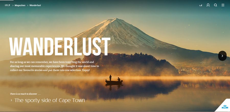
Highlights: Outstanding navigation menus
Since one-page websites always have limited space to show off their products or services, they are often designed with a clear and easy-to-use navigation bar or system to improve the UX. This website template follows this design strategy and builds a really effective navigation menu to attract users.
Here’s a tip:
Use outstanding navigation bars/systems to make your website easy to understand and navigate
Designer: Born05
Highlights: Horizontal scroll design; Video background and music
Most websites are created vertically. But, this travel website goes against the grain and uses a horizontal scroll to display its content. The exciting background videos and music also make it distinctive and attractive.
Here’s a tip:
Spice up your one-page website with wonderful videos and audios.
Think about using a horizontal scroll design to make your site stand out.
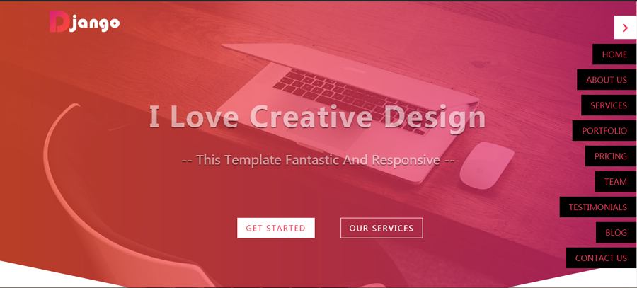
Highlights: Hidden navigation bar
A navigation bar is very important for a single-page website. However, this does not mean that all navigation bars should be placed at the top or the bottom of the single page. To help highlight products or services effectively, many designers also use hidden navigation bars.
This one-page HTML5 website template cleverly uses a hidden navigation bar to simplify the UX.
Here’s a tip:
Simplify your one-page website with hidden navigation bar.
Designer: Bourn
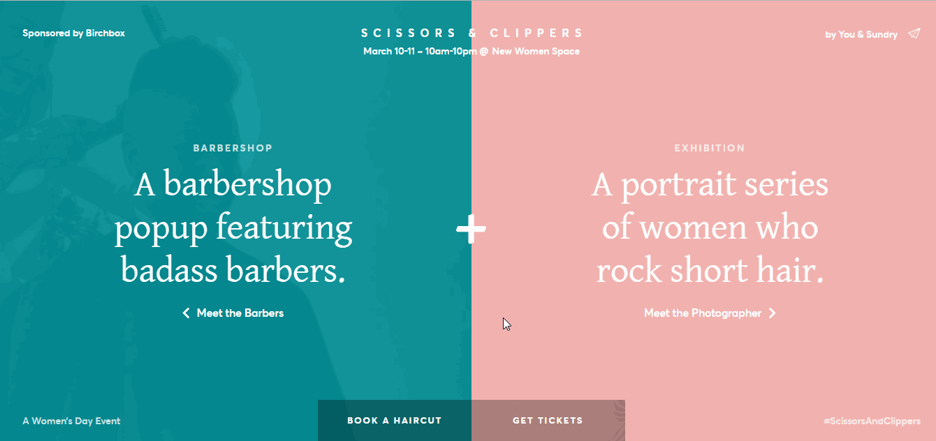
Highlights: Dividing different functional areas
Dividing different functional areas with distinct color blocks is an effective way in which designers can organize and display their content intuitively. This fullscreen CSS3 one-page website follows this strategy and uses two color blocks to divide the page into two distinct functional areas.
This makes it very easy and quick for users to find the content they are looking for.
Here’s a tip:
Make your website simple and intuitive with different functional areas.
Designer: Playground Digital Agency
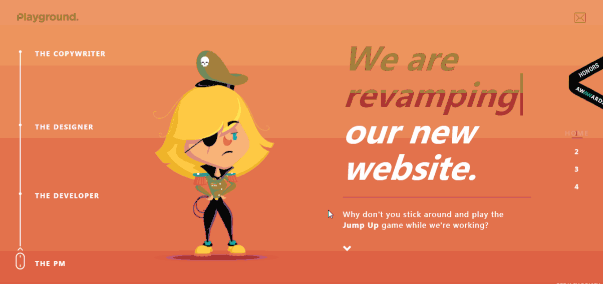
Highlights: Beautiful illustration design style; linear navigation bar
This games and entertainment website template stands out as a result of its beautiful illustration design style. It also has an amazing easy-to-use linear navigation bar.
Here’s a tip:
Use a unique design style, such as the illustration design style. Create a linear navigation bar for your one-page website.
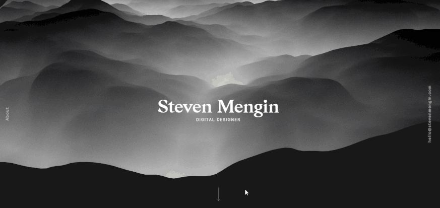
Designer: Steven Mengin
Highlights: Eye-catching fluid effect; Interactive website
This portfolio website scores highly with its eye-catching fluid effects. As an interactive website, it is also really effective at piquing users’ interest.
Here’s a tip:
Use special effects, such as fluid, jumping, shaking, or rotating images to produce an eye-catching design.
Designer: Denys Mioshunov
Highlights: Funny illustrations; Striking color scheme
This single-page website is an interactive portfolio website created by a front-end developer, Denys Mioshunov. It features many funny illustrations created by the developer. The beautiful color scheme and large bold fonts also help to make the site impressive, even irresistible!
Here’s a tip:
Improve your website design with funny images, illustrations, or copy.
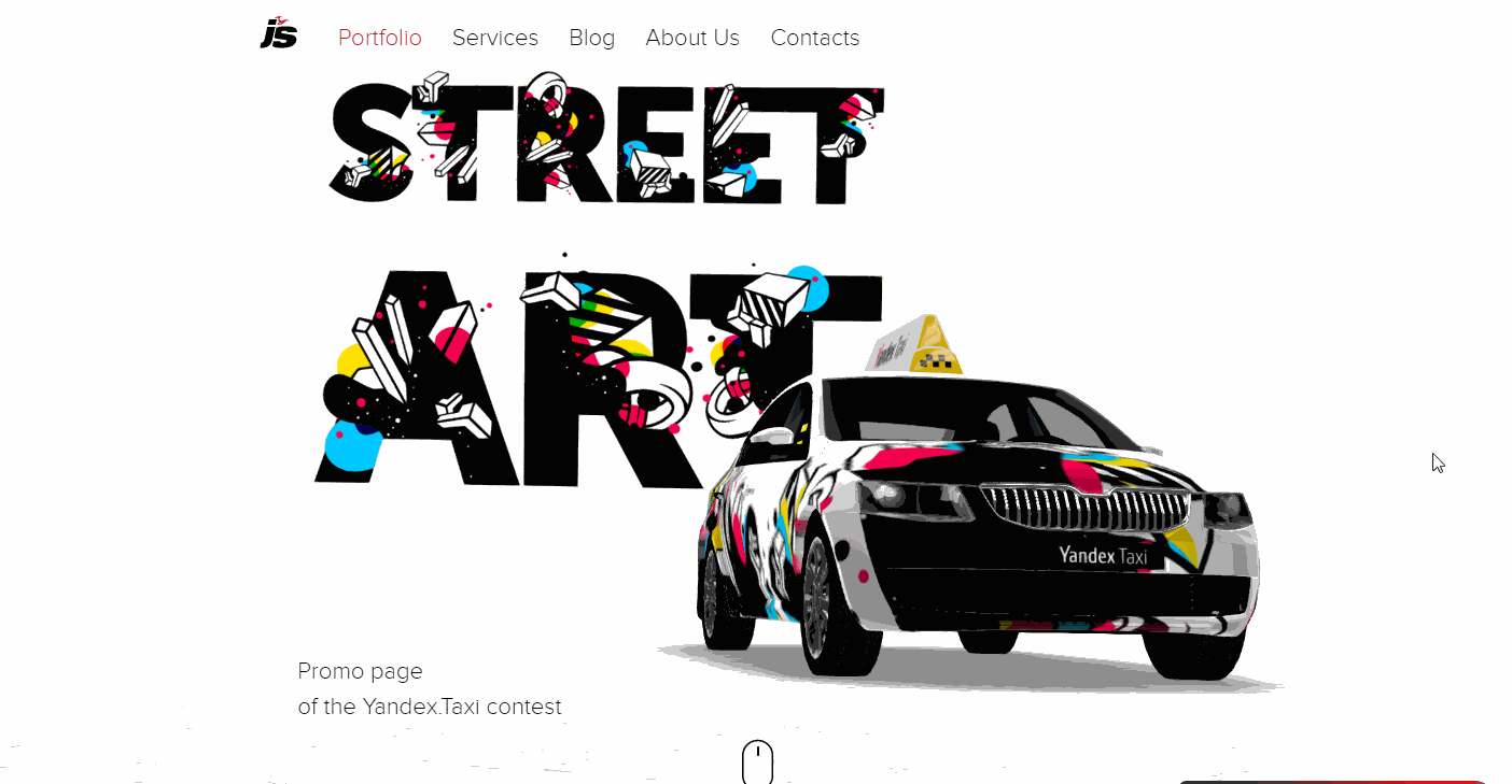
Highlights: Creative fonts; 3D technologies
This is a promotional website created for Yandex.Taxi. It uses distinctive fonts and 3D technology to introduce the latest taxis in a very cool and visual way. It is easy to scroll with the mouse to get a 360-degree overview of the latest cars.
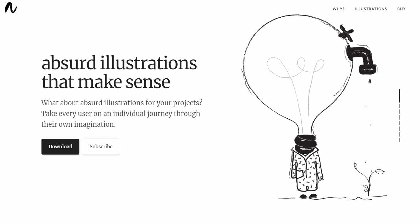
Designer: Diana Valeanu (Spain)
Highlights: Interesting illustrations
This template features a series of surrealist illustrations that will catch the user’s attention from the very first click. Careful pairing of explanations and illustrations delivers the website’s message - that everyone should save water in daily life - in a way that is powerful, while at the same time innovative and visual.
It’s a site other designers should be seeking to emulate.
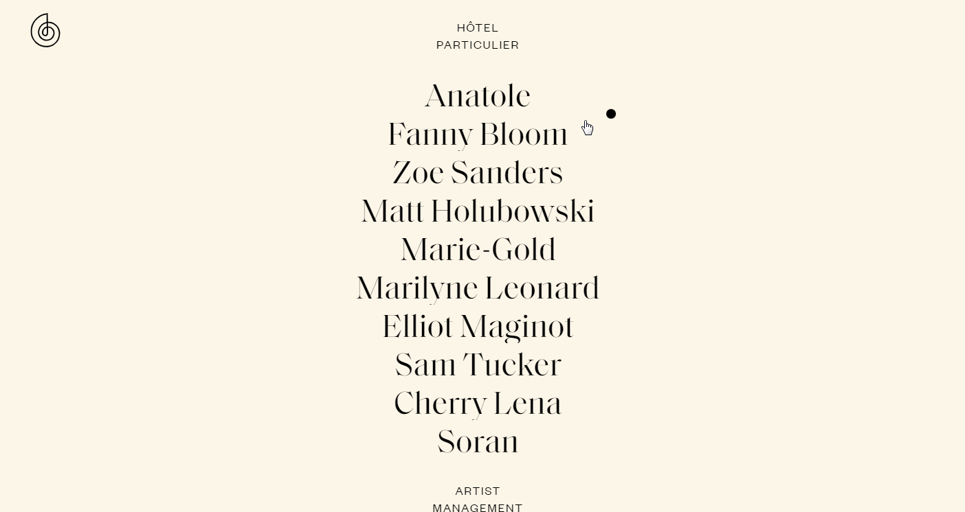
Designer: Pier-Luc Cossette
Highlight: Centered navigation menu
This agency website uses a centered navigation menu to introduce the artists it hosts. Users can easily click any one of the artists listed to see more details about them.
This type of centered placement of the navigation menu/bar is not so common in website and app design as it is not easy for designers to give the navigation bar a central position without it becoming annoying to users. However, this website pulls it off skillfully.
The compelling interactions and hover effects make it easy for users to focus on the list of artists.
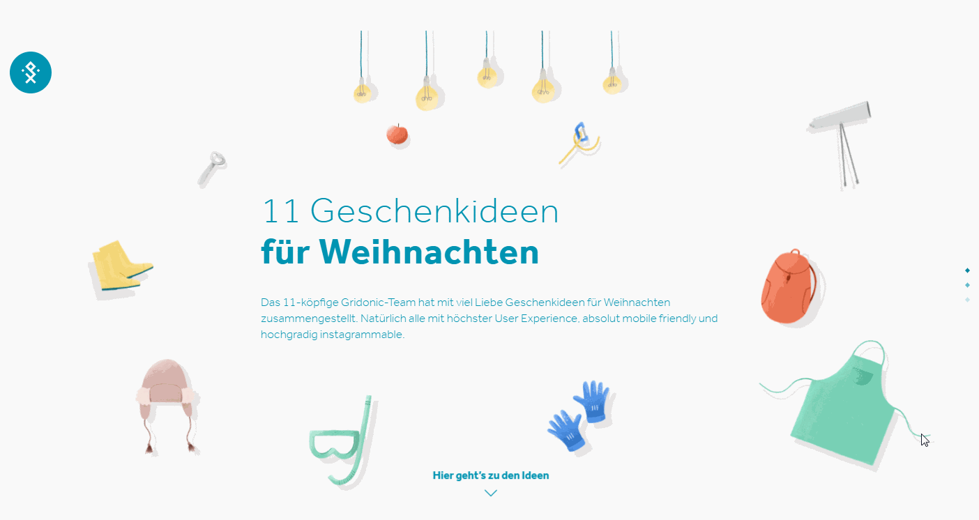
Designer: Gridonic (Switzerland)
Highlights: Cute gift animations
As an interactive gift website, this single-page website template features many lively animations to illustrate the gifts on offer. Its fresh illustration design style is very pleasing on the eye.
If you’re looking for unusual gift ideas for Christmas, this site would be a great place to start.
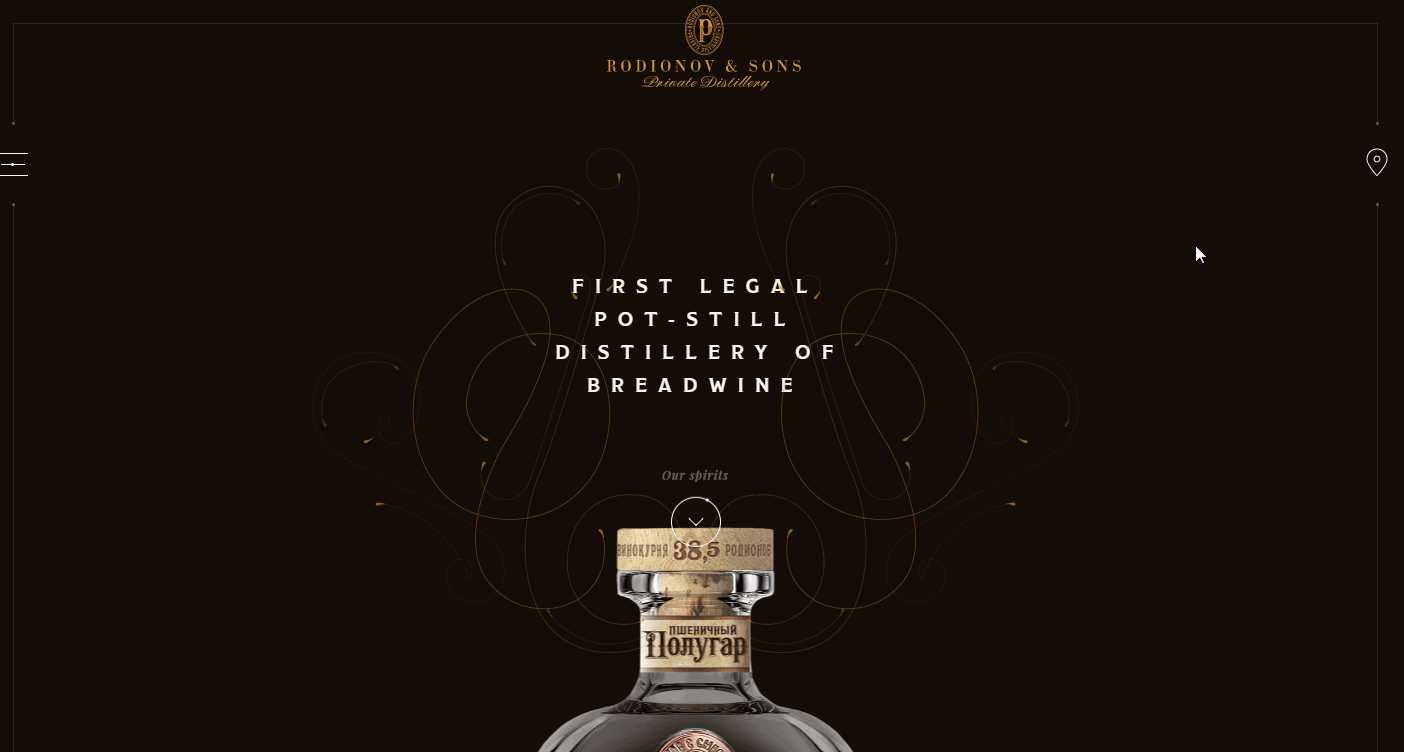
Highlights: Retro design style
The visual design of this website is inspired by classical Russian aesthetics. The design uses many retro photos, decorations, and animations to create a classic and retro feel to the site.
The black background really sets off the products on display, giving a high-end impression.
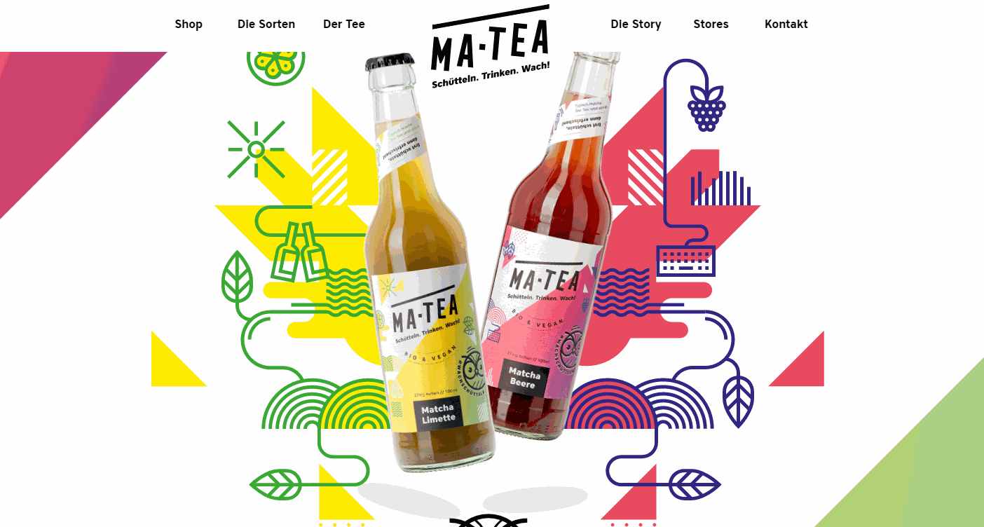
Designer: 9elements (Germany)
Highlights: Bright color scheme
This template is another site offering beverages. It features a bright color scheme and rich animations.
It would be a great model for companies and designers looking to see how a fresh and modern website dealing with wines and other drinks can work.
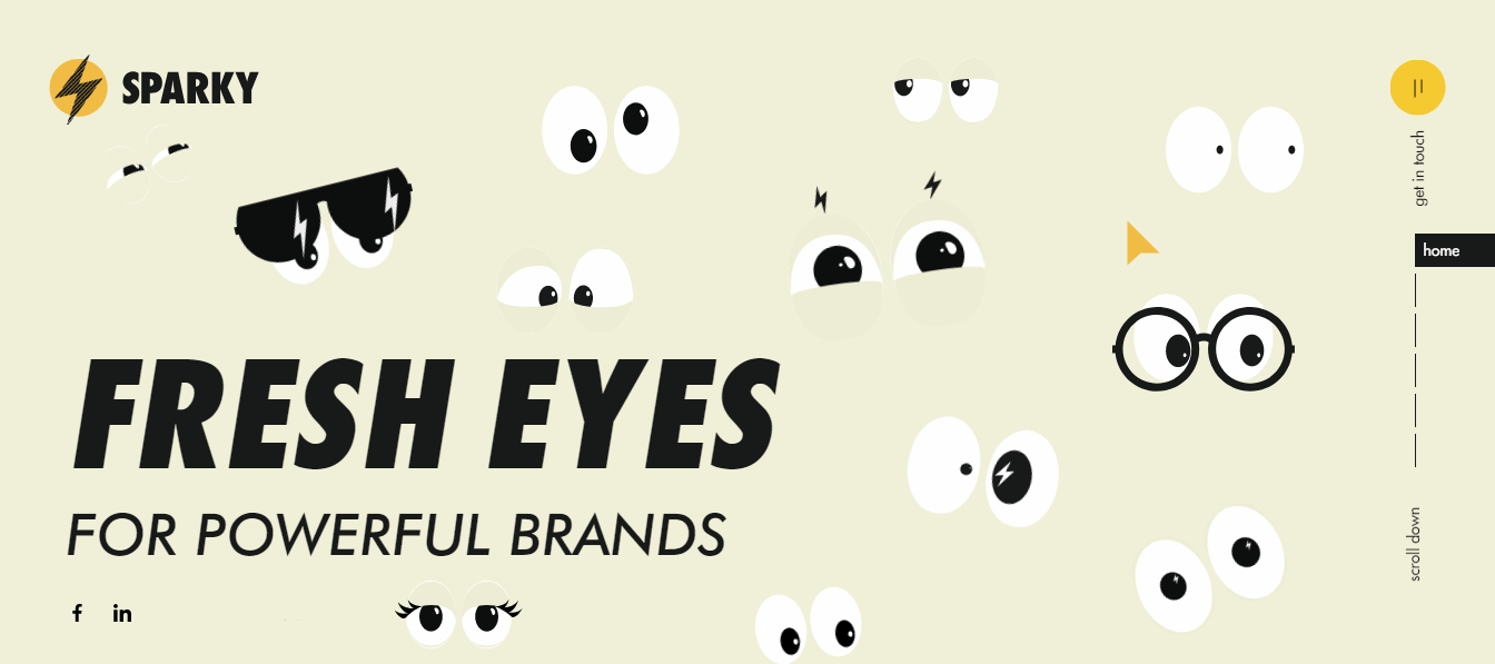
Designer: Sergey Churilov
Highlights: Sparkling eyes; Unique font design
Sparky is an illustrated one-page portfolio website created by a digital agency. The designer of this site has used a set of fresh sparkling eyes on the Homepage to engage users from the outset. The different pairs of sparkling eyes blinking around the page while you read the content are an impressive achievement.
Adding cute pairs of eyes, flowers, birds, and other such elements might work for you. If so, this site would be an example to follow.

Designer: DVIGA (Russia)
Highlights: Innovative animations and photos
If you’re still stuck for ideas after checking the previous template with the sparkling eyes, this template might fill the void for you.
It uses very unusual and eye-catching ways to present its products. It has rock animations which may seem crazy, but prove to be quite irresistible. The weird images and animations on the landing page have a really powerful impact on the user.
You just can’t help wanting to scroll down and see more - exactly the reaction a powerful website should have on a user!
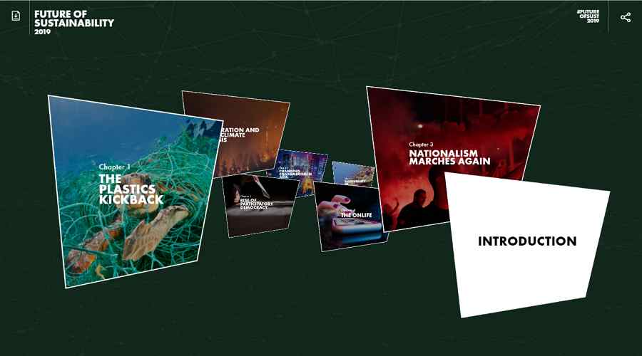
Designer: Fiasco Design (United Kingdom)
Highlights: Interactive card designs
This parallax website template features interactive card designs. Visitors can scroll around the site easily to check all the card designs and click on any one they want in order to get more details about it.
Related article: Best 15 Examples of Popular Card UI Design for Inspiration in 2018
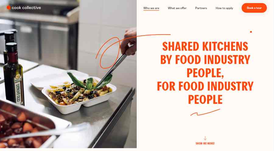
Designer: Rafa Cobiella
Highlights: Parallax scroll design
This is a classic food recipe website with a user-friendly parallax scroll design. It is a perfect example for designers looking to build easy-to-use commercial websites.

Highlights: Asymmetric grid design
This template is another good example of a one-page website with asymmetric grids. It is clean, minimal, and easy to use.
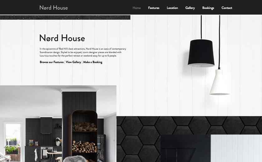
Alt: Nord House
Designer: Racket
Highlights: Modern design style; Black & white color scheme
This real estate website template is another good example of a single-page site that will inspire many designers.
Related article: Top 12 Free Inspirational Real Estate Web design Examples & Templates

Highlights: Flat website design; Interactive website
This WordPress one-page website template uses a flat design style. This approach usually results in faster loading speeds and better browser compatibility. The interactive website design is also really worth a look.
Here’s a tip:
Improve your single-page WordPress website with flat website design
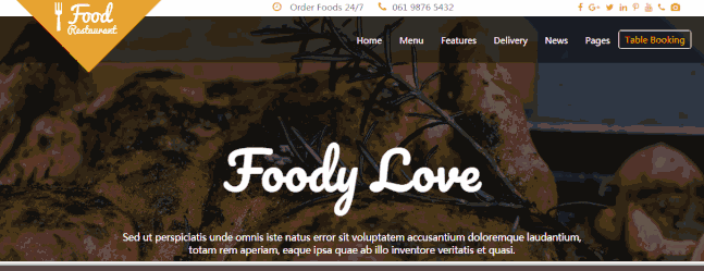
Highlights: “Photo + Text” pairs; Parallax scrolling
This food and restaurant website uses “Photo + Text” pairs to make all the dishes look mouth-wateringly delicious. The parallax effect also helps engage users.
Here’s a tip:
Use “Photo + Text” pairs to make your website more attractive.
And why not use parallax scrolling designs to make your website more engaging?
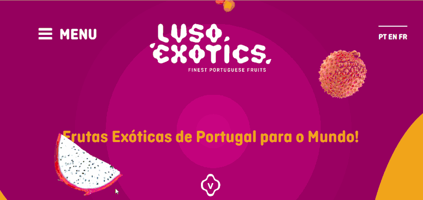
Highlights: Nice colors to catch users’ attention; Minimalist design
Great products and excellent services are essential to website success. But designers can also use colors imaginatively to generate interest. This single-page website uses a beautiful color scheme that really grabs the attention.
In addition, it is a wonderful example of how effective a minimalist website can be.
Take the time to choose the right color scheme for your single-page website.
A good minimalist design can give you better UX.
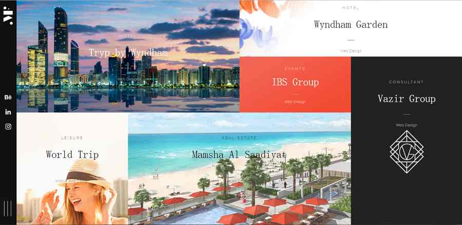
Highlights: Asymmetric grid
Asymmetric grids have recently become a trend in web and app UI design. This single-page website follows this trend to create an aesthetically pleasing and functional website.
Here’s a tip:
Used carefully, both asymmetric and symmetric grids can be effective in making your website more functional and intuitive for users.
So, now, let’s look at a few more of the best one-page websites that you really need to see:
The Best One Page Website Examples:
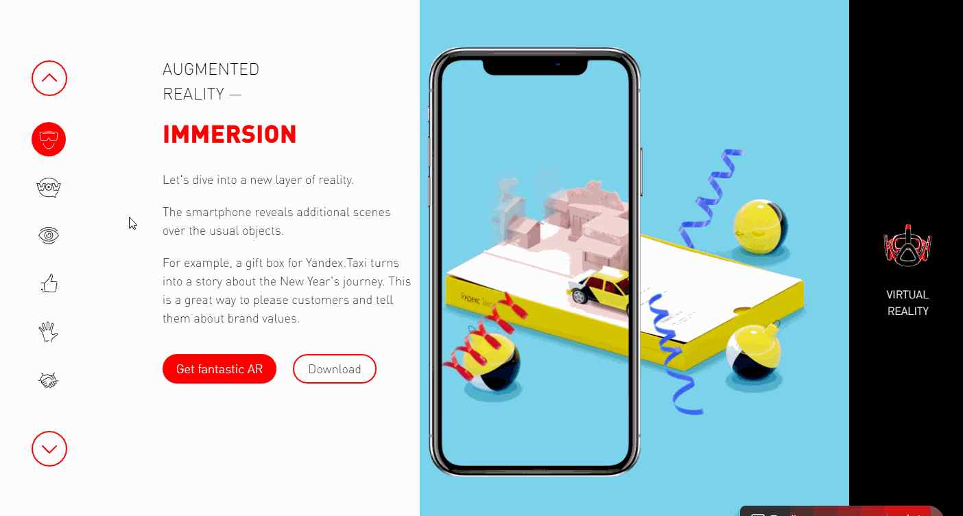
Highlights: Cool icon navigation bar; 3D effects
Jet Style is an interactive one-page website created by a digital company in order to share their experience in AR and VR design. It features a cool icon navigation bar and has rich 3D effects to make the website elements more realistic.
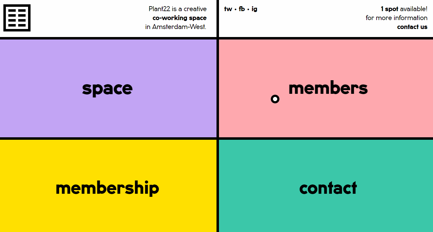
Highlights: Minimalist design; Simple grid design
This minimalist website has been created to offer an online co-working space for users. It features four simple intuitive grids that allow users to learn more about its online services. Just click to enter one of these grids and you will find it every bit as easy as it looks.
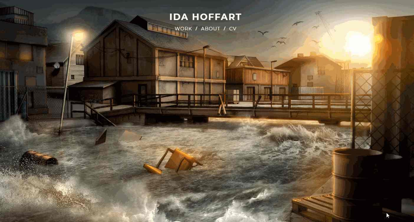
Highlights: Intuitive “Photo + Text” pairs; High-quality photos
This is an interactive one-page portfolio website from designer, Ida Hoffart. As an experienced designer in the film industry, Hoffart has included many high-quality and dramatic stills from films in this site. It is an object lesson in how to do it. You could do a lot worse that imitate some of its features.
The “Photo + Text” design makes it very easy for visitors to learn more about the design projects.
It will prove to be a great source of ideas for designers looking to create a distinctive portfolio website.
Designer: Grain & Mortar
Highlights: Elegant fonts and layouts
This single-page website uses very elegant fonts and layouts in a fresh approach to how it presents its products (a variety of ice creams) as well as the story of the company.
If elegant and fresh is the way you want to go when developing your portfolio or commercial website, this one-page design example is worth looking at.
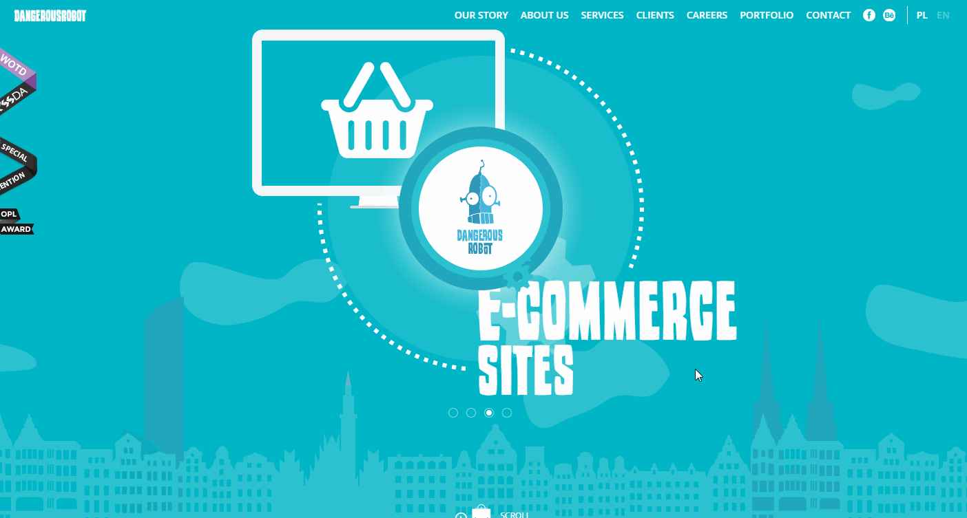
Highlights: Illustration design style; two- column layout design; an interactive elevator design
This is the one-page portfolio site of a digital agency portfolio which uses a very striking illustration design style to draw the users in. After entering the site, users can easily follow an interactive elevator design to read all about the agency.
The two-column layout offers an intuitive way to introduce the agency’s projects. The beautiful color scheme is another feature that budding designers could learn from for their own UI designs.
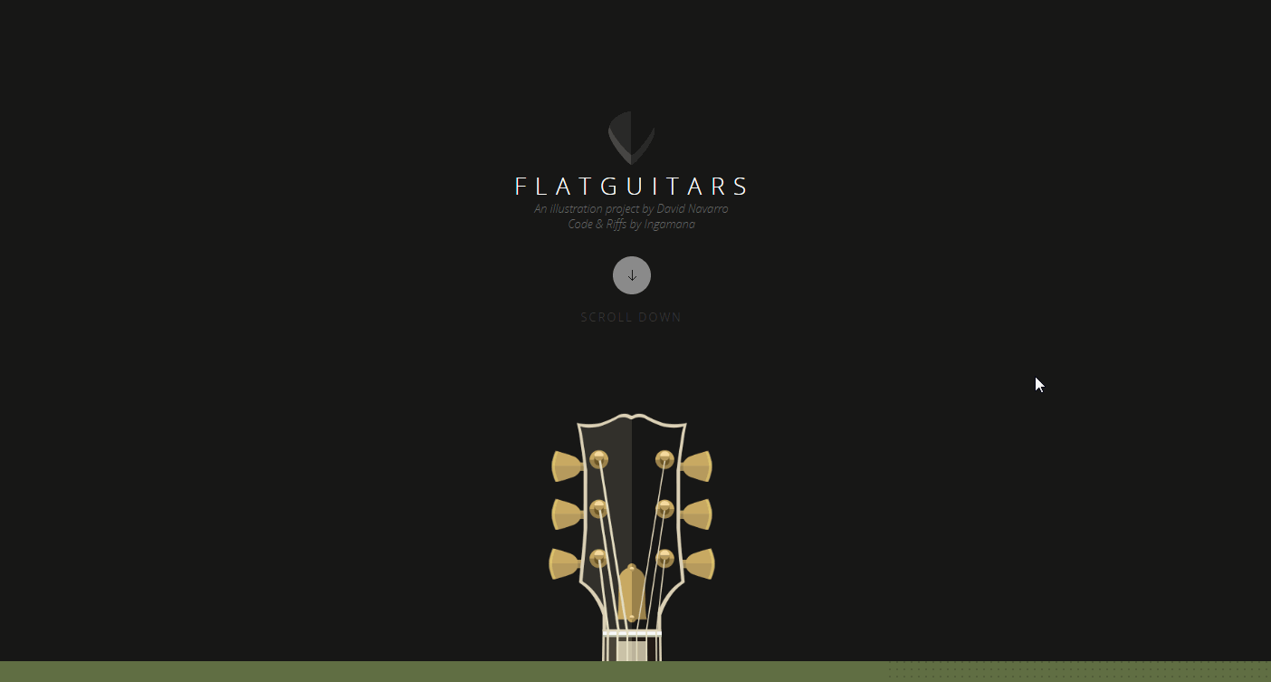
Highlights:
Flat Guitars is a beautiful single-page website that introduces a series of guitars. The flat guitar illustrations are beautiful and the user can zoom in to see minute details. Users can learn more about each guitar from the brief introductory text next to each illustration.
So, if you are a guitar lover, this site is not to be missed, whether you’re planning to buy a guitar or not.
In addition, the parallax scrolling design also really improves the UX.
More one page website examples & templates:
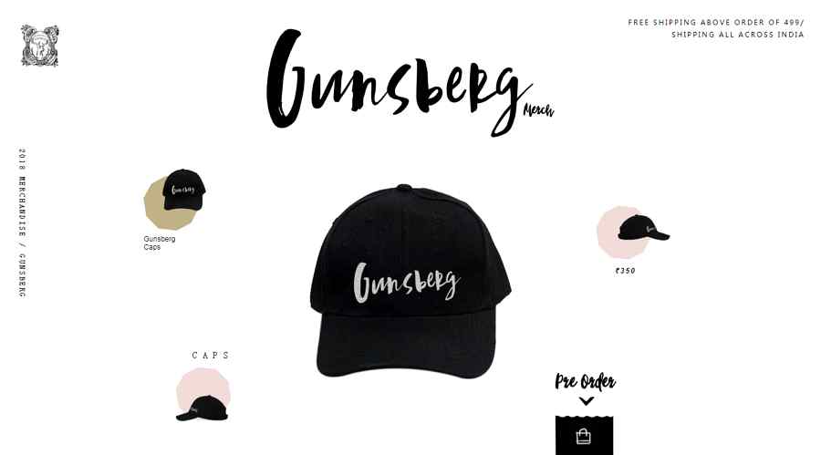
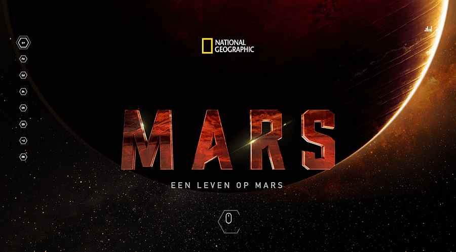
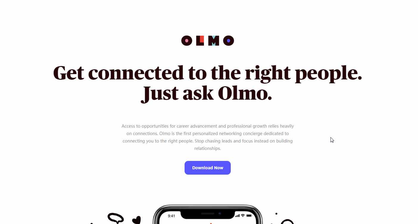
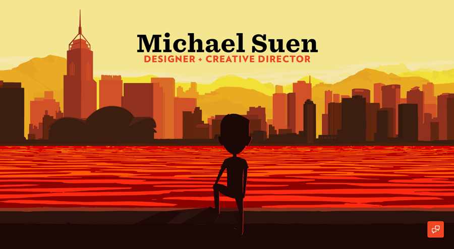
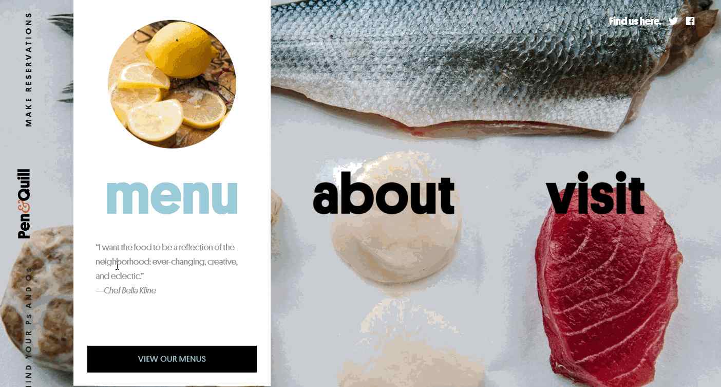
Overall, all these one page website examples and templates can surely inspire you and help you create a gorgeous single page website of your own.
But, if the examples above don’t help, then we list below the five best websites for searching and downloading the most creative one-page website templates:
As its name suggests, One-page Love is a specialized website created to enable users to search for and download templates and resources for single-page websites. The templates on this site that have been labeled “Most Loved” are often very good.
2.Awwward
Awwward is another good online design website that provides lots of one-page examples and templates. Many of them are simple, beautiful, creative templates that are sure to give your site the look and feel that you want.
Themeforest provides over 1000 free and premium website design templates, a great resource for designers looking for something different.
4.Colorlib
If you’re looking for creative one-page website templates, do not overlook colorlib.com. This is a great site that provides many free or paid-for HTML5/CSS3 single-page website templates.
Template.net also shares beautiful and editable one page website templates.
Of course, if you still cannot find what you’re looking for in all the templates and website resources listed above, why not look at creating a one-page website on your own? It could be the perfect solution.
These days, there are so many one-page website builders out there ready to help you get a brilliant single-page site off the ground in no time: Wix, Weebly, Mockplus, and Instapage are just some of the possibilities.
Take Mockplus as an example. Mockplus is a website design tool that can help translate your one-page website design ideas into interactive prototypes with simple drag-and-drop.
Except some powerful features, covering the powerful component library, icon library, component style library and design system library for web/app designs, its team collaboration and management feature also helps improve work efficiency effortlessly.
If you are interested, this tutorial video can help give you more details: 10 minutes to get started with Mockplus
Even though one-page websites can be a benefit for website designers and owners alike, this does not mean that single-page websites work for everyone since, with a one-page website, you only have one HTML page to show all your content.
Single-page sites work best for websites with relatively little content, such as small businesses or UX/UI designer portfolio websites. Limited content makes it easier to keep the website intuitive and user-friendly.
Web Design Inspiration: 25 Best Storytelling Website Examples & Templates
Website Background Design: Best Examples & Design Tips in 2019
22 Best Free Color Tools for UI/UX Designers to Create Amazing Web/App
 Mockplus RP
A free prototyping tool to create wireframes or interactive prototypes in minutes.
 Mockplus DT
A free UI design tool to design, animate, collaborate and handoff right in the browser.
