The design of a product page, especially for e-commerce websites, is not merely about aesthetics but about creating a seamless, informative, and persuasive shopping experience. As a product page is the critical juncture where most "buy or not buy" decisions are made, a well-design product page is paramount to driving successful transactions. Effective product pages combine visual appeal with functionality, providing users with all the information they need in a clear and engaging manner. This includes high-quality images, detailed descriptions, customer reviews, easy navigation and more, all designed to build trust and reduce friction in the buying process.
Undoubtedly, the impact of a well-designed product page is profound, making it a cornerstone of successful e-commerce strategy and a key differentiator in the competitive online marketplace.
In this article, let's examine what makes a product page effective, identify the key components to include, and review 30 of the best product pages together.
What is a product page?
First, let's get to know what a product page is. A product page is a crucial page of an e-commerce website, designed to provide customers with comprehensive information about a specific item. It serves as the virtual counterpart to a physical shopping experience, offering details that help customers make informed purchasing decisions.
Unlike a brick-and-mortar store, an online product page cannot offer the tactile experience of handling a product or the immediate assistance of store staff. Therefore, the design, usability, and navigational efficiency of a product page become paramount. A well-designed product page is not just about presenting information; it's about creating an engaging, informative, and persuasive journey that leads to increased sales and customer satisfaction.
What should be included on a product page?
The product page typically includes a variety of elements aimed at giving a clear and enticing presentation of the product of service. Here are several crucial elements that should be included:
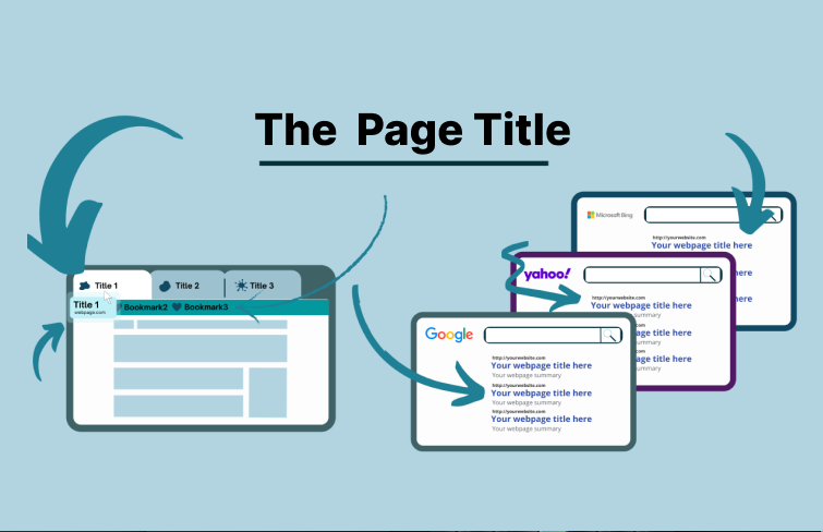
1.Page titles
Page titles, also known as title tags , are an HTML snippet that specifies the title of a webpage. They appear in Google's search results and are a minor factor in Google's ranking algorithm. Clear page title helps both searchers and search engines understand the content of your product page.
2.Product images and videos
High-quality images and videos showcase the product from multiple angles, providing customers with a more detailed and immersive shopping experience, which can significantly increase conversion rates and overall customer satisfaction.
3.Detailed product descriptions
Provide technical details, such as dimensions, materials, and highlight the primary attributes and benefits of the product.
4.Customer reviews and ratings
They provide social proof, helping potential buyers gauge the product's quality and suitability, increasing trust and conversions.
5.Calls-to-action (CTAs)
CTAs are crucial elements that guide customers towards making a purchase or engaging further with the product. By including relevant and compelling CTAs on your product pages, you can increase the chances of converting interested visitors into paying customers.
Above are some crucial elements a product page should have. Depending on the type of a product, additional features might include size and color options, availability status, delivery estimates, and trust-building elements, such as secure payment icons and return policy information, further enhancing customer confidence.
30 best product page design examples
Here are 30 best product page design examples that showcase a range of design principles, layouts, and features that are proven to be effective in attracting and retaining customers.
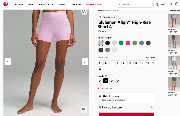
Lululemo is a sport brand renowned for their high-quality yoga and athletic garments, as well as other activewear products. On their product page, they prominently feature all the essential product details, providing users with comprehensive information. They also highlight their free shipping & returns offer, effectively encouraging customers to make a purchase by offering added value and convenience.
Additionally, it also includes a "You May Like" section on the right side, which showcases related products that might interest the customer, enhancing the shopping experience and encouraging further exploration and potential purchases.
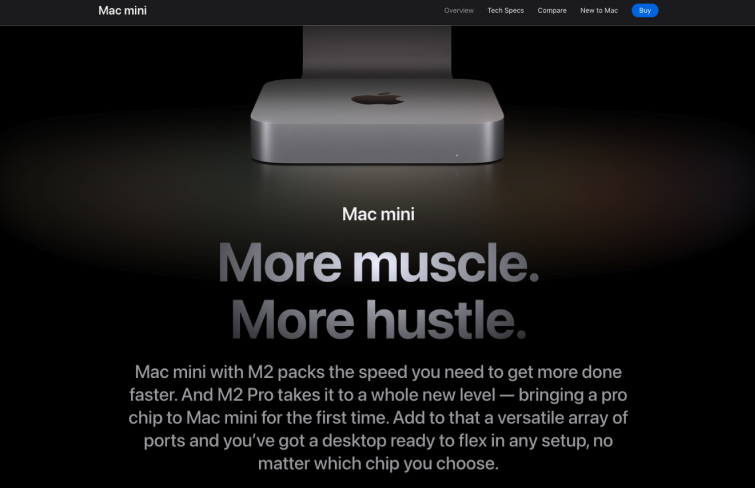
High-quality visuals are a hallmark of Apple's product pages. They use sharp, detailed images and videos that showcase their products from multiple angles, helping customers appreciate the design and functionality. The clean, intuitive layout ensures that information is easy to find, with succinct yet informative descriptions that highlight key features and benefits.
Additionally, their call-to-action (CTA) uses a solid blue button background, making it stands out against a minimalist layout with ample white space.
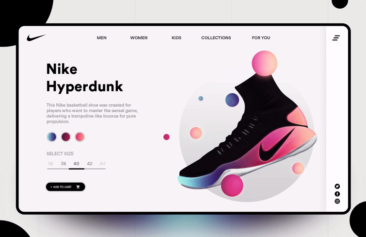
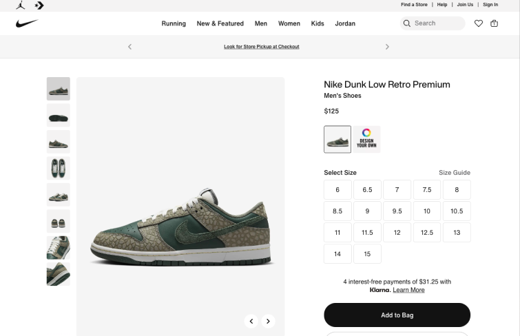
Nike's product pages are a masterclass in effective e-commerce design, capturing the spirit of the brand with a dynamic blend of visuals and storytelling. Its product page is filled with high-quality photos that showcase every angle and detail of their product, replicating the experience of seeing them in person.
Additionally, Nike includes clear and compelling call-to-action buttons, easy navigation, and comprehensive size guides to enhance the shopping experience.
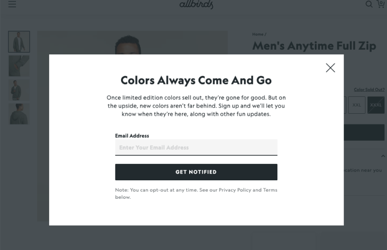
Allbirds excels in managing out-of-stock shoes by offering a waiting list feature where you can submit your email. It's easy to identify which product and size you're interested in.
Additionally, an optional checkbox allows you to receive alerts about new products, effectively helping to grow their mailing list.
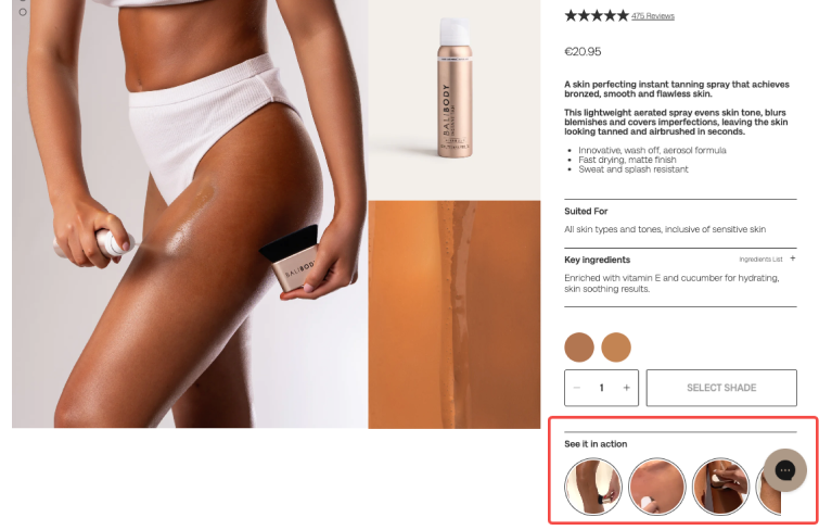
BaliBody's product page is modern and clean, featuring high-quality photos and detailed descriptions. User reviews add a layer of authenticity, allowing potential customers to see how much existing buyers have enjoyed the products.
Additionally, the "See it in action" section offers guiding videos that demonstrate how to use the products on various parts of the body, enhancing the shopping experience by providing practical insights into the product's application.
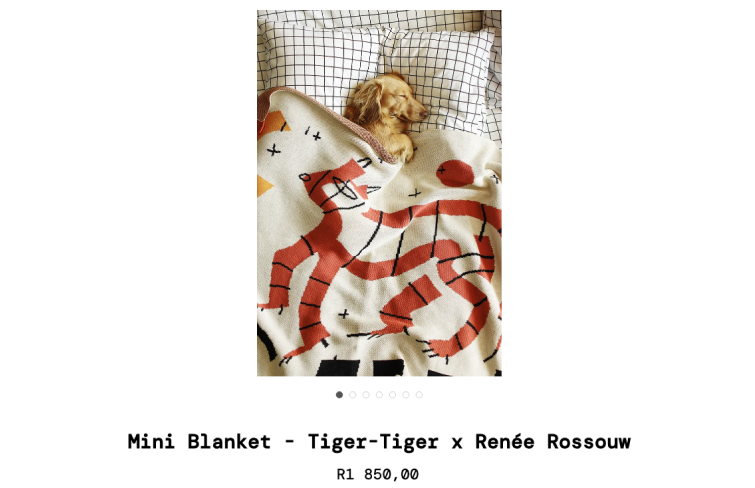
Something Good Studio captures attention with its stunning and unexpected lifestyle photographs. Instead of featuring a person wrapped in their mini blanket, they showcase a puppy, eliciting an emotional response from shoppers.
This thoughtful and playful imagery encourages consumers to spend more time on the site, engaging with the brand and its products.
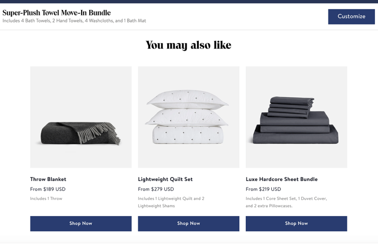
Brooklinen employs clever cross-selling strategies on its product pages. When customers browse through a selection of towels for their “move-in” bundle, Brooklinen understands that someone moving into a new home might also need sheets, a quilt, and perhaps a throw for their couch.
Instead of merely suggesting more towels, they recommend a range of complementary products to meet the broader needs of new homeowners.
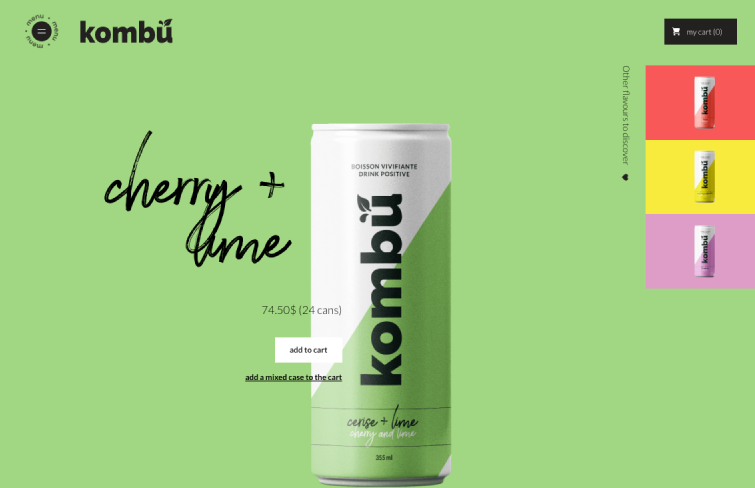
Beverage company Kombu showcases a bold design that breaks away from the conventional product page layout. Given that Kombu visitors are often returning customers who have already enjoyed the drink and are looking to order in bulk, there' no need for extensive descriptions or lifestyle images.
The focus is on providing a straightforward and efficient purchasing experience, highlighting the ease of ordering their well-loved product.
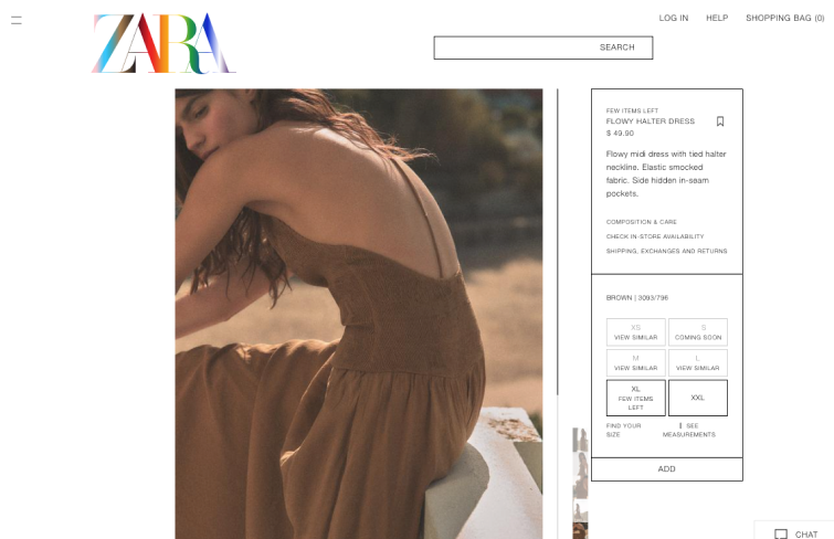
Zara's product pages are designed to make a striking visual impact while keeping textual descriptions minimal. The emphasis on high-quality, full-length images allows the products to speak for themselves, creating a sophisticated and high-fashion atmosphere. The clean and uncluttered layout, with ample white space, ensures that the focus remains on the product.
The use of bold and dramatic photography, often featuring unusual model poses, captures the attention of online shoppers and reinforces Zara's trendy and upscale brand image.
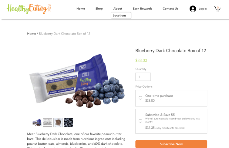
Healthy Eating recognizes the importance of transparency for its health-conscious customers. To meet their needs, the company ensures that each product page provides comprehensive details about the ingredients and nutritional content.
Both the written product descriptions and accompanying images display this critical information, allowing shoppers to make informed decisions about what they consume.
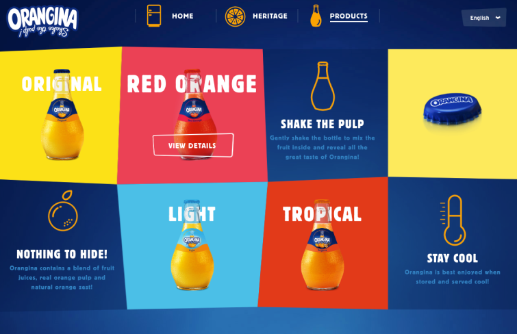
Exploring Orangina's website is a delightful experience. Each block on the page comes to life with playful animations when hovered over — bottles jiggle, orange slices split, and thermometers drop. These animated visuals, combined with vibrant colors, perfectly capture the fun and energetic essence of the Orangina brand.
The interactive elements not only engage visitors but also reflect the brand's lively personality, making the browsing experience both entertaining and memorable.
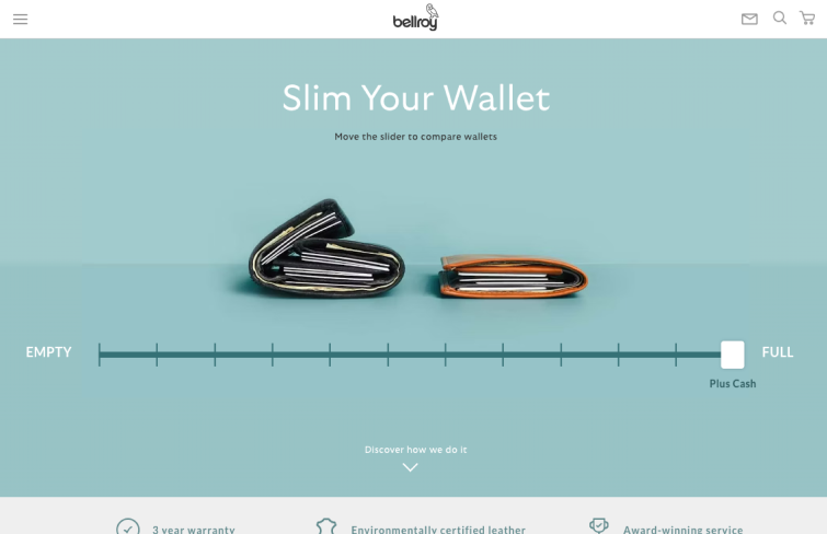
Bellroy specializes in ultra-slim wallets and effectively communicates their advantage through a clever interactive feature on their product pages. This section demonstrates how their minimalist design stacks up against traditional wallets.
Users can slide a control to compare how each wallet fills up with cards and cash, clearly illustrating the bulkiness of standard wallets versus the sleekness of Bellroy's.
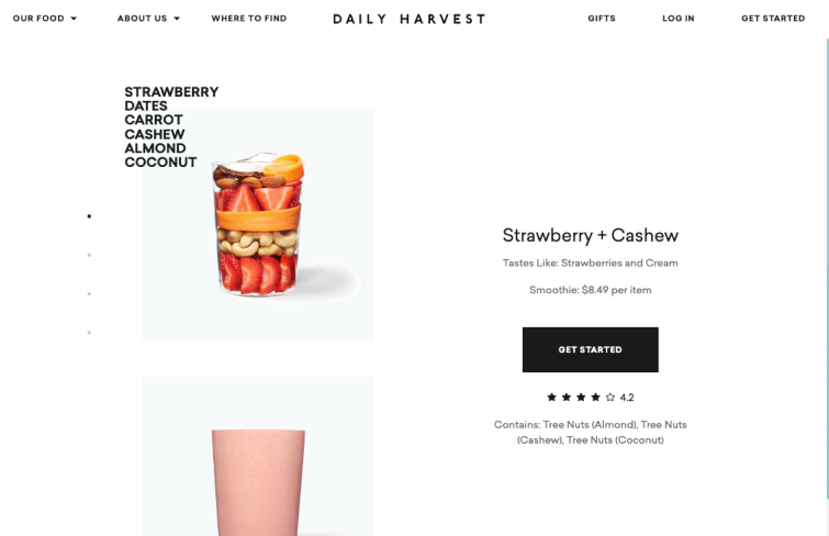
Daily Harvest excels in presenting their superfoods, such as smoothies and soups, on their product pages with exceptional clarity. They effectively highlight the nutritious ingredients and health benefits in a straightforward and easily understandable manner, ensuring that customers know exactly what they're consuming.
This transparency and clear presentation help reinforce the value of their health-focused offerings, making the information accessible and engaging for health-conscious consumers.
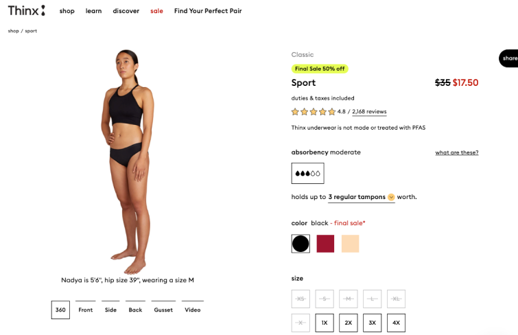
Thinx, a brand known for its absorbent, eco-friendly products for people with periods. A standout feature of their product pages is the interactive 360-degree view available for all items. This allows customers to rotate models and examine products from every angle, offering a comprehensive view that sets a new standard in reliability for online shopping.
This functionality ensures that buyers know exactly what to expect, making the shopping experience more trustworthy and detailed compared to that of competitors.
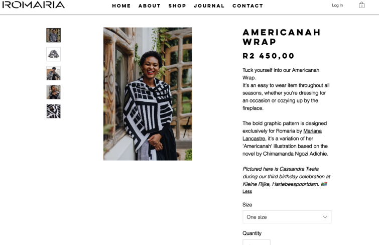
Romaria collaborates with a variety of artists and designers to craft a vibrant array of unique knitwear. Each product page highlights the designer behind the piece and delves into the inspiration for its creation. This insight into the design process enriches Romaria's narrative and reinforces its reputation for offering genuinely couture items.
By sharing the stories and creative journeys of their collaborators, Romaria adds depth and meaning to each piece, enhancing its appeal to customers seeking distinctive and artistically inspired fashion.
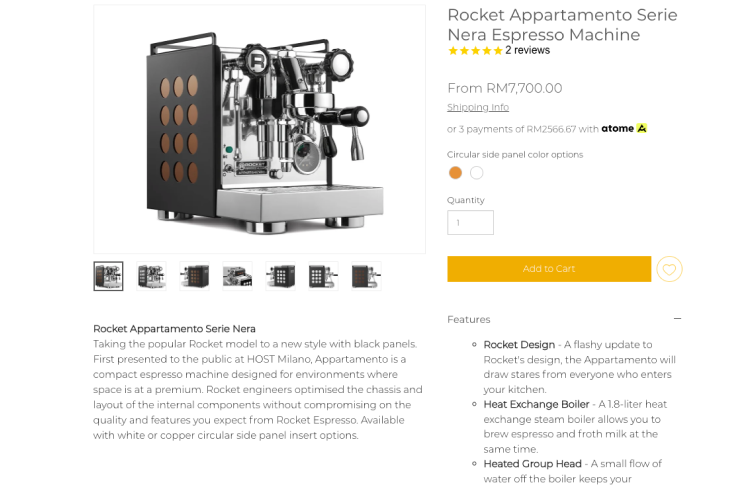
When consumers browse through espresso machines, their primary concern is discovering the unique functionalities and capabilities each model offers. To facilitate easy comparison with other products available, Lamarsa presents the mechanics and distinctive features of its machines in a concise bullet-point format, ensuring shoppers can quickly assess the value and suitability of each option.
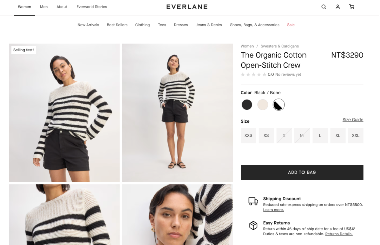
Everlane's product pages provide an abundance of details that any shopper would find invaluable. They feature high-resolution images, a size guide, fabric composition, manufacturing origin, price, and customer reviews.
Moreover, it also thoughtfully adds washing instructions. This thoughtful detail helps many customers avoid common laundry errors with their new purchases.
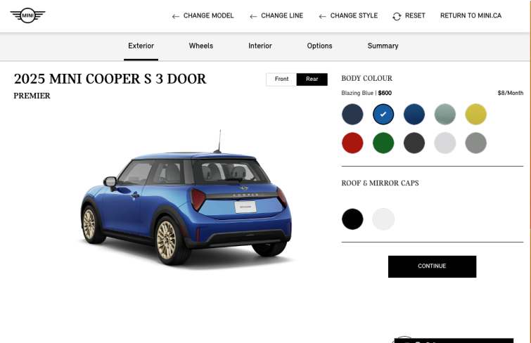
Mini Cooper engages shoppers with an interactive experience on their product page, allowing customers to build their personalized vehicle. As customers select or deselect features and customize their car, they can view real-time price updates on the bottom bar. This dynamic approach captivates visitors, whether they are actively looking to buy a car or just browsing, making the process both entertaining and compelling.
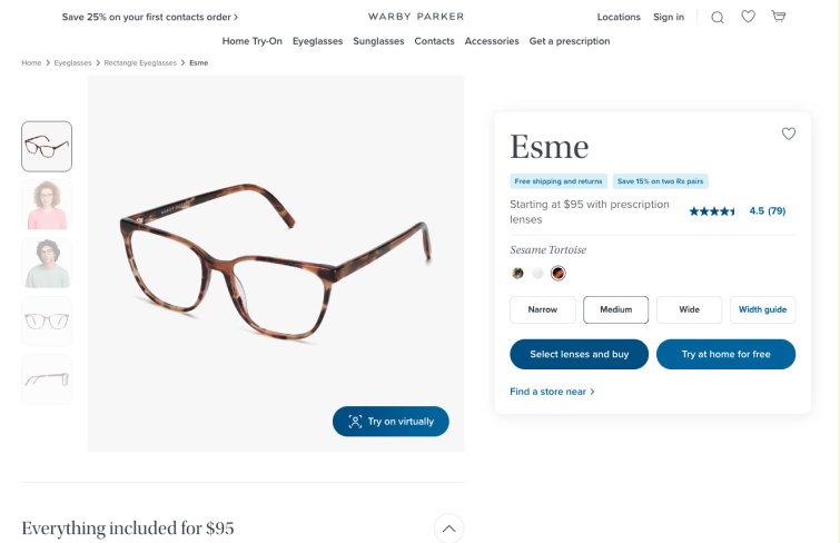
Warby Parker, a successful eyewear brand. It has a clean product page with eye-catching CTAs, high-quality photos, user reviews and more. What makes it stand out is its virtual try-on features that allow users to try eyewear at home with the camera before making the decision, enhancing the shopping experience.
Oak and Willow excels in demonstrating the value of its products through the testimonials of satisfied customers. Their product pages prominently feature reviews from delighted buyers, effectively building trust and encouraging potential sales.
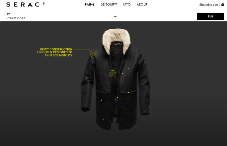
Serac, a men’s luxury outerwear brand, captures the attention of its target audience with a striking lifestyle image, encouraging customers to envision themselves in similar scenarios. Something special about serac is its clickable product image with yellow dots. Users can click on yellow dots to reveal descriptions highlighting the features and benefits of the coat.
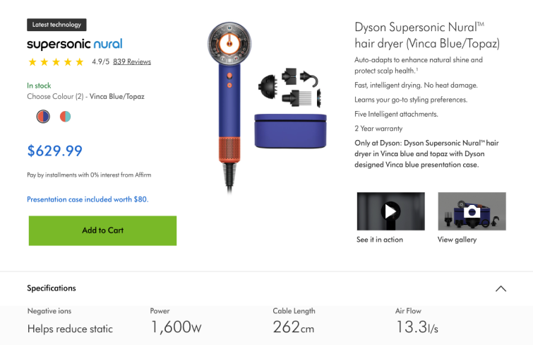
Dyson's supersonic hair dryer product page shows their keen understanding of hair care needs. The page effectively uses engaging text and vivid images to market the hair dryer, and it includes video tutorials and customer reviews to enhance the shopping experience.
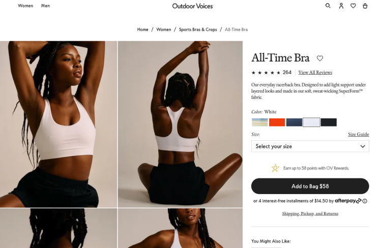
Outdoor Voices' product page stands out with its clean, minimalist design that highlights products effectively. High-quality lifestyle images show the clothing in action, helping customers visualize usage. Its detailed descriptions, including key features and materials, enhance understanding.
Moreover, customer reviews and user-generated content provide social proof, building trust in the brand.
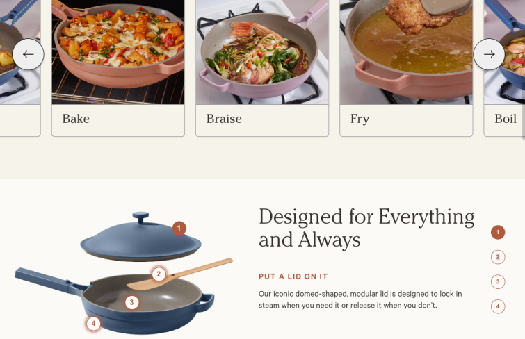
Our Place’s product pages are visually stunning, featuring recognizable brand colors and high-quality images that showcase the product's quality. What truly distinguishes these pages are the detailed graphics that break down each component, highlighting its benefits and features. This approach not only facilitates easy comparison with similar items but also emphasizes why this pan stands out, showcasing its exceptional qualities.
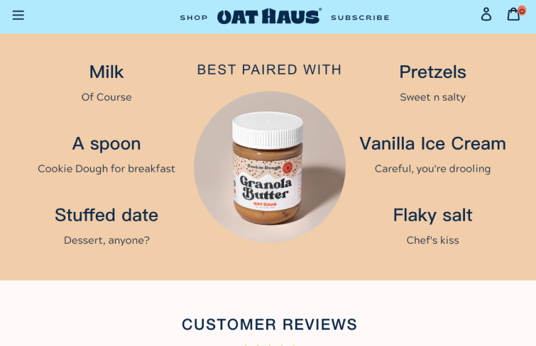
Oat Haus’ product pages mirror the brand's vibrant and playful identity. Alongside captivating images and lively descriptions, they feature a section dedicated to creative usage suggestions. This inspires customers with delicious ideas, enhancing their shopping experience and encouraging purchases.
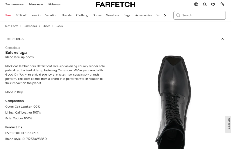
Farfetch’s product page excels in simplicity, presenting essential details like pricing, sizing, and estimated delivery date prominently above the fold. Below, breadcrumb navigation and tabs provide access to detailed descriptions without cluttering the page, ensuring a clean and user-friendly shopping experience.
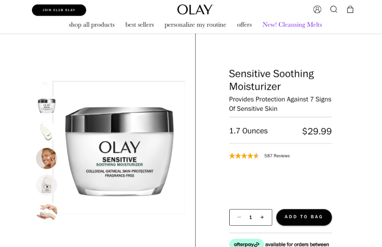
Olay, a globally recognized skincare and beauty brand known for catering to various skin types, ensures its product page is thorough. It provides essential details like size, key ingredients, and payment options, along with a dedicated section on product usage, target users, and additional information, helping customers make well-informed choices.
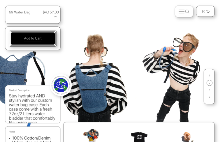
Sixty Nine is a denim lifestyle brand based in Los Angeles. Its product page comes in a clean, minimalist design with ample white space ensures a distraction-free buying experience, guiding users smoothly towards purchase. Featuring multiple product images shot from various angles, the page provides visitors with a comprehensive and detailed view of the product.
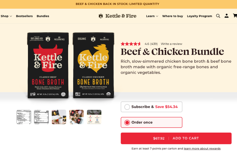
Kettle & Fire, known for chef-crafted bone broths and soups in durable packaging. It excels in making key information noticeable. It highlights the product price and a "Subscribe & Save" offer prominently on its product page, with clear options for adding items to the cart. Moreover, the page also includes a dynamic carousel showcasing various images, including nutritional details, lifestyle shots, and ingredient breakdowns.
FAQs
1.What are the benefits of a product page?
A product page, much like a retail salesperson in brick-and-mortar stores, plays a crucial role in e-commerce by making compelling arguments for the product and addressing any potential customer questions. One of the primary benefits of a product page is its ability to highlight key features and advantages of the product, making it easier for customers to see how it meets their needs. This detailed presentation helps in building credibility and trust, as customers feel more informed and confident in their purchasing decision.
Additionally, a comprehensive product page can include customer reviews, ratings, and testimonials, which further enhance trust and provide social proof of the product’s quality and effectiveness.
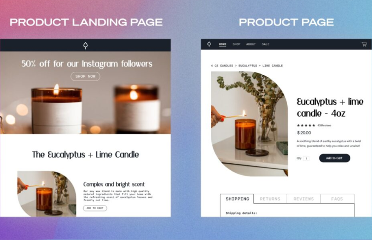
2.Landing page vs product page
Unlike a regular product page, a landing page eliminates distractions by focusing on one clear message and goal or one aspect of the product. It's created specifically for a marketing campaign with the sole aim of converting visitors into leads.
On the other hand, a product page (or webpage) is designed to inform visitors about a product or service. Its content is broader and more comprehensive, aiming to attract a wide audience.
A product page should introduce your brand, educate customers about your product, and provide links to other parts of your website to guide visitors to areas they might find interesting.
3.How to create a product page?
Creating a product page involves several key steps:
Define goals and conduct user research: Determine the page’s objective, such as increasing conversions or product awareness, and understand user needs and behaviors.
Plan page structure and content: Use a prototyping tool like Mockplus RP to design the layout, placing key elements like content areas, navigation bars, and purchase buttons strategically, and plan comprehensive content including product details and user reviews.
Design visual elements: Use tools like Mockplus DT to design the visuals of the page. Choose colors, fonts, and image styles that match the product and appeal to the target audience, using high-quality visuals to enhance appeal.
Then it should go through development & test process before launching. This involves translating the design into code, ensuring functionality across different devices and browsers, and rigorous testing to identify and fix any bugs or issues.
Conclusion
As we wrap up, it's clear that product pages are extreme important for businesses to increase their brand awareness, build trust, and achieve business success. We've learned a bunch of best practices from the 30 best examples in this article. The key lies in balancing its visual appeal, informative content, and a smooth user experience. By following these best practices and staying up-to-date with design trends, you can create pages that resonate with your target audience and drive meaningful results for your business.

 Mockplus RP
 Mockplus DT


 Sign up with Google