The search bar connects people with websites, mobile apps, and the world. It’s a conversation window between the user and the app or website. In the face of complicated web content, users express their needs by searching keywords, expecting to obtain accurate information and quick and smooth user experience.
A well-designed search bar can improve conversion rates and enhance user experience. In spite of its importance, the search bar is a simple element on a website or app and can very easily get ignored.
Before moving on to awesome search bar design examples and how you can prototype and test your design with the Mockplus prototyping tool.

Applicable to: web/mobile search
Design features:
This is a search form created using HTML/CSS. Through CSS code, the magnifier button has an animation effect that can be converted to a right arrow when hovering. For your better understanding and learning, the designer Himalaya Singh released the code for your reference.
You can also get inspiration from 8 Best Animated Websites with CSS & HTML Animation.
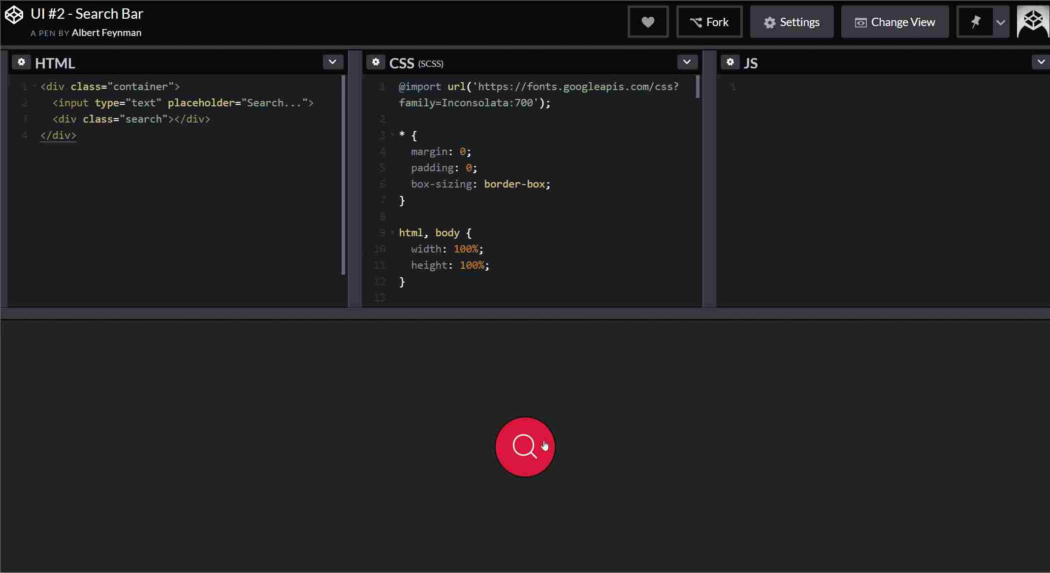
Applicable to: web/mobile search
Design features:
The traditional search box design is usually limited to a search box, a prompt, and a delete button. But in fact, a simple search box can be smartly designed with pleasure. Such as the delete button, it not only deletes the search content but also closes the search box quickly.
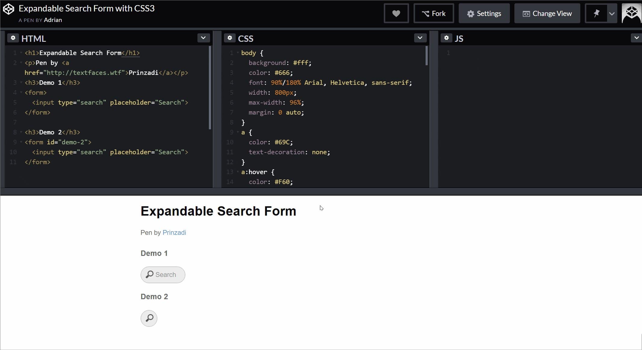
Applicable to: web/mobile search
Design features: Expandable search box with input words
This is an adaptive search bar design example. As you can see in the demo, the search box expands the frame based on the number of characters entered. The use of CSS3 allows it to remain styled even after expansion.
Plus, if you are still curious about adaptive design, another 5 Great Adaptive Web Design Examples can help you.
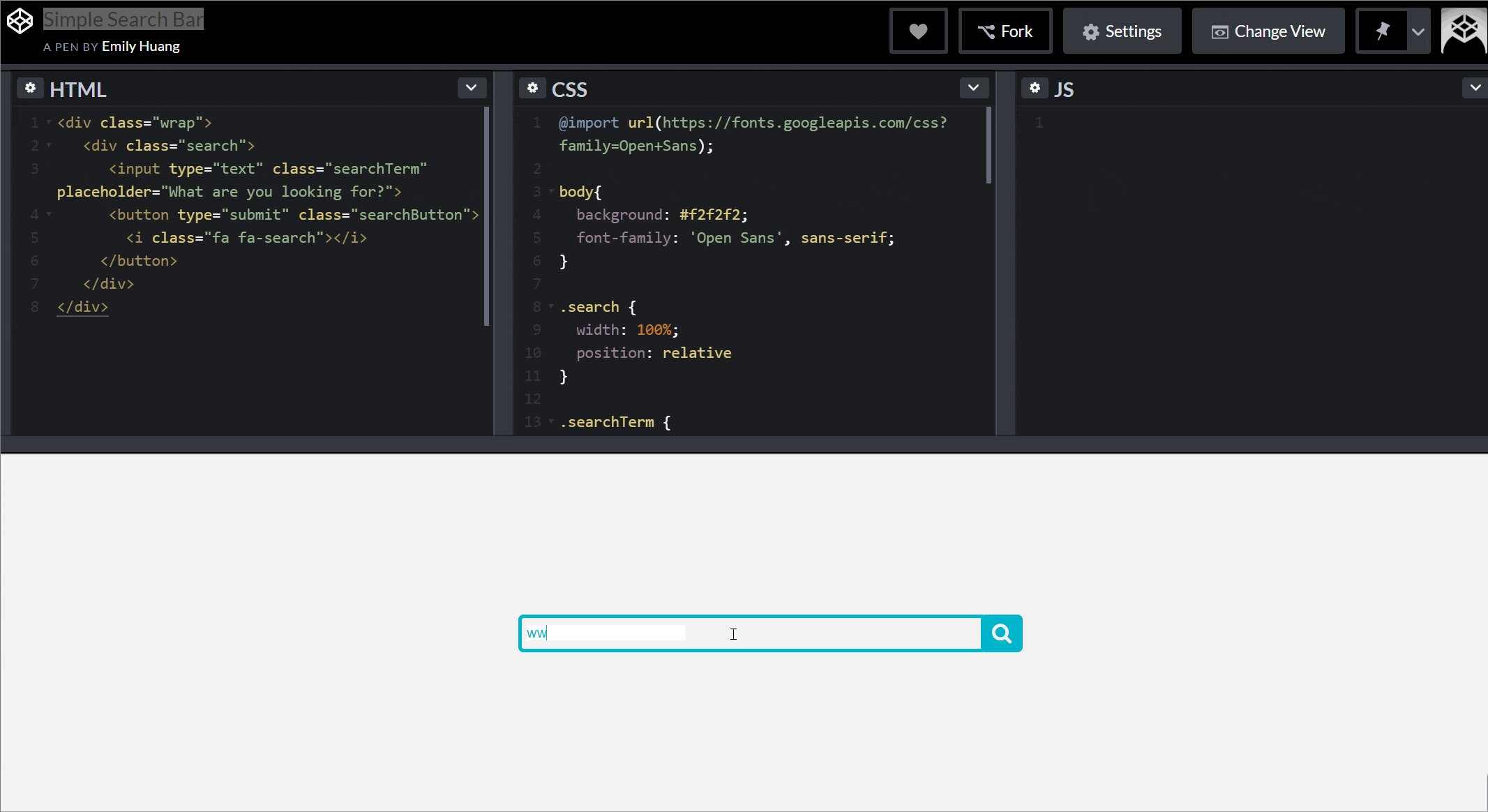
Applicable to: web/mobile search
Design features: color border + default prompt + search button
After seeing too many fancy designs, a simple search box design is visually refreshing. The elegant blue background and white search button with the default prompt text allow users to easily and directly implement the search function.
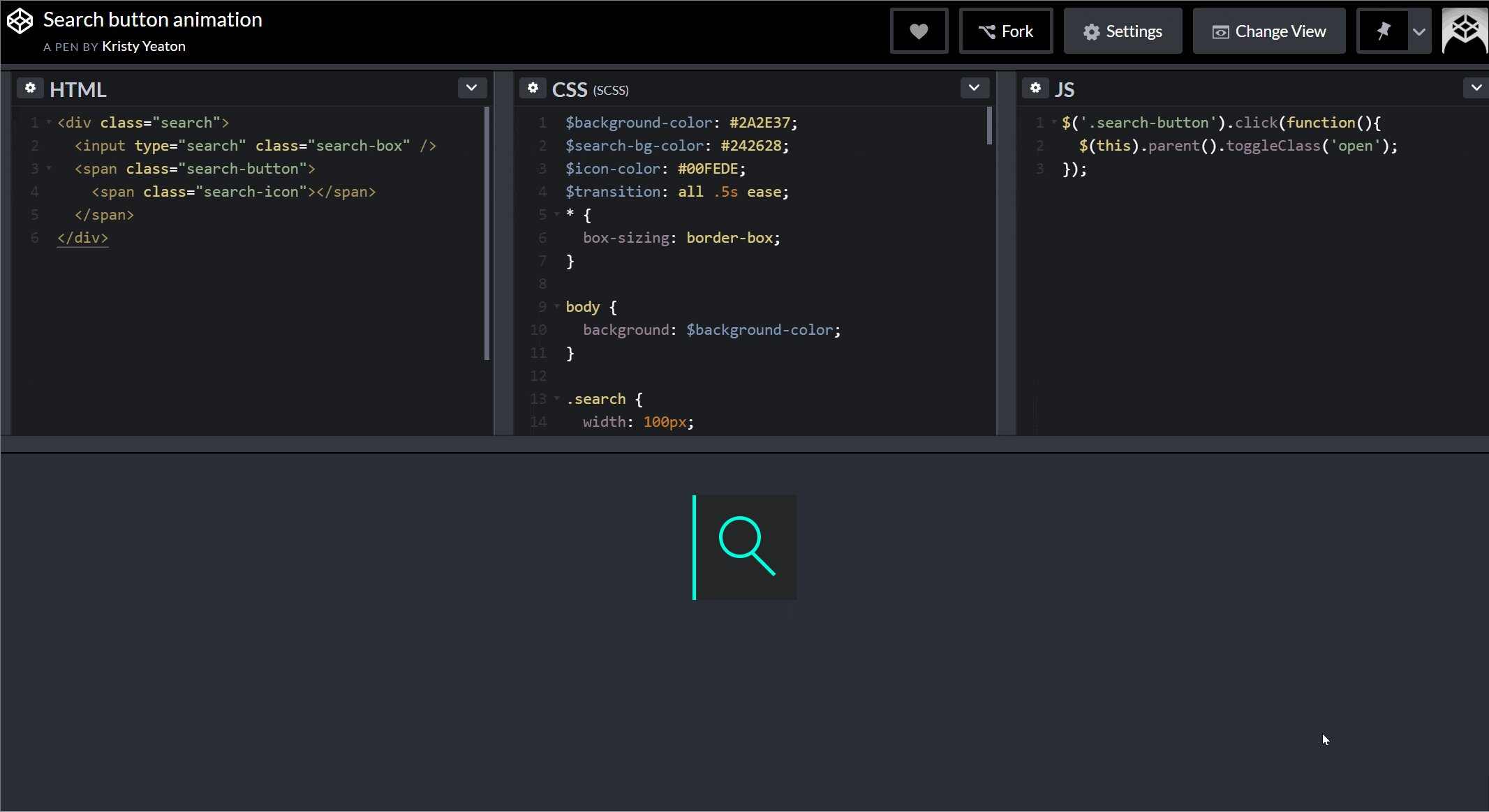
Applicable to: web/mobile search
Design features: search button animation
In this search bar design, designer morphs the magnifier icon into the forward button along with the search action. The text prompt uses the pulsing cursor as the input signal.
If necessary, also do not forget to check out 13 Latest and Best Button Designs for inspiration.
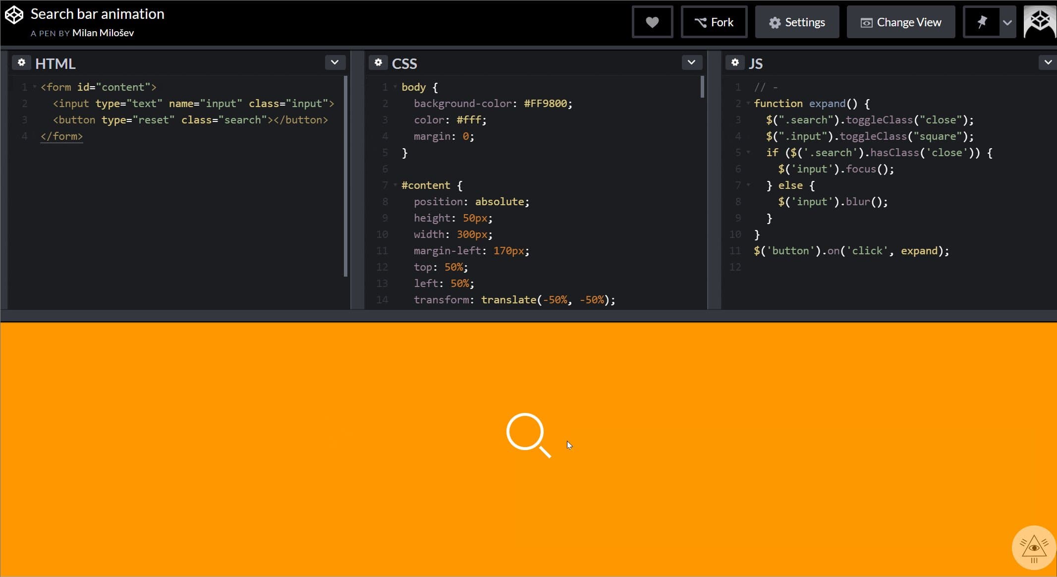
Applicable to: web search
Design features: search input morphing effects
When selected, the search icon morphs into a search box. The transformation between magnifier and search box are mainly done with HTML/CSS/JS.
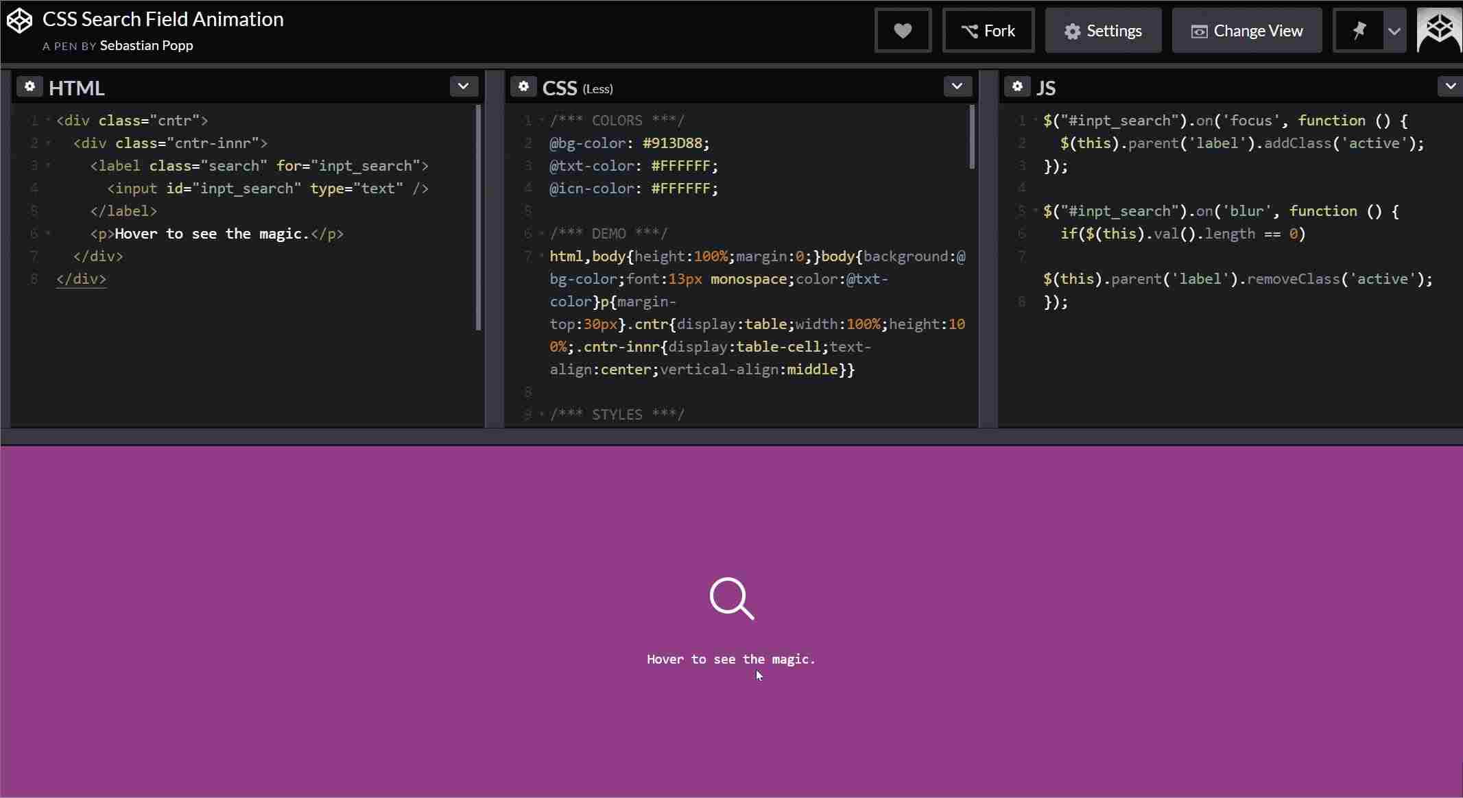
Applicable to: web/mobile search
Design features: Floating CSS search field animation
When the mouse hovers over the magnifier button, the search box expands automatically. This is a good way to eliminate the selection step as you can begin to enter text with a single click.
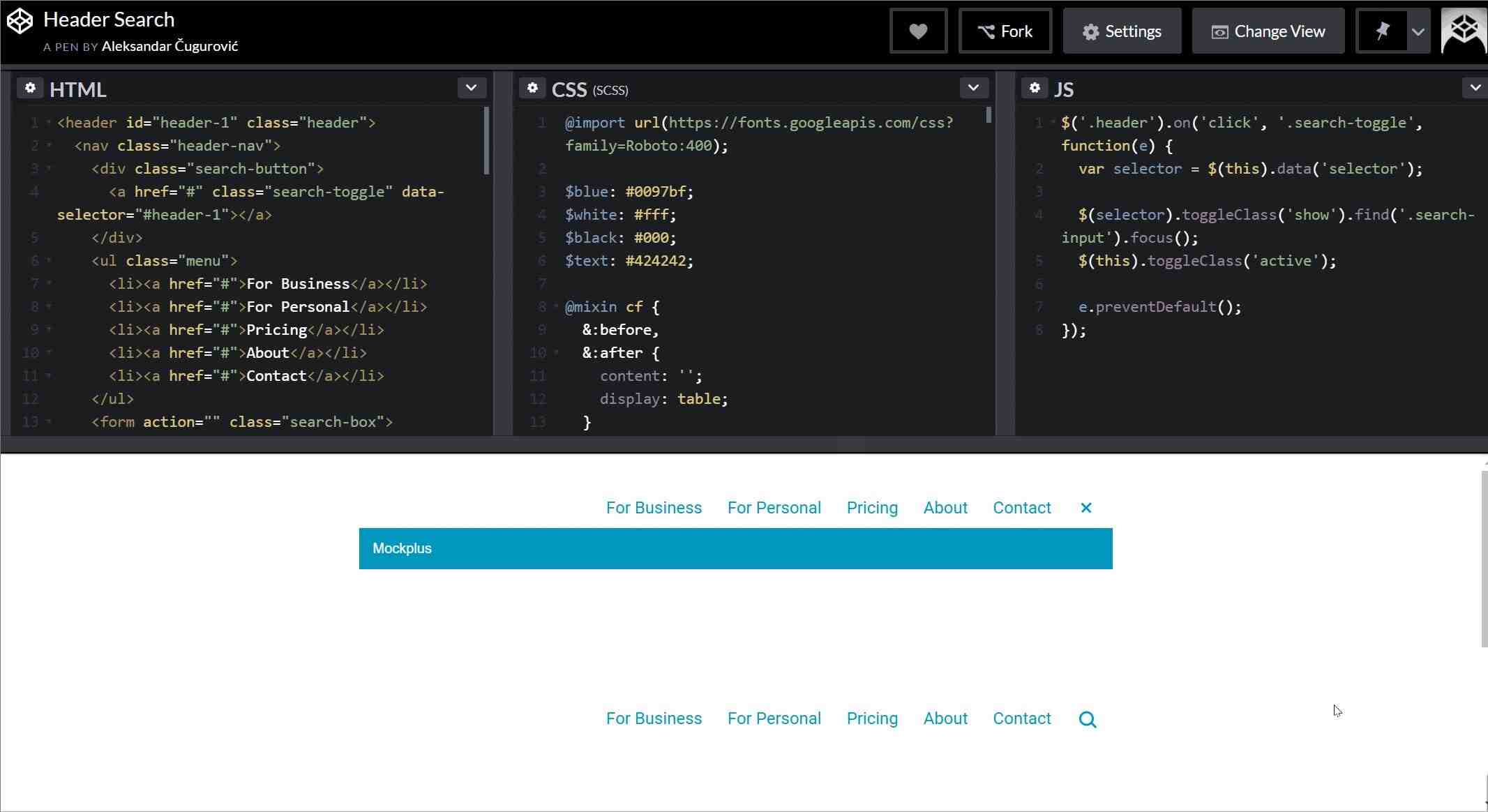
Applicable to: web search
Design features:
• Drop-down search
• Navigation bar transition search box
This example shows two top search box styles that are commonly used on web pages.
First, click the search button to pop up the drop-down search box. The advantage is that it does not affect the layout of the navigation bar.
Second, click the search button, the navigation bar transitions to the search box, and the navigation bar disappears. This kind of design saves layout space on the webpage.

Applicable to: web search
Design features:
• CSS animation
• Icon button activates the search
This is a search box designed using CSS. What's unique about it is that you can put the search button anywhere, and it will expand to a search box by clicking. When you complete a search or click again, the search box is automatically be restored to a magnifier button.
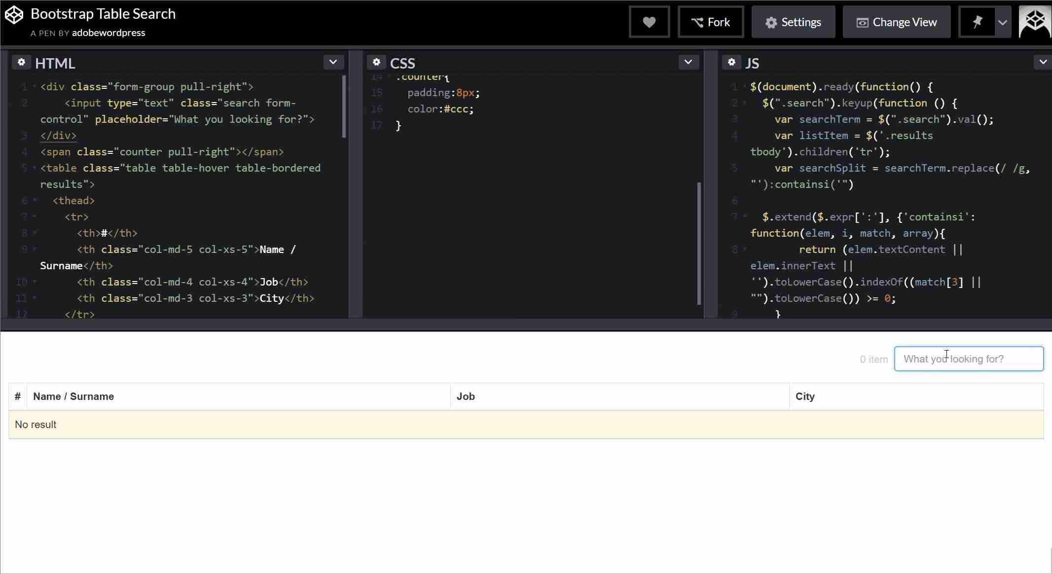
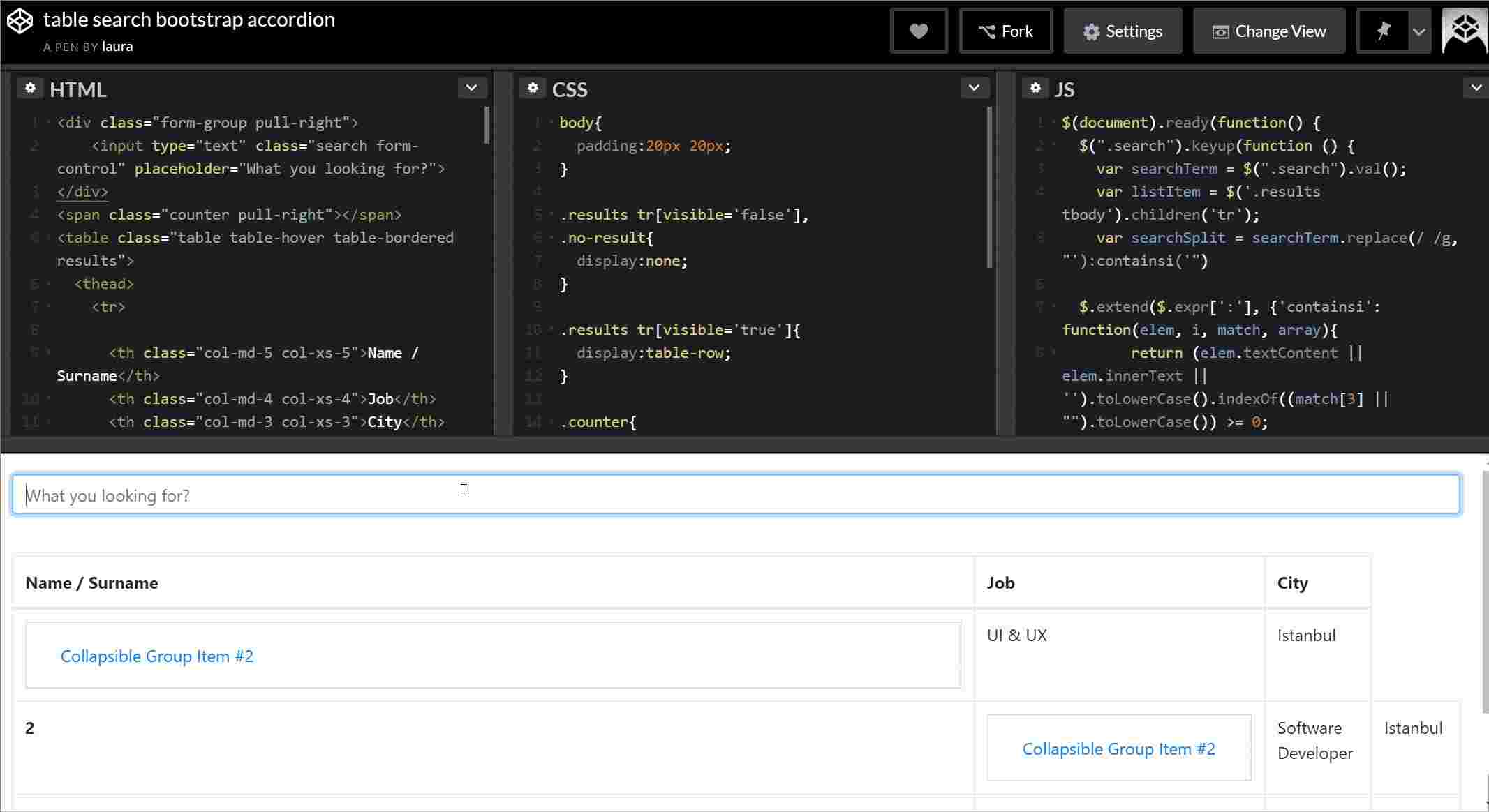
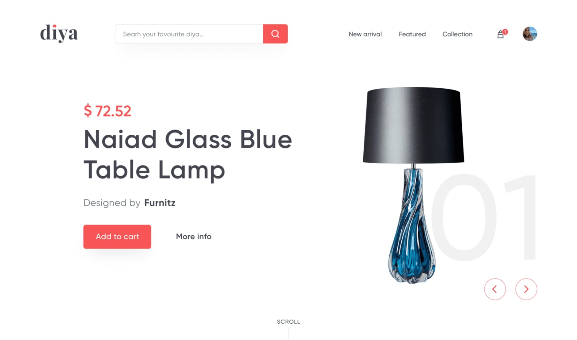
Design features:
• Favorable search box size
• Compound search
• Search hint button
Experience has shown that it’s appropriate to input 27 characters in a search box. That basically meets 90% of query conditions.
Diya's search design fits perfectly with this search bar design principle. Because too short input box design only forces users to search for website content with limited characters. As a result, it does not allow search results to be presented in full visuals. That is not conducive to users reading the search results and is not user-friendly.
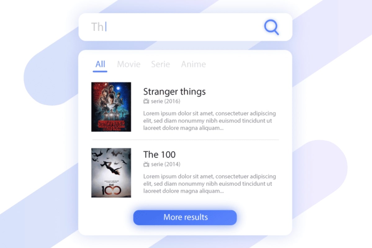
Design features:
• Search result classification
• Keyword association
Search hint is a search bar created for movies. Entering keywords within the app presents search results in real time. Due to the limited screen space of the mobile phone, the search results are presented by category. It helps to improve the conversion. For mobile apps, Search hint is a good reference for getting search bar design inspiration.
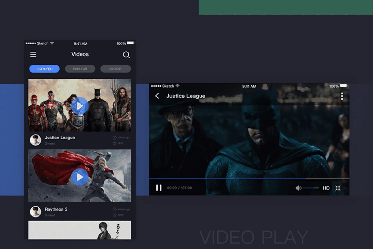
Design features:
• Search button to save space
• Input box activates search
Similar to the common mobile app search bar design, the Video page's search box design is placed on the top right of the screen. In order to save screen space and balance the design of the navigation bar, it is replaced by a simple magnifier button. You can activate the input box by selecting the magnifier. When the search action is completed, the search box will return to its initial state, without affecting the navigation bar or interface.

Design features:
• Search transition effects
• Voice search
Material Search Bar is an example of a material search bar design. When not being used, the transparent navigation bar displays a static prompt text. When the search button is selected, a dynamic transition animation is rendered, at the same time, the search function is activated. Also notice the microphone button on the right side, indicating that it supports voice search.

Applicable to: webpage, mobile search
Design features: search icon interaction
Search Icon Interaction is quite interesting. When the search box is selected, the search button will automatically change to a flashing input cursor, prompting the user to perform a search operation. adding visual interest to the search.
Applicable to: web search
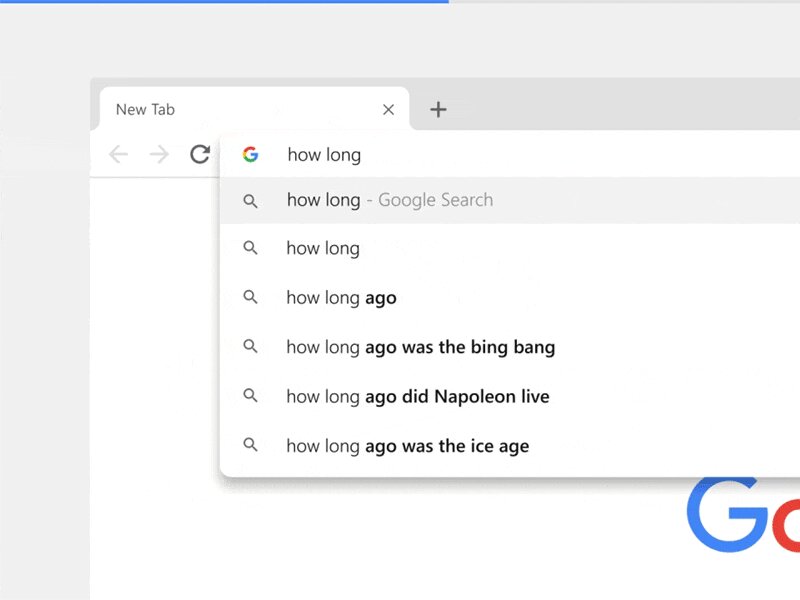
Design features: desktop search bar + address bar (Omnibox)
The latest Chrome design update uses Omnibox (desktop search bar + address bar) in the search bar design. That is, you can now get the answer directly in the address bar without opening a new tab. Also, if you search for a website in the address bar, Chrome will tell you if it is already open, and allow users to jump to the page directly using "switch to tab".
Applicable to: web search
Design features:
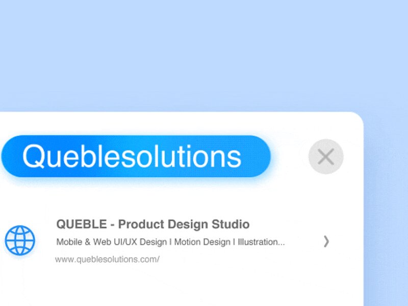
• Search area extends with the number of characters
• Search icon interaction
This search animation concept focuses on the interactive animation of the search box and the search button as well as exact keyword matching. Compared to the traditional "boring" search function, this example hopes to provide some new search bar design inspiration for designers and developers.

Applicable to: web search/mobile app search
Design features: continuous micro-interaction of swing and bouncing
This is a very interesting micro-interaction search box design concept. The search button changes to a search box after a continuous swing bounce. The entire search box participates in this dynamic effect. This kind of active search bar design is most suitable for children's apps or games, not for serious, more conservative apps.
Applicable to: web search
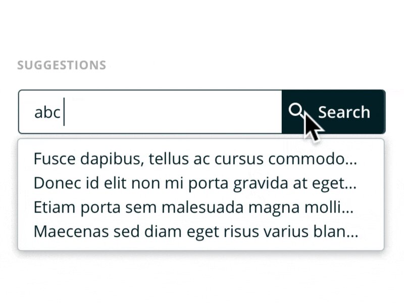
Design features:: different search status
Designers should be obsessed with the design details. In this search bar design, several different search states are shown in detail, namely default, hover, focus, suggestion, search, and so on. Each state corresponds to a different design detail.
The above 20 excellent search bar designs or search box designs each focus on different aspects. Some of them focus on the search box's style and interaction design, while others focus on functions, while yet others focus on design and development techniques.
Mockplus has summarized how to design a search boxor creative search bar. Here are some useful tips for the search bar interface design. The amount of interaction or animation you’ll wish to add will depend on your situation.
• Fill color: Usually, the fill color of the search bar will be one that contrasts with the background color of the page, allowing it to be easily seen.
• Wireframe: mostly used for clean and simple background pages
• Projection: Commonly used for simple and lightweight styles, and higher search functionality.
• Transparency: Commonly used in scenes with complex background colors. The purpose is to be more visually harmonious without damaging the overall interface design of the background page.
• No borders: For large and white pages with a clean style.
• Right angle
• Rectangles with radius: The most commonly used is 4~8px
• Capsules: For a lively, young, and affable brand style.
• Alien
Hopefully, the search bar design examples and analysis above, have helped illustrate how important an excellent search bar design is in improving the user experience of an application or website. Different scenarios need to accommodate different search functions in order to enhance the search experience. We hope this has helped you find some search bar design inspiration for your own work.
 Mockplus RP
A free prototyping tool to create wireframes or interactive prototypes in minutes.
 Mockplus DT
A free UI design tool to design, animate, collaborate and handoff right in the browser.
