In the digital landscape of today, a truly effective search interface goes beyond a basic input field—it incorporates a range of features such as auto-suggestions, filters, and sorting options, ensuring the accuracy and relevance of results. Besides functionality, a well-designed UI is also essential for an effective search experience. If your website or app users struggle to locate or use the search bar, you won't fully capitalize on the potential benefits of your search functionality.
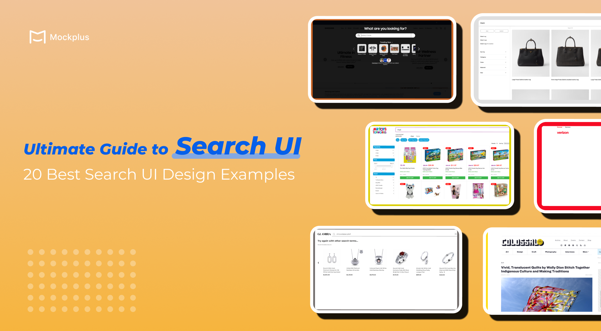
Enhancing both the functionality and UI of your site search can lead to happier users, increased conversions, better engagement, and greater site loyalty. In this article, let's dive into how to create a good site search UI and get inspiration from 20 best search UI design examples.
The free UI design tools recommended would also help you to save lots of time and efforts.
First, let get to know what a search UI is. Search UI refers to the user interface elements and design strategies that make up the search functionality on a website or application. It encompasses not just the visual presentation of the search box itself but also the entire experience of searching. The goal of a well-designed search UI is to provide a smooth, efficient, and intuitive search experience, ensuring users can quickly and easily locate relevant content.
According to research, approximately 43% of retail customers head directly to the search bar when visiting a website, around one-third of website visitors use on-site search to locate desired items, and users who engage with search are twice as likely to convert compared to those who browse. It's clear that investing in an efficient search bar is crucial for business success, especially for E-commerce websites.
The design of a search UI not only improves functionality but also contributes to a lasting, positive impression of your brand. Investing in a thoughtfully designed search interface yields several benefits.
Firstly, it improves search efficiency by allowing users to easily input queries and quickly access relevant results, minimizing friction in the browsing process. This streamlined experience saves users time and keeps them engaged with your site, ultimately leading to increased conversions.
Moreover, a well-designed search UI helps reduce bounce rates by keeping users on your site longer. When users find what they're looking for with minimal effort, they are less likely to leave out of frustration.
Additionally, an intuitive search interface builds trust and enhances customer retention by consistently delivering accurate and relevant search results. This fosters a positive impression and encourages repeat visits.
Beyond just aiding in quick and accurate user navigation, a well-designed site search UI can also provide valuable insights for your business. It reveals what users are actively looking for, highlights gaps in your offerings, and suggests ways to optimize product categories and naming conventions.
Search functionality is essential and plays a important role in designing content-rich apps or websites. Even small adjustments, such as optimizing the size of the input field, can greatly enhance usability and improve the overall user experience. Here are some tips for creating a good site search UI design:
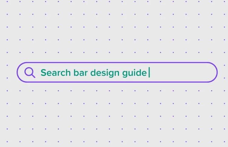
Icons serve as visual cues that help users quickly understand their purpose. The magnifying glass icon is widely recognized and universally associated with search functionality, making it an essential component of your search UI. Its simplicity aids in immediate recognition, even without accompanying text.
Ensure that the search box includes descriptive placeholder text that guides users on what they can search for. This text should be concise and directly related to the content users are likely to look for.
Design your search box to be straightforward and easy to use. Usability studies show that a clean and minimalistic design is more user-friendly, with advanced search options hidden by default. Displaying complex features can overwhelm users and detract from the search experience. Focus on a simple, intuitive search box to make it easier for users to find what they need without unnecessary complications.
When the field is not wide enough, users can only see a part of their query at a time, making it difficult to review and edit their input. This limitation often forces users to use shorter, less precise queries, which can hinder their search experience. To enhance usability, ensure the input field is sized to accommodate the expected length of user queries. A general guideline is to design the field to fit approximately 27 characters, which covers around 90% of typical search queries.
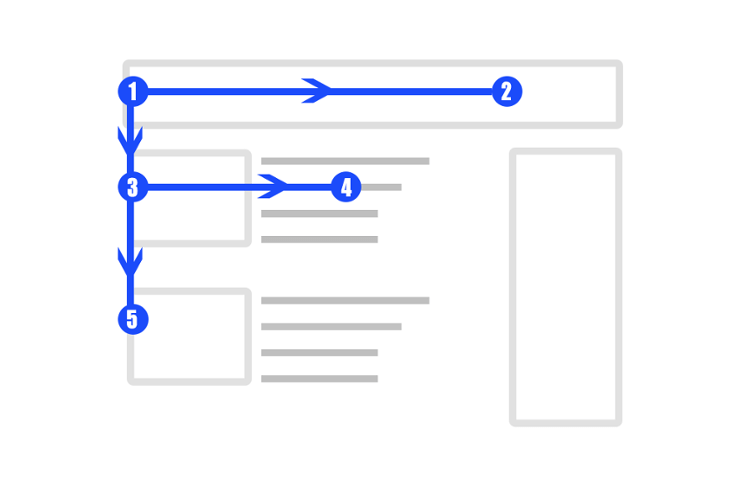
Research by A. Dawn Shaikh and Keisi Lenz shows that users typically look for the search box in the upper-left or upper-right corners of a page, following the F-shaped reading pattern. To enhance visibility and user experience, place the search box in the upper-right or upper-center of your layout. This strategic placement ensures users can easily spot and use the search function, reducing frustration and improving overall site navigation.
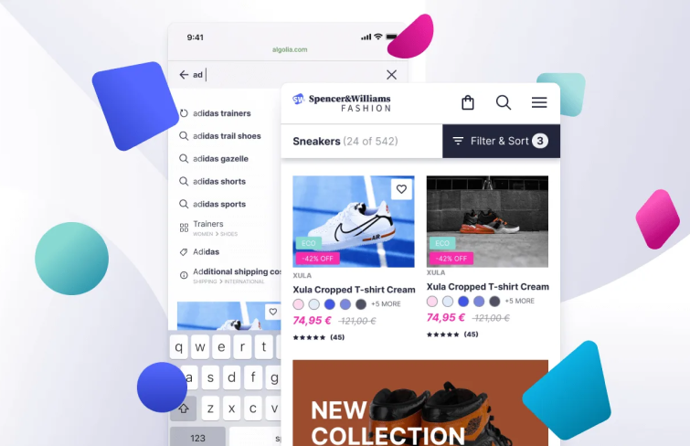
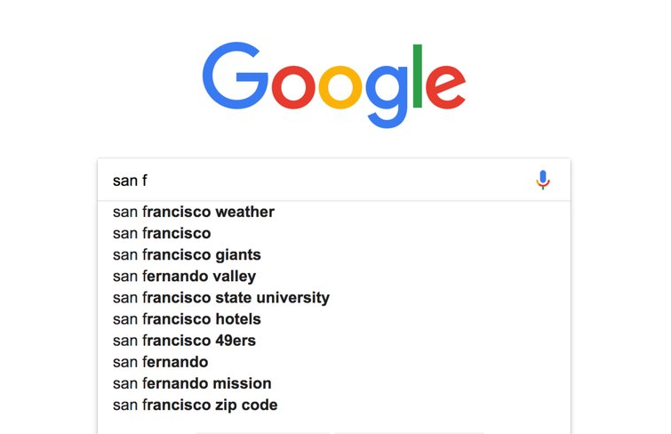
Autocomplete, also known as predictive search or autosuggest, provides real-time search recommendations as users type their queries. These suggestions are contextually relevant to the user's input and often include popular queries from the site. By offering these instant recommendations, autocomplete speeds up the search process and enhances user experience,
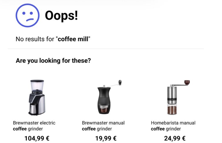
A "no results" page can often feel like a dead end in the user experience. While optimizing search functionality can minimize these instances, there are times when users may enter irrelevant queries or make typographical errors that your system can't correct. In such cases, it's crucial to offer users a clear pathway to continue their search and discovery journey. Provide suggestions for alternative searches, popular queries, or related categories to help users find what they are looking for and keep them engaged with your site.
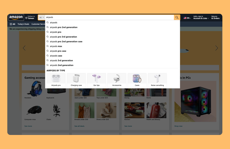
Amazon consistently positions its search bar at the top of every page, providing a familiar and easily accessible location for users. The large search bar aligns with the site’s overall design, making it a prominent feature on the page. Moreover, when clicked, the search bar is highlighted with a dark overlay, minimizing distractions and directing user focus to the search function. Moreover, as a user types in search bar, they are served both specific product suggestions as well as broader category suggestions with images, making it easy for users to choose the best option for them.
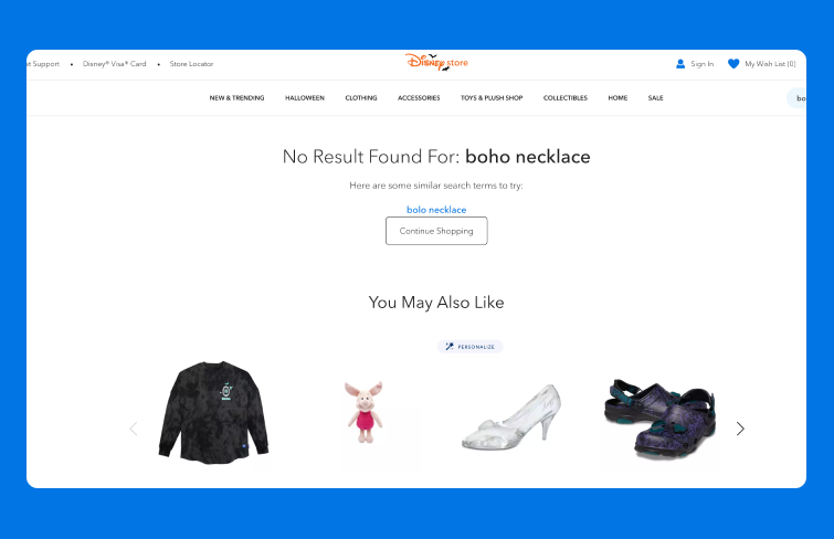
When users enter unclear queries or search for non-branded products, they are directed to a "no results" page. Rather than being a dead end, Disney store's "no result" page provides informative feedback about the search and offers alternative product suggestions. This thoughtful approach helps users navigate through the site effectively, either by refining their search or exploring other options, thereby improving the overall search experience and reducing the likelihood of users leaving the site.
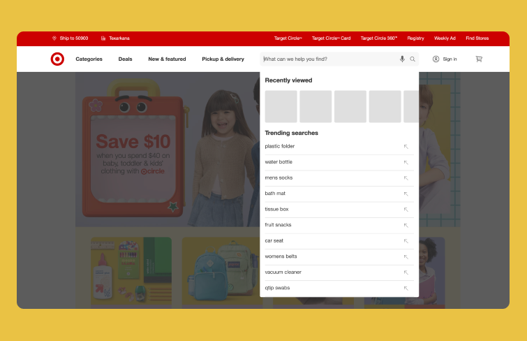
Target enhances the search experience by featuring trending searches in the drop-down menu beneath the search box. This feature helps users who are unsure about what to look for by showcasing popular products across the site. Highlighting trending searches provides social proof and encourages customers to consider top-performing items, effectively motivating purchases. Additionally, when users click on the search bar, it is emphasized with a dark overlay, reducing clutter and allowing users to concentrate on their search.
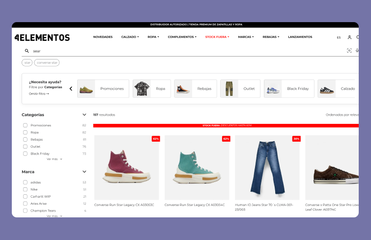
4elementos enhances the search experience by providing instant basic filtering options directly in the search bar. This feature allows users to quickly narrow down their search results using predefined categories and select multiple criteria simultaneously. For brands with extensive product catalogs or diverse product attributes, this functionality streamlines the shopping process, making it easier for customers to find exactly what they need with minimal effort.
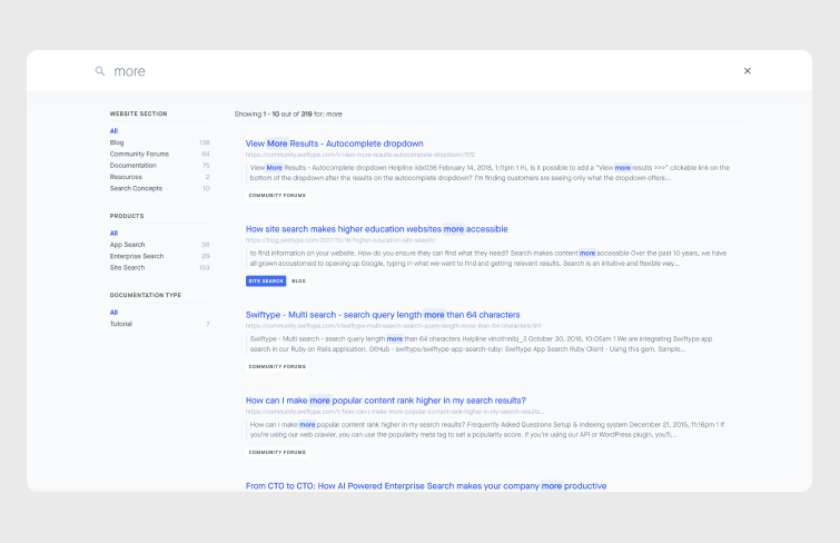
On the Swiftype website, users can access the search feature by clicking the search icon in the upper right corner. It opens a large search bar and a results container that occupy the entire page. The full-page search UI design allows users to concentrate solely on finding the information they need. As users type, autocomplete suggestions dynamically update, and the full results are shown without needing to press enter, providing a seamless and efficient search experience.
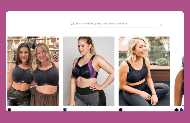
Brava Lingerie enhances its search box with microcopy, providing users with helpful hints and suggestions. Microcopy, consisting of short, informative text, guides customers through the website and assists them in their searches. By including microcopy, Brava informs users that they can search for products by brand, size, stype or other features. This content serves as an effective call to action, making it easier for customers to find the products they need and improving their overall shopping experience.
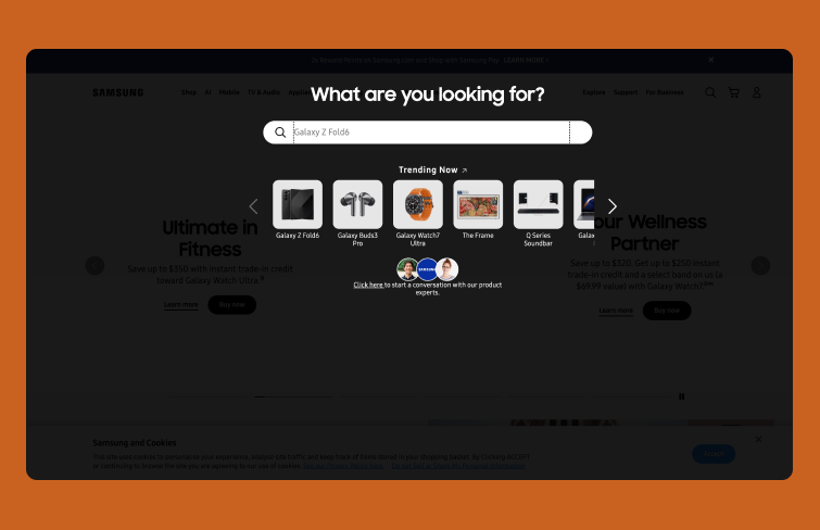
Samsungs's website features a full-page search functionality designed to enhance the user experience. When activated, the search bar becomes a prominent, highlighted element against a black overlay, focusing the user's attention on the search functionality and minimizing distractions from the rest of the page. It also provides a "Trending Now" section to guide users toward popular and relevant items and enhancing the overall shopping experience.
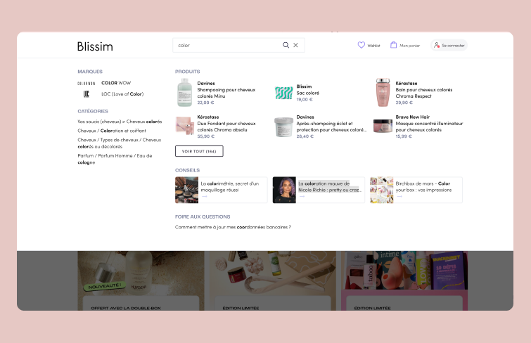
On the Blissim website, the search experience is designed to be highly efficient and user-friendly. With just a few keystrokes, customers are instantly presented with a selection of relevant products, top brands, useful categories, and related articles. This federated search system not only streamlines the search process but also enhances the customer's perception of the brand, as it showcases the thoughtful curation behind the presented results.
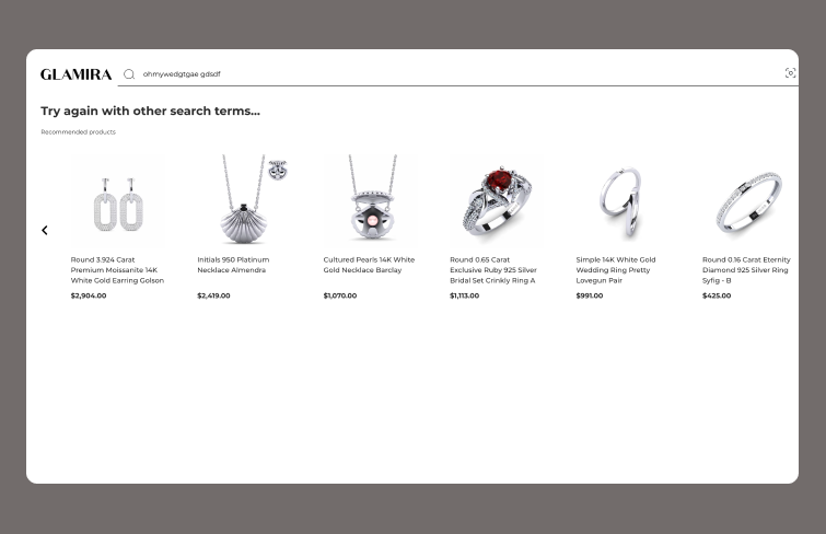
Glamira turns the potential disappointment of a "No Results" page into an opportunity for engagement. When users don't find what they're looking for, the site offers helpful suggestions, directs them to relevant categories, or highlights top products. It keeps users engaged, sparking their curiosity and encouraging them to continue exploring the site. By proactively offering alternatives, Glamira ensures that users remain interested and find value, even when their initial search doesn't yield results.
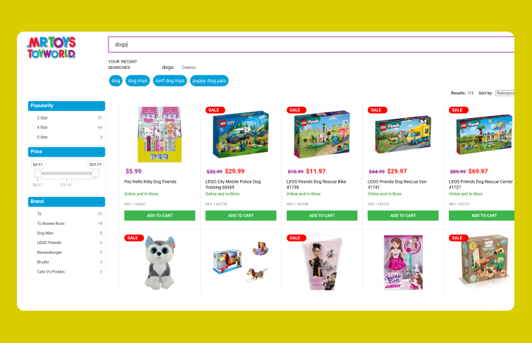
Mr Toys enhances the search experience by implementing faceted filtering, which allows users to narrow down results based on various category attributes like popularity, price, or brand. By enabling users to easily refine their searches, it helps customers quickly find exactly what they're looking for, improving their overall shopping experience.
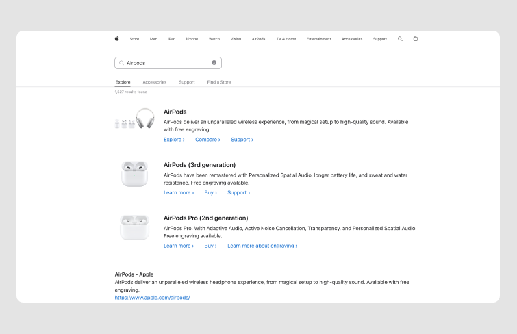
Delivering relevant results is crucial for a positive search box user experience, as users seek accurate and comprehensive answers that guide them toward their goals. Apple excels in this aspect by categorizing search results effectively. They prioritize product results but also provide easy access to other categories like 'Support' and 'Accessories' through additional tabs. It not only offers a broader range of information but also allows users to navigate the site more holistically.
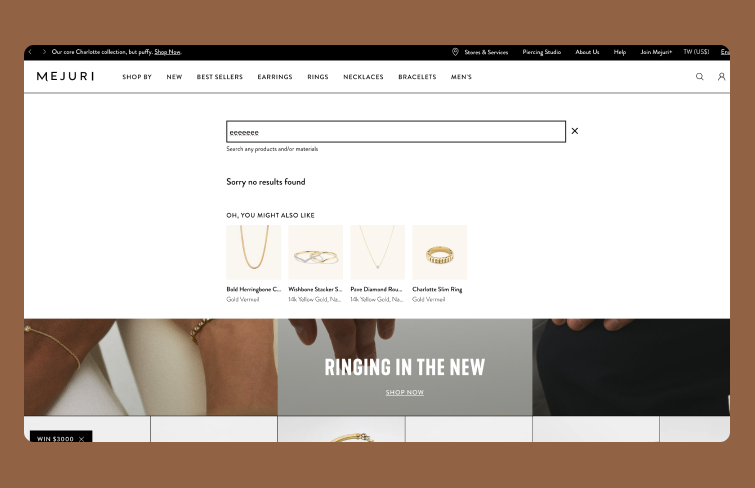
An effective strategy to handle "no results" scenarios is by providing relevant product or content recommendations. Instead of leaving users at a dead end, you can redirect their attention to similar or popular items. Mejuri excels at this by including an "Oh, you might also like" section beneath their no-results message. It transforms the interaction from a disappointing experience to an opportunity for further exploration, keeping users engaged and potentially leading them to products they didn't initially consider.
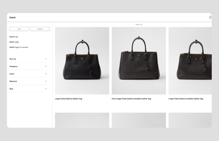
Absolutely, fashion brands often elevate their search forms to reflect their sophisticated style. Prada’s search bar is a great example of this trend. Integrating image-based search alongside keyword input elevates the user experience by combining convenience with the brand’s cutting-edge aesthetic. It seamlessly blends functionality with fashion, ensuring that every interaction feels as refined and sophisticated as the products being searched for.
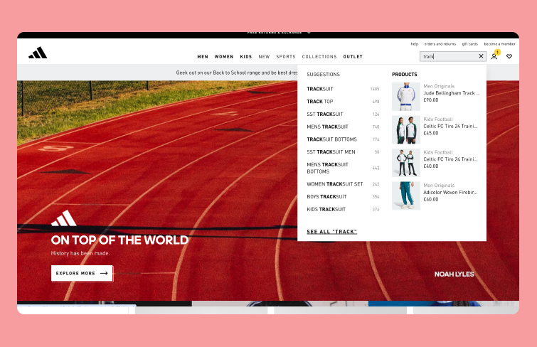
Adidas's search bar comes with a darker color scheme in order to stand out from the background, making it more visible. It also added feature of suggestions under the search box enhances usability by providing alternative search terms and popular queries, helping users find exactly what they need with ease.
Verizon’s search bar design reflects both aesthetic appeal and functionality. The magnifying glass icon is a classic choice, but Verizon’s implementation takes it a step further. Upon clicking, users are greeted with a full-page search experience, ensuring an efficient and distraction-free search process. Besides, it also provides quick links and featured products for users. This minimalistic and full-page search interface makes easier for users to find what they’re looking for, while also highlighting relevant products or services.
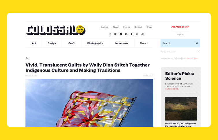
Colossal’s search box design is a standout example of creativity and functionality. Positioned in the right corner alongside other options, it turns blue on hover and grey when clicked. This artistic touch not only enhances visual appeal but also provides interactive feedback, making the search experience both engaging and intuitive.
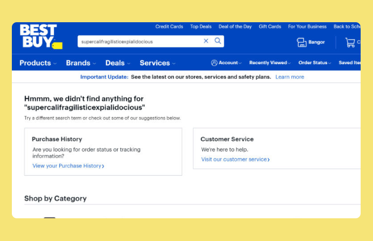
Best Buy’s no-result search page is thoughtfully designed to keep users engaged and help them find what they need. If a search yields no results, users can circle back to their order history to view and track previous purchases. Additionally, there’s an option to easily contact customer service for further assistance. This approach not only provides a way to revisit past interactions but also ensures users have access to support when needed, enhancing the overall search and service experience.
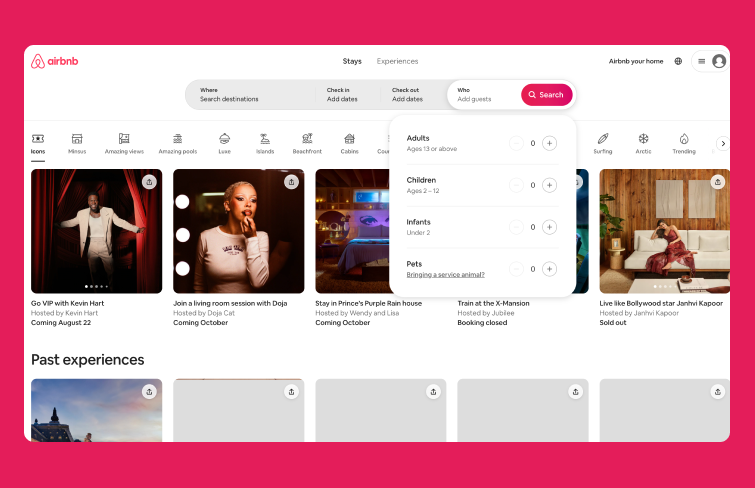
Airbnb’s search bar design is distinctive and user-centric, enabling users to quickly find and book accommodations. It features interactive drop-down menus for various parameters, such as budget and location, and offers advanced filters to refine search results, providing a tailored experience.
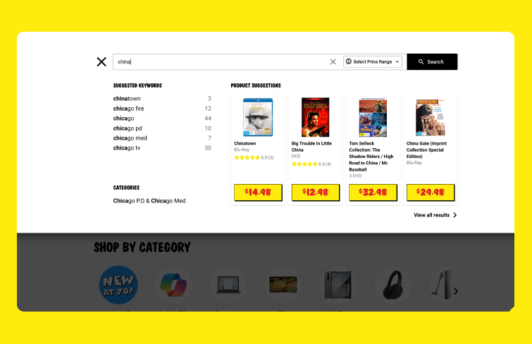
JB Hi-Fi incorporates instant filtering to enhance its search experience, making it easy for users to narrow down their options as they type and improving both the efficiency and relevance of their search results. This kind of functionality not only helps users find what they’re looking for faster but also reduces the likelihood of frustration by allowing for more precise searches.
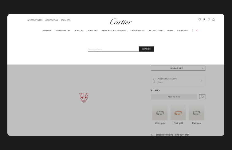
Cartier’s approach to maintaining consistent search bar placement is a smart move, especially in the luxury market where user experience is paramount. By keeping the search bar in a fixed, prominent location, Cartier ensures that users can easily access it no matter where they are on the site. This level of consistency helps streamline the navigation process and reinforces the brand’s commitment to a high-quality, user-centric experience.
When designing a search UI, here are some popular design tool that can help streamline the process and enhance the overall design:
Mockplus DT is a free, online UI tool to design, animate, collaborate and handoff in one central place.It mirrors editing practices and shortcuts you’re accustomed to in design tools like Figma and Sketch, making it quite intuitive and effortless for everyone to quickly get onboard. As for design functionality, it covers almost all the key features of Figma. Mockplus offers a free version for everyone and for its paid version with advanced features, it costs only $8 per user per month, while Figma charges $12-$45 per user per month. With Mockplus DT, you can enjoy an easy and smooth design experience and also minimize costs.
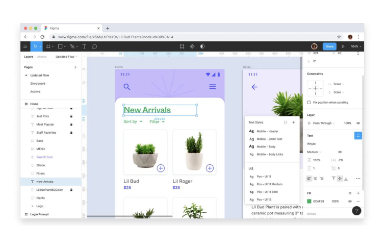
Figma is an online design tool widely used for UI/UX design, prototyping, and collaboration. It allows designers to create, share, and iterate on designs in real-time with others. Its real-time collaboration, cross-platform accessibility, robust prototyping capabilities, vector editing, plugin support, responsive design features, and version control make it a excellent choice for designers and design teams worldwide.
Sketch is software available for Mac OS. Known for its vector-based design capabilities, Sketch is useful for designing search UI elements and creating reusable components. It has a strong ecosystem of plugins and integrations that can enhance your design workflow.
Adobe XD is a UI design software. It provides robust prototyping and design features, including interactive elements and animations. It also offers integration with other Adobe products and supports collaboration through shared design specs. But Adobe XD is currently in maintenance mode, so it's no longer available for new downloads and will not ship any new features.
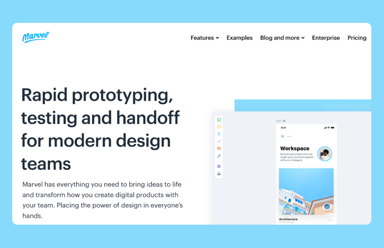
Marvel is a comprehensive design platform that caters to both experienced UI designers and newcomers. It facilitates the creation of low-fidelity and high-fidelity wireframes, interactive prototypes, and user testing, all within one intuitive interface. Additionally, Marvel’s Handoff feature supplies developers with the necessary HTML code and CSS styles to start building and refining product designs.
Justinmind is a versatile platform for creating both low-fidelity wireframes and high-fidelity user interface designs. It provides an extensive selection of built-in UI components, widgets, and libraries, enabling designers to quickly develop mockups and layouts. Additionally, JustinMind supports real-time collaboration, allowing multiple team members to work on the same project simultaneously. The platform also features tools for collecting feedback, comments, and annotations from stakeholders and users, and offers the capability to create custom UI kits.
Overall, the design of a search UI is crucial for creating an excellent user experience on your website. As one of the initial elements users interact with, an effective search interface not only helps users find information quickly but also shapes their overall perception of your brand. It significantly enhances user satisfaction by simplifying the process of locating desired products or content, leading to a smoother navigation experience. Hopefully, by exploring the best examples and practices for creating an effective site search UI outlined in this article, you can gain valuable insights to improve your own project and create a more user-friendly experience.
 Mockplus RP
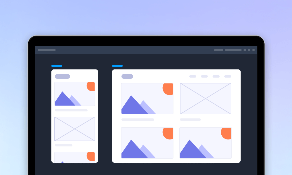
A free prototyping tool to create wireframes or interactive prototypes in minutes.
 Mockplus DT
A free UI design tool to design, animate, collaborate and handoff right in the browser.


 Sign up with Google
 Join our Discord community
 support@mockplusapp.com