Designing a stepper for mobile or web forms can be tricky. There are two types of steppers—input steppers and progress steppers. The input stepper is a standard input control that makes data input as easy as possible, while the progress stepper is a UI element that conveys progress through numbered steps. Both of them help improve the UX of websites or mobile products and delight users.
Steppers keep users informed about their progress by indicating what step they’re on and how many steps are left. This article will answer what input steppers are, when, and how to use them and share 15 best input stepper examples for your inspiration.
An input stepper, also called numeric stepper, is a common UI element that allows users to input a number or value simply by clicking the plus and minus buttons.
Below is an example of an input stepper:
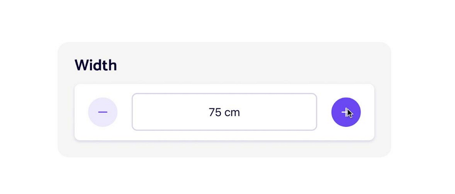
According to the design orientation, the input steppers can be either Horizontal or Vertical.

Whether it is designed vertically or horizontally, the input stepper is always an important input control that helps users to place an order, volume up or down the sound, and increase or decrease a particular value.
Input steppers are simple controls— they have only two buttons (i.e. "Up" and "Down" buttons) so that even a complete beginner can quickly know how to use this control.
When users have to input a series of numbers, the list of input steppers is much easier for them to scan. Even without a list, a single input stepper in a registration, order, or user profile form can improve form filling.
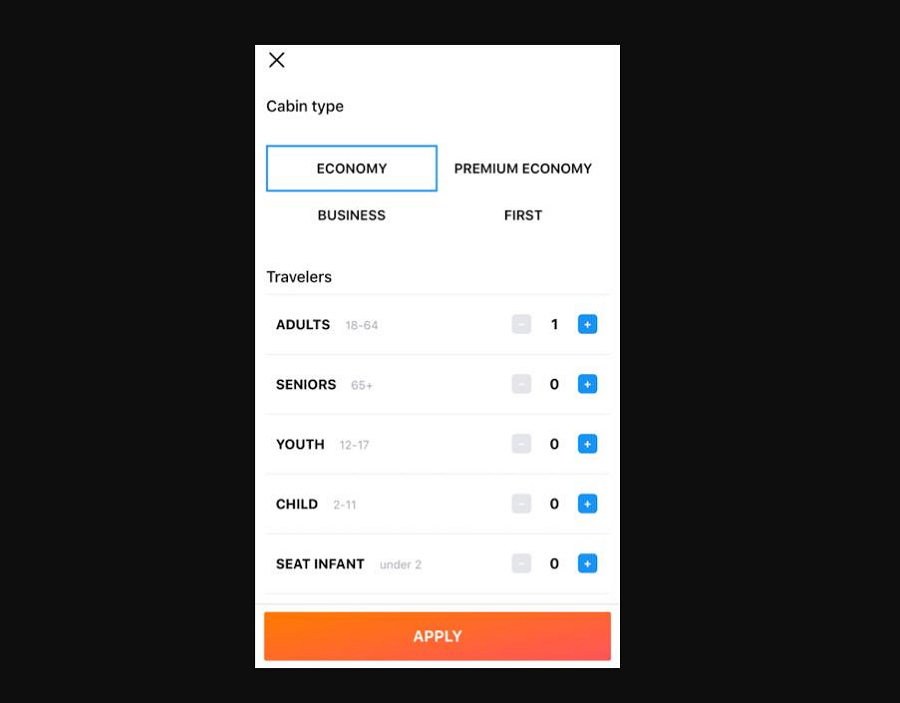
As the above image shows, input steppers make it easy for users to scan and input data.
To provide a more pleasant user experience, some input steppers provide users with more methods to enter the number:
Type a number directly using a numeric keypad.
Click the Plus and Minus buttons using mouse clicks.
Click the Up and Down arrow keys on your keyboard.
This makes it easier for users to provide numbers.
Steppers require fewer interactions than other input methods. A few simple clicks are all that you need to do to fill out a form.
Here are a few common cases for using input stepper:
When placing an order online, you may need to enter the number of items. An input stepper is an ideal solution for this case.
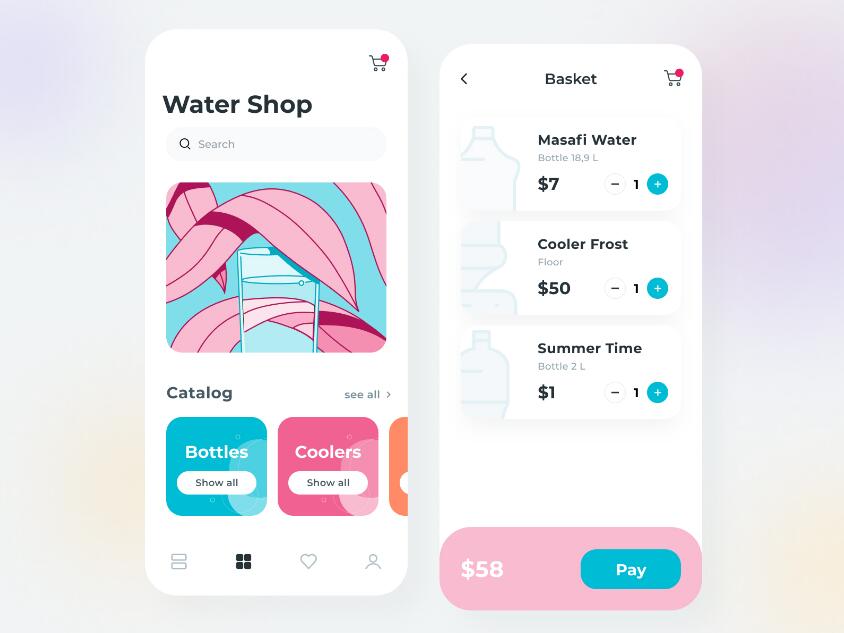
When filling different forms online, such as the registration forms, delivery forms, or feedback forms, you may also need to enter some numbers. You can use an input stepper for that.
When designing steppers, you need to pay attention to the overall layout of your forms. So, all form elements, including the input fields, input steppers, dropdown lists and so on, will be easy to digest by end-users. Only in that case, all required customer information can be collected successfully.
Input stepper for the Width and Height properties can help designers to position an element or component on the workspace or canvas.
When designing a website or mobile app, designers and developers adjust the properties of different elements. Input stepper is perfect for defining properties like opacity, corner radius, and so on.
The input steppers are widely used to adjust numeric values within a small range, like from 1 to 20, 1-50, or 1-100. A too-large range can make it very annoying and troublesome for users to adjust the number to the desired number by clicks.
Designers are highly recommended to set a default value for their steppers to minimize the chance of selecting an incorrect number. For example, when users are trying to purchase a ticket, the valid quantity should be greater than 0.
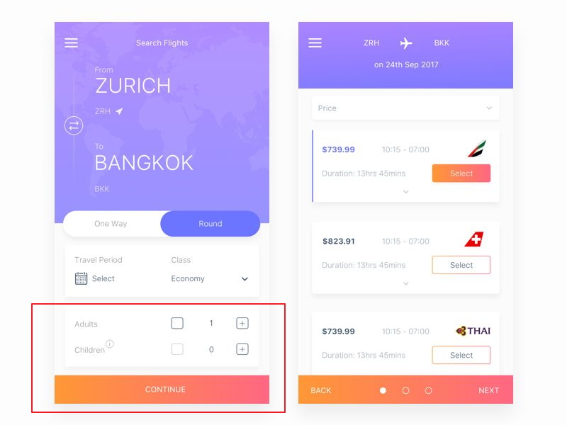
To avoid any invalid input, the designer has grayed out the Minus button so that users can add at least one or more children based on their needs.
Apart from the default number, the maximum and minimum numbers should also be considered. A maximum and minimum limit should be defined in advance.
For instance, when users are trying to purchase a flight ticket, the number of children is often limited. In this case, the input steppers should be set with a maximum limit.
If you add a list of input steppers for your project, it is necessary to add a reset button. So, the users can reset any numbers once they've made some mistakes.
Handy product design tools like Mockplus are good options to help you and your team visualize and test your input stepper.
Mockplus will help you to test your prototypes and streamline your entire design-to-development process.
Check our list of 15 best input stepper examples:

Stepper IX uses numbers as interactive UI elements. Website visitors can easily slide the numbers with simple clicks. It is a good numeric control solution for layouts with limited UI space.
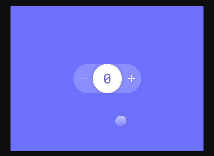
Stepper Touch is a concept shared on Dribbble. Users can easily decrease or increase a value simply by dragging the number to the left or right.

Stepper is a typical numeric input control designed for a vertical orientation. Users can easily drag the number up or down to change the value. It works well on both website and mobile projects.
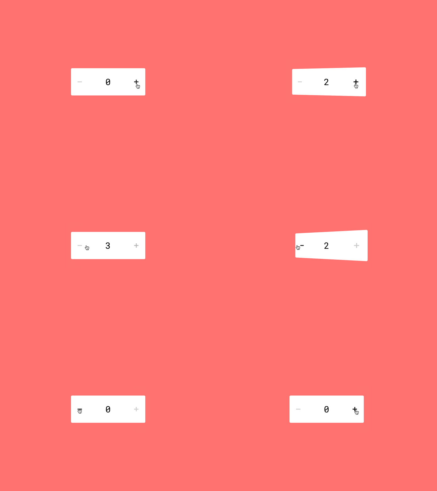
Stepper 3D showcases a stunning stepper with a 3D transformation animation. Clicking the Plus or Minus button can activate a rotating animation, creating a very cool visual experience for users.
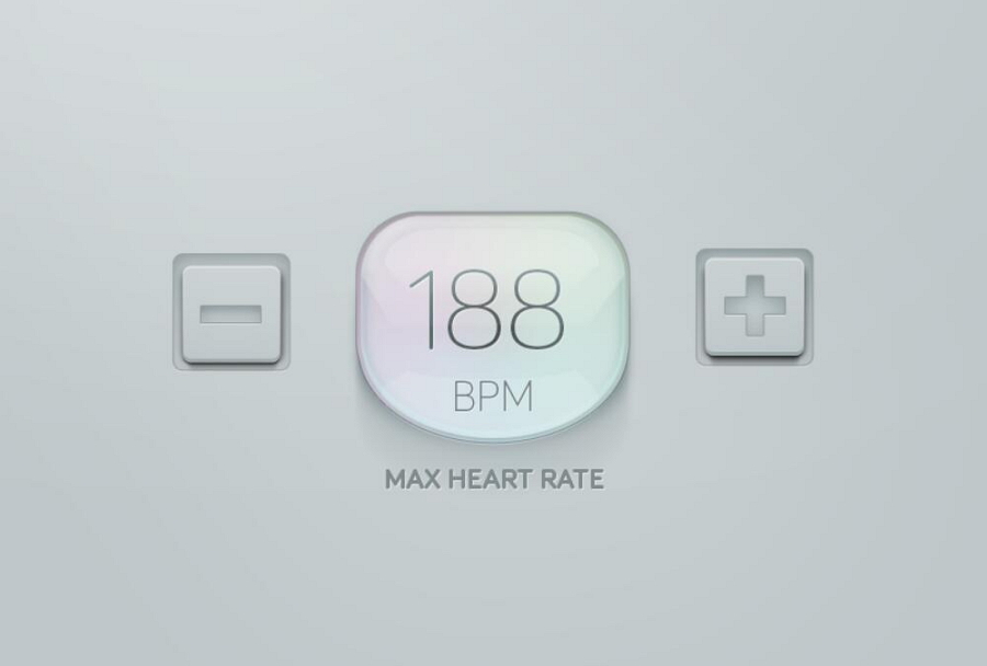
Max Heart Rate Steppers has a cool 3D appearance. This 3D stepper can help you create a modern look for a health or hospital website or mobile app.
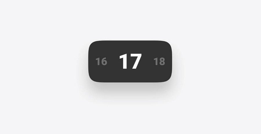
This Stepper XI stepper example offers users unique methods to input their desired values. Users can click/tap the arrows or hold up/down the arrows to change more than one unit at a time.
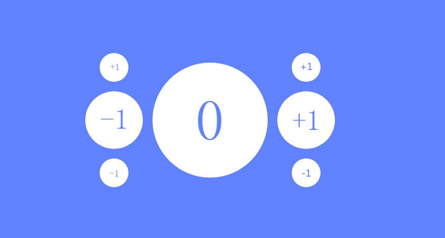
Fractal Stepper showcases a different concept that a stepper control can follow to enter data. It's kinda crazy but very interesting. The 3D style of this control can benefit AR or VR interfaces.
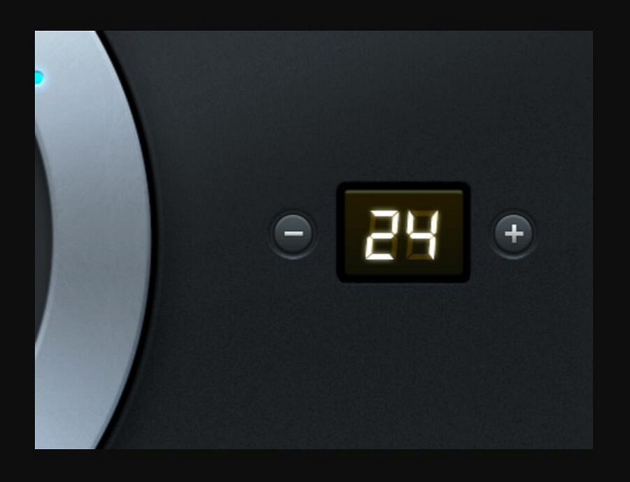
Digital Stepper is a modern and realistic stepper example. The digital style appearance makes it perfect for designers who want to create a sci-fi or realistic website project.
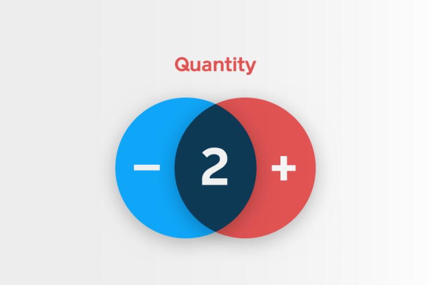
Quantity Steppers are input controls that can help users type the desired quantity of products, members, or users, etc. This quantity stepper example uses rich colors and shapes that can quickly attract users.

Stepper demonstrates a brilliant idea of how to hide the Plus and Minus buttons of stepper control. When users click the number, the Plus and Minus buttons show up, and the user can adjust the number to the desired value. This is a good stepper concept for minimalistic websites or mobile user interfaces.
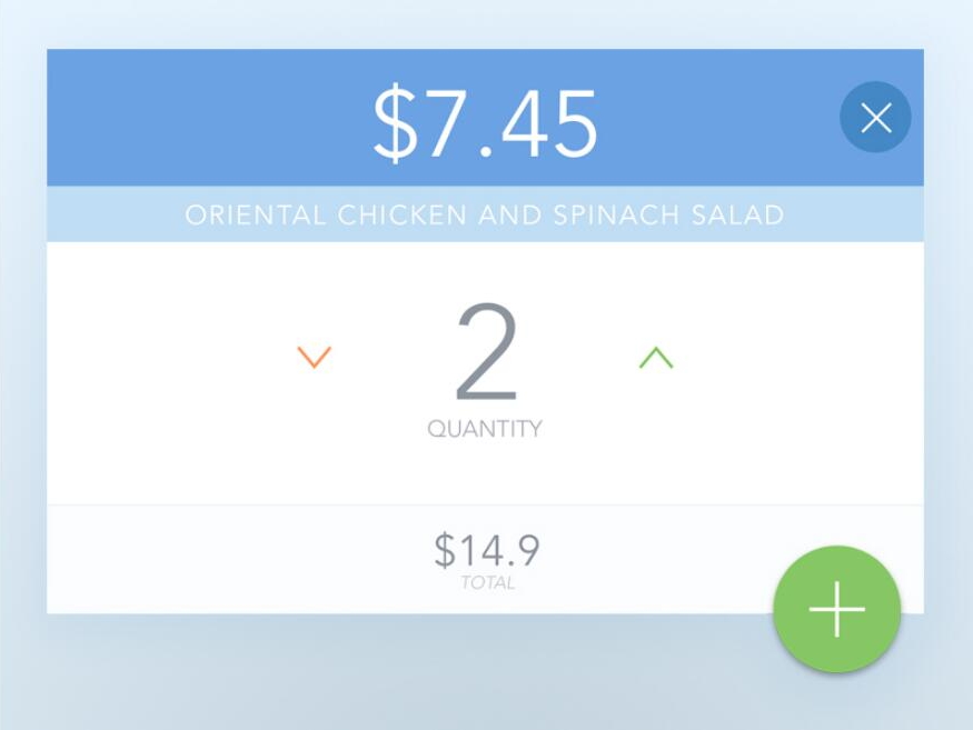
Stepper Popup View is an excellent example of a quantity stepper designed in a popup window. The overall layout and minimalistic style can bring your interfaces to an entirely new level.
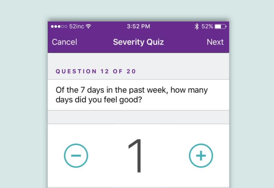
Large Stepper demonstrates another example of how to display a quantity stepper in a popup window. The horizontal and minimalistic design style improves the usability of this control.
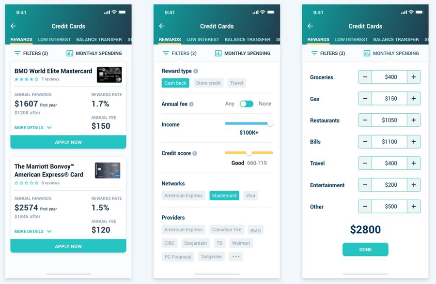
The Credit Card Finder uses a clear stepper list to showcase the credit card data. The horizontal style makes it easy for users to scan and catch the desired data.
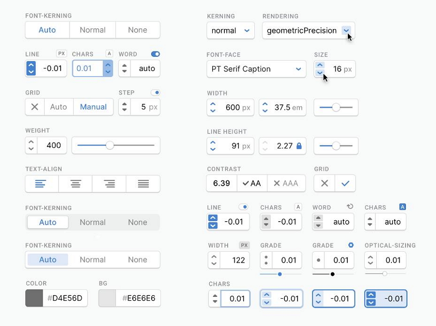
This example gathers a set of UI elements, such as the tab bars, input steppers, alignment bars, and so on. The input steppers allow users to enter numbers with decimal places.
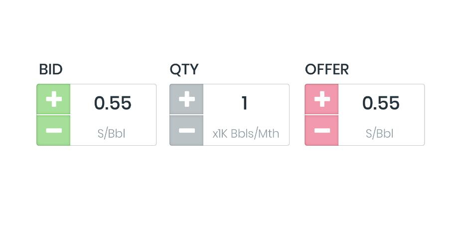
Number Input is a simple stepper example with tickers and descriptive labels. You can also customize the button colors based on your needs.
Input steppers simplify users' data input process and help product owners collect user information more effectively. We hope this article will help you design better input steppers and create the best possible user experience for your customers.
 Mockplus RP
A free prototyping tool to create wireframes or interactive prototypes in minutes.
 Mockplus DT
A free UI design tool to design, animate, collaborate and handoff right in the browser.
