For most website designers, a thank you page is not just a page to express their gratitude to users for what they've done, such as filling a form, making a purchase and registering an account. It also offers a great chance to nurture leads and increase sales.
However, designing a thank you page that really boosts conversions is not easy. That's why we've compiled this article to inspire your own designs in 2022 and beyond.
In this guide, all design details and ideas of thank you page design are included as well as a review of 20 of the best examples and templates to give you inspiration.
When some good ideas hit you, also try to use our prototyping tool to visualize, test and iterate your thank you page ideas on your own or as a team seamlessly online.
Table of Contents
What is a thank you page
Why to use a thank you page
When to use a thank you
How to create a thank you page that converts
30 best thank you page design examples & templates
A thank you page (or confirmation page) is a website page designed to thank users and confirm to them what they did was successful.. It pops out after users complete registration, make a purchase, submit a contact, feedback or survey form or take other actions on a website, giving users instant feedback to show them whether their actions have been successfully accepted.
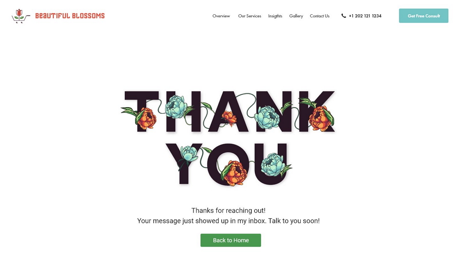
From a thank you page UI design template
A thank you page is mainly used to confirm users' actions and show appreciation to users. Well, for designers, the thank you page design does more than that, bringing many more benefits, including:
guiding users to the next step
introducing your brand or products by adding a video or audio
offering an exclusive bonus and offers to generate leads
showing your brand's personality and creating a strong brand identity
encouraging users to share with other colleagues and friends
adding user reviews and testimonials to increase the web credibility

A thank you page can also create a strong brand identity by using a typical mascot, a humanistic text design or an impressive illustration.
A thank you page is a great way to help you nurture more loyal customers, promote your brands and grow your business, together with the squeeze page and event landing page.
Thank you pages are designed to be different according to different brands, user needs and companies' marketing goals. But, most of the successful thank you pages on the market includes three basic elements:
A personal confirmation and appreciation message
A strong CTA button
A clear instruction on what to do next
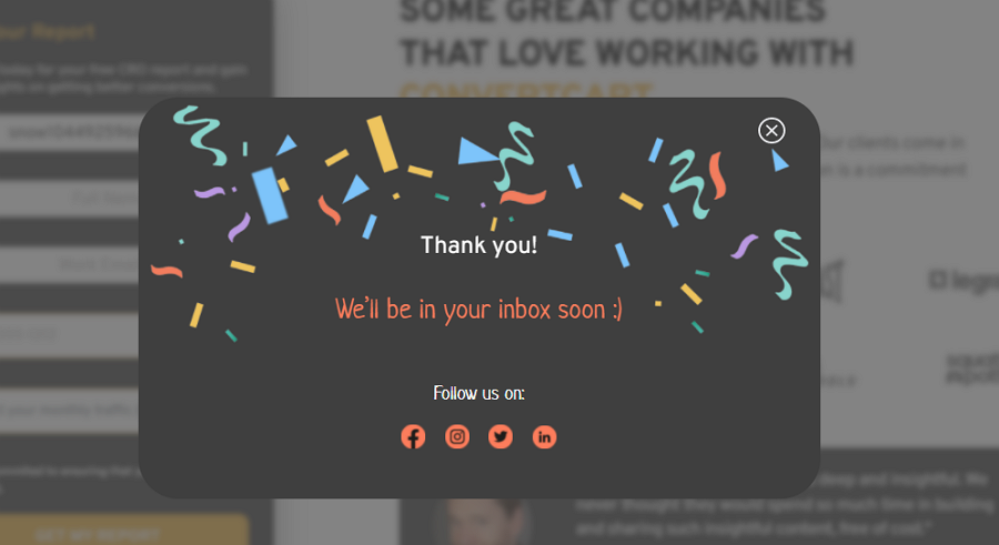
You may also add extra elements to extend the page function, such as:
an exclusive offer to encourage users to sign up or make a purchase
a countdown timer to create a FOMO feel
a brief intro video or audio to draw users' attention
an eye-catching animation or interaction to hook users
social proof, such as reviews and testimonials, to quickly gain user trust
a social media share button to encourage users to share a message about your brand
a free demo to allow users to try your products or services
And any other elements that can help you arouse users' interests and stay on your website for a longer time.
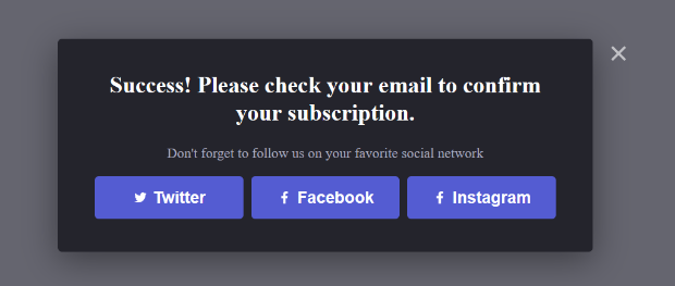
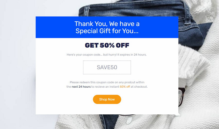
There are many ways that you can use to create a high-converting thank you page, such as a website page builder or directly asking for a professional page design studio and so on, but these can take lots of time and can be expensive. No matter which way you choose to create yours, select the right design tool to visualize your ideas and iterate them to the best version.
For instance, you can choose Mockplus - an all-in-one website design collaboration tool - to bring your ideas to life, iterate, collaborate and hand off with your team in one place.
Whether you are using Sketch, Adobe XD, Adobe Photoshop, Axure or Figma, import your thank you page designs, discuss details and even share with developers through a single share link. Of course, you may also prototype your thank you page completely with its built-in collaborative prototyping tool with easy drag-and-drop of some of the hundreds of built-in components.
Everything you need is connected in one shareable platform.
And now, let's take a look at 30 of the best thank you page design examples and templates for your inspiration:
Features:
Minimal look
Gradient colors help the CTA button stand out effectively
Simple navigation bar and social media buttons
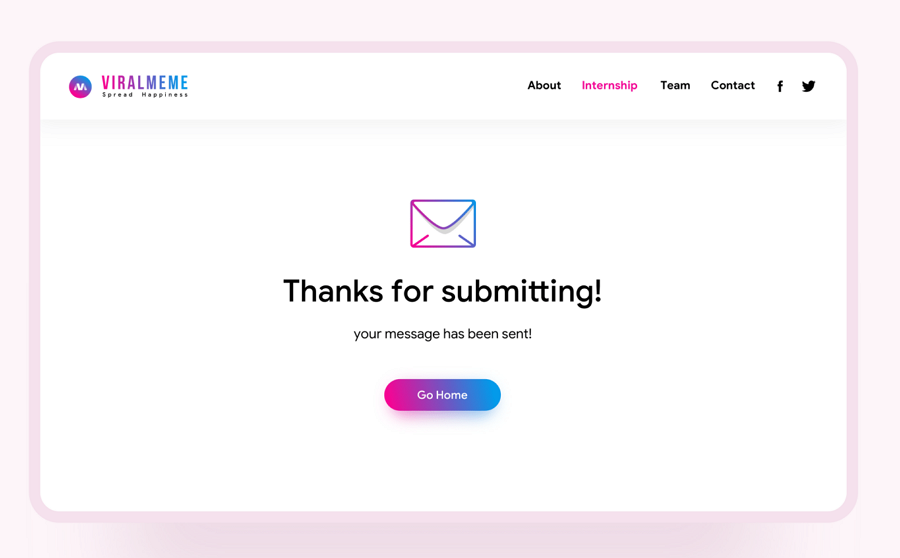
The first example is a typical thank you landing page shared by Gerns Fine on Dribbble. It is presented to tell users that their message has been sent successfully when their message has been submitted. It's simple navigation bar on the top-right corner helps users quickly jump to other web pages. The social media buttons on the side also let visitors share the company with their friends and colleagues.
The gradient colors also draw users' attention to the CTA button, encouraging them to go to the website’s home page, instead of just jumping out the website.
Features:
Bold and bright color schemes
Custom illustrations
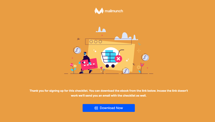
This thank you page example of Mailmunch (that generates leads and email marketing services) is shown after signing up for its recommended checklist. Even though this example has only a few design elements, such as the CTA button, brand logo and confirmation message, its bold and bright color schemes grasp users' attention immediately. The custom illustrations also create a unique visual experience, hooking users in to read the message and download the checklist as the message recommends.
What can you learn from this:
No matter which type of websites you are designing, always add more eye-catching colors and visuals to hook users, especially if you are using a minimal design scheme.
Features:
Encouraging headline and emojis
Popup example slider
New book recommendation and preview
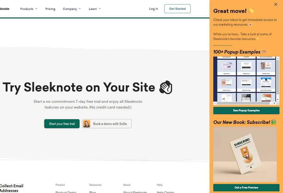
As the above image shows, this thank you page popup design is from a popup building website, Sleeknote. It pops up when users subscribe to its blog newsletter. Even without words like "Thank you", its headline and confirmation page shows appreciation and clearly tells users what they should do next.
Apart from general appreciation and guidance, there is also an example slider and a book recommendation section to encourage users to check out more resources on their website.
What can you learn from this:
Add more sections to introduce your website services or resources on your thank you page, keeping users hooked into your services.
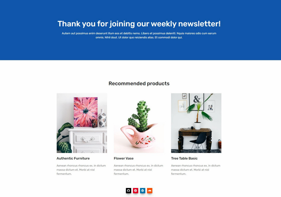
Features:
Bold welcoming headline
Product recommendations
This thank you page design for a furniture website uses a card-format slider to recommend hot products to encourage users to make a purchase, giving users something to see before leaving the page.
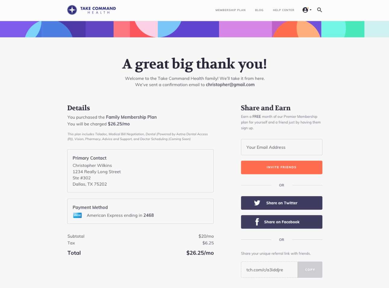
Features:
Humanistic headline
Detailed payment info
Free offer
Share buttons
Take command is the most complete thank you example of this list. It shows up when users have created a new account. It features humanistic message designs, using phrases like "a great big thank you" and "Welcome to the Take Command Health Family" to successfully make customers feel close to the brand.
Apart from the detailed order information, there is also a free exclusive offer to encourage users to share the tool with their friends.
What can you learn from this:
If you want to generate more leads with your thank you page, provide users with a free or exclusive offer to encourage users to invite their friends or colleagues to sign up or complete do other actions.
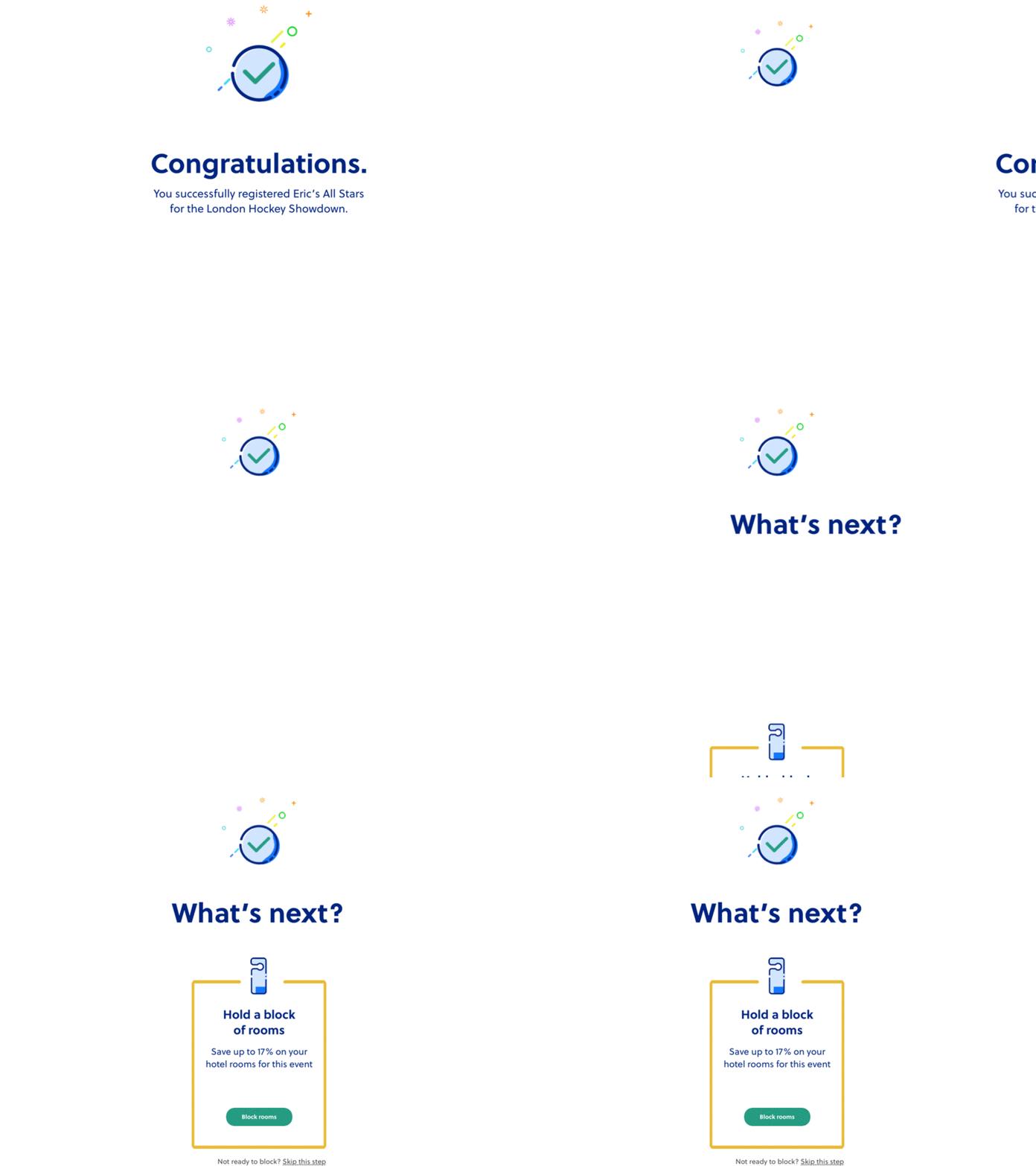
Features:
Offer the confirmation and guidance messages separately
Allow users to skip this
Unlike the other thank you page with all the guidance and confirmation messages presented on the same page, this design example for a tournament platform shows similar content on two screens. When a user has completed the registration process, a congratulatory message would show to confirm their registration. The guide on what to do next would slide out to introduce up to 17% off discount.
If users are not interested, they can also easily skip this step.
What can you learn from this:
Allow users to skip the thank you page or other information
Animate your thank you page to spice up your design
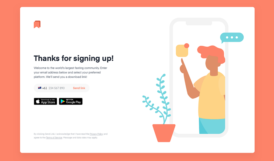
Features:
Guide users to download the mobile app
Send users the download link through mobile phone
This is a simple thank you screen design presented after users have created an account. Apart from the common confirmation and appreciation words, this example offers instructions to guide users to download the company’s mobile app. If they don't want to download it directly on the website, they can choose to type in their phone number and receive a link sent directly to their phone.
An inspiring example that you should check if you are designing a mobile app project.
Features:
Show order details clearly
Clear visual hierarchy
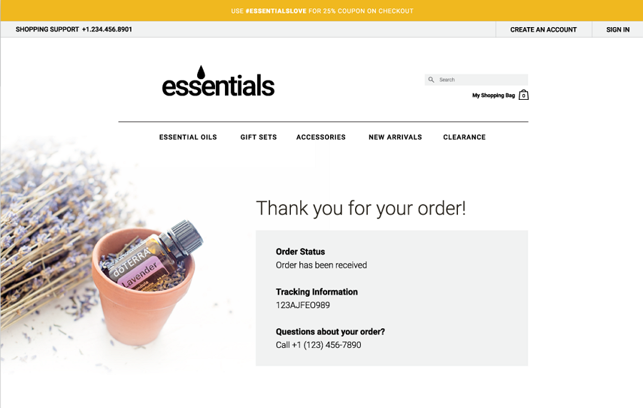
How can you design a thank you page when users have successfully made a purchase on your website? Don't worry! This thank you page example shows you exactly how. It adopts a big headline to show appreciation to customers and also presents all order details for users to track. Even if users have any questions about their order, they can still dial the shown phone call number to get instant help. Simple and very effective.
Features:
Unique illustration
Simple navigation
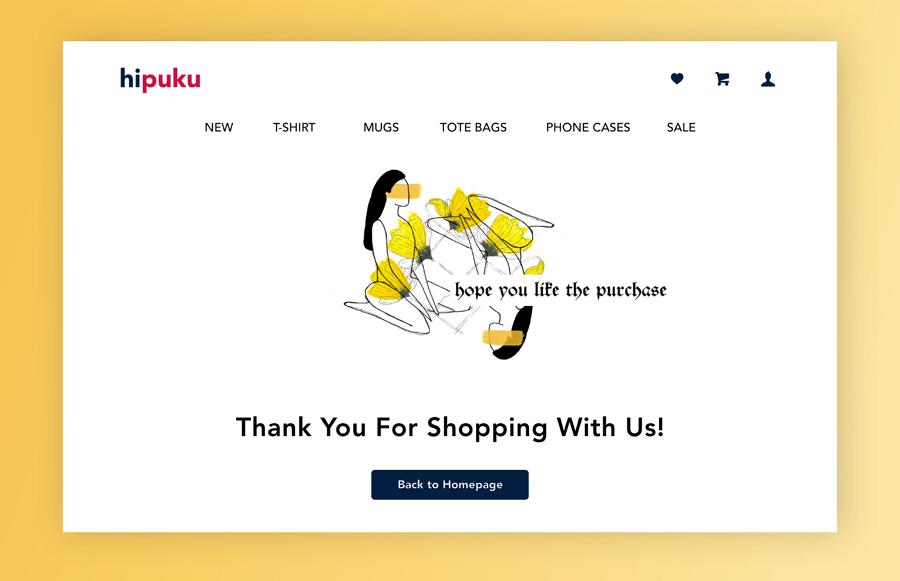
This minimal thank you page example offers another design idea to show appreciation after a user purchase. Its unique illustrations grasp users' attention quickly. The top navigation design and other icon buttons enrich the user experience there.
Features:
Two-column layout
Elegant appreciation and confirmation letter
Extra rewards and gifs
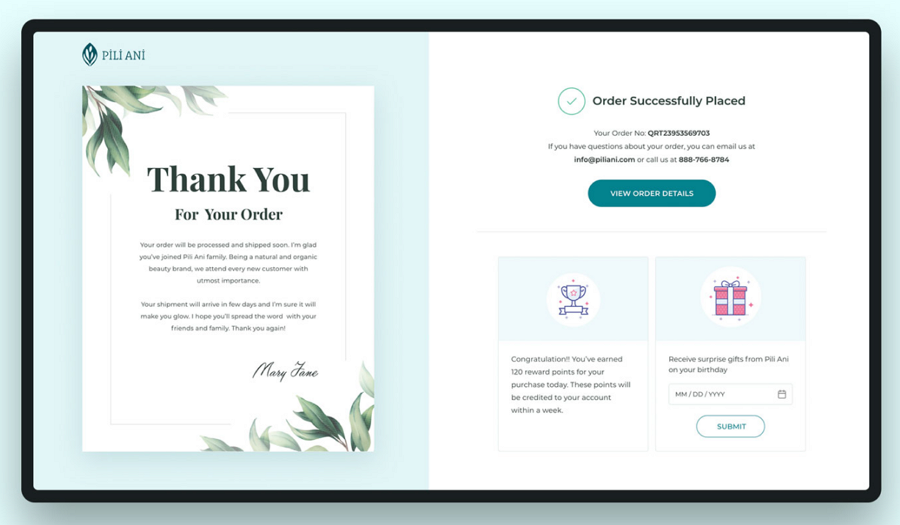
This example is an elegant thank you page designed for an ecommerce cosmetic brand. It features a two-column layout, showing all content in two different sections. The left section presents a letter-style confirmation message, showing gratitude and guidance clearly in a very elegant manner. The right section, apart from the order information, shows the extra reward points and a gif bonus that helps educate more loyal customers.
What can you learn from this:
If you also want to educate more loyal customers through the thank you page, remember users' birthdays and try to send them a birthday gift. You can also craft a reward point system to encourage users to complete more actions on your website.
Features:
Two-column layout
Elegant fonts
Exclusive offer
Social media buttons
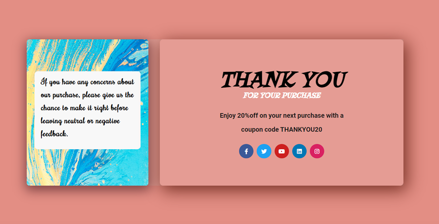
This thank you example is shown when users have successfully made a purchase. The two-column layout divides the page into two sections, creating a high-quality and effective page design.
Features:
Eye-catching animations
Dribbble-theme design
Minimal design
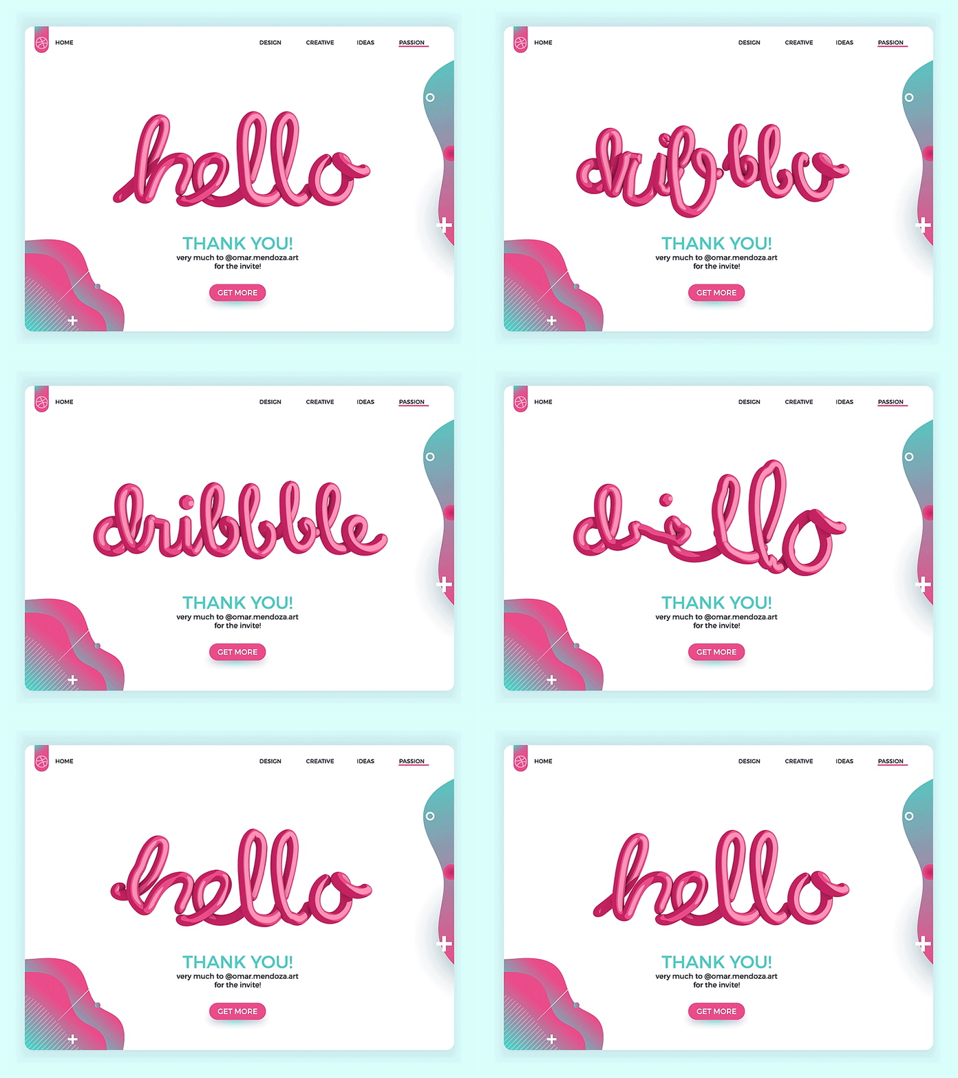
This page example is designed to thank users for signing up to the Dribbble community. It features an eye-catching 3D animation. The dribbble-themed logos, decorations and colors also make people think of Dribbble naturally.
What can you learn from this:
Animate your thank you page to hook users
Use consistent brand visuals to arise the brand awareness of your users
Features:
Brilliant visual mix
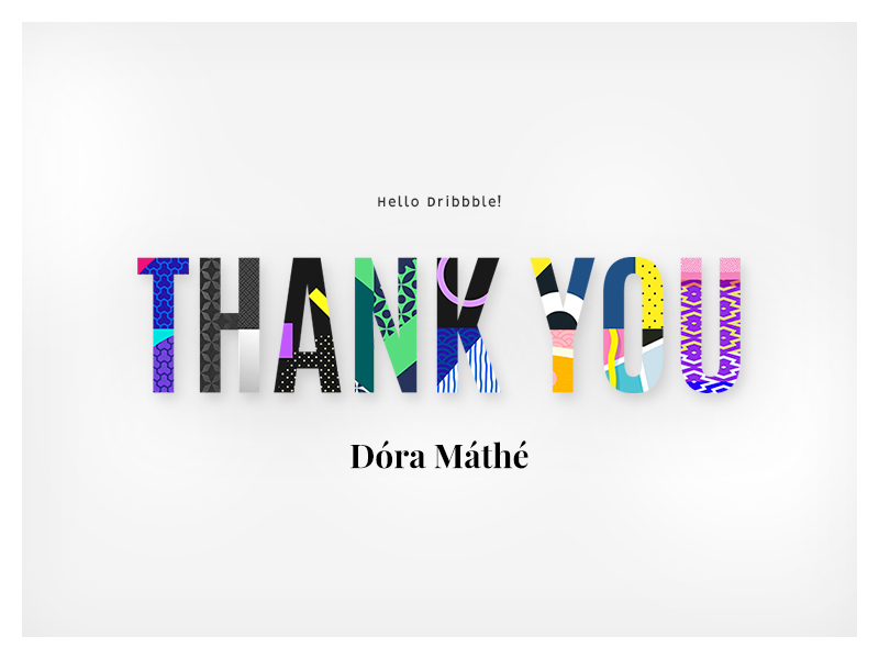
Another Dribbble thank you design example is presented when users join the Dribbble community. It covers only a few elements and has an extremely impressive font type that mixes different textures and colors together to create a unique visual appeal. Modern and impressive.
Features:
A transparent popup design
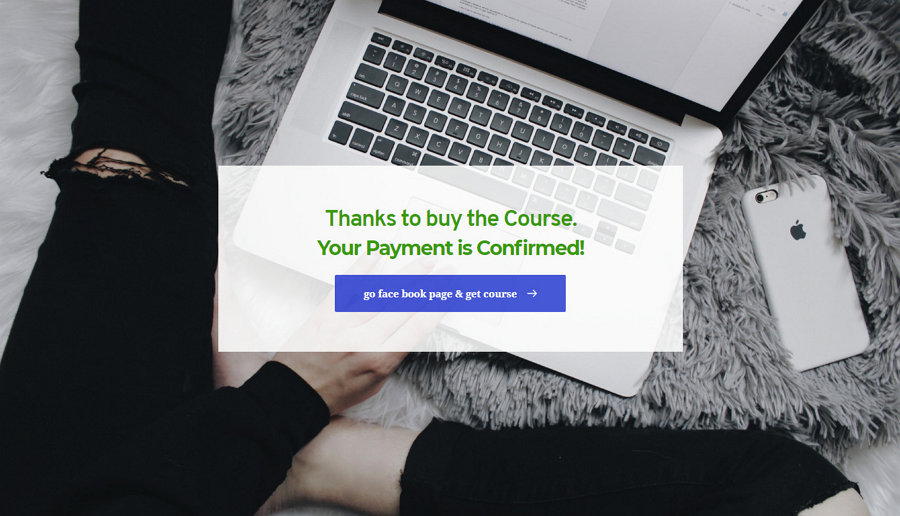
Semi-transparent layer design is really trendy in both website and mobile app UI design. This thank you page adopts that trend and uses a transparent popup to make the thank you message stand out from the main page, helping add visual depth to this website. The hero background image on the main page also enriches the page content, making it more attractive to users.
What can you learn from this:
Add a semi-transparent layer or popup to impress users
You may also add a different color to your transparent layer or popup, so your thank you page content stands out from the main page content.
Features:
Inspiring appreciation messages
Allow users to leave a comment and like the page
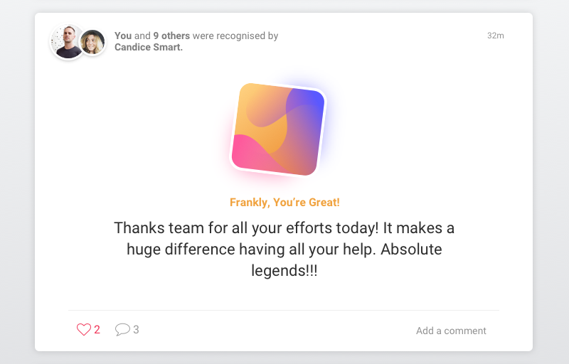
This is a thank page concept designed for an employee recognition app. To encourage users to interact with the website page, there is a Like button and an Add a comment button to add feedback. The appreciation message is also warm and inspiring, helping to gain users' trust and favor.
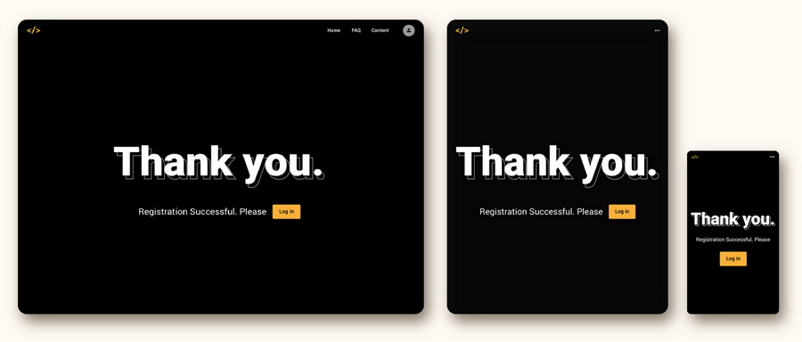
Features:
Responsive design
Dark-theme design
Most users check or view product or price information through mobile devices. So, if you are designing a thank you page for your website projects, you may spare some time considering responsive design that adapts to both desktop and mobile devices.
This page gives a perfect example of how to design your thank you page with different screen sizes, like a common website size, a tablet size and a mobile phone size. The dark-theme color schemes are also very popular in UI/XU design and give you more dark theme ideas.
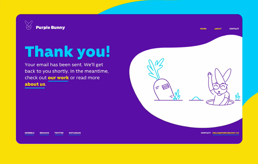
Price: Free
Features:
Bright color schemes
Cute animated illustrations
This free website template shared by a digital innovation design studio, Purple Bunny, offers every one three website page screens, including a thank you page and two error pages. It has a bright blue, yellow and white color scheme that catches users' eyes quickly. The animated rabbit illustrations are cute and interesting, adding great interest to this free template package.
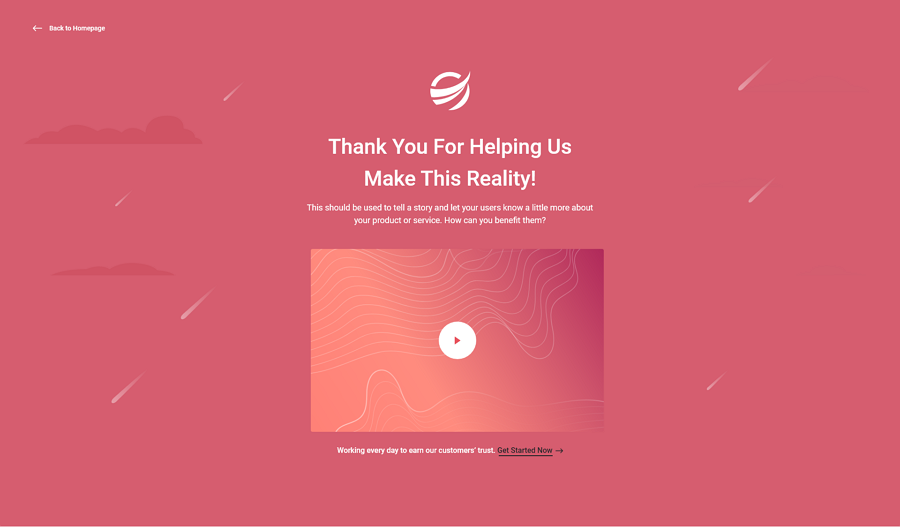
Price: $8
Format: Adobe XD
Features:
Embed a video to tell your story
A logo element to promote your brand
Fully editable
LeLand is an isometric business landing page template for users to promote any products and service over the internet. It also includes a thank you page, allowing you to directly embed a short video to tell your brand or product stories. All elements are also fully editable and well-layered.
A good thank you page is not only an effective way for designers or website owners to show their appreciation and confirm users' actions. It also brings many more benefits, such as guiding users on what to do next, sharing an exclusive offer or offering free resources and helps increase website engagement, giving your website another huge potentially impactful way of increasing your website’s values and sales.
We hope these thank you page examples, templates and ideas would give you the inspiration to create your own with ease.
 Mockplus RP
A free prototyping tool to create wireframes or interactive prototypes in minutes.
 Mockplus DT
A free UI design tool to design, animate, collaborate and handoff right in the browser.
