The number of mobile phone users in the world is expected to pass the five billion mark by 2019. This makes mobile an extremely valuable medium for app developers. At the same time, numerous myths still surround mobile app development which prevents mobile teams from creating excellent user experience.
In this article, we’ll review 9 myths of mobile app design & development.
When thinking of mobile users, many of us have a stereotypical image of a person who always rushed. Yes, there are times when this might be true; for example, when we’re going to the work and play with our phones while waiting for the train. But it might be incorrect to assume that most of interactions with mobile apps happen in such circumstances.
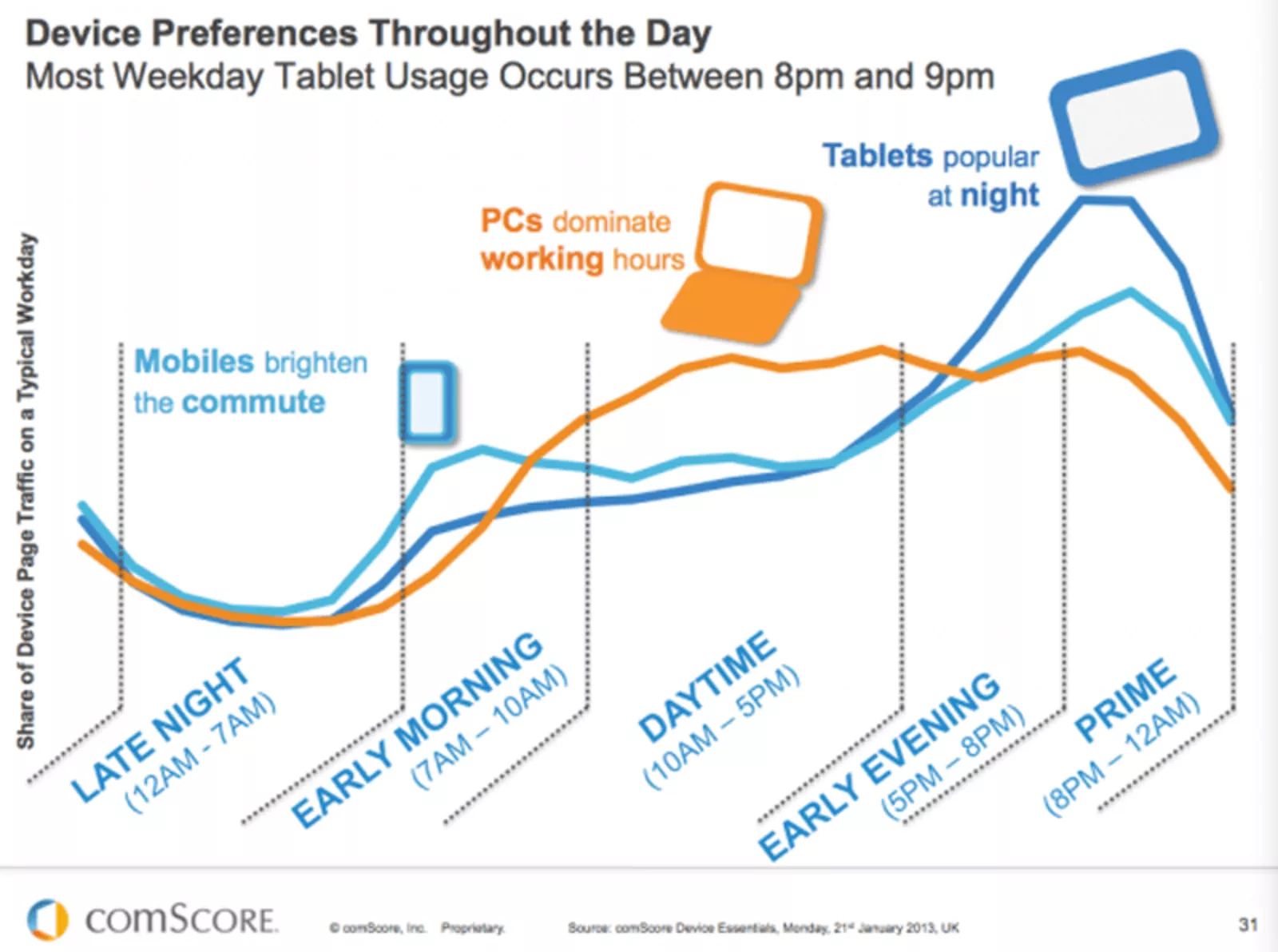
In 2012 Google conducted a multi-screen word study and found that 60% of mobile phone usage takes place at home. According to another study from comScore, peak hours of mobile usage are from 6:00 pm till 10:00 pm. So instead of thinking of mobile users as people running to catch the train with their mobile phones, should we should think of people who use mobile apps mostly at home? No. We should analyse our target audience behaviour to understand how users prefer to interact with our apps and design our products to satisfy the needs.

Peak of mobile usage is from 6:00 pm till 10:00 pm. Image source: comScore
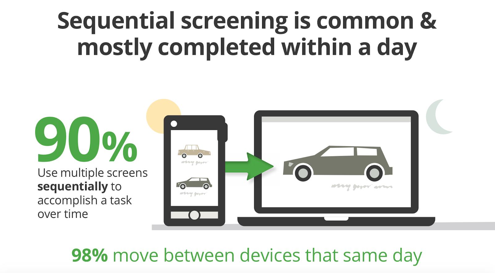
Many developers believe that mobile apps are stand-alone experiences and don’t need to be integrated with other channels. But in fact, mobile is just part of a bigger picture in which other types of devices (desktops, tablets, smartwatches, etc.) are mediums through which the experience is delivered. Users should be able to switch to a different medium and continue the journey.
Here is just one example. According to Appticles, 37% of users do research on mobile but switch to desktop to complete a purchase. Thus, if you’re designing an e-commerce app, mobile users should be able to switch to their desktop or laptop to continue the journey.

When it comes to creating a user journey, the ultimate goal is to create a seamless experience across all devices. Image: Google
It’s important not to think of your mobile app as an isolated experience. Synchronization of user progress across devices is a key priority for creating a seamless experience. It makes users feel that their workflow isn’t interrupted.
One of the first things app developers do even before beginning app development is choosing what type of the app they want to build — whether it’ll be a hybrid or a native mobile app. The difference between two types is really significant — as the name suggests, native apps are mobile apps designed specifically for the mobile platform (Android or iOS), while hybrid apps are web-based apps that basically web services that users run in their browser.
Many developers believe that native apps are always better in terms of delivering optimal user experience. Typical arguments are speed (developers believe that native apps are faster than hybrid apps) and supported features (native apps provide access to advanced features). In reality, modern hybrid apps can demonstrate excellent performance, they allow creating powerful mobile apps. Hybrid apps don’t require product team to spend extra time on building a separate app for each mobile platform. Thus, when it comes to selecting native vs. hybrid app, it’s crucial to weigh pros and cons of both approaches and choose the one that better fits product strategy.
While this myth is less popular today, still many product teams believe that they should put the most important content ‘above the fold.’ In reality, the fold doesn’t exist anymore.People do scroll, and they do it naturally. And when it comes to mobile, mobile users are total scrollers — scrolling is second the most popular interaction after the taping.

People start scrolling almost immediately upon landing on a mobile page. Image: getaloadageo
In the US and Europe, users are accustomed to ubiquitous connectivity. But that certainly isn’t true worldwide. Products in emerging markets have to be able to perform over slow or intermittent connectivity. If you plan to design for such market, make sure your product works when it isn’t connected to the Internet at all (allow caching of data) and optimize your product for fast loading (minimize page size by keeping images and other weighty content to a minimum).
Many product teams believe that it’s possible to skip wireframing/prototyping phase and jump straight to coding. While this saves time in short-term perspective, it often leads to significant problems down the road. Mobile app development is a complex activity which requires focussing on different aspects of design - information architecture, visual design, interaction design, etc.
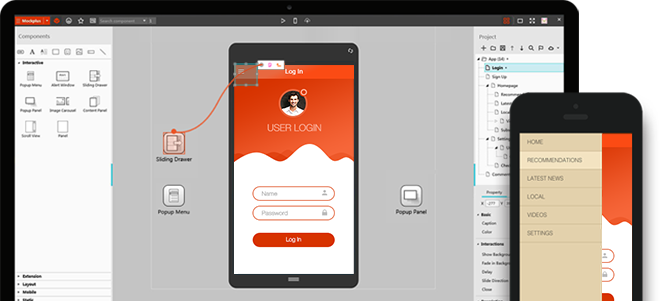
It’s almost impossible to consider all possible product requirements without prototyping. You need to have a tangible design to play with it and to understand how it works. This happens only when you focus on prototyping your solutions. Thus, create prototypes, have users test them, and iterate the design until it’s good enough. Mockplus will help you prototype faster and smarter.

Prototyping in Mockplus
When it comes to mobile experience, it’s clear that this experience might be different from the one we have on our desktops. Designing for mobile has certain restrictions, mainly because of screen real estate limitations. Designers should strive to reduce the complexity of interaction with a product and create a more focused experience. But this doesn’t mean that this should be achieved by removing some parts of the product. It is absolutely incorrect to assume that mobile users need fewer features simply because they use a product on mobile. The number of features depends on the nature of your product. It’s crucial to analyze user interactions to figure out what features our users really need.
More features = more value for users is a very dangerous misconception. Putting too many features in your product not only increases the time-to-market, it also affects user experience. It’s hard to deliver plenty of complexity without compromising the user experience. When an app tries to be a swiss knife (do “everything for everyone”), it usually ends up being overly complicated and completely unusable. In the field of UX design, we have a special term for such cases —feature creep. It’s possible to prevent feature creep by doing user research. User research helps you to distinguish between users needs and wants, and helps you better prioritise feature requests.
Testing is a time-consuming activity, and it might be tempting to postpone it until the time when your app will be available for the real users. Make no mistake: You cannot afford to not test products. it’s very dangerous to assume that users will be happy to test your app and report all issues. First, users will be frustrated by a negative experience, and this will increase bounce rate. Second, it’ll be hard to rework some parts of your product because it’ll require design and development effort. It’s much better to start testing as soon as you got a first interactive prototype.
When it comes to mobile, it’s vital to think about the overall user experience and design for your users. Don't let myths confuse you!
 Mockplus RP
A free prototyping tool to create wireframes or interactive prototypes in minutes.
 Mockplus DT
A free UI design tool to design, animate, collaborate and handoff right in the browser.
