Interaction design (IxD) is one of the most basic but most important skills for designers in the industry today. A designer who can't get an accurate handle on interaction design—what it is and how it works—will quickly find it increasingly difficult to create the sort of digital products that will connect with and benefits their users.
This article aims to provide a good starting point both for newcomers and for people interested in learning more about interaction design. A full range of issues will be presented, such as the definition of interaction design, guiding principles, job descriptions of interaction designers, and more. This should bring you up to speed with this fascinating area of design.
Table of contents:
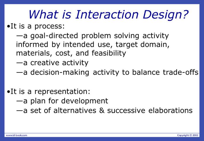
Put simply, interaction design is the design that facilitates interactions between users and digital products such as websites and apps. Sometimes, the interaction only involves the design itself, but at other sides it includes related elements that help users achieve their goals such as aesthetics, motion, sound, space, and many more.
According to Wikipedia, "Common topics of interaction design include design, human–computer interaction, and software development." In this context, the purpose of interaction design is to create a product that is easy to use thanks to simple operations such as clicking, sliding, etc.
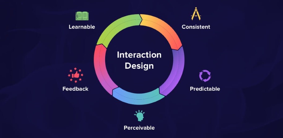
It should be clear that interaction design overlaps to some extent with the area of user experience. I will explain the difference between the two in Part 3 below.
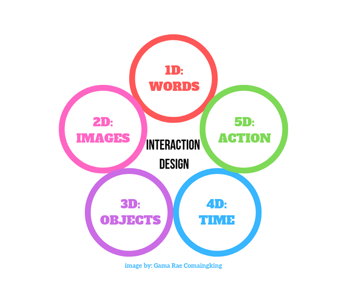
In Designing Interactions, Crampton Smith first introduced the idea of interaction design with four dimensions: words; visual presentation; physical objects or space; and time. Later, Silver later added the fifth dimension, behavior.
Words covers the direct communication with users. This happens by conveying useful information that should be clear and concise.
Visual presentation includes UI elements such as images, typography, and icons, etc. These supplement what is communicated with words.
Physical objects or space usually means the actual device or environment that users interact with. This could be a smartphone or laptop, and the environment can vary depending on where the user is.
Time is a dimension that used to measure how long the users spent interacting with the interface through words and animation, or any progress they made through their interaction.
The last dimension, Behavior, refers to the ways in which users respond to a product, based on the previous four dimensions. Studying users' different reactions enables programmers to create better interactions for them.
Interaction designers create the design strategy and, with it, the interactions between the product or service and its users. Their work includes defining the interactions, creating prototypes, and tracking the latest design trends that may benefit or affect users, etc.
The role of an interaction designer is more like that of a philosopher in that they have to keep lots of questions in mind when creating design interactions.
In Interaction Design Basics, usability.gov divided these questions into six categories to be considered when designing interactions:
If you starting to think like this and ask questions like these, the you are already well on the way to understanding what an interaction designer does and how they work.
Interaction designers define the design strategy, before it is developed according to the goals agreed for the product or service. To get the strategy right, the interaction designers need to conduct user research as this tells them what goals the users have in using the product. This information is then combined with the questions listed by Usability to come up with an interaction strategy.
Wireframes and prototypes are important concrete steps in the process of developing a digital product. For most interaction designers, one of the most important jobs is to create wireframes and prototypes. With free quick wireframe and prototyping tools, interaction designers can present the strategy, reflecting their thinking intuitively, even without the help of programmers.
"Experience is critical, for it determines how fondly people remember their interactions". —Don Norman in The Design of Everyday Things.
Interaction design principles are the most important guidelines for designers who are creating complex interactions between products, devices, and users. Don Norman defines human-centered design and applies universal and practical interaction design principles to the process of designing digital products.
Good interaction design provides appropriate and easily visible information for users. This information needs to communicate to the users in the easiest way possible what the product or service is and how to use it.
Consistency involves creating a UI surface with similar operations and elements applied to similar tasks. That saves users from having to learn new rules and operations each time. It reduces the chances of users making mistakes. For example, the design of how the mouse clicking works needs to be consistent so that a left-click is always for selecting an item, and the right-click for calling out a menu.
Each time a user interacts with the UI interface of a digital product, the user needs a reaction from the system to indicate that the action has been noted, for example, a sound, an animation, or a transition. This is called a feedback. Clear feedback gives both users and the product a signal that the product or the service is working and that the user is being taken to the next step.
Feedback gives users a signal of what is happening now. Constraints give the user a range of the limits of interaction possibilities. This simplifies the interface and guides the user to move to the next step in an appropriate way. For example, footer navigation is a constraint that informs the user that they have reached the end of the page and cannot scroll down any further.
Besides the four principles listed above, there are more clear and basic interaction design principles that achieve good UX and interaction design.
When it comes to interaction design methods, there are plenty to choose from. The methods most commonly recommended are given by usability.gov and include use cases, card sorting, and prototyping.
A use case is a description of how users act on your website. They enable you to collect data on how users perform, and how many different types of interaction there are with your product or service.
What should be included in a use case:
What should not be included in a use case:
Card sorting is a method for building an information system for your website or product. This step enables you to learn what users want and how much they understand your design.
What you will get by card sorting:
Prototyping is not just part of the interaction designer's job, it but also an important method for creating great interaction design. Through prototyping design, what you conceived in your brainstorm comes to life as you create the layout for the whole foundation and structure of your product.
Should you create a low- or high-fidelity prototype? That depends. If you don't know the difference, take a look at low-fidelity & high-fidelity prototyping.
These three are the most commonly used methods. But here are five further interaction design processes as described by Allen Cooper in About Face:
Whatever form you use, such as a questionnaire or an interview, the purpose of qualitative research is to find out the five elements of interaction design: activities, attitudes, aptitudes, motivations, and skills.
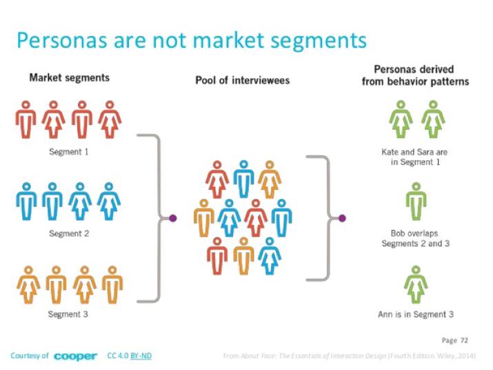
Generally, the persona contains the basic information about the user. Analyzing the persona helps interaction designers learn more about their users and the specific situation around their use of the product, such as their family, working conditions, living environment, etc. Normally, three to six user roles are designed to represent the whole group of real users.
Based on an understanding of the persona and two particular dimensions of the scenario—the problem scenario and the action scenario—interaction designers can visualize and connect problems that users may encounter during their use of the product.
Creating a question list to produce detailed analysis of how users interact with the product is the key feature of scenario. It allows interaction designers to prepare a preplan to mock up and hand off possible difficulties that users might experience when using the product or service.
Once this process has been undertaken effectively, you can make an evaluation for your prototype. Heuristic evaluation is a commonly used evaluation method which follows the standard of Nielsen Heuristic.
Here are ten Nielsen Heuristic rules:
1. Visibility of system status
2. Match between system and the real world
3. User control and freedom
4. Consistency and standards
5. Error prevention
6. Recognition rather than recall
7. Flexibility and efficiency of use
8. Aesthetic and minimalist design
9. Help users recognize, diagnose, and recover from errors
10. Help and documentation
With Heuristic evaluation, a designer can list the problems users encounter, associate each with the corresponding rule, and from this calculate a rate on the following scale:
It is important to to modify the wireframe and prototype after evaluation.
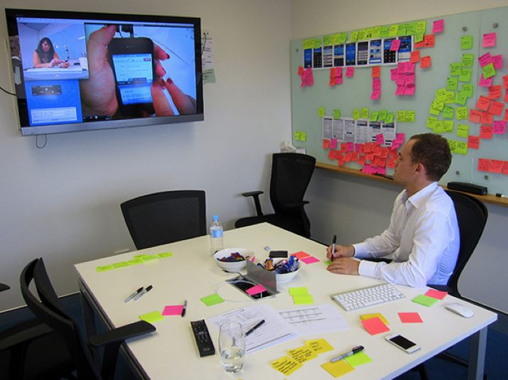
For this stage, you should find some typical users to test the prototype after going through the expert evaluation. Those users should each be assigned a special task to address; this will assist in achieving precise evaluation. Any problems encountered in this process should be recorded and given a score for the final judgement.
Important point to note:
In the world of design, some terms, such as UX vs UI, are often confused or poorly understood by people. Here we will only focus on the difference between user experience and interaction design.
User experience involves the whole spectrum of feelings and emotions that a user goes through while using a product. Understanding UX requires the designer to take into consideration a much broader scope than the simple traditional idea of ‘usability to obtain.’ Normally, UX can be assessed according to several elements:
1. Usability which is necessary but not the only thing that matters.
2. Good points of interest and things that attract or appeal to the user of a service.
3. Concise instructions and specifications that make it easy for the user to understand and use the product.
4. The real value and experience that a user gains throughout their time using the product
5. The satisfaction and good interaction that the user gets from the product or service in their daily life and which they then communicate to others.
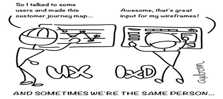
Interaction design is associated more with the way a user uses or interacts with a product and the method of how to go about designing the process involved in that interaction. The interaction designer is the person who need to focus on how this happens.
1. Mockplus can help you master prototype design, enabling you to present your ideas intuitively.
2. Interaction design involves a lot of work if you want to get it right: customer research, extensive testing, field studies, feedback review, etc.
I have made a list of the 26 Best Interactive Design Examples to Inspire Designers in 2019. So, here I will list some examples of bad interaction design for you to learn by comparing the good with the bad. Studying how people have got things wrong can be just as powerful a way to improve your own skills.
1) Yale University School of Art - Illogical Layout

Look at the picture: the layout of texts, animations, and colors is illogical. This website—Yale University School of Art—goes against the principle of visibility and normal aesthetics. The colorful elements and repeated animation just make users tired. There is little to attract uses or encourage them to stay on the site.
2) MGBD Parts & Services - Hard to Find Navigation Option

The problem of this site is that the navigation options are actually very hard to find. Text overlays the pictures, giving a very untidy look. A user is lost when trying to get any useful information.
3)Arngren- Overloaded information
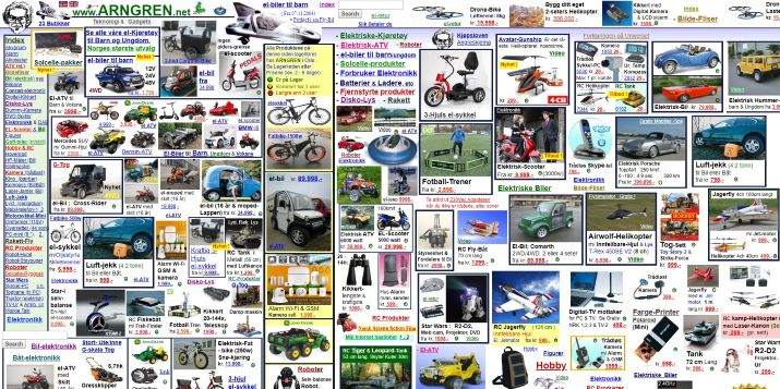
A choking design, not only in terms of its interaction design, but also the user experience and user interface design. Information floods the page so that it actually fails to deliver effective product information to users. By trying to convey a lot of information it ends up conveying almost nothing at all!
4)Blinkee website – Over animated

Blinkee is a website selling glowing and blinking products. So, the designer has tried to represent this by presenting blinking elements everywhere, including the website's title and the products themselves. But with everything sparkling and animated in bright colors, the user is left with tired eyes and a strong urge to just run away.
5) Mrbottles - Random interaction
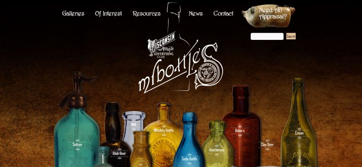
Here the bottles and texts shake so much you are left feeling quite dizzy. The designs and descriptions of the bottles on the site seem random, giving the site an unprofessional look.
To answer this question, you need to learn the product development process:
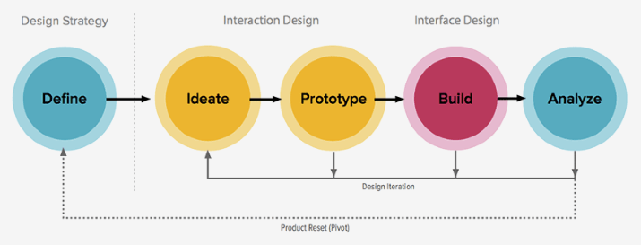
This image demonstrates clearly that interaction design comes first when defining the design strategy and product features. Visual design comes next for what we call the UI design.
Salary research websites like as Payscale, Glassdoor, etc. should give you an idea of what you can expect. Payscale suggests that an average salary for an interaction designer in the US was around $79,385 in 2019. The more experienced you are, the more you can hope to earn.
Interaction design has become more important than ever as digital product development has evolved rapidly. Interaction designers need to keep learning to meet the changing requirements set by users and clients.
We hope this article will have given you an idea of what interaction design is and how it works.
 Mockplus RP
A free prototyping tool to create wireframes or interactive prototypes in minutes.
 Mockplus DT
A free UI design tool to design, animate, collaborate and handoff right in the browser.
