Animation in user interfaces has become very trendy in recent years. A good web/app animation not only attracts far more users, but also provides a much more enjoyable user experience, resulting in higher retention rates.
If you are looking for some good examples to boost your creativity, check out this collection of 35 latest and most creative UI animation designs for Android and iOS apps.
Designer: Ruohan
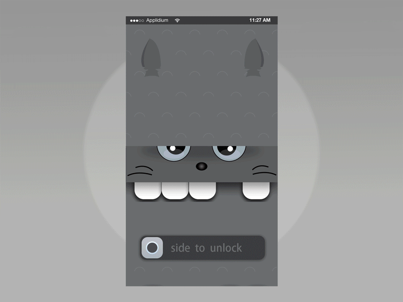
Highlights: Cute theme, smooth sliding button animation and icon buttons with text labels
This app animation example features a cute Totoro theme inspired by the famous Japanese anime film - My Neighbor Totoro. The smooth sliding button animation and the set of Totoro-themed icon buttons make the app irresistible to the fans of the Japanese film.
But, even if you are not a fan of the film, you’ll easily get caught up in Totoro’s cute smile. Plus, the sliding button animation is simply irresistible!
Here’s a tip:
Choose a special theme or tell a story when designing your UI animation
Take inspiration from a well-known film, novel, TV show, or festival, and weave the story around it. This way, catching the users’ attention becomes a piece of cake.
Designer: Cuberto
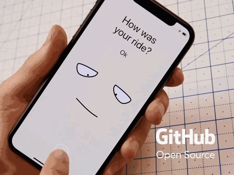
Highlights: Creative emoji animations and interactions
Unlike common mobile apps which uses a table or form design to gather feedback, this ride app uses creative emoji animations and interactions instead.
When you choose different answers for the question "How was your ride?", the emoji animations will vary correspondingly. The background colors will also change at the same time.
This design cannot only stimulate users'emotions to choose a better answer, and it also impresses users easily, building a brand image in the users’ mind quickly.
The brief-stroke design style also makes the emoji animations more vivid and engaging.
Here’s a tip:
Emoji animations can make your app UIs stand out easily.
When you find yourself stumped, try using emoji animations. Who knows? The simplest design (like this one) may turn out to be the best design, right?
Designer: Aaron lker
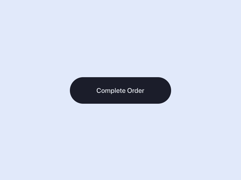
Highlights: Excellent confirmation button animation
This order confirmation button uses vivid animations to give users visual feedback: "Your order has been successfully accepted and confirmed". In comparison with a static button, such an animated button design enhances the main action of the button and lets users know what's happening.
Here's a tip:
Add a vivid button animation to enhance the primary button’s action
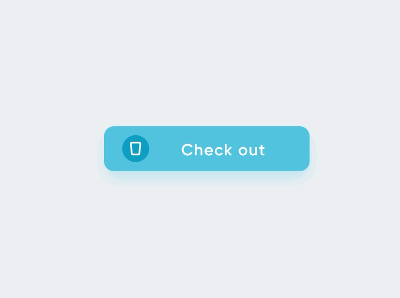
Designer: Hoang Nguyen
Highlights: Perfect button design combined with a progress bar
This is another animated button design example that is combined with a progress bar. With this design, users are always informed of what’s happening, receiving instant feedback about the delivery status.
Some designers think that if it can be designed with a number label to indicate the percentage progress of the delivery process, it would be more intuitive for users. How about your thoughts on this?
Here’s a tip:
Combine your buttons with other design elements, such as a progress bar, different button states, different dynamic effects and more
Related article: Mobile APP Design: 7 Best Tips of Android Button Design
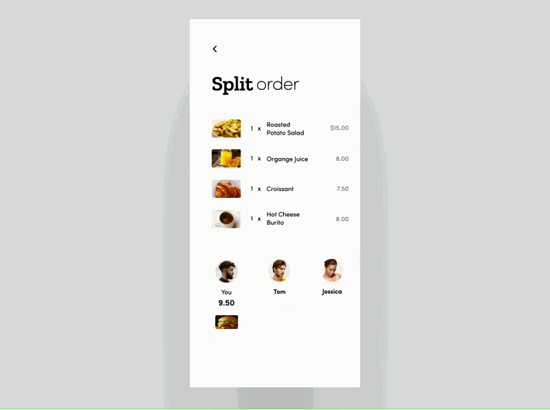
Designer: Den Klenkov
Highlights: Easy drag-and-drop animation
This is a split pay App, which allows users to split the check after having dinner with friends in a restaurant. It uses an easy drag-and-drop animation to split the orders. It is minimal, clean and easy to use.
If you are working on a food delivery app, this animation design is a good springboard.
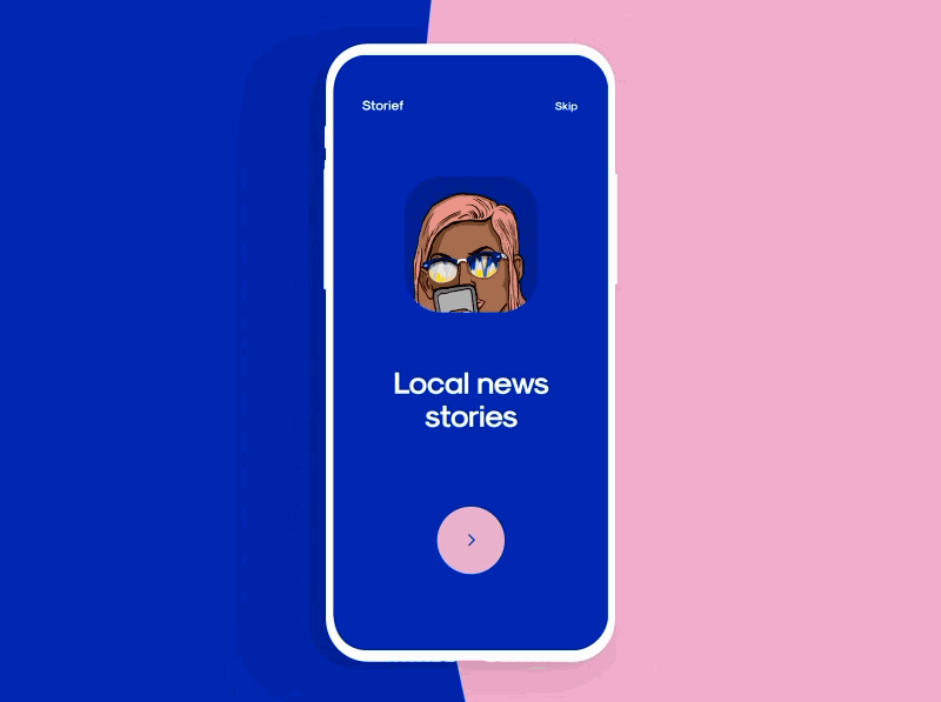
Designer: Cuberto
Highlights: Nice transition animations, striking color scheme, beautiful illustrations
This onboading screen design features a very nice transition animation. It uses a very cool overlapping transition effect to make sure that all the Onboarding screens are continuously presented to users for a better UX.
The combination of the beautiful color scheme and fashionable illustrations makes the onboarding screen really attractive.
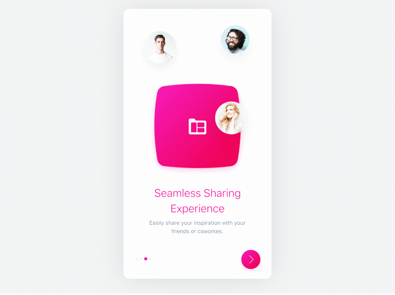
Designer: Lubos Volkov
Highlights: Zooming and fading transition effects, bright color scheme
This short onboading animation uses smooth zooming and fading transition effects to catch the viewers’ attention. On top off the beautiful and bright color scheme, this onboarding screen design is really intuitive, effectively attracting and engaging users.
Here’s a tip:
Optimize your app UI animation with one, two or more transition effects.
Transition effects, such as wiping, fading, dissolving, sliding, and zooming and more, is an easy way to add visual appeal.
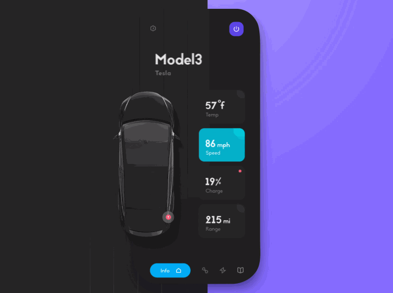
Designer: uixNinja
Highlights: Wiping transition effect, icon navigation bar, and dark mode design
This app animation features a wiping transition effect, which goes from left to right. The left icon navigation bar and the trendy dark mode design also make this app UI stand out from the packs.
Moreover, to help other designers learn how to create their own animated UI designs step by step, the designer has shared a YouTube video tutorial. You’ve got all you need to make your own design!
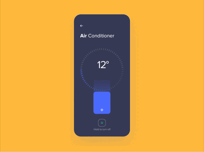
Designer: Outcrowd
Highlights: Wiping transition effect, icon sidebar
Like the Tesla mobile app UI design, this smart house mobile app animation also uses a wiping transition effect. But, it has a different style which starts from the two sides of the page and ends in the middle. The right sidebar also helps users navigate effectively.
However, in our opinions, to create a more intuitive and “obvious” icon sidebar, it would be great if a text label can be added below the icon to further explain it.
Here’s a tip:
Pair your icon buttons or icon bars with text labels to create more obvious app UIs
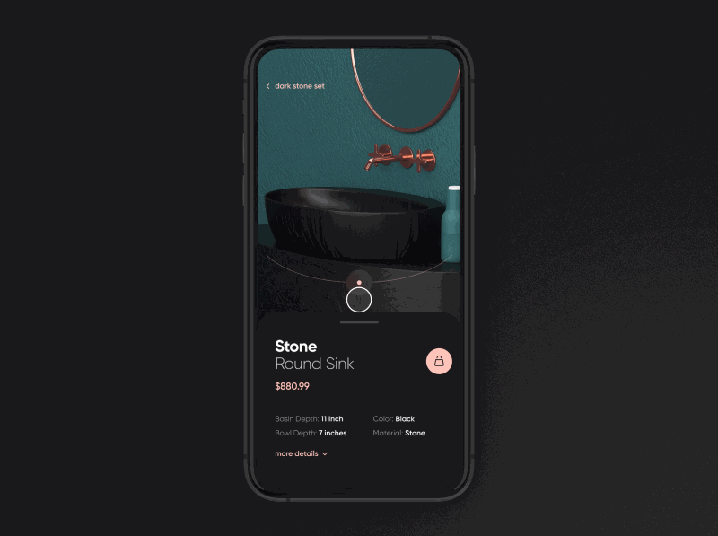
Designer: Yanosh
Highlights: Cool 3D effects
This furniture app animation comes with a cool 3D effect to showcase the details of its products.The overall effect is a captivating user experience.
Here’s a tip:
Create cool app UI animations with fascinating 3D effects
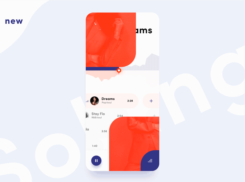
Designer: Taras Migulko
Highlights: Mask sliding transition effect
This music app animation uses a gorgeous mask sliding transition effect to present the song cover image.The combination of text and video designs makes this music app is really attractive and functional.
Related article: 10 Best Music App Design in 2018 For Your Inspiration
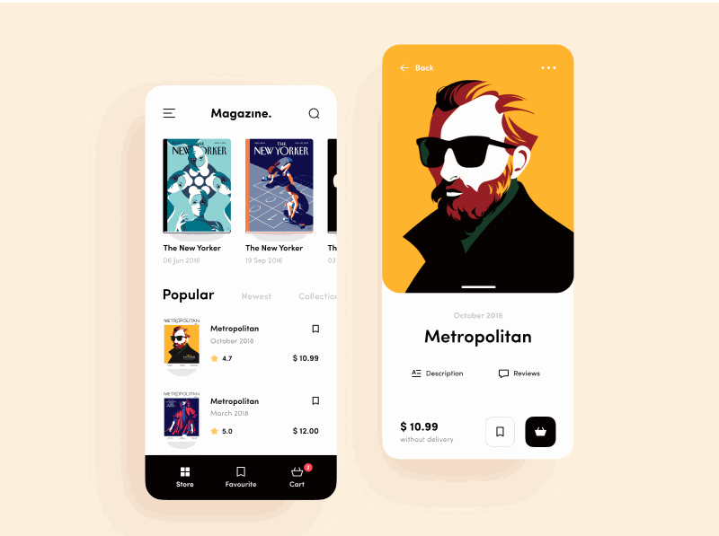
Designer: Dan Moss
Highlight: Fun Avatar animation, oil painting design style
This magazine store app animation uses a fun avatar animation to grasp users’ attention. The old-painting style Van Gogh illustration from Malika Favre and eye-catching colors put this app in a league of its own.
Here’s a tip:
Optimize your app UI designs with fun micro-animations or micro-interactions.
For example, while designing a profile page, you can use an avatar animation or dynamic button/icon animation to attract users and improve user experience.
Related article: Micro Interaction Design: Create Micro Animations to Improve UX
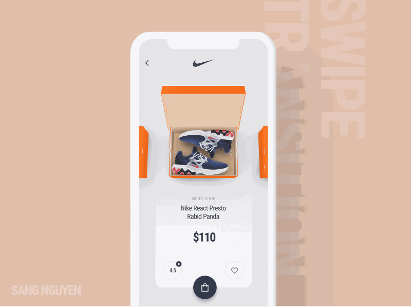
Designer: Sang Nguyen
This shoe shopping app uses a swiping transition effect to present the shoe boxes one by one. Users can easily click to choose their desired products and view the product details. This app design is clean, neat and user-friendly.
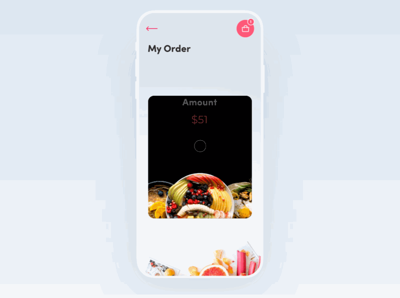
Designer: Afterglow
Highlights: Smooth rotating transition effect
This recipe app uses a smooth rotating transition effect to showcase its dishes. The combination of proper text explanation and delicious dish images makes the app eye-catching - and the great user experience helps as well.
This is the perfect model if you are working on a food or recipe app.
Related article: 10 Latest and Best Food Mobile App UI Designs for Your Inspiration
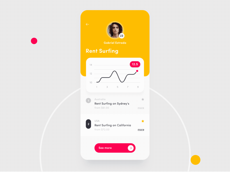
Designer: Taras Migulko
Highlights: Animated charts to visualize user data
This dashboard animation for a rent sport equipment app uses animated bar and line charts to show the dynamic user data in real-time. After entering the profile page, it is super easy for all app users to view and track their own activities, as well as that of their friends' activities.
Related article: Top 22 Free Dashboard Design Examples, Templates & UI Kits for You
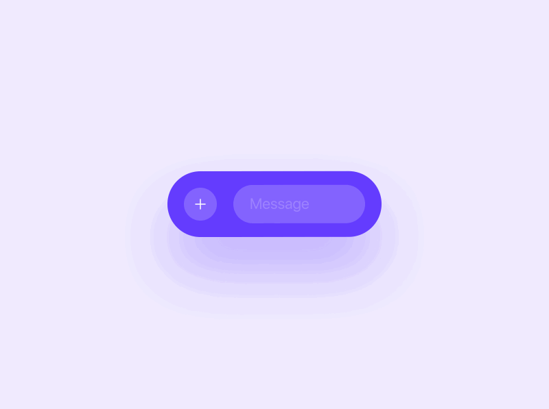
Designer: Oleg Frolov
Unlike other chat bar designs which allows users to click to expand the chat menus up or down, this chat bar design uses a completely different strategy. Users can easily click to switch between different chat options for better communications.
Without a menu design expanding up/down, this char bar design does not occupy much interface space and is a perfect example for designers to create a minimalistic Android/iOS chat app.
Related article: 12 Best Chat UI Designs for Mobile Apps in 2019
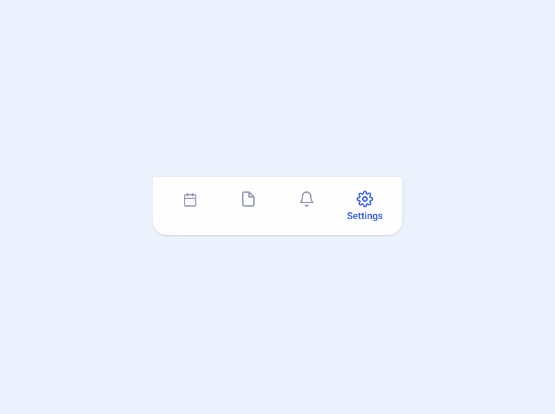
Designer: Aaron lker
Highlights: Liquid selection effect
This tab bar animation features a cool liquid selection effect. In combination with the changing colors, icons and text labels, this effect shows users clearly what they've selected.
Here’s a tip:
Use cool selection effects to optimize your tab bar design
For example, you can try to add a dynamic effect (such as rotating, jumping, shaking, etc ), fluid effect, splashing effects and color changes to make your tab bar design different.
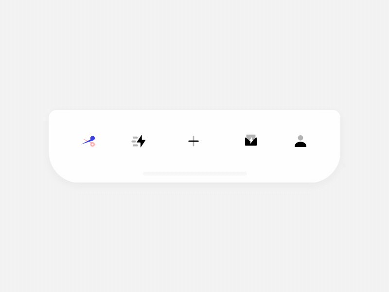
Use rich dynamic effects to make your tab bar designs stand out.
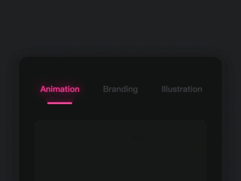
Use splashing and light effects to create a fascinating tab bar for your app.
Designer: Cuberto
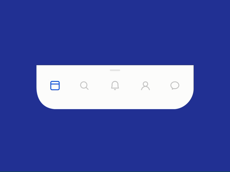
Highlights: Hidden menu, swipe-up transition effect
This menu animation is a perfect example of how to use a hidden bottom/top tap bar in an Android/iOS app. Users can easily click one button to expand the menus and switch to other app pages quickly.
To enhance user experience, also do not forget to add some text labels or reminders to let users know how to use the menu.
Realistically speaking, integrating this with the bottom/top bar of your mobile apps could present a problem. Do you have any ideas to deal with it? Let us know!
Designer: Anton Tkachev
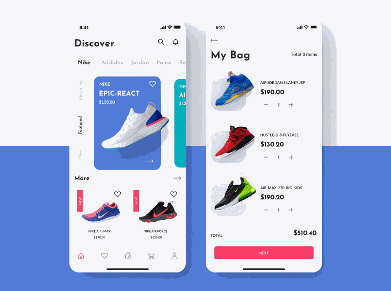
Highlights: Sliding transition effect, intuitive card design
This shoe shopping app uses a sliding transition effect to present its products. The intuitive card designs help showcase the products clearly and make it easy for users to find details about the shoes so they can make their choice quickly.
The designer of this app also links to the related app UI kit. You can purchase it for further use, if necessary.
Related article: Best 15 Examples of Popular Card UI Design for Inspiration
Designer: Alex Gorbunov
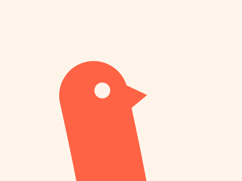
Highlights: Lovely cuckoo animation
The cuckoo animation in the logo is a novel idea and is very catchy. If your app's logo has an animal character, consider using animation as it is an effective way to attract users. Compared to a static logo, an animated logo (with cute animals especially) is certainly more eye-catching, isn’t it?
Related article: 30 Creative and Cute Animal Logo Designs for Your Inspiration
Designer: Oleg Frolov
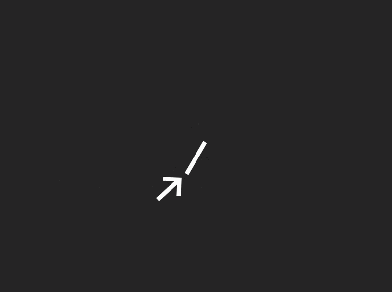
Highlights: Gravity effect
This download icon button animation uses a distinctive gravity effect to attract users.
Like this animation, you can try a flying, jumping, fluid or rotating effect to optimize your icon button designs. Combine these effects with different wash-painting, brief-trick or Chinese ink design styles, your animated icon button would be completely different from the rest.
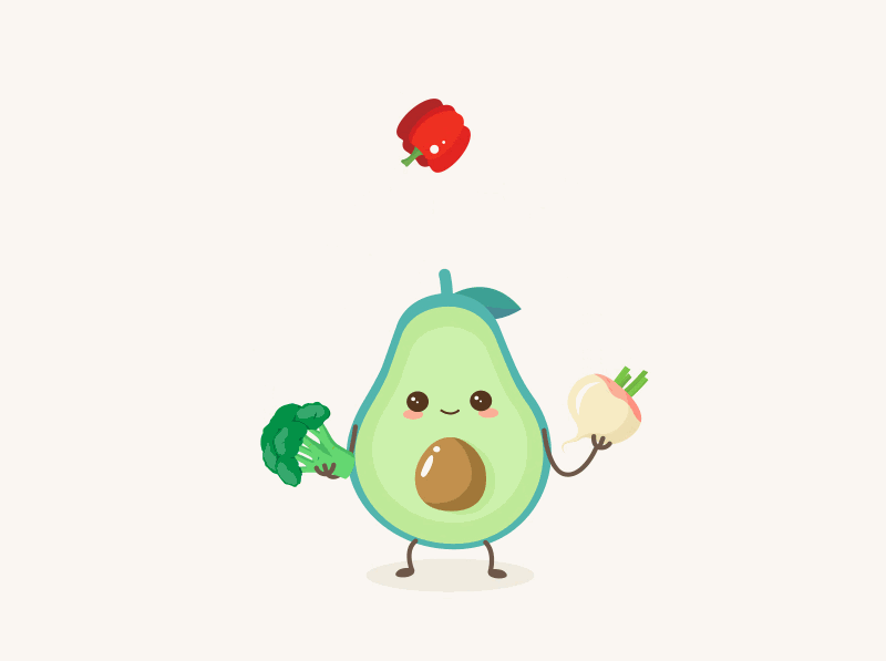
Designer: Taras Migulko
Highlights: Cute avocado animation
This food website exemplifies creativity by using an avocado-like mascot as a loader. Users can spontaneously play with the mascot as the page loads, distracting them from the fact that time is passing.
This is a great example of how to distract users (in a good way) by allowing them to interact with elements of an app/website.
Here’s a tip:
Use mascot loader animations to distract users from loading times
Adding the mascot to your loader animations can not only help distract users, and also help build brand image effectively.
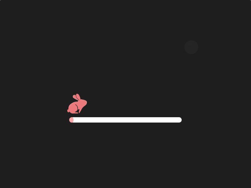
Designer: Cristina Vazquez
Highlights: Storytelling design
Storytelling app/website design is very trendy these days. This progress bar design follows this trend and tells a romantic story about a little cute bunny chasing the moon on a bright starry night.
It not only gives users the feedback about the app loading, but also offers them an enjoyable experience while waiting for the page to load.
And if the designer can add a number feedback, the user may feel even better while waiting.
Here’s a tip:
Build storytelling progress bar or app UIs
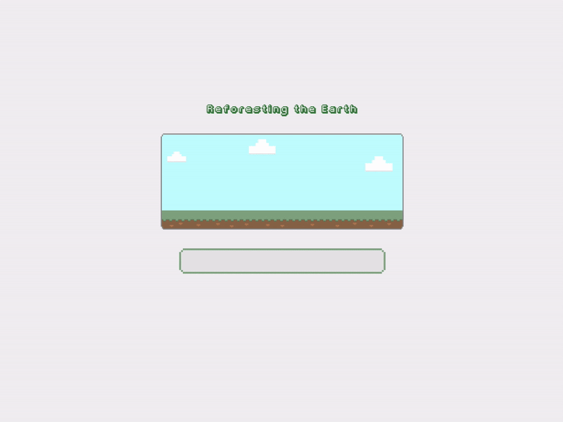
This progress bar tells a story and leads users to complete a task while loading the app data. It helps enhance UX easily.
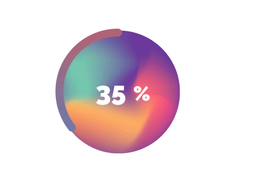
Designer: Chuhan Cao
In comparison with other horizontal progress bars, this circular progress bar is far more attractive to users. With changing numbers and colors, this progress bar is a gorgeous example for designers to engage users for a longer time when they have to wait.
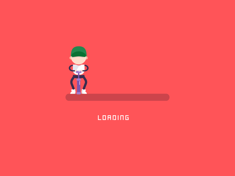
Designer: Allen Zhang
The designer got the idea for this design while he was pumping his bicycle. This is also another good example for you to create a storytelling loader.
Here’s a tip:
Good design ideas come from life
Use design ideas or stories from your daily life to improve your app UI.
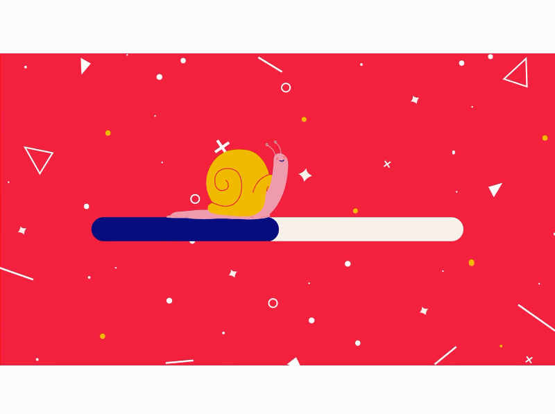
Designer: Mowe
This loading animation uses eye-catching colors, trendy shapes, and a lovely little snail to create a brilliant design. It is good practice for designers to give users feedback when an app page loads very slowly. This way, the users know that something is happening and know that they’re not waiting for nothing.
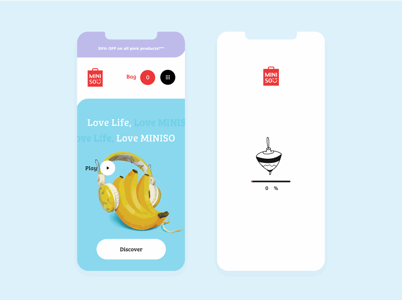
Designer: Nino Lekveishvili
This continuously spinning top animation is really eye-catching and helps reduce the negative emotions of users when they have to wait for a page to load.
The use of UI animations is one of the most feasible shortcuts to improve your app designs quickly. We hope these latest app UI animation examples and design tips will help you create apps that will attract and retain users easily.
 Mockplus RP
A free prototyping tool to create wireframes or interactive prototypes in minutes.
 Mockplus DT
A free UI design tool to design, animate, collaborate and handoff right in the browser.
