To ensure the success of a website or mobile app product in the global marketplace, product design teams should not only accurately translate the text but also align it with local cultures, so the local customers can easily understand what they try to deliver and eventually make a purchase. This is where UI localization comes into play, empowering UI/UX designers to create products that resonate with global users.
In this article, we'll introduce UI localization, explore best practices through real examples and more details. As you learn how to localize user interfaces, don't forget to leverage our free UI design tool to visualize and test your localization ideas effectively.
Table of contents
UI localization or User Interface localization is the process of adapting the user interface of a website or mobile app product to culturally, linguistically and functionally suit the requirements of the specific target audience or market. It generally involves adjusting the following aspects:
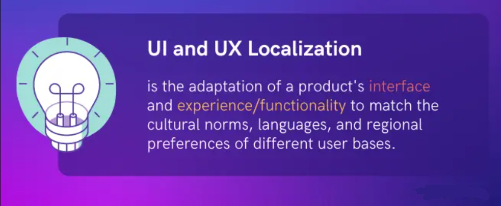
Simply put, interface localization covers nearly all possible aspects aimed at making the product more accessible, understandable, and acceptable to local users. It goes beyond mere translation of interface texts.
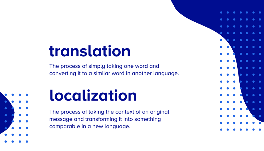
In today's digital era, customer-centric design strategies are paramount to the success of any product. Here's why localization should be a top priority for you and your team:
Customers in different countries and regions can have diverse preferences and habits when using a product. How your product can make them all easily understand and navigate around to get what they need is exactly the key point to your success. So, a good UI localization is exactly the right solution for you to improve the usability, reduce confusion, and increase overall satisfaction with the product.
Because of cultural and religious diversity, target customers may hold varying cultural norms, taboos, preferences, and sensitivities. Interface localization isn't just about adapting, it's a journey of understanding, respecting, and reflecting these nuanced cultures. This approach not only mitigates potential cultural conflicts but also fosters harmonious interactions with local users.
By simply translating the UI, websites and app interfaces become more accessible and user-friendly to local audiences, ultimately expanding the reach to a broader spectrum of target users globally.
A localized product is more likely to resonate with users, leading to higher conversion rates and increased revenue. When users feel that a product is designed specifically for them, they are more inclined to engage with it and make purchases.
Localization enhances your brand's reputation by showing that you value and respect the cultural diversity of your user base. This builds trust and credibility, leading to positive word-of-mouth recommendations and brand advocacy.
Interface localization also ensures that your website or app product aligns with the local laws and regulations, helping to avoid potential legal issues and minimizing the cost.
Anyway, prioritizing localization as part of your customer-centric design strategy can bring far more benefits to both your team and products. You should never underestimate it!
Creating a localized user interface can be long and time-consuming depending on different projects. However, there are simple 6 steps that you can follow:
At the stage, you are supposed to do user and competitor research to find the target users and market. Learn and understand the cultural nuances in each target market, and at last make a interface localization plan for each target market.
For example, you tend to sell your product to Japan or China, and make sure to make a comprehensive localization plan for the Japan and China market separately. Go all possible cultural differences covered in your plans, including language variations, dialects, and writing systems used in different regions.
Extract all the text strings of your web or app interface design, including menus, buttons, labels, and error messages, and gather them all in one document for later translation.
Let the professional translators and designers to translate the text strings and also adjust the designs, layouts and the similar to align with cultural preferences and sensitivities.
To accurately anticipate future user scenarios and experiences, it's crucial to create interactive wireframes or prototypes for testing. Utilizing free wireframing and prototyping tools can significantly streamline this process, saving your team time and effort.
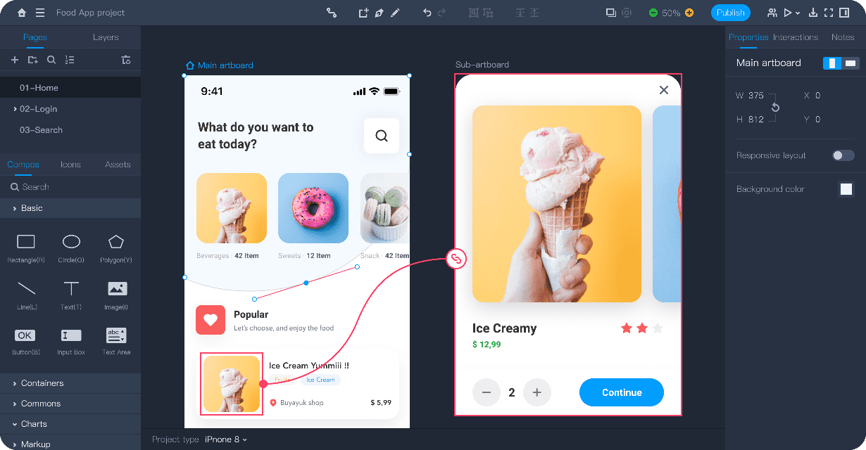
Create a interactive website or app wireframe with Mockplus
Now that you've created the wireframe or prototype, it's time to thoroughly test it with your partners to identify any potential issues and iterate on them for improvement. To gather the most valuable feedback, consider involving real users from the target markets, such as Japanese or Chinese users, to ensure that the localization designs are accessible, understandable, and user-friendly as intended.
In the final step, it's essential to document all files and materials related to your localization efforts, ensuring easy tracking and reuse for future localization projects. Additionally, keep the localized UI design up to date with software updates, content changes, and evolving user needs to maintain its effectiveness over time.
Overall, by following these steps, you can effectively localize your UI designs to cater to diverse audiences and maximize the reach and impact of your products in global markets.
To ensure that your web or app interfaces are well-suited to the habits and cultures of different countries and regions, here are some proven best practices you should keep in mind:
Localizing a web or app product requires design teams to consider all aspects of the cultures involved, including language customs, social norms, taboos, values, sensitivities, user behaviors, and more. Therefore, whenever you start a project targeting a global audience, always remember to conduct thorough cultural and habit research. This research will help you better understand your audience and the cultural context behind your target markets, guiding you to overcome potential cultural conflicts and troubles.
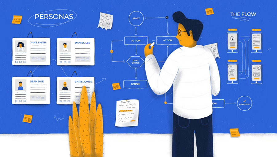
While designing the interface or doing the UX writing, you should always consider every detail from the aspect of the target users, the local people, such as:
- Understand their goals and behaviors
"How will they like to achieve that goal?" Consider the easiest paths and actions your end users many follow to achieve their goals.
- Anticipate user thoughts and reactions
"What kind of thoughts would they have while facing this kind of issue?" List out all possible problems that users may encounter, and anticipate user frustrations, concerns, and expectations to design solutions that address them effectively.
- Use familiar language and slangs
"What kind of well-known slangs or language would they understand without thinking too much?" Use local expressions and language that resonate with users. Just try to ensure that all UX writing is clear, concise, and culturally relevant to avoid confusion and also enhance user engagement.
- Tailor the layout and interaction
Stand in the shoes of the locals and design the layout and interactions that align with the local patterns. For example, if some countries prefer top-to-bottom or right-to-left reading directions, adjust the layout and interaction accordingly as well.
Simply, whenever you decide on the layout, interaction, user journey, interface strings and more details, you should always prioritize the needs and expectations of the local users, rather than solely relying on your or your team's perspectives.
The UI localization process is complex and time-consuming. To ensure that your team covers every aspect thoroughly, it's crucial to plan everything ahead. This includes two key aspects:
- Plan your whole UI localization process
Before diving into interface localizations, convene a meeting to quickly assess the entire localization process. Take note of all steps, documents, and potential challenges your team might face. Then, craft a comprehensive plan to ensure that all potential challenges are addressed and all necessary details are included.
- Make multiple plans for diverse countries and regions
When it comes to design stages, while focusing on preparing the localization plan for a specific country or region, also try to create multiple plans if possible. This approach allows your team to continue working on the next plan if one is died out, delayed or encounters obstacles.
UI localization has become increasingly important in recent years. Therefore, it's imperative to always get the professional involved. For example:
When it comes to the content translation stage, go get the professional translators, who possess a deep understanding of the cultures, language customs, and slang of the target countries and regions. These experts are adept at delivering the same message clearly and effectively, ensuring that your content resonates with the local audience and avoids any potential misunderstandings.
When it comes to the design stages, it's crucial to involve professional UI/UX designers and interactions. Listen to their thoughts and ideas whenever adjustments to the layout, user flow, or interactions are necessary, ensuring that your final decision will never cause UX problems.
While doing the localization, never underestimate any details, such as the dates, times, and numbers.
For example, using the "mm/dd/yyyy" date format in a region where "dd/mm/yyyy" is customary can cause confusion among users and lead to misinterpretation of deadlines.
Similarly, displaying currency amounts without proper localization, such as using commas as decimal separators in regions where periods are standard, can result in inaccuracies and hinder user comprehension.
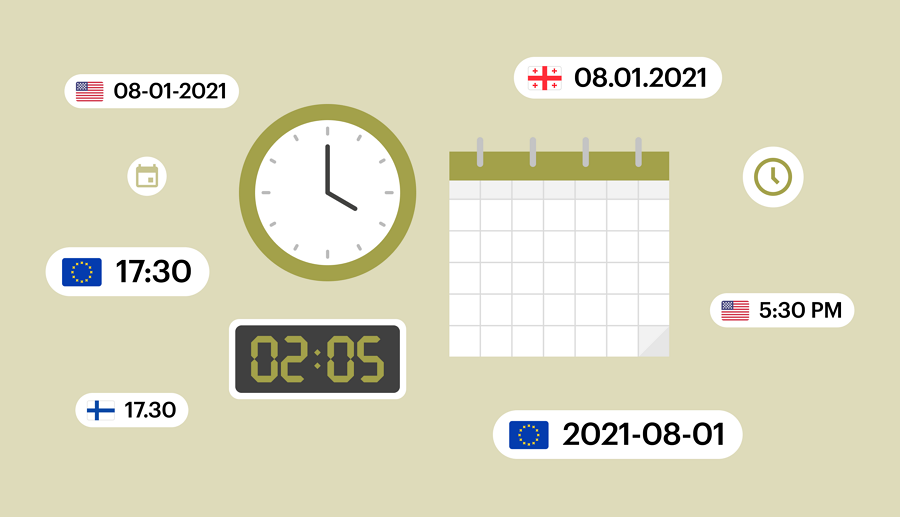
Time in different countries can be displayed in different format.
Globalization makes the world smaller, but it also necessitates that we never underestimate cultural differences, especially cultural sensitivities. The following are some examples of cultural senilities you should consider:
- Color meanings - In some cultures, certain colors have specific meanings or associations. For example, white may symbolize purity and mourning in Western cultures, but it represents death in many Asian cultures.
- Symbol meanings - Symbols can hold different meanings across cultures. For instance, the thumbs-up gesture is a positive sign in many Western countries, but it can be considered offensive in parts of the Middle East.
- Language taboos - Certain words or phrases may be considered taboo or offensive in particular cultures. For example, mentioning specific body parts or discussing sensitive topics may be inappropriate in some contexts.
- Cultural traditions - Understanding cultural traditions and customs is crucial for localization. For instance, scheduling meetings or events during religious holidays may be perceived as insensitive in some regions.
- Gender roles - Gender roles and expectations vary significantly across cultures. It's essential to be mindful of gender-sensitive language and imagery to avoid reinforcing stereotypes or causing offense.
There may be more cultural sensitivities to consider when focusing on a specific country or region. Nonetheless, we hope this list provides a comprehensive example of what cultural sensitivities entail.
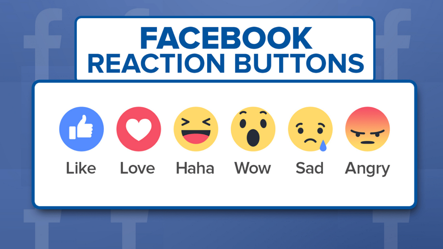
Facebook extended its "Like" button to offer more reaction emojis, allowing users from different cultures and backgrounds to express themselves more appropriately. This is taken as an effective approach to avoid culturally sensitive conflicts.
While automatically detecting and displaying the suitable language based on location can be convenient in most cases, it may not always be desirable.
For instance, an American working in China or Japan may find it challenging to switch the language from Chinese or Japanese to English. Therefore, if your website or app offers versions for multiple countries and regions, allow them to manually select their desired language and region to ensure a seamless experience.
Of course, this is not a one-size-fits-all solution. You should always carefully consider the needs and preferences of your users, as well as the context in which they are accessing your website or app.
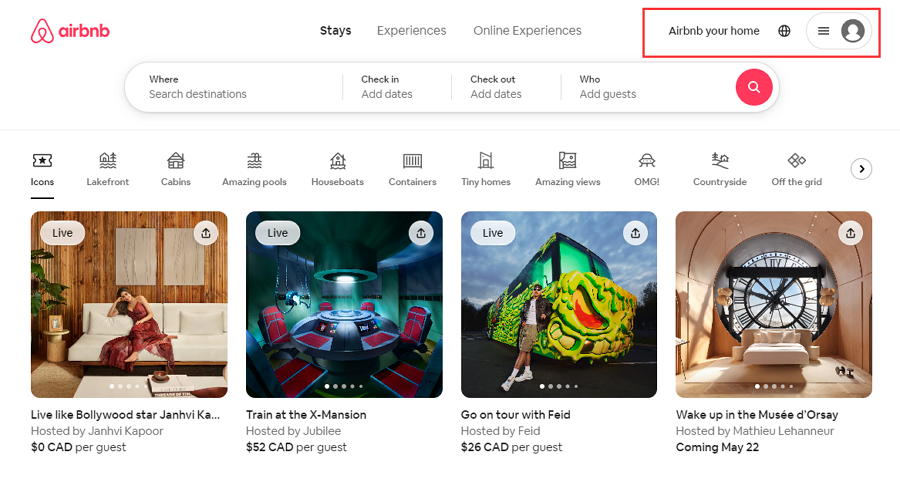
A language and region selection design from airbnb.ca
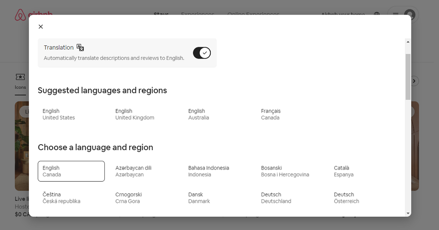
The audience can easily click earth icon button to expand a popup that looks like the below to select a desired languages and regions.
When you and your team have finally worked out your localization plan, the next step is to timely test them all with the real users. You may need a professional design tool to present and estimate the whole process within your team and company, and also never forget to involve local individuals to identify any potential issues specific to the target market. Their insights can be invaluable in ensuring the effectiveness of your localization efforts.
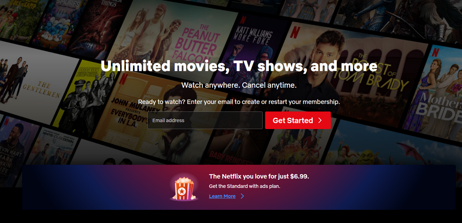
Netflix is a renowned platform that facilitates global users in streaming TV shows and movies online. It offers a diverse array of TV shows and movies tailored to specific countries and regions. Thus, its online interface is meticulously curated with content suited to different locales. The website automatically detects users' IP addresses and associated location, allowing them to seamlessly access content relevant to their location.
Additionally, users have the flexibility to manually adjust their country and region preferences as per their requirements. Even on search engines like Google, users can find various country options available, as depicted below:
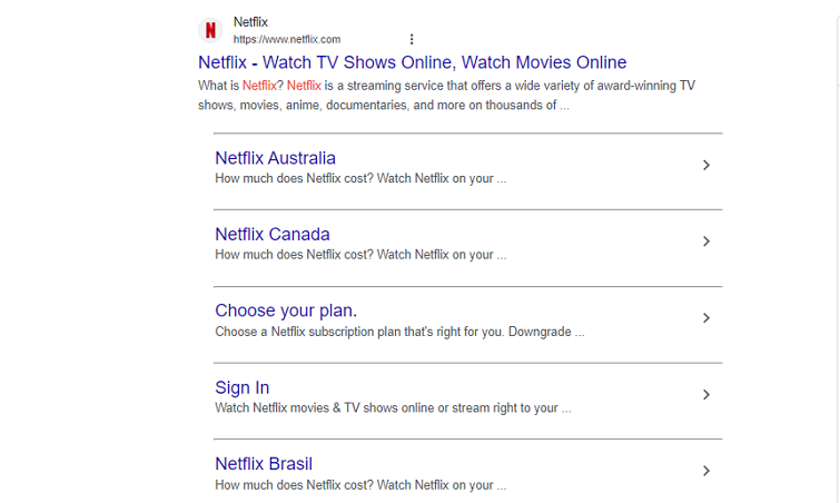
Users have access to various country options when conducting searches on Google.

The online website of the World Wide Life organization features images of local wildlife to capture the audience's attention and promote their ongoing campaigns. Additionally, it offers easy options for selecting different languages and showcasing various wild animals.
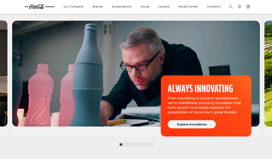
Coca-Cola's official website allows you to select your location. While the website layout remains nearly identical across different regions, the content varies. Each version features different popular products, hero carousels, and images tailored to the local audience.
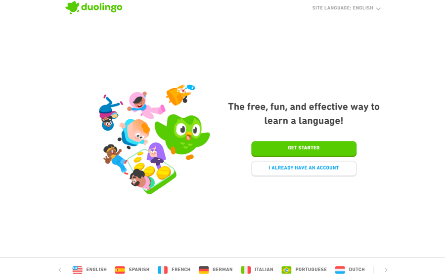
Duolingo is one of the most popular websites with excellent interface localization. It offers a wide range of language options, and the user experience is customized based on the selected localization.
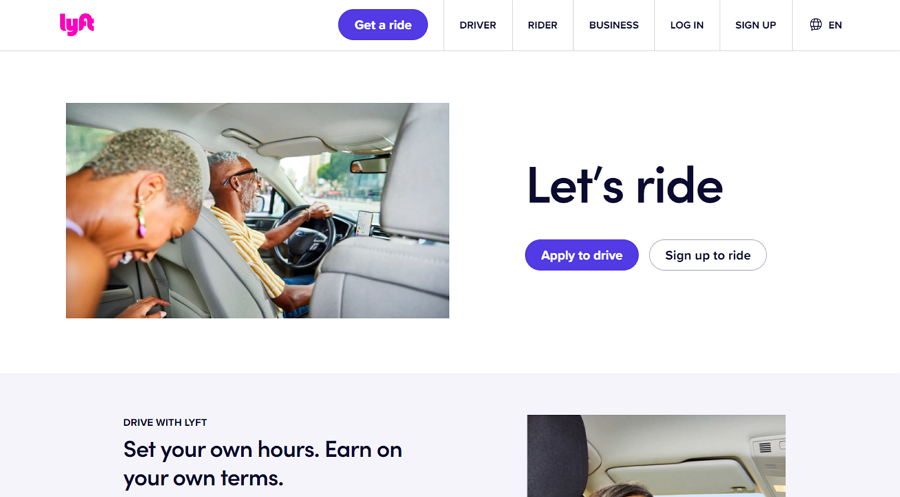
Lyft not only offers language options but also customizes its payment system. This includes auto-detecting the local currency and adjusting payment policies according to country-specific laws and regulations, and more.
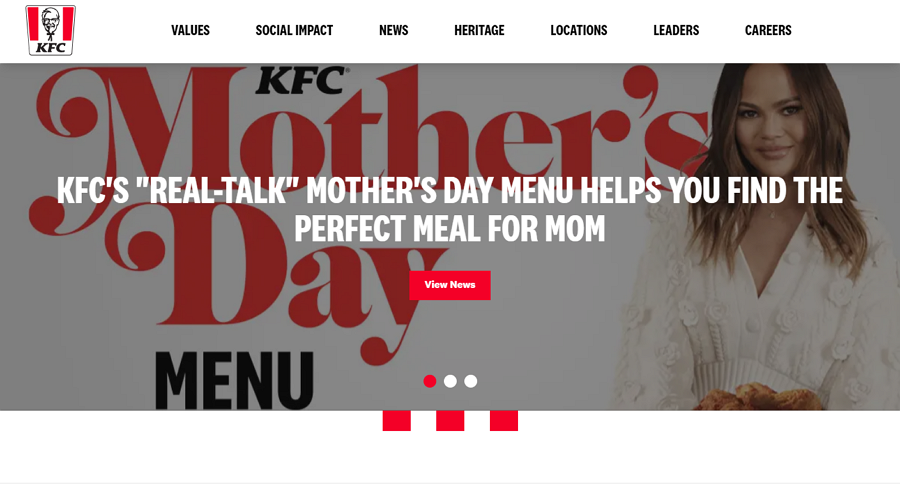
KFC creates specific versions of its website for different countries and regions, ensuring localized content. Additionally, there is a global version that delivers a consistent message to people around the world. Users can freely choose the desired one based on their needs.
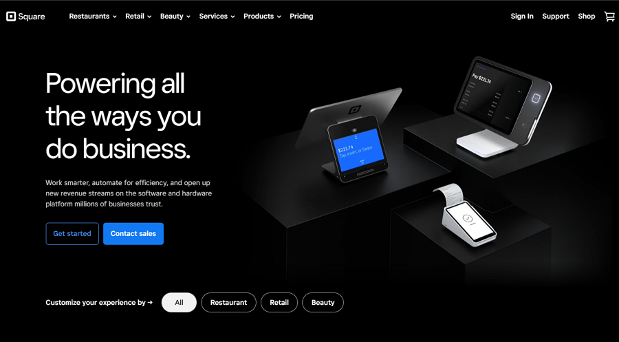
Square offers fully customized versions of its website for different regions and languages. The Canadian version is completely different from the U.S. version, including variations in language, layout, and content.
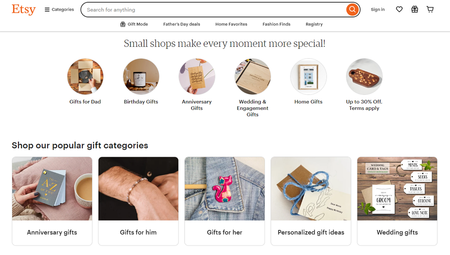
As an online shopping platform, Etsy allows you to choose your preferred language, region, and currency, ensuring you see accurate prices while browsing. Additionally, the displayed products also vary based on the selected location.
Conclusion
In today's globalized world, effective interface localization is essential for promoting products on a global scale. We trust that this ultimate guide has provided you with a comprehensive understanding of interface localization, empowering you and your team to maximize revenues by reaching diverse markets worldwide.
 Mockplus RP
A free prototyping tool to create wireframes or interactive prototypes in minutes.
 Mockplus DT
A free UI design tool to design, animate, collaborate and handoff right in the browser.
