The principles of design are a set of considerations that form the basis of any good product. These principles are widely accepted, and they are created to help designers offer an overall optimal user experience.
In this article, we will give you a comprehensive guide about the unity principle of design and how to use it to improve your next piece of design.
Table of contents:
What is design unity?
The importance of design unity
Factors that affect unity in design
How to achieve unity in your design?
Some best examples that achieved unity in design
By definition, design unity means creating design elements that support each other and allow each individual element to coexist with one another to form an aesthetically pleasing design. By implementing the principle of design unity, some mixed messages will be avoided. Ultimately, the design elements should look like they belong together and not just randomly placed on the page.

As a designer, you need to utilize all design principles to achieve unity, because the principle of design unity is complex and complicated, and incorporates other, more basic design principles such as repetition, proximity, and alignment.
In short, unity can work as a measure to decide how well the elements on the page work together. If the viewer sees a design that has unity, they can first see the whole and then the sum of the parts making that whole. Unity is the most important Principle of Design because it brings your design together as one cohesive unit. Unity can be achieved when each individual element of a design comes together like a puzzle to reveal a singular cohesive vision.
Each design has a goal and unity in the the design can help you deliver your goal easily and without creating a mixed message. The more unified your design elements are, the more of your message you'll deliver to your viewer.
So why do we need to uphold the principle of design unity? Here are the answers.
Having a design with unity can help to reduce conflicting information and messages. By consolidating content and features onto fewer screens without causing cognitive overload, users can find the information they want and reach the target information quickly, which can help enormously in creating a better user experience.
Designers can structure visual characteristics by unifying related elements with consistent styles. This helps users easily understand the information in your design. So, whether for a website, app or related product to succeed, it’s crucial to structure the pages or screens with consistent and unified elements, as well as showing maximum empathy with users to give them something pleasant to view.
As a designer, you can craft well-suited, consistent, and self-reinforcing designs that identify and present your product, service, or company in its best light. By unifying all the elements of your design, the public's impression of your brand will be shaped, and users are more likely to remember your brand.
All in all, there are many factors that contribute to and affect the unity in your design. If you want to have a unified design, you need to take them all into account and make everything in your design visibly linked and easier to be perceived.

Color --The first factor that affects design unity is the color designers use. Color is one of the biggest factors in the unity of a design. That's the reason why a team of designers needs to have a design system and stick to a consistent, controlled color scheme. This can help unify your products into a family and also help to take large bodies of disparate information and make it all feel continuous.
Alignment -- Alignment also plays a role in design unity, because elements designed around a common axis can make the whole design feel more connected.
Proximity -- Your design unity can be promoted by using proximity. Proximity is just simply how close elements are to each other. Creating unity with proximity is easy because grouping elements together can help to tell the viewer the relationship between each group of elements and buttons, along with their functions to each other.
Repetition -- If you want to have a unified design, repetition is another way to promote unity. You can use repeating elements like colors, shapes, textures, patterns or other characteristics to unify your design as a whole.
Consistency -- Consistency is key, and it's the last thing we'll cover in the quest to understand the roles played by unity in design. It can be achieved by keeping the style of similar elements unchanged, and relates to themes like color since they are the very factors in creating successful consistency throughout your design.
As we mentioned above, unity is achieved once the internal parts of the design reach a state of harmony and there are many factors that can have an impact on your design unity. So, how can you get unity in your design? How can you make each individual element coexist with one another to form an aesthetically pleasing design? How can you ensure each element is having its intended and desired effect to achieve unity in your design? The following steps can help you reach that goal.

Before you get your design started, you need to have a clear objective in mind and know exactly what you want to communicate in your design. Your design elements can't be unified toward a common message if you don't have a clear idea of what that message is. For this step, you need to choose the color scheme and theme of your design and also make sure that all the different colors can be matched, so as to reach the same color density.
Once you know the objective of your design, you must stay focused on achieving the objective and not deviate from it. No matter what element you add to your design, typography, a graphic, icons or components, you first need to decide whether they match the main color and what their relationship is with each other and make sure they are unified.
After taking the above two steps, you need to analyze your work. Just take a step back from your design and assess: does the color scheme help you to enhance your design or not? How do the design's internal parts interact with one another?
Then you should create a checklist to help you ensure that all factors that affect design unity are reasonably used in your design, and you also need to evaluate whether or not they are working together harmoniously.
At last, if you are using a design tool like Mockplus, you can invite peers, friends, family members or others to check your design and accept critiques from them. When the majority of them can consistently understand the purpose and message you intend to portray, then unity has been maintained in your design.
Here we have some best unified design examples from different industries to get you inspired.
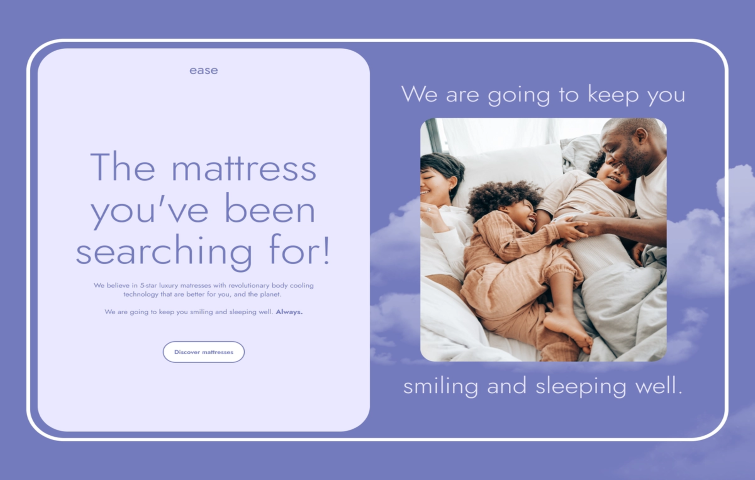
The designer used similar colors for the main theme of this page, and with similar photos and patterns used on it, the page becomes more refreshing and pleasing to the eye.
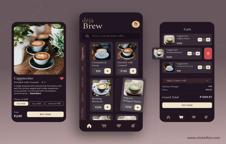
As for this design, the designer used some trending and analogous color schemes to make it a very unified design. It also implements the principle of alignment and repetition, helping to enhance its unity.
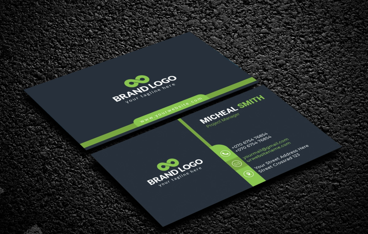
The design uses two different colors, dark blue, green and white to make this a great and impressive design. Using the repetition of the color green and implementing the principle of alignment also makes it a unified design.

For this site, the designer has used a combination of green colors, which gives an impressive look that depicts calmness. The analogous color scheme used in this design makes it a unified one between the product and the website.
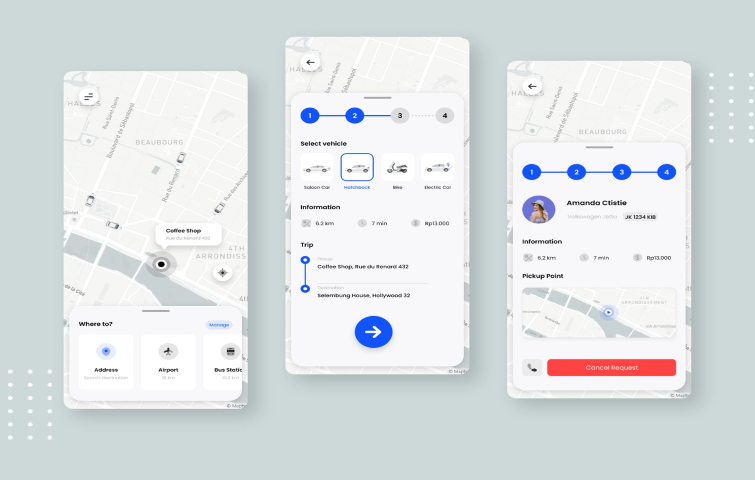
The design of these pages has a limited color palette, it does not have colorful images but the information is simple and concise, which creates an overall friendly and unified environment.
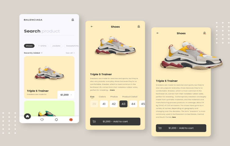
This design uses a combination of yellow, light green and brown, making the overall aesthetics pleasing to the eye. The repetition of color use, the use of similar pictures and patterns also make the design unified.
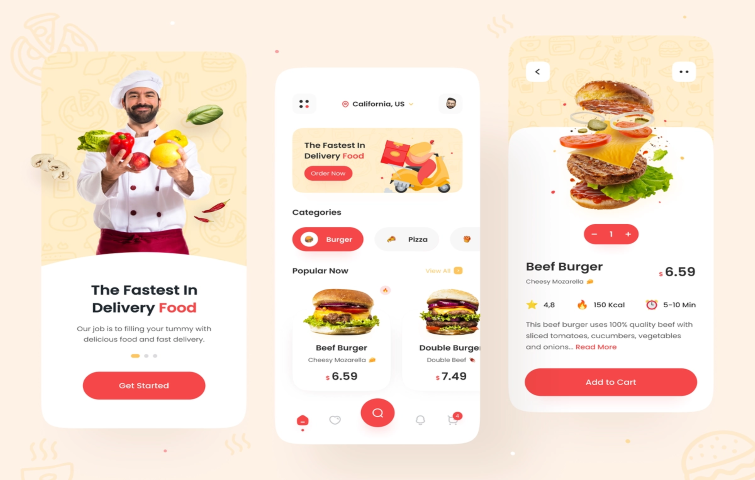
The designer keeps their base color as light yellow but at the same time creates more striking elements in every other element while highlighting brand personality which appeals to younger users. With the repetition of the color red and the use of similar patterns, the design becomes more attractive to viewers.
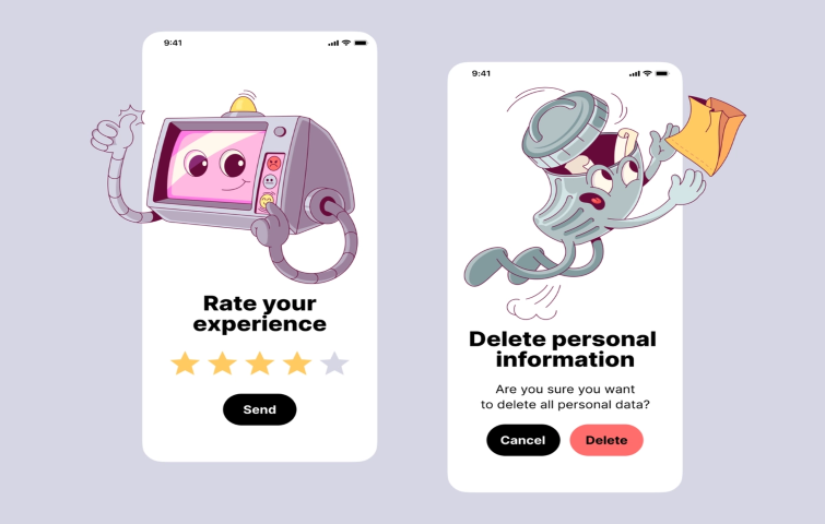
This design is funny, emotional and very helpful for creating a cool design. It has two similar cartoons and the typography style is the same, making the design impressive and unified.
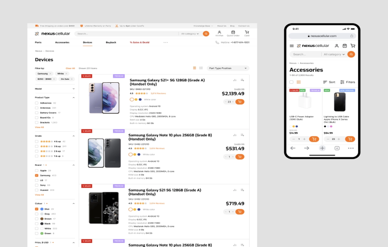
The patterns on the left hand side of this page are well-organized, the photos and product descriptions are well-aligned and the repetition of red, yellow and purple make it a very unified design.
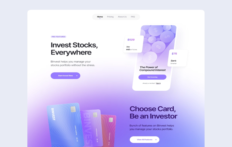
This page uses shades of blue and violet, making it quite pleasing to the eye. The combination of blueberry, sky blue and amethyst makes an analogous color scheme, which contributes to enhancing the unity of the design.
Unity makes things feel connected and together. To achieve design unity, the designer needs to look at the project as an integral whole. If we have too many colors and fonts, or the items are pushed away, or the alignment differs inside your text, then bonds are broken, and the design will not feel connected and design unity cannot be achieved.
This comprehensive guide can be of great help for you to maintain unity in any design work, and make it truly stand out and integral.
 Mockplus RP
A free prototyping tool to create wireframes or interactive prototypes in minutes.
 Mockplus DT
A free UI design tool to design, animate, collaborate and handoff right in the browser.
