User experience and usability are very close related terms in web or app design. However, the more technical terms people come across, the less they understand the difference, especially for the young designers.
So, even though this topic has been discussed in many posts, it is still necessary to clarify the differences between user experience and usability based on my years of research.
To make it clear, I shall discuss 6 aspects of differences:
User experience refers to a person's subjective feelings and attitudes when using or interacting with a particular product, such as a website or app. It can be affected by the UI functions, interactions, product brand, psychological expectation, and actual emotional feelings, etc. It is an indispensable part of product design.
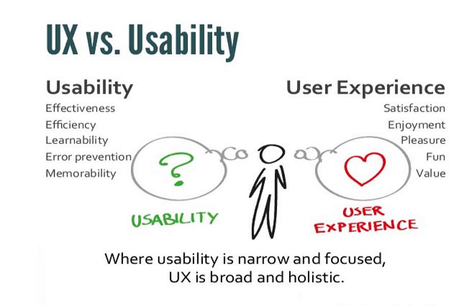
Usability is an important quality indicator for interactive IT products/systems. It refers to the degree to which products are effective, easy to use, easy to learn, efficient, error-free, and satisfying to users. So, it is mainly about the functional part of a product. In short, "Don't make me think" is one of the typical principles for usability design. Just remember to stop making usability mistakes as they can reduce your website conversions.
If you are still not clear about usability design, an introduction to usability can help you.
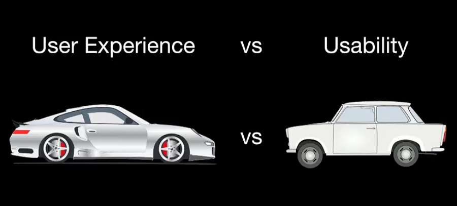
From the definition, we can understand that usability is only a narrow aspect of user experience. Usability focuses more on the functional aspects of a product. However, user experience is often concerned with nearly all aspects that can make users enjoy a product.
Let's talk about the basic elements:
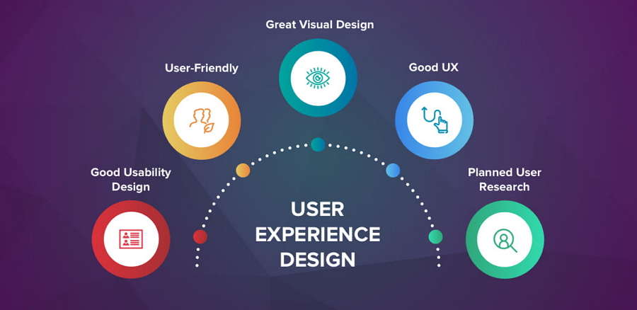
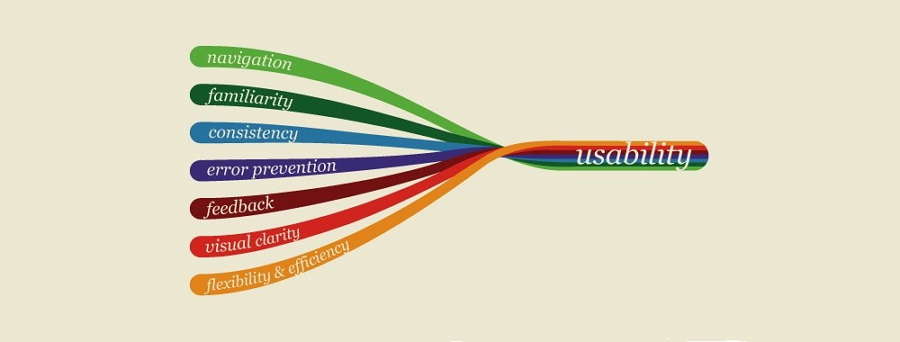
For a website or app, the only goal of usability design is "easy to use".
In other words, when a product is intuitive and easy to understand, and users can easily complete any task in a few clicks, we often say that a product has high usability. However, if most users have difficulty in understanding the interfaces and functions, and a complicated process is involved in completing a task, we often say that a product has very low usability. If so, we often think that its usability needs to be improved.
However, the concept of user experience is about the overall feeling that a user gets before, during, and after using a website. Usability is related to how easy it is for the user to complete a task while using the site; the user experience focuses on the user's perception of how the site interacts with him.
So, if users do not have a good feeling about a product, we often say that its user experience needs to be enhanced, including the functions, interactions, interfaces, and more.
While designing a user-centered product, designers often analyze many aspects of a product.
There are a few basic principles that designers often adhere to:
1) Usability first
The functions a product offers are often why people choose to use it. So, no matter what types of website or app you are working on, usability design is one of the top things you should pay attention to while designing UX.
2) Content is key
To make a product usable for everyone, the content in every page should be simple, short, and easy to understand. So, it is always necessary to spend a lot of time on page text design.
3) Pay attention to visual design
To provide users with a more enjoyable experience, a product should have good visual design. For example, you may need to create a clear, intuitive hierarchical layout, a beautiful or fashionable color scheme, an immersive video, audio, images, or other visuals.
4) Keep designs consistent
Design consistency is one of the most important factors that can put users in a good mood and give them a better experience.
5) Make users enjoy waiting
It is inevitable that you have to let users wait sometimes due to poor network or much page data. You can add a loading animation or progress bar to make users enjoy waiting.
1) The 2-second loading rule
A product with high usability will not make users wait too long. So, to improve the usability design of your product, you should try your best to decrease the loading time of every page to less than 2 seconds.
2) User-centered design
Usability focuses on the functional part of a product. And the functions that a product should have often rely on the needs of users. So, always remember to design everything based on users' needs.
3) Manage errors correctly
Apart from main functions, you should also learn to manage errors correctly. All products can have problems. How you explain the problems and guide users to overcome the problems can make your product stand out easily.
4) Make CTA buttons clear
To help users buy a product or complete a task, CTA buttons help a lot. A clear and effective CTA button can definitely streamline the entire process.
5) Make easy-to-follow navigation
An intuitive and easy-to-follow navigation also helps users find their desired functions and information quickly.
1) Testing
No matter what types of designs you are working on right now, continuous testing is one of the basic rules.
2) Accessibility
These days, many people uses different websites/apps on their mobile phones. So, while designing a product, you should also pay attention to the responsive design and make it accessible on different PC or mobile devices.
3) Responsibility
Be responsible to your users and try to think from their perspective.
We've picked 5 of the best usability design and user experience design examples. They can enable you to have a better understanding of the differences between them.
Day and night view modes help highlight page content and reduce eye strain, often providing users with a pleasant experience. Line Friends Online Store is a considerate website which uses day and night modes to enhance UX effectively.
To help users find their desired bikes quickly, Bike Shop uses seamless, immersive navigation interactions and animations to provide a cool user experience.
Explore the Space has a very eye-catching hand-drawn design style that helps attract users and ease the entire browsing process.
Rate Your Ride uses cute emojis to guide users to rate their rides and provides them with a different and interesting experience.
Tesla mobile app uses an intuitive, simple sidebar to guide users through the app, and know more information about their cars. It simplifies the user exploration process effectively.
A poor navigation experience is among the top reasons why users leave a website. So, the navigation usability design is an important aspect that designers should pay attention to. Baker Tilly provides clear navigation menus. Every website visitor can have a fluent and pleasant navigation experience.
The Bazaar has a cool accordion style navigation bar that simplifies the entire navigating process effectively.
Search usability design is another vital part that cannot be underestimated. Housing Search is designed with a powerful search bar that allows visitors to easily search for their desired houses quickly. It helps empower the navigation system of the entire website.
Precise and well-formed website content helps explain website services or products clearly, and guides visitors to complete tasks easily. So, content usability design should be a focus of the design process. Bug Store e-commerce Website uses simple and clear hierarchical content design to enable users access information on the page quickly.
As we've mentioned above, managing error messages correctly is an effective way to improve website usability. Userberry has a very interesting 404 animation design that helps visitors understand the error and guide them to browse the website smoothly.
So, user experience design includes every detail that can improve user experience on your website/app. However, usability design is a part of user experience design and covers everything that can help people use your website/app easily. They are different and also similar to some extent.
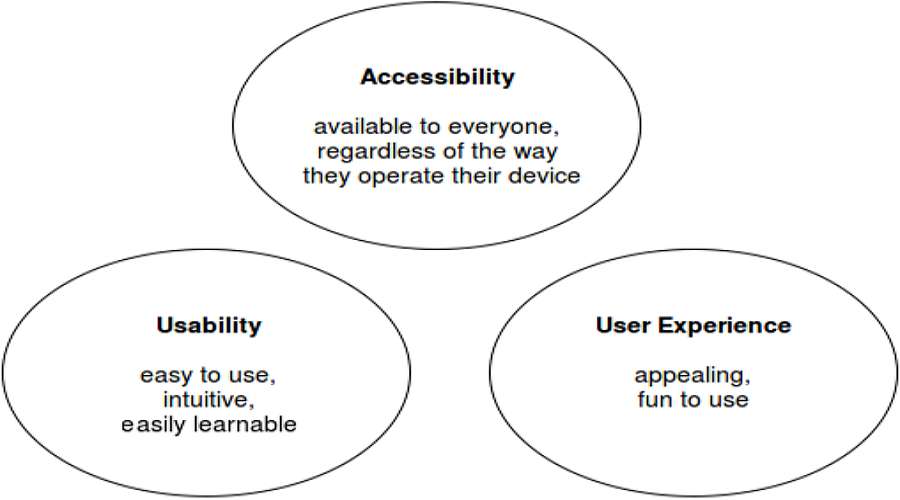
Products with good usability are convenient and make users feel comfortable while using a product. It also reduces the possibility of users making mistakes while operating a product. If it arouses a good emotional experience and makes the user feel happy and enjoyable, then the user experience design of the product is good.
Accessibility refers to whether a website is available and can be easily accessed by a normal person or even a disabled person. Accessibility testing focuses on testing if the website is accessible to disabled people and is compatible with various tools used by them.
Usability deals with how easy and intuitive a website is to use. If the users can use a website without any instructions, it can be called highly usable. Usability testing focuses on measuring the ease of use of a website. Remember, you should conduct a usability review before jumping into design.
Conclusion
Usability involves effectiveness, efficiency, and satisfaction enabling users to complete certain tasks as easily as possible. On the other hand, user experience covers a wider aspect of a user's interaction with a product. Hope you can get a clear understanding of the difference between user experience and usability from this post.
 Mockplus RP
A free prototyping tool to create wireframes or interactive prototypes in minutes.
 Mockplus DT
A free UI design tool to design, animate, collaborate and handoff right in the browser.
