Similar to any other product, when it comes to website design, a solid design process will guarantee chances to a successful outcome. In this article, we will discuss a step-by-step process of creating a website and share some web tools that will help you make it even more efficient.
The process of creating a website should always start with understanding your target audience. You need to know your audience to create a product that will satisfy their wants and needs. That’s why, before starting a web design, invest in user research. Conduct a series of user interviews with people who represent your target audience. Identify the needs and expectations of your visitors and match them with your business goals. Use this information to create a simple version of your design—sketch out a schematic representation of your design and test it with your users. A technique called guerrilla testing will help you to validate your key design decision in no time.
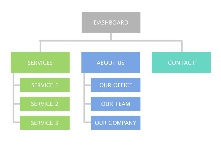
Information architecture is the backbone of your website. The structuring of information on your website, as well as the navigation scheme, will be based on information architecture. That’s why as soon as you identify your target audience and their needs, invest your time in creating a structure that will match the mental model of your users.

Example of information architecture of a website. Image by dev.to
A technique called card sorting will help you understand how users categorize information. You can rely on special tools such as OptimalSort to group and label ideas about categorizing information.
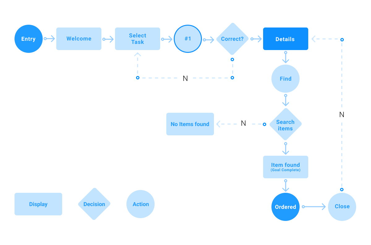
After you finish working on information architecture, your next step will be to create user flows. A user flow is a series of steps which represent a scenario in which a visitor might interact with the website you are designing. Typically, it’s recommended to create a few user flows that cover the key scenarios of interaction. For example, if you design an eCommerce website, the most important user journey will be ‘purchase a product.’

Example of user flow. Image by careerfoundry
Design is a team sport, and when it comes to making critical design decisions, it is vital to invite all team members in this process. Miro, an online collaborative whiteboard platform, will help your team members to design user flows together. You will be able to ideate and brainstorm with your team online and evaluate the user flows together.
When it comes to design actual pages, it’s tempting to create mockups for all possible pages of your website. However, it’s better to avoid that temptation. While the opportunity to see mockups for all pages will help you understand how your design will look and work, it doesn’t guarantee that you won’t need to introduce changes in your design. That’s why it’s always essential to divide the large scope of work into smaller pieces and move gradually from screen to screen. It’s a safe bet to start with the most important pages first. For example, if you design an eCommerce website, you might want to start with a product listing page.
It’s equally important to use a prototyping tool that will allow you to create mockups fast and then help you turn mockups into real solutions. Mockplus is a tool you should try because this tool will help you create a design and then hand-of it to your development team.
Here are a few things to remember when creating individual pages:
At the moment when you finish working on your mockups, it’s time to turn them into a fully-fledged solution. When it comes to coding design, product teams have a lot of options to choose from—from robust websites builders like Wix, Elementor or Squarespace to powerful tools like Webflow that attempt to break the code barrier. Ultimately, when it comes to selecting a tool for turning design into code, you should remember what level of freedom you want to have.
Product teams often face a dilemma—they have a few different versions of the same page and don't know which version to choose. They want to understand which version performs better. A simple technique known as A/B testing (or split-testing) will help you with that. A/B testing is an experiment where two variants of a page are shown to users at random, and analytic tools are used to determine which variation performs better for a given conversion goal. For an eCommerce website, a conversion goal can be a number of purchases on a product page. A tool called VWO testing will help you conduct A/B testing.
Design is not a one-and-done process. It’s an iterative process of creating and perfecting a solution. So after you release your website, you need to analyze how users interact with your design and introduce changes to make the interaction easier. The first thing to remember at this step—users can interact with your design in a way that doesn't match how you expect them to do it. Thus, it’s recommended to compare the user flows—the user flows that we’ve created at the beginning of your design process (so-called ideal interaction flows) and the one that users have in reality (real flows). Try to focus on the roadblocks (things that prevent users from completing their tasks). The insights you will collect will help you to prioritize changes in your design.
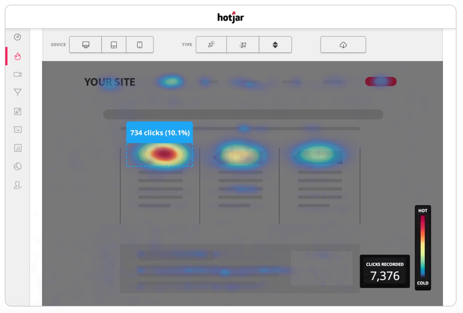
Also, you might want to know what content resonates the most with your users—content they spend most of their time on. It’s recommended to use Google Analytics and Hotjar to measure and analyze the user behavior.
 Heatmap will help you understand what parts of your page capture the most attention. Image by Hotjar
When it comes to web design, the most important thing to remember is that we should always keep our visitors in the heart of our design. When each design decision is evaluated in accordance with the needs and wants of our users, we have a better chance of creating something that will be valuable to them.
 Mockplus RP
A free prototyping tool to create wireframes or interactive prototypes in minutes.
 Mockplus DT
A free UI design tool to design, animate, collaborate and handoff right in the browser.
