90% of web design comes down to two design elements: images and fonts. The importance of fonts is self-evident, yet finding free web fonts and good web safe fonts continue to prove difficult. To save you the search, the Mockplus team has collected a list of the best web fonts available. We hope this web font list will bring you not only convenience but also value to your design.
Tip: It’s a good habit to check the font usage terms before use, especially if using them for commercial purposes.
In this article, there are four parts to introduce the web fonts:
Web safe fonts are fonts that are usually pre-installed on most devices - computers, mobile phones, smart TVs and tablets.
Ideally, you would be able to choose any font you want for your website design. In actuality, the type of fonts you can use is limited. Most computers and web browsers come with a set of fonts pre-installed by the manufacturer.
If the font you are using is not installed on the user's computer, your website will revert to a generic font that was not part of your original design. This is very unfriendly for the UI design and user experience of the web page. If you want to keep your website design and visual brand consistent, then using web safe fonts ensures that your website is exactly what you expected to display on different devices.
For example, if you do not use a web safe font when using the prototyping tool Mockplus, the preview font on the webpage will be inconsistent with the font preview on the mobile phone. So next time you encounter a font problem when using Mockplus, first check if the corresponding font is installed on the computer you are using.
1. Select a base font
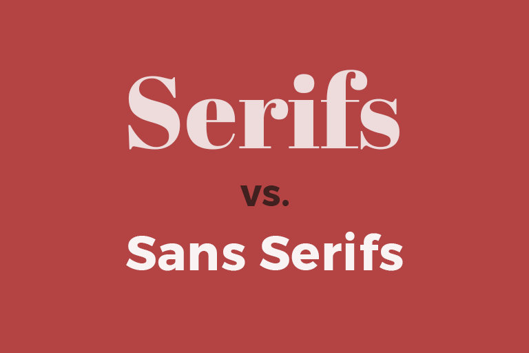
In general, there are four font types:
2. Choose a font size greater than 12 points
3. Note the length of the text
4. Pay attention to the spacing
This web safe font list includes the most popular fonts and the best widely used typography fonts. While some are free, please purchase genuine authorized fonts.

The Arial font is one of the most widely used designs in the last 30 years. Designed by Monotype Imaging designers Robin Nicholas and Patricia Saunders in 1982 for use with early IBM laser printers. Since Arial is easy to read in both large and small sizes and in a variety of applications, Arial has been the main screen font for decades.
Use for: advertising, book design, office communications, posters, large print ads

The release of Calibri by Microsoft and its implementation as the default font in many applications is widely recognized. It is a humanistic sans serif font known for its warm and rounded lines. Calibri's compact layout gives it the flexibility to work in a wide range of text sizes.
Use for: digital media

One of the most common font types is Times New Roman. This serif font comes from the British "Times". In 1929, font expert Stanley Morison criticized the magazine's fonts as difficult to read and ugly. The magazine's people accepted his criticism and asked him to design a new font suitable for magazine reading. So, Morison collaborated with Victor Lardent from the magazine to design the now famous Times New Roman.
Use for: books, periodicals, annual reports, brochures, newspapers

Helvetica is one of the most widely used sans serif fonts, created in 1957 by Max Miedinger and Eduard Hoffman. The neutral design of this font makes it quite usable in a variety of applications. Due to its usability, Helvetica is ubiquitous and has always been a popular choice for corporate identity. In addition, Helvetica is widely used by the US government, and the Helvetica font is used on the US tax bill.
Use for: brand trademark

Tahoma is a very common sans serif font. The font structure is similar to Verdana, its character spacing is small, and its support for Unicode word sets is large. It was launched by Microsoft in 1999. Many people who don't like the Arial font often use Tahoma instead. Specifically, Arial is criticized for certain style issues, such as uppercase "I" and lowercase "l" being difficult to distinguish
Use for: screen dialogs, menus

Georgia is a serif font, designed by the famous font designer Matthew Carter for Microsoft in 1993. One of its strengths is good readability even in small font size.
Use for: e-book, mobile phone, computer webpage

Verdana is a sans serif font designed by Matthew Carter for Microsoft. Like the font Frutiger, the Verdana design concept is adapted to the low-resolution computer screens of that time. The breadth and width of Verdana characters are key to the legibility of this font on the screen. Although the Verdana font family is small in size, it has a higher resolution and as such is one of the most popular fonts.
In 2010, IKEA abandoned Futura, which had been in use for many years, and turned to Verdana. According to IKEA, the reason for this change was to ensure that the font could be adapted to texts of various countries (previous IKEA fonts were not compatible with Asian characters), thus ensuring the consistency of the IKEA design. Thus, Verdana has a wide international appeal and usability.
Use for: e-book, mobile phone, computer webpage

The Optima font is a clear and precise font designed by the famous designer Hermann Zapf. Optima is inspired by classical Roman inscriptions, with slightly different curves and lines, leaving an elegant and clear impression. Therefore, Optima is often used to convey classic ideals, as well as current trends. For example, Estée Lauder uses it as an official typeface design.
Use for: poster design, bookbinding, album cover, product packaging design

The Palatino font series is said to be one of the ten most used fonts in the world. Palatino's design uses classic serif fonts in a strong, open style that is easy to read and very attractive. Its popularity has spawned many imitators.
Use for: newspapers and magazines, advertising, e-books, mobile apps, computer pages
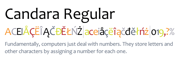
Candara is a sans serif font developed byFont Designer Gary Munch for Microsoft and shipped with Windows Vista. ——Wikipedia
Use for: email, web design, magazines, and informal typographic settings
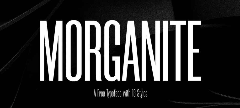
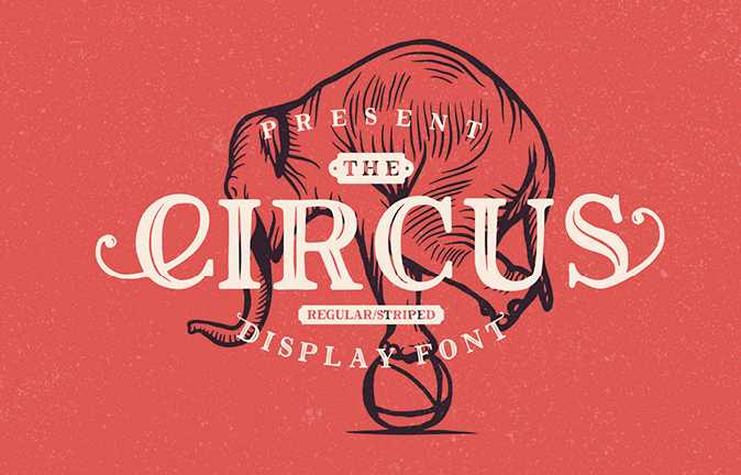
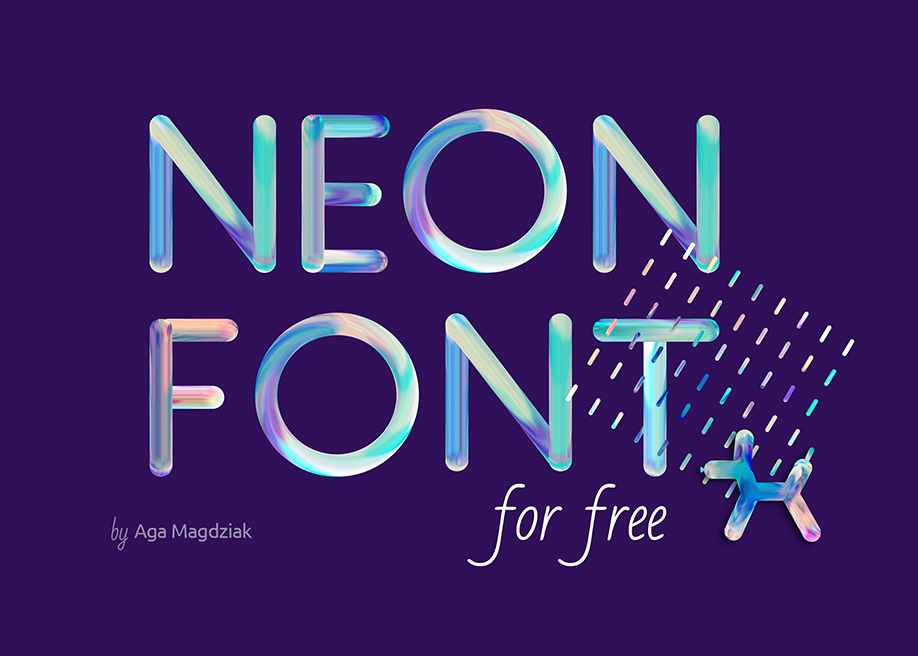
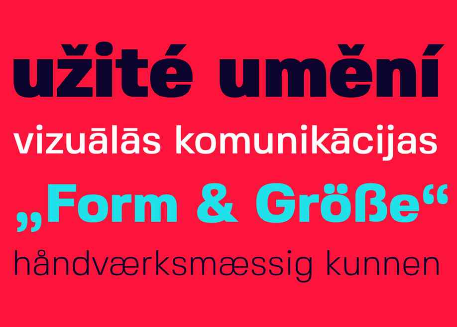
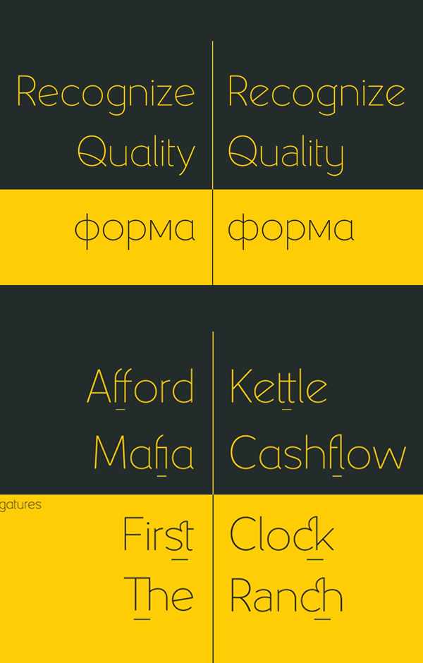
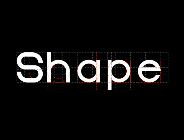
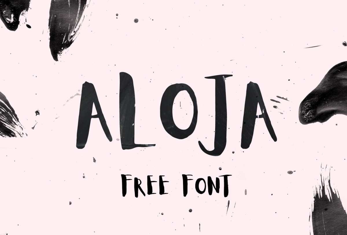
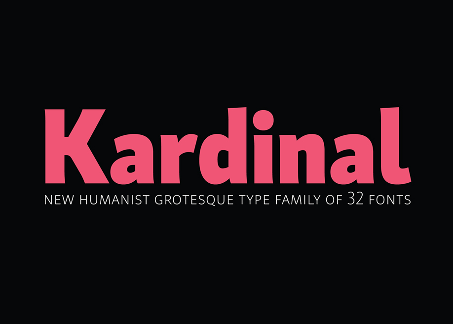
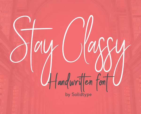
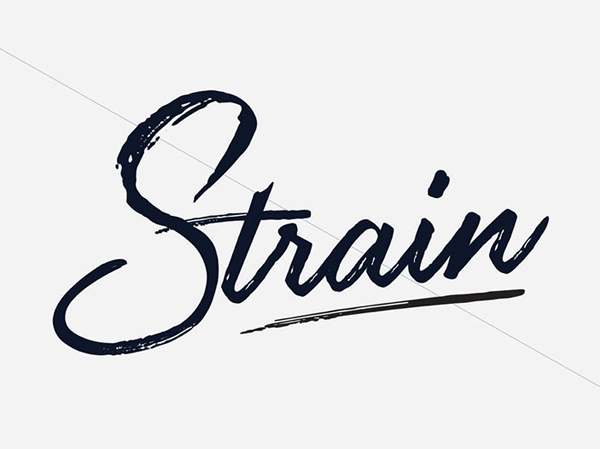
Standard Web Fonts are fonts that are available on Windows, Mac, and iOS (but not on Android). Also known as web safe fonts.
Here is a list of standard web fonts as a supplement of the web safe fonts discussed above.


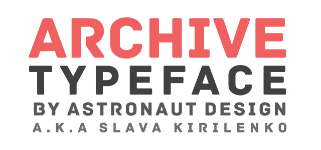
Thanks to fontsquirrel.com for these resources.
There are lots of lists provided web fonts resources for designers. I know many of you prefer Google fonts, so there is a Package of 1,208 Google Fonts for Designers. You can download fonts and learn how to use Google fonts. Looking for beautiful and unique fonts? No worry, here is a list of 43 free fonts packaged for commercial use.
Web fonts are a great resource for designers. Free web fonts provide a shortcut for high-quality design.
More on web fonts:
100 Amazing & FREE Custom Fonts
30 Cool Custom Fonts Free Download
Top 20 Best Free Fonts for Designers
24 Flat Fonts for Free Download
 Mockplus RP
A free prototyping tool to create wireframes or interactive prototypes in minutes.
 Mockplus DT
A free UI design tool to design, animate, collaborate and handoff right in the browser.
