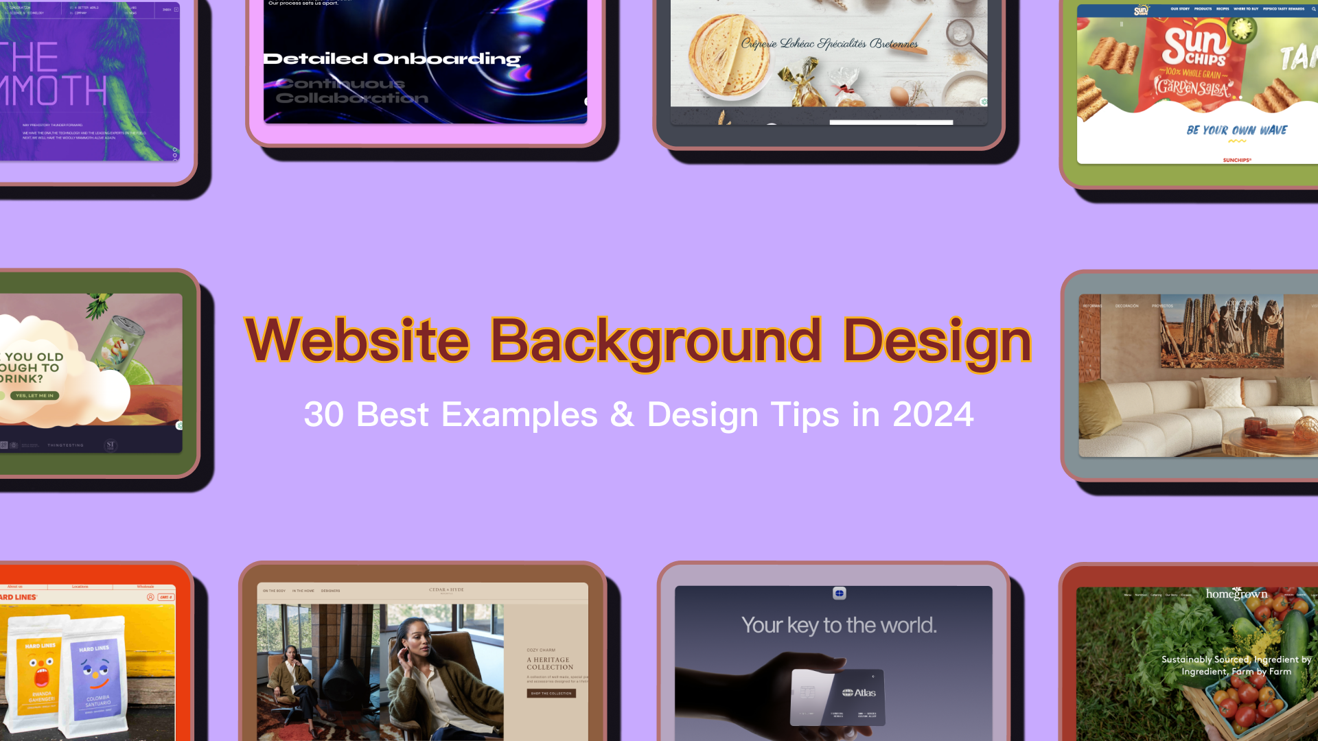
Creating a captivating website background is crucial for delivering a memorable user experience. A well-designed background can keep visitors engaged and enhance conversion rates, while a poorly chosen one—with mismatched colors or distracting images—can detract from the entire experience. Studies show that users make subconscious judgments about your website in just 17 milliseconds. Therefore, an experienced designer thinks about background design, layout, colors and fonts at the very beginning. s right from the start.
In this article, we'll delve into the essentials of website background design and explore the top tips for crafting visually effective backgrounds. Plus, we’ve curated a list of the 30 best website background examples and templates to inspire your 2025 designs. Let's dive in!
A website background serves as the visual foundation of any webpage, encompassing the entire area on which content is displayed. Various options are available when it comes to designing a website background, including solid colors, gradients, images, patterns or videos. Each choice can evoke different moods and messages, aligning with the website’s theme and purpose. For instance, a vibrant background might convey energy and creativity, while a minimalist design can project elegance and professionalism. Therefore, a website background plays a crucial role in shaping the overall user experience and perception of a site. A well-selected background not only enhances the website's character but also influences its emotional appeal, making it a key element in design.
As we know, the background of a website plays a crucial role in setting the tone, guiding user experience, and reinforcing brand identity. While website backgrounds can broadly be classified into color, video, and photo backgrounds, there are indeed more nuanced types within these categories. Here’s a deeper breakdown of background types, offering more detail to help refine your choice:
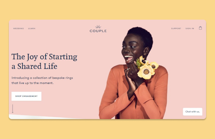
Clean, simple, and effective, solid color backgrounds are a go-to for many websites, especially for minimalist designs. Colors can reflect brand identity and create specific emotional responses in users.
-Use Case: Ideal for professional, straightforward, and content-focused websites. Works well for businesses, personal portfolios, and corporate sites.
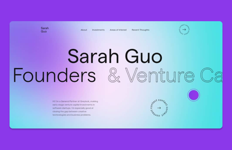
Gradient backgrounds add depth and dimension, making the site look dynamic and engaging. Subtle transitions between colors create visual interest without distracting users.
-Use Case: Effective for modern brands, creative portfolios, and tech-related websites. Works well in hero sections or as full backgrounds.
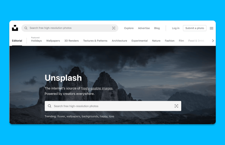
Background images can visually communicate the brand or the story behind the website. From nature scenes to urban landscapes, the possibilities are endless.
-Use Case: Perfect for lifestyle, travel, and photography sites, where the image itself reflects the website's content.
Patterns and textures add personality to a website without taking the spotlight from the main content. From subtle patterns like dots or lines to more intricate textures like wood or fabric, these backgrounds create an inviting feel.
-Use Case: Great for creative brands, craft-related businesses, or websites aiming for a tactile look.
With a parallax effect, backgrounds move at a different speed than the foreground, creating an immersive, 3D-like effect.
-Use Case: Works well for storytelling, product showcases, and interactive websites. Frequently used in gaming, tech, and e-commerce sites.
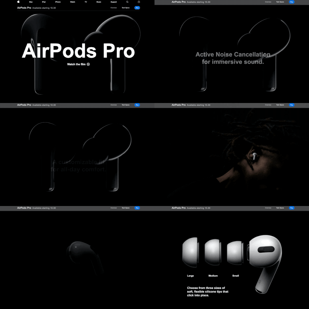
Video backgrounds add a strong visual impact and can quickly engage visitors. Used thoughtfully, they can effectively convey complex messages or showcase products.
-Use Case: Popular with fashion, luxury, and technology brands looking to create a high-end, immersive experience.
A well-chosen website background enhances your brand, improves user experience, ensures accessibility and more. Here are the key elements of a good website background:
Your website background should visually represent your brand's character. For a lively, energetic brand, opt for vibrant colors or playful designs. For a more formal or professional brand, choose neutral tones or understated textures. A good background should communicate your brand's essence and make a strong impression on visitors.
A good website background should contribute to a positive, seamless experience, helping users engage with content effortlessly. Think about how the background affects the site’s atmosphere—does it make navigation smooth and enjoyable? A well-chosen background guides visitors intuitively, creating a pleasant journey through the site.
Clear, readable text is essential for a good website background. It maintains a strong contrast between text and background. For example, light text on a dark background or dark text on a light background often works best.
A good website background design ensures everyone, including those with disabilities, can use your site comfortably. It usually avoids bright or flashing backgrounds, which can be challenging for some visitors.
A good website background should look appealing and function well across all devices. For example, video backgrounds on desktops may need static images on mobile for faster performance.
Here we’ve curated a list of the 30 best website background examples and templates to inspire your 2024 designs:
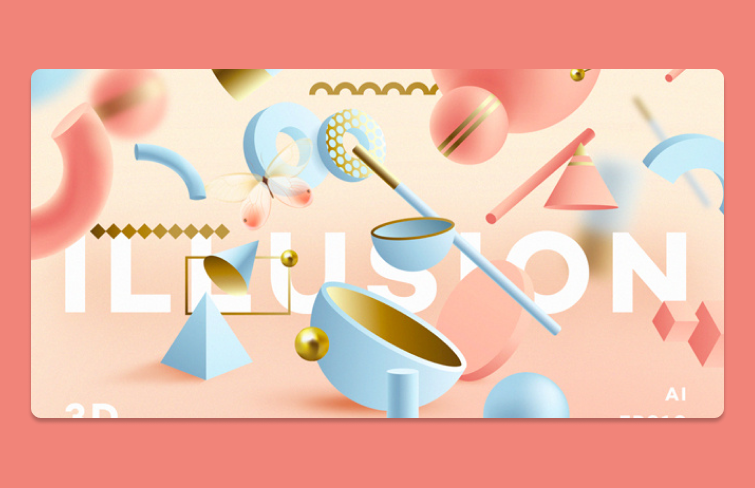
The " Illusion -3D Geometric Objects" by Diana Hlevnjak showcases the growing popularity of 3D geometric elements in design. Unlike flat objects, 3D geometric shapes add depth and dimension, enabling a more dynamic and expressive look.
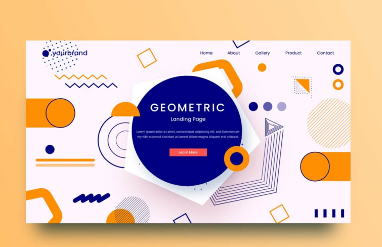
Hadianto Nugraha’s “Geometric shape Exploration for landing page ful” features a clean, straightforward layout enhanced by angular geometric elements and a minimalist color scheme. The result is a modern, visually striking design that captures attention.
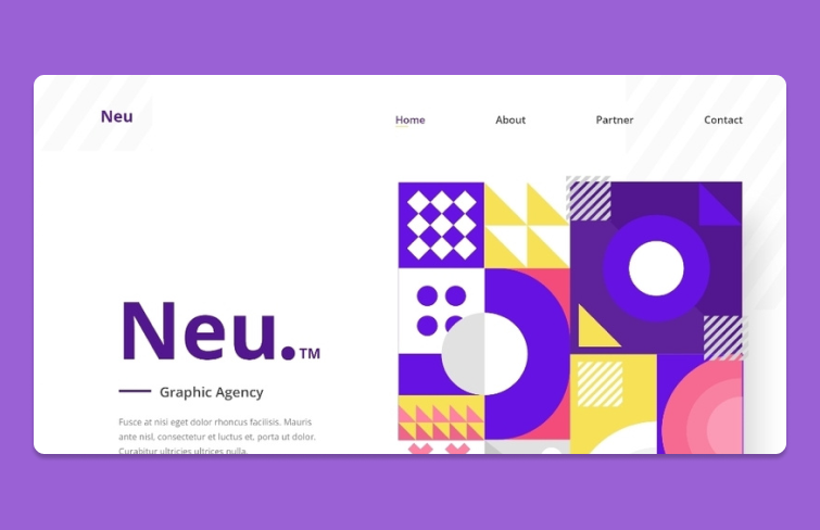
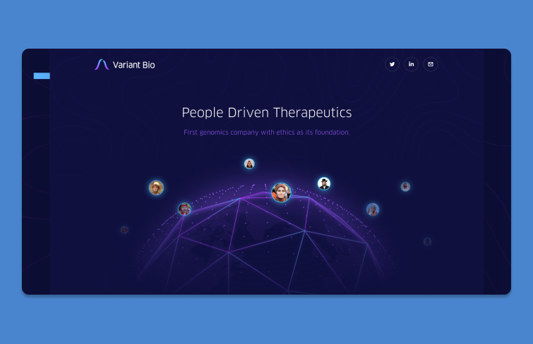
This Variant Bio features geometric lines of a polygonal pattern that are instantly recognizable to anyone who has seen sci-fi films. Incorporating these elements into website design effortlessly imparts a high-tech vibe to the overall web experience.
This “Freestyle Design” by Dawid Legierski is a good example of website background design for designers who favor a monochromatic palette, particularly black and white. The website incorporates vibrant dynamic colors to enhance visual interest and engage visitors effectively.
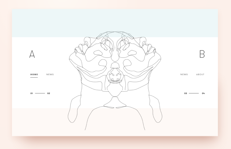
Samson Vowle’s sketches - “The Crutches of Wisdom” showcase how a skilled designer can turn a simple line into a captivating work of art, perfectly exemplifying the magic of creativity in design.
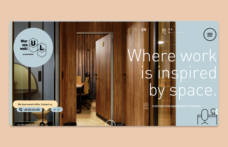
"Warszawski UL" is an interactive website that employs scrolling animations and large background images to engage and retain visitors' attention. Each image provides an intimate glimpse into the interiors of the serviced office, enhancing the overall user experience.
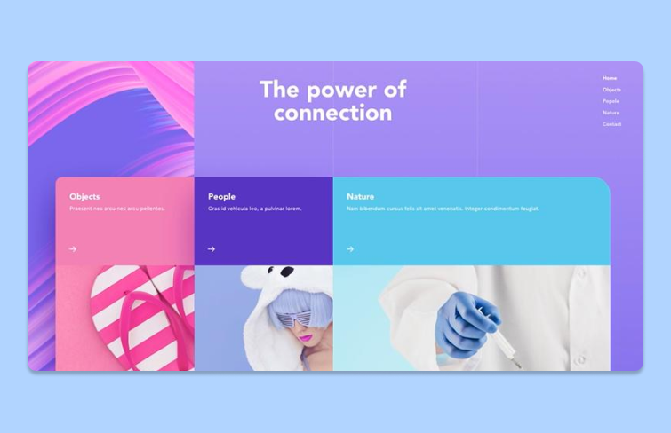
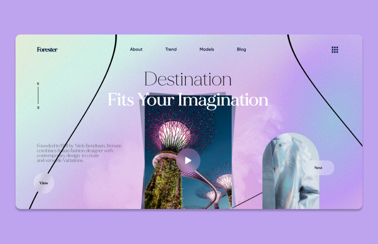
This “Gradient Website Design” by Shaafi Ahmad features a gradient background. Gradient colors are emerging as a key trend in website design in recent years, embraced by numerous designers. You can opt for a distinct gradient as your background or layer it over a video or image.
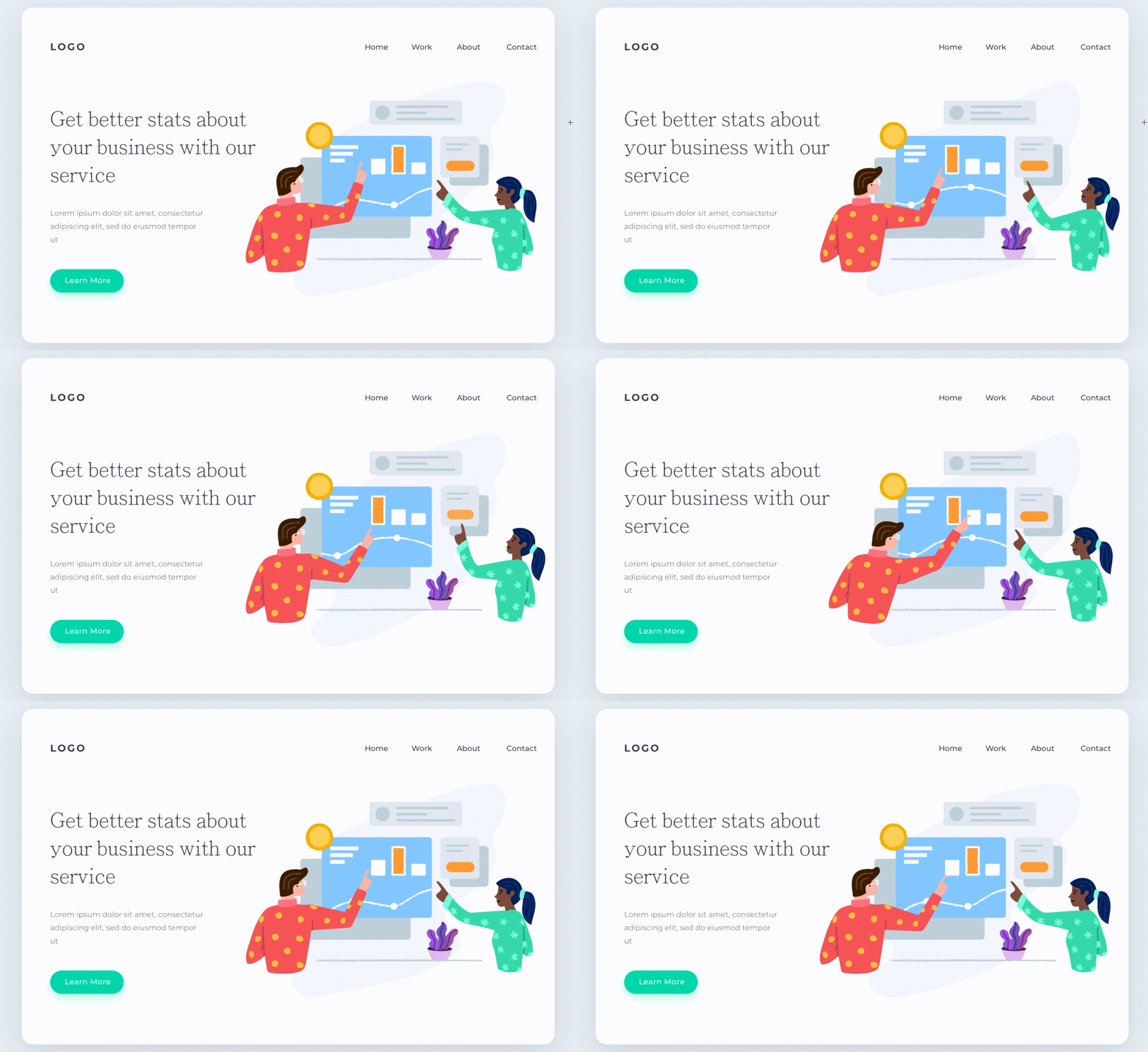
In this background design-“Colorful & Fun Illustrations II”, animation serves a functional purpose by showcasing the company’s business processes, allowing visitors to understand the services offered more clearly.
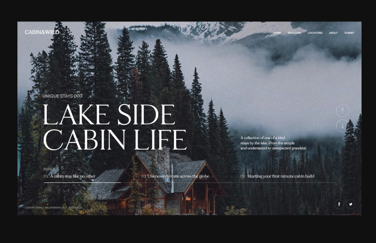
An increasing number of designers are opting for large background photos in their designs. This particular work -Cabin & Wild Lake Side by Nathan Riley features stunning high-resolution photography that beautifully complements a travel website, making it both visually appealing and practical.
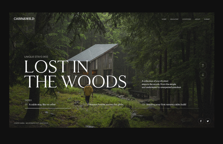
"Lost in the wooods" is a website design centered around cabin and wild themes. The traveling industry is growing fast in recent years, and not surprisingly, we see more and more travel websites. Designers often prefer to use real photographs as a website background. The ever-changing real-life photography carousel makes visitors enjoy the charm of the wild
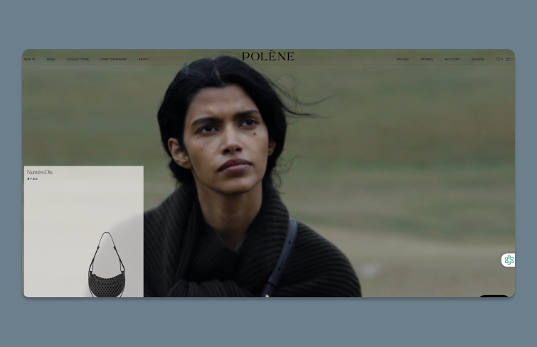
Polene is a fashion brand known for its elegant and minimalist handbags. Its website features a striking video background paired with an eye-catching header that highlights a collection of handbags.
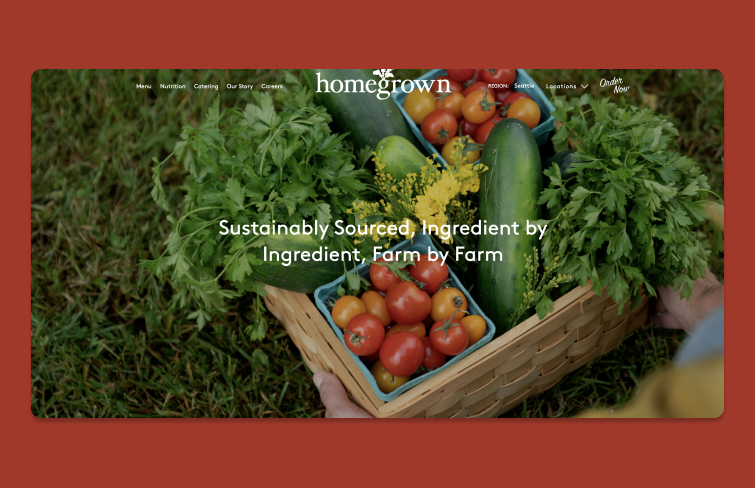
Homegrown is a food delivery service committed to providing fresh, locally sourced ingredients and healthy, delicious meals. On its website, high-quality background image beautifully complements the business model centered around premium farm ingredients, featuring a basket of fresh fruits and vegetables sourced directly from Homegrown's farms.
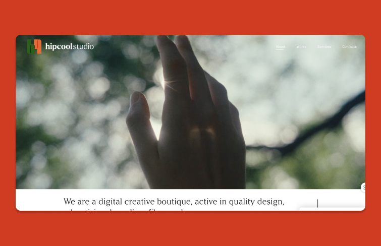
Hipcool Studio captivates visitors with a vibrant, colorful background video that highlights their creative spirit. The clean white text is easily readable and enhances the site’s modern aesthetic.
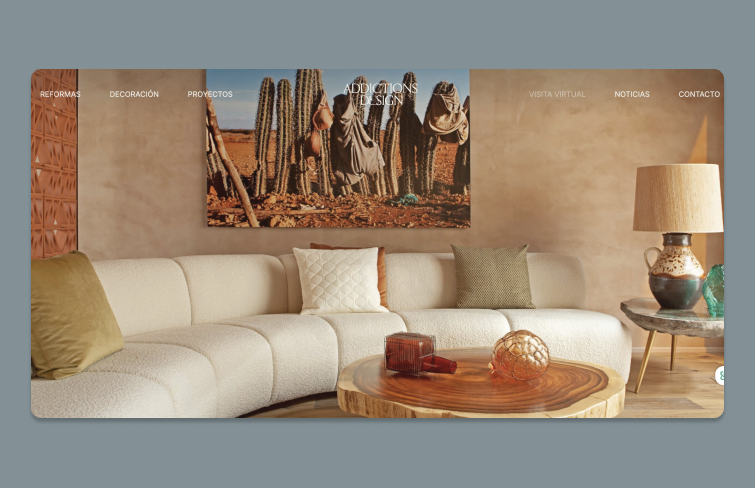
Addictions Design envelops visitors in a cozy, earthy atmosphere with its website background. The bold, elegant text prominently stands out, harmonizing beautifully with their focus on home decor.
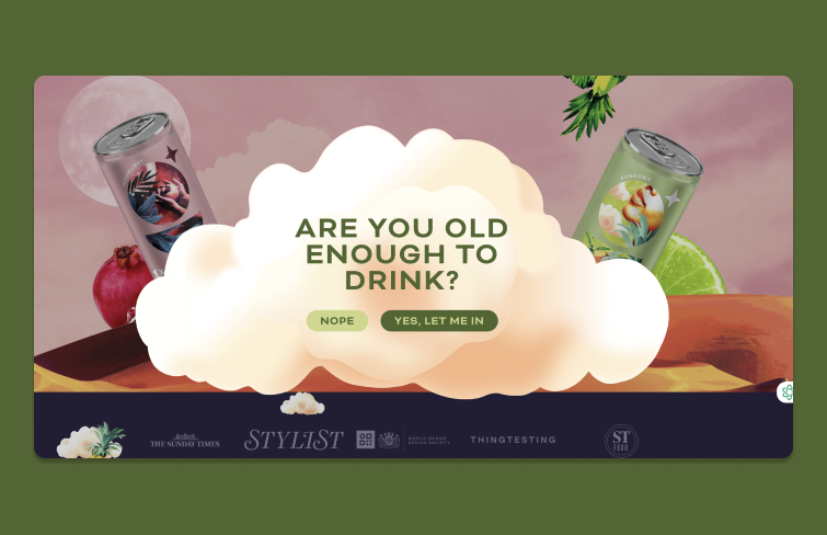
Goldling Drinks embraces a playful and vibrant aesthetic with a cloud-themed background. This eye-catching design creates a warm and inviting atmosphere, featuring clear text that perfectly aligns with the cheerful vibe.
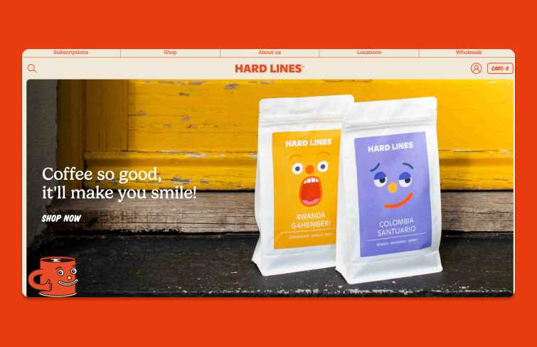
The background image features some of Hard Lines' playful designs, creatively highlighting the delivery process with coffee bags placed in front of a door. This setup invites visitors to envision themselves in the scene, bringing them one step closer to experiencing a coffee bag from Hard Lines.
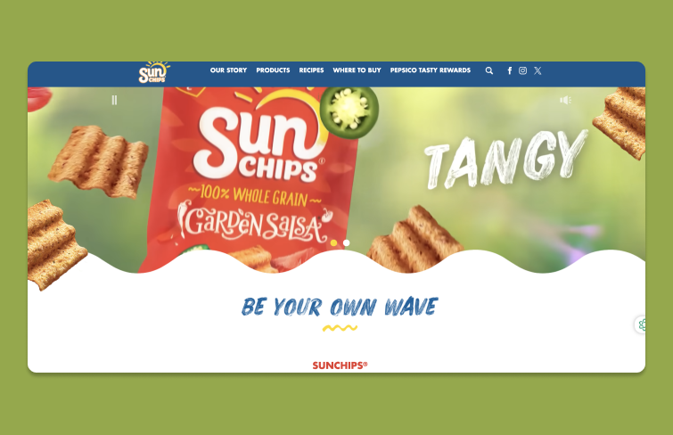
Sun chips' website isn’t designed to directly sell more chips; instead, it focuses on using a video background to foster a connection with the brand. It aims to share the brand's story and provide a centralized hub for important product information.
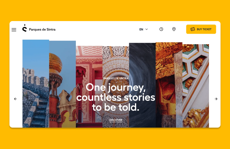
Parques de Sintra presents a stunning collage of landmarks that captivates visitors. The vibrant photos draw attention, while the crisp white text stands out against the colorful backdrop, ensuring readability and encouraging exploration.
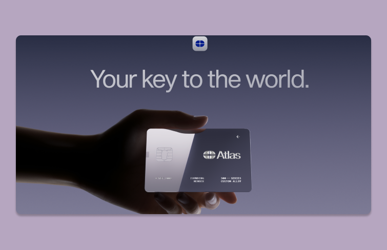
Atlas Card adopts a sleek, modern aesthetic for its website background with eye-cathcing animations. At the end, it features a gradient that elegantly transitions from dark to light, accentuating the futuristic card image. With minimal text, the focus remains on the card, ensuring clarity and maximizing impact.
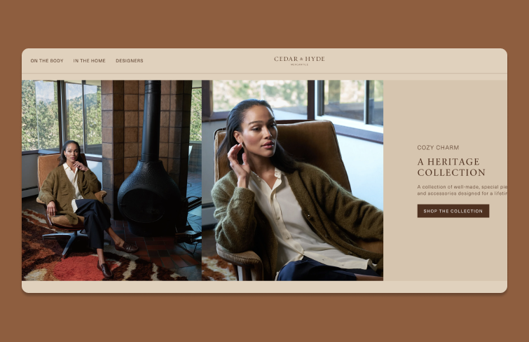
Cedar & Hyde is a boutique retail store featuring a thoughtfully curated selection of stylish clothing, accessories, and home goods. The simple background image showcases a model wearing the company's clothing and includes a call to action, inviting visitors to explore more of the collection.
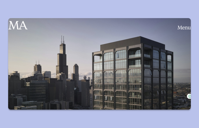
MA's website reflects the studio’s mission to create distinctive buildings. The homepage features a hero image slider complemented by a minimal navigation bar, displaying only the logo and a “menu” button. Its minimalist navigation bar allows the background images to take center stage, showcasing the studio’s impressive portfolio.
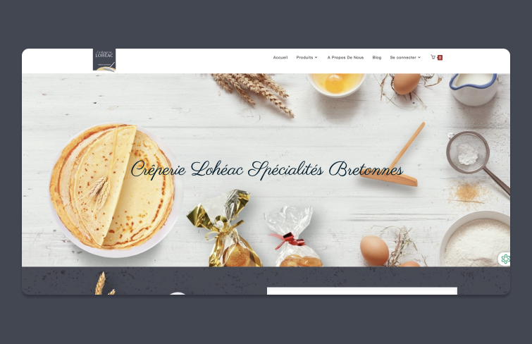
Creperie Loheac is a French restaurant specializing in authentic crepes. Its website tantalizes visitors with visuals of fresh ingredients, enticing them to visit. Its straightforward design effectively showcases the menu, making it easy for potential diners to explore and engage.
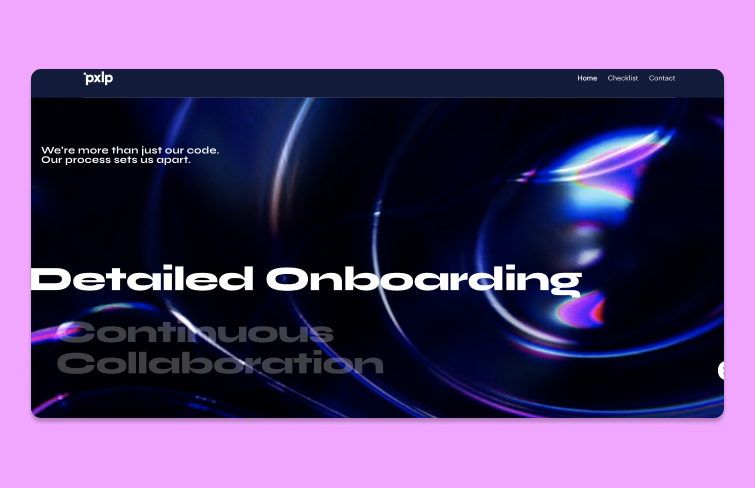
Pixel Perfect Development is a digital agency specializing in innovative design and development solutions. Its one-page website effectively utilizes design elements, featuring a cool-toned background that contrasts with bold messaging, clearly showcasing the agency's value in delivering effective design solutions.
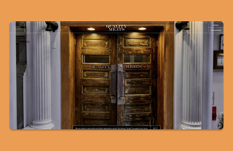
Quality Meats NYC's website captures the essence of the restaurant with a striking image of its entrance. The visuals effectively transport visitors to New York, making them feel just a step away from experiencing the restaurant's high-quality offerings.
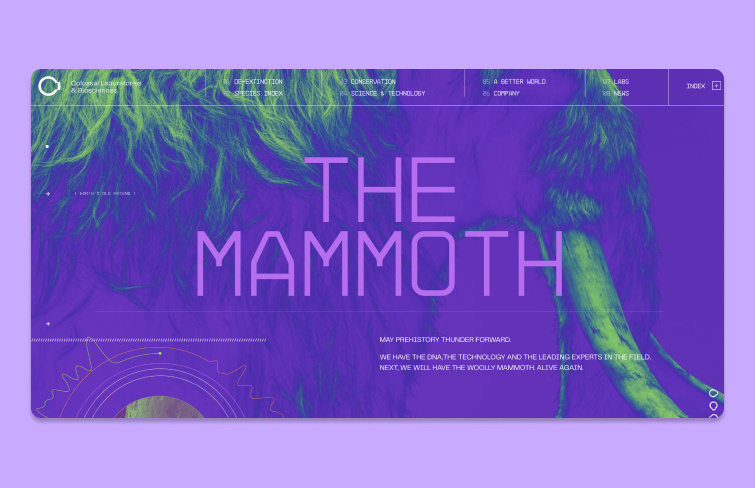
Colossal's website for "The Mammoth" project features a strikingly bold and colorful background that instantly captures attention with vibrant purples and greens. The large, clean text enhances readability and aligns seamlessly with the high-tech vibe. This dynamic design immerses visitors in the thrilling realm of de-extinction from the outset.
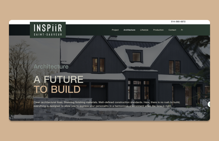
INSPiiR highlights the Saint-Sauveur district through large background images throughout its site. The images are slightly darkened and made transparent, ensuring the text remains readable.
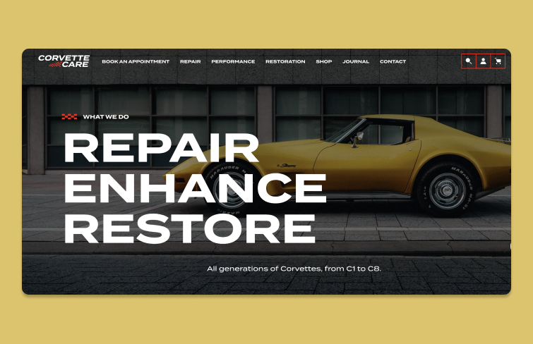
Corvette Care features a visually engaging website, with a homepage that includes a hero image slider activated by hovering over service-related text. This dynamic approach showcases the company's offerings, highlighting its expertise in both basic maintenance and as a top facility for Corvette restoration and performance.
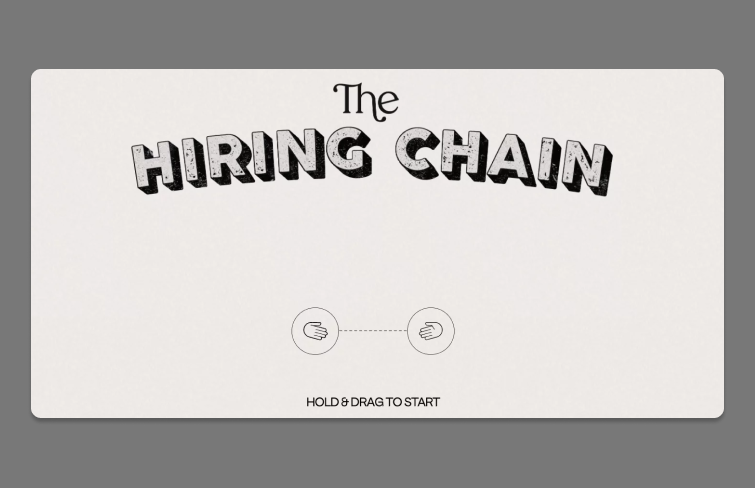
The beige background offers a minimalist contrast, enhanced by a subtle pattern that evokes the "classifieds" section of a vintage newspaper, adding a touch of nostalgia while keeping the design clean and inviting.
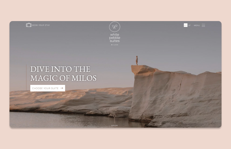
White Pebble Suites embodies harmony in its website design. The background image aligns seamlessly with the overall ambiance, complementing the soft pastel color palette. Additionally, the white text, logo, and call-to-action buttons create a striking contrast, ensuring clarity and visual appeal throughout the site.
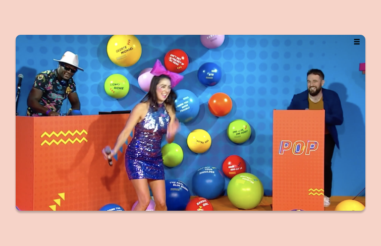
WLLX opts for a bold, eye-catching video background with fast-paced sequences and large white captions that effectively narrate the story. While the dynamic visuals capture attention, the disappearing logo and navigation menu until user interaction may hinder navigation and user experience.
Here are some of the best practices for creating effective website background designs:
Overly detailed or complex backgrounds can overwhelm visitors and detract from your primary content. You should aim for a clean, minimalist background that complements your content rather than competing with it.
To make text legible against a background image, it's essential to ensure it stands out. This can be achieved through various methods, such as using contrasting colors, placing a solid color behind the text, or applying overlays on the images. Additionally, positioning text over the lighter or darker areas of the background can enhance visibility.
Avoid busy and cluttered images, particularly when overlaying text. While it's tempting to use a striking image for visual impact, it should enhance rather than distract from your message. Simple, captivating backgrounds like landscapes work well, providing both visual appeal and clarity without overwhelming your content.
If your background image is intricate or visually dense, add a color overlay to soften its effect. Overlays help maintain text readability by reducing distraction and letting your message stand out clearly against the image.
Select backgrounds that align with your brand’s voice, tone, and values. If you’re a luxury brand, for instance, using high-resolution, elegant imagery with a muted color scheme might suit your aesthetic better than bright, playful visuals.
Low-resolution backgrounds can make your website look unprofessional. Invest in high-quality images that appear crisp on all screen types, especially retina displays.
Animations can add an engaging, dynamic element to backgrounds, but they should be used sparingly to avoid overwhelming the user. Soft looping animations, such as a subtle wave effect or gentle scrolling, can add depth without distracting from the primary content.
Large background images or videos can significantly slow down a website, especially on mobile devices with slower internet connections. Compress images without losing quality by using tools like TinyPNG or JPEG Optimizer, and consider using video formats with lower bitrates.
In today’s digital landscape, most users access websites on mobile devices, even if you’re designing from a desktop. To ensure a seamless experience, follow these essential mobile-friendly principles for a responsive and user-friendly design.
Periodically refresh your backgrounds to maintain user engagement, especially if your site has seasonal promotions or evolving content. New backgrounds can reinvigorate the user experience and reflect up-to-date branding.
To create your web page, you can easily find background pictures using one of the following resources:
1.Unsplash: Widely popular among web designers looking for high-quality images for website backgrounds.
2.Pexels: Similar to Unsplash, offers images under its own license, allowing free use for both commercial and personal projects.
3.Freepik: A free picture resource for website background design.
4.Designshack: A website providing free resources & collections for website design.
5.Dribbble: The best design community for designers to find & search designs for inspiration.
6.Behance: Another design community gathers a lot of great design resources.
7.Gratisography: For a quirky and fun aesthetic, Gratisography is an excellent choice. It provides a collection of free, high-quality images that add a unique flair to your website
Throughout this article, we've explored what makes a great website background, from types and best practices to inspiring examples and resources. To conclude, a well-chosen background can transform a website, drawing users in and elevating your brand's message with just a glance. The curated examples above showcase the power of unique backgrounds to create memorable experiences and immediately capture attention. With the list of free resources provided, you have everything you need to select backgrounds that perfectly complement your site’s style and voice, adding that final creative touch to make it truly stand out.
 Mockplus RP
A free prototyping tool to create wireframes or interactive prototypes in minutes.
 Mockplus DT
A free UI design tool to design, animate, collaborate and handoff right in the browser.
