Updated 7/2/2022: We added more valuable website carousel/slider examples and templates to help you create a successful one with ease.
A website carousel or slider, is an effective way of displaying multiple images or content in a single space. It not only helps in saving screen space, but also encourages visitors to focus on important website content and improves the overall visual appeal effectively.
However, designing a good website carousel is not easy. Sometimes, if the design fails, it can affect the UX and ruin your website.
To help you avoid this, we've picked 32 of the best website carousel/slider examples and templates to help you create a successful one with ease. The guidelines about how to make a carousel or slider are also introduced to help you get started quickly.
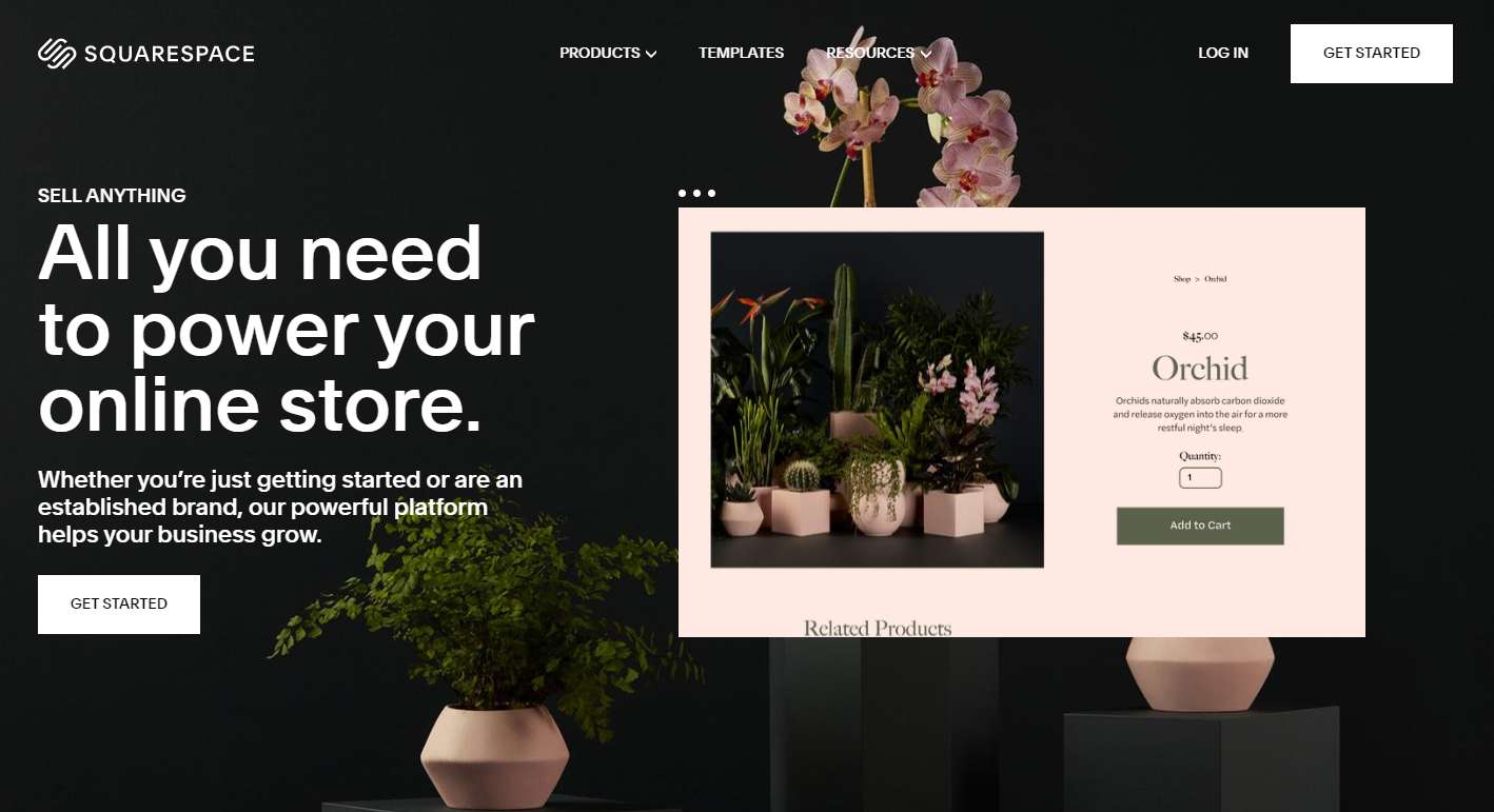
Squarespace, the well-known website builder, has two stunning and creative website template carousels on its home page.
The first one is on the top and will auto-play three website images to showcase wonderful web templates. The second one (which is in the middle) is interactive and enables users to view website templates one by one with clicks.
Both of them help engage users and encourage them to purchase.
Why it works:
Autoplaying carousel + interactive carousel
The first autoplaying carousel attracts users’ attention quickly once they open the website. The second interactive carousel engages them and keeps them on the page, increasing the possibility of purchasing. They both have their roles and work together to increase sales.

Usain Bolt is a personal website which features a high-quality full screen image carousel. The striking images, CTAs, short texts, and arrow buttons guide visitors to switch different image cards easily and let them know Usain Bolt better.
The thumbnail bar beneath it enables them to know what's coming next and freely choose the desired image to view details.
Visitors can hide this carousel by clicking the green button on the left side.
Why it works:
This website excels in user-friendly design. The thumbnail bar beneath the carousel helps visitors navigate easily. The green button helps them choose to show/hide the carousel. All of these designs enhance UX effectively.
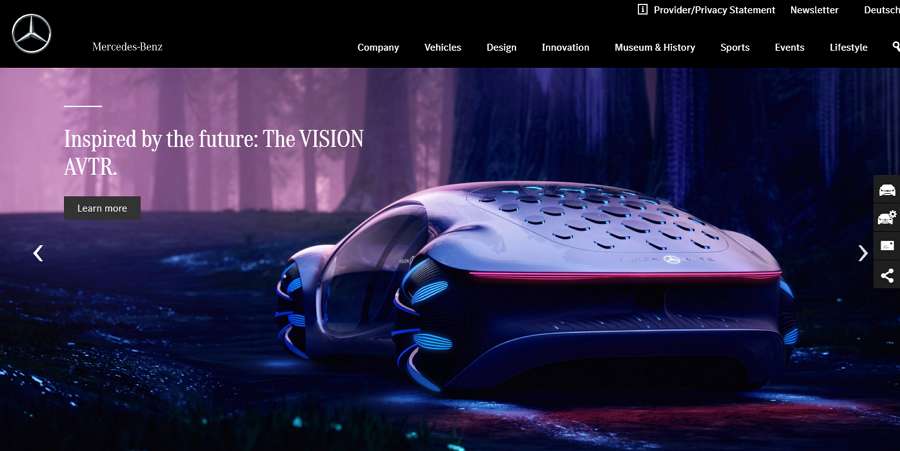
Benz uses a typical hero image slider to show off its cars on the home page. The high-quality product hero images, clear headings, CTA, and arrow buttons give visitors a clear direction on how to view the next image and learn more details about the cars
The micro-animations also make headings and CTAs stand out easily.
Why it works:
This carousel example is modern, effective, and user-friendly. The overall visual appeal is great. You can adopt this template to improve your own web design.

Rolling Stones is a well-known English rock band and its official website has a very fashionable carousel with distinctive illustrations. Apart from the colorful illustrations that catch visitors' attention quickly, the fancy transitions encourage them to view the next image card.
Why it works:
This website has a very immersive visual design, which includes rich colors, rocking design style, and striking transition animations. All of them increase the website conversion rate effectively.
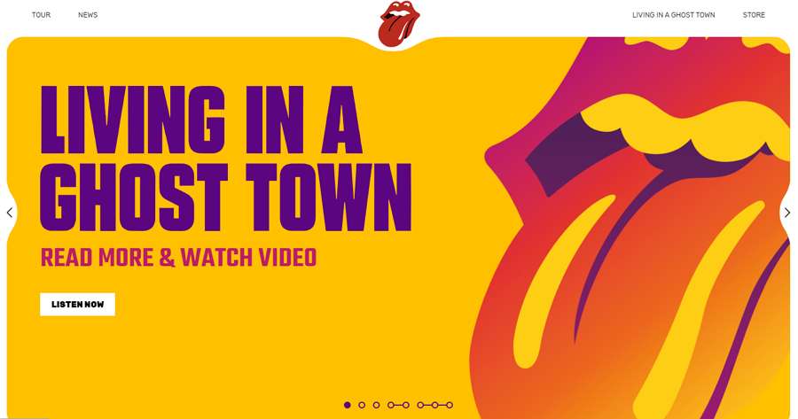
The official website of Toyota Motors Brazil has a very minimalist card carousel that consists of a product showcase, text introductions, CTA buttons, and arrows.
Once visitors open the website, the carousel will auto-play to showcase different products and brand concepts.
A simple progress bar runs automatically to indicate when the next card is going to come up. Visitors can also manually click arrow buttons to move back and forth.
Why it works:
The autoplaying image cards, progress bars, and navigational arrows make it easy for visitors to move through the carousel.
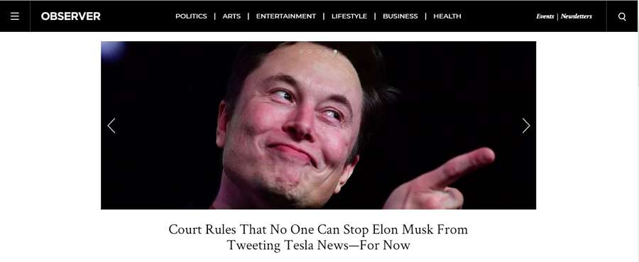
Observer is a famous news website. Its official website features a boxed news slider on the top. It showcases the latest and most important news, and helps visitors catch up with the latest trends easily.
Why it works:
Many news or trend websites use similar looping news sliders on their home pages to showcase the top news. It attracts visitors' attention effectively.
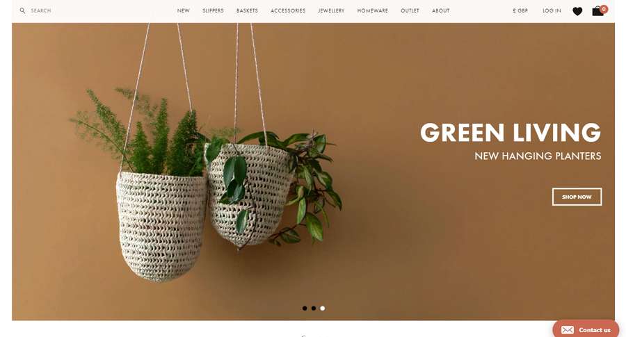
Bohemia is a minimalist e-commerce website that sells functional, fun objects from all over the world. Its home page uses a high-quality hero image carousel to showcase its products. The white text and CTA buttons contrast sharply with the colorful background hero images, enticing users to purchase something quickly.
Why it works:
This carousel is clean, modern and has three dots at the bottom to indicate there are two more products to check.
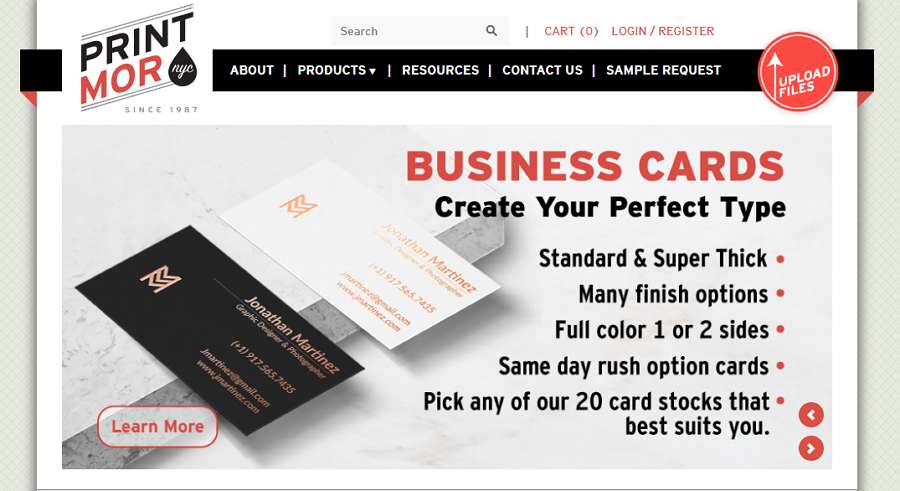
Print Mor is a full-service NYC printing company dedicated to all types of printing and design services. To showcase its main services, the company created an image carousel with an excellent printing style on its website home page. There are also navigational arrows to help visitors move through the carousel.
Why it works:
To help users navigate carousels smoothly, many types of controls such as navigational arrows, numbering the carousel images, and adding thumbnails can be used. This website uses navigational arrows effectively.
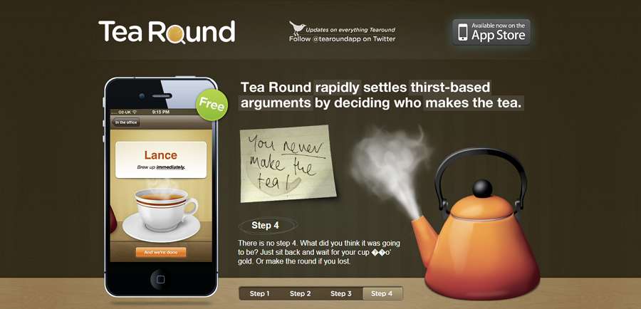
The Tea Round App sticks to the basic functions of its app with a home page slider. This slider is just like a step-by-step app usage tutorial that enables users to read and navigate the app features with simple clicks. The other aspects of the design, such as handwritten notes, artistic images, and smart button navigation, make it attractive, unique, and effective.
Why it works:
The slider is simple and attracts users' attention quickly for a unique tutorial-like design style.
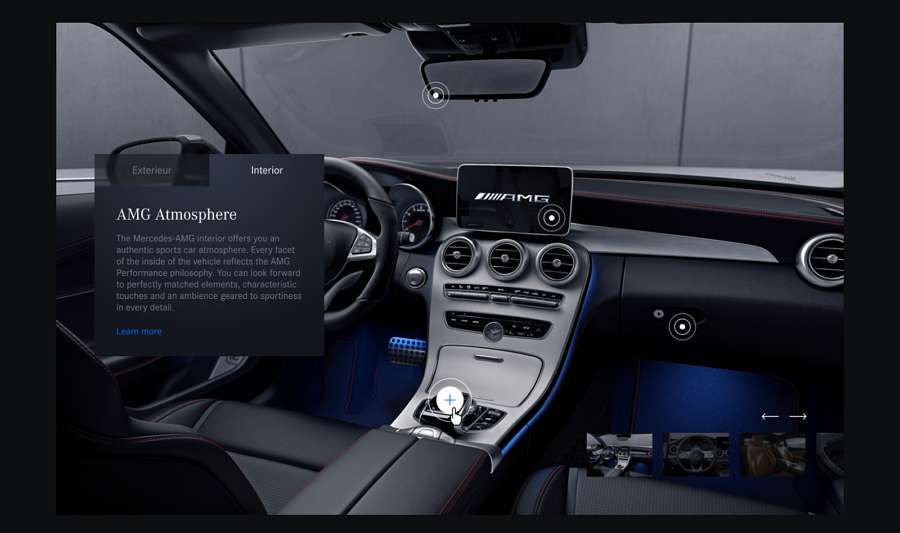
Mercedes Class Gallery Carousel is a concept carousel example made for a big brand Mercedes. Apart from the cool thumbnail bar on the right side, it features fully interactive car images. Visitors can not only click arrows to navigate the car images, but also click the triggers on the images to view details of different parts of the cars.
Why it works:
The cool car image interactions make this example stand out, creating a very fantastic visual effect.
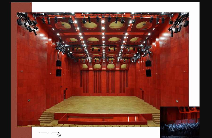
Fala Dźwięku gallery carousel is coded with HTML/CSS. The designer uses arrows and images to create a fancy full-width carousel. In order to entice users to continuously click and view the next image, the designer displays the thumbnail of the next image on the lower right corner.
Why it works:
Apart from a navigational thumbnail bar, partially or completely displaying the thumbnail of the next image is an effective way to encourage users to check all the images.
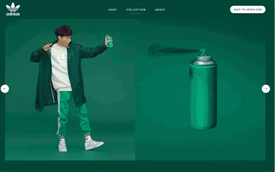
LookBook carousel is an impressive concept carousel example made for fashion websites. Unlike common carousels which play horizontally, this example auto-plays vertically.
Why it works:
Vertical rotating designs are combined to facilitate website visitors to view the products effectively.

This home page carousel incorporates 3D style illustrations to showcase the features of the Even app. The auto-playing design helps visitors learn about the features clearly. Moreover, the bottom bar also provides visitors a way to navigate these features freely.
Why it works:
Without using arrows, other directional icons, or buttons, it uses some indicators to help visitors navigate visitors, such as the autoplaying circular progress bar, the red lines on the bottom bar, which helps them know which features they are viewing.
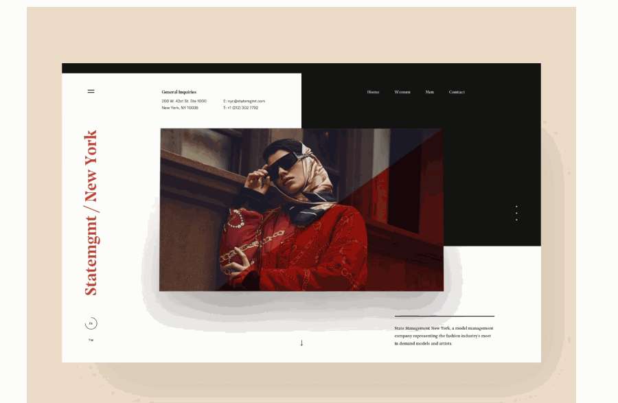
Want to make your carousels stand out for brilliant visual appeal? Add appealing transitions and animations to your carousel images or cards.
This State Mgmt Carousel example incorporates a cube effect and a rotating effect to create fabulous transitions.
Why it works:
It combines different after-effects and motion effects for images to create very striking transitions. This is a very good concept which you can copy.
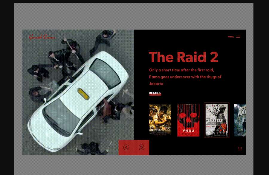
Movie Poster Slider is an animated concept slider design made for movie websites. It features a two column design which showcases the trailers and movie information separately.
Why it works:
This movie showcase slider uses exciting video backgrounds to attract visitors. The two-column design also makes the movie information clear to them.
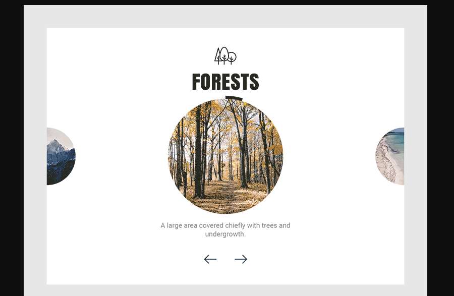
This website slider example features special circular images, cool transitions, and video backgrounds.
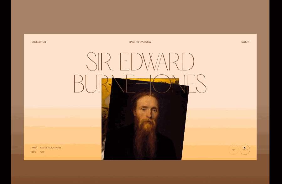
Pre-Raphaelite Gallery Slider features fresh swiping transitions. The overlaid font is eye-catching.
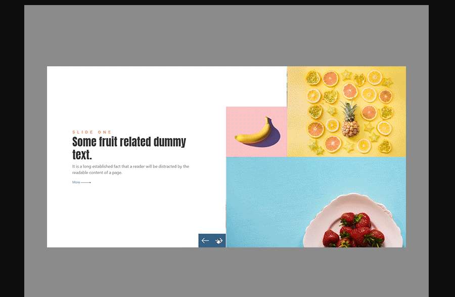
Broken Grid Carousel Slider is a creative bootstrap 4 carousel slider customized using CSS. It has a trendy broken grid layout, giving it a very modern, attractive look. The simple, refreshing transitions distinguish it from other carousels.
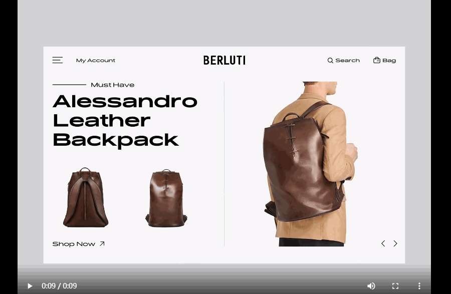
Product Carousel is a creative product carousel example for an e-commerce website. It features wonderful transitions, well-crafted layouts, and amazing fonts.
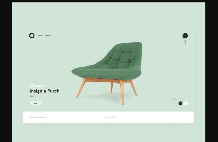
Bon Carousel is a minimalist carousel example for furniture websites. It has eye-catching colors and simple yet cool transition animations.
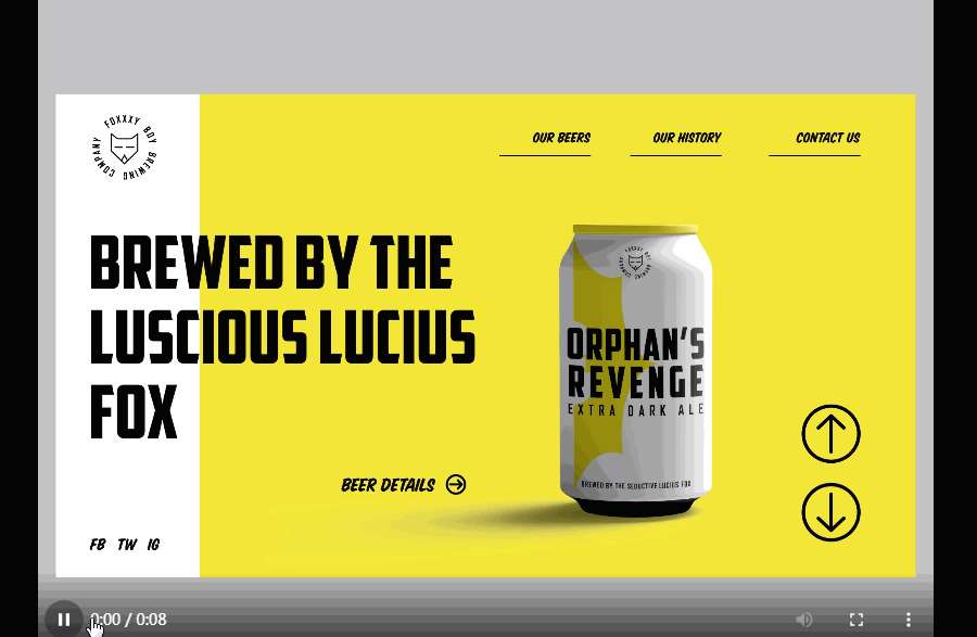
Brewery Slider is a good example of how to create a simple home page slider for drink or beverage websites using rich bright colors. The falling color waves help in creating impressive product transitions.
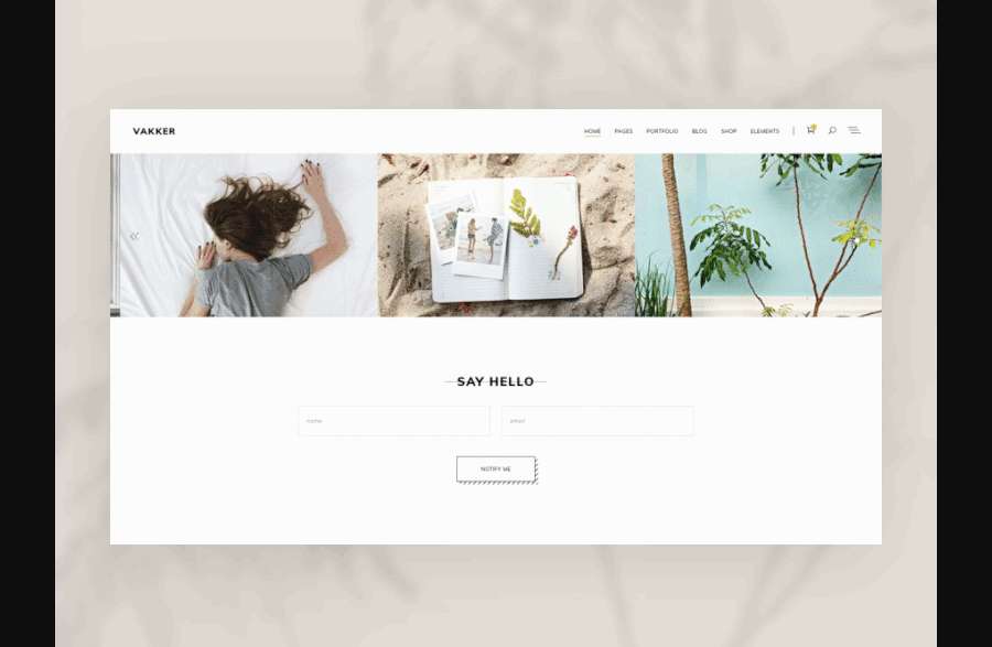
Portfolio Carousel is an image carousel made for a portfolio website. Visitors can easily navigate between these images using arrows. While hovering on an image, the related project themes will show up to help you make a decision.

Carousel designs can not just be used on your website home page. Like Login Carousel, you can use a two-column design to incorporate your carousel, providing more information about your website’s products or services.
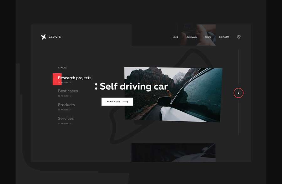
Lab Carousel uses a clear sidebar to help visitors navigate the carousel.

Homepage Hero Carousel is a wonderful full-width hero carousel example with clear fonts and sliding transitions.
Want more? Check out 7 of the best free bootstrap carousel or slider templates that are downloadable and can be used on any website directly:

Media Carousel Template consists of slides with images, YouTube and HTML5 videos. It features a navigation bar at the bottom and provides a variety of layouts to help you create your desired carousel with ease.
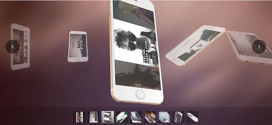
Want a high-quality product carousel? This carousel template presents a swipe-controlled product showcase carousel. It can be easily used on your website’s home page, landing, or product page to showcase your products clearly from different angles.

Fade carousel Slider is a bootstrap image carousel example with a fading effect.

Bootstrap 4 Carousel Template is designed with customizable images, text, and responsive slides.
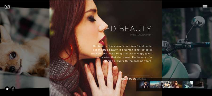
Photography Carousel Template features high-quality images and a navigational thumbnail bar.

JS 3D Carousel Template is a cool 3D rotating carousel that can help you create a very striking visual appeal for your website.

This CSS template is a good option to help you create a video carousel for your movie or personal websites.
Apart from design inspiration, to create a user-friendly, effective carousel or slider, you should also follow 7 of the best tips to avoid serious usability issues:
The first image or card gets the most attention of website visitors. So, you should ensure that you display the most important content or current promotion information on the first image or card.
An auto-playing carousel, as its name suggests, rotates automatically without visitors doing a thing. This makes it difficult for them to locate and view the desired image or card content. However, it does not mean that you cannot use an auto-playing carousel on your website.
Instead, you can use it when you don't want visitors to interact with your carousel (like the Squarespace example mentioned previously). Or use it together with navigational arrow buttons (like the Toyota Auto-playing Carousel example mentioned previously).
To improve UX, you can add indicators and guide visitors to navigate back and forth. Here are common ways to help you do so:
You can directly add a direction arrow or icon to guide visitors to move back and forth.
Customize a hover effect for every carousel card or image to guide them.
Create a clear and short navigation menu/sidebar to guide them to move around.
To encourage users to go on navigating your carousel or slider, you can also display a complete or partial thumbnail of the rest of the images.
To engage visitors on a carousel, you can limit the number of images or cards included in it. 5 or less images or cards is OK.
Carousels are often used to highlight key features, promotions, news, and important information. To make this work, you should keep all carousel content short and clear. To increase sales, it is necessary to add CTA buttons correctly for your promotional products.
The carousel content on the website home page gets multiple times the exposure of the website content elsewhere. However, it should not be the only place to display important content. You should always make sure that the content can be checked in detail elsewhere on your website.
Like other aspects of website design, the best carousel designs require a lot of teamwork, prototyping, testing, and iterating. To achieve this, you will surely need a handy website prototyping tool, like Mockplus.
It provides a special "Image Carousel" component to help you create a distinctive website carousel with simple clicks. And then, you can prototype the rest of your website, test, iterate, and collaborate with your entire team in one place.
It also enables your entire team to work remotely and effectively.
An effective website carousel tends to showcase the most important information and engage visitors easily.
We hope all these best web carousel design examples, templates and best practices can help you create a stunning, effective carousel smoothly.
 Mockplus RP
A free prototyping tool to create wireframes or interactive prototypes in minutes.
 Mockplus DT
A free UI design tool to design, animate, collaborate and handoff right in the browser.
