Your website is often the first touchpoint between your brand and potential customers. But in the fast-evolving digital world, what looked modern and effective two years ago may now feel clunky or outdated. Design trends change, user behaviors shift, and business goals evolve—so does your website need to.
That's where a website redesign comes in.
Whether you’re aiming to boost conversions, modernize the UI, improve user experience, or realign your brand, this ultimate guide will walk you through everything you need to know about redesigning a website. From strategy and steps to real-world examples and tools, we've got you covered.
While redesigning your website, also try our free design and prototyping tool to timely iterate your redesign ideas.
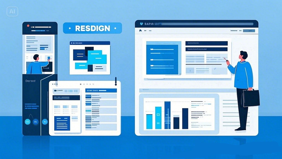
Website redesign is the strategic process of revamping the structure, layout, visuals, and user experience of a website to better meet business goals and user expectations. This goes far beyond changing a few images or updating the color palette—it often involves rethinking navigation, optimizing page speed, refining the user journey, and sometimes even restructuring the backend.
There are different levels of redesign:
Cosmetic/UI redesign: Updating visual elements like fonts, colors, and layout
UX redesign: Improving usability, navigation, and accessibility
Structural redesign: Reorganizing pages and information architecture
Full overhaul: Rebuilding the website from the ground up
In some cases, after the redesign, the website of a product or service can be completely different.
Here are some common reasons businesses decide to redesign their websites:
Outdated look and feel: If your site looks like it belongs in 2015, users will notice. An outdated design can make your brand appear less credible, especially to first-time visitors.
Poor user experience: Bad user experience can lead to frustration, decreased engagement, and loss of users or customers.
Low conversion rates: A confusing UX can lead to lost leads and revenue. If visitors struggle to navigate or find key information, they’re unlikely to convert.
Brand evolution: If your messaging or positioning has changed, your site should reflect that. Your website should communicate your brand story, values, and offerings consistently.
Technical issues: Slow loading speeds or outdated tech stacks hurt performance and SEO. Your website should communicate your brand story, values, and offerings consistently.
User complaints or high bounce rates: Direct signals that your site isn’t delivering.
"88% of users are less likely to return to a website after a bad user experience."
So, if your website clearly has poor user experience, a low conversion rate, or similar performance issues, you and your team should seriously consider whether it’s time for an update—or a complete redesign.
Please note: Before jumping into a redesign, always audit your website using analytics and user feedback tools to ensure your decisions are grounded in real data, not just gut feelings.
Many people confuse a website redesign with a website refresh—but they serve different purposes and involve vastly different scopes of work.
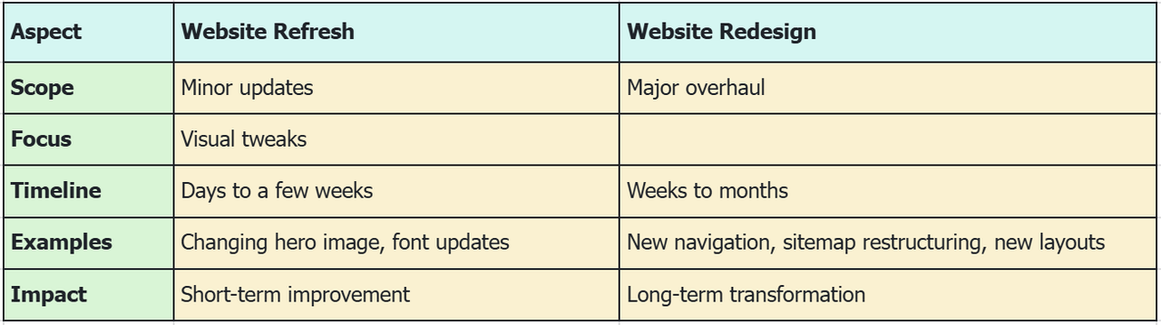
When to refresh:
Your branding has slightly evolved
You’re testing new call-to-actions or messaging
Your content is still relevant, but the visuals need a facelift
When to redesign:
Your site doesn’t meet your current business goals
The structure or UX is confusing
You’re seeing performance drops or user complaints
In short, while a refresh helps polish your existing website with minor updates, a redesign is a deeper, strategic transformation that rebuilds the foundation of your site to meet evolving user and business needs. Think of a refresh as a “facelift,” and a redesign as “reconstructive surgery.”
Here’s a proven roadmap to redesign your website the right way:
Use tools like Google Analytics, Hotjar, or user surveys to uncover what’s working and what’s not.
Identify what success looks like: better user retention, faster load times, increased conversions?
Update your buyer personas and map key user journeys.
Benchmark features, design trends, and UX patterns that are working in your industry.
Reorganize pages and layout using a tool like Mockplus RP for fast wireframing and testing.
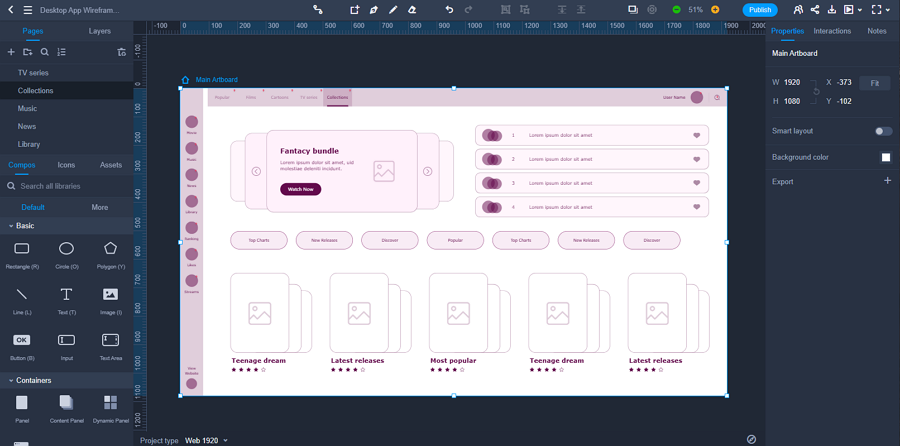
A free music website wireframe kit made with Mockplus RP
Focus on mobile-first design, clean interfaces, and intuitive interactions. Tools like Mockplus DT help you build scalable, high-fidelity designs.
Work closely with your developers. Use Mockplus Cloud to streamline design-to-development handoff, ensuring pixel-perfect results.
Perform quality assurance, A/B tests, and user testing. Don’t stop improving post-launch.
A successful website redesign isn’t just about looking better—it’s about solving real problems, improving usability, and creating a stronger connection with your audience. Let’s take a look at how 15 well-known brands tackled their redesigns, what wasn’t working before, and the impact those changes had.
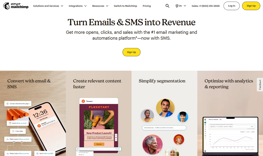
Mailchimp had the functionality, but not the feeling. Their old website felt dry and a little too buttoned-up for a brand known for creativity. It lacked visual energy and personality, and it certainly didn’t speak to their growing audience of makers and marketers.
The redesign flipped the switch.
Out went the generic stock imagery and stiff tone. In came bold, character-rich illustrations, cheeky microcopy, and a brighter, more playful design system. It wasn’t just a new coat of paint—it was a full-on identity refresh. Now, Mailchimp looked, sounded, and felt like the creative brand it had always been.
And with that personality on full display, user engagement jumped, and the site finally matched the voice of the product.
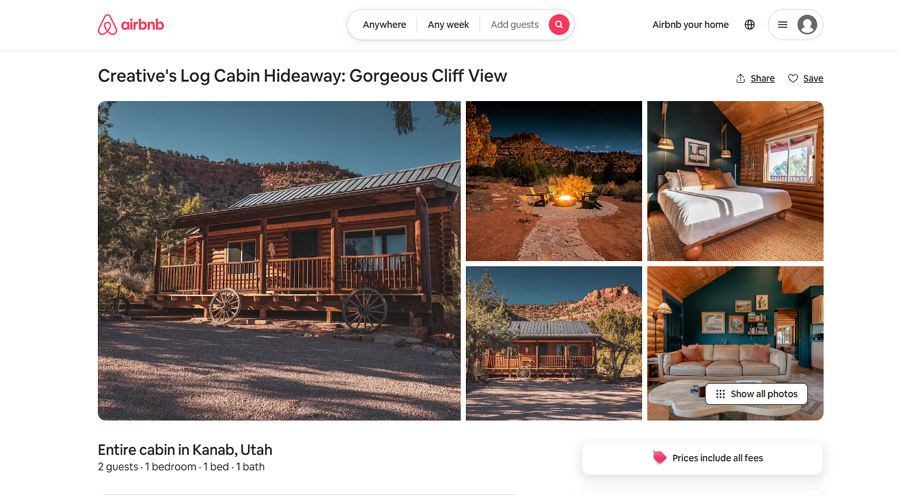
Airbnb’s original site was efficient, but transactional. It helped people book homes, but it didn’t inspire them. There was a disconnect between what the product offered—unique, human travel experiences—and how it was being presented.
Their redesign bridged that gap.
They leaned heavily into storytelling—big visuals, clean layouts, and soft, emotional copy that made you feel like you were already on vacation. Hosts were spotlighted, experiences became part of the narrative, and the UI became intuitive enough for anyone to use.
The impact? People didn’t just browse. They explored. They dreamed. And Airbnb became more than a booking platform—it became a brand that felt like travel.
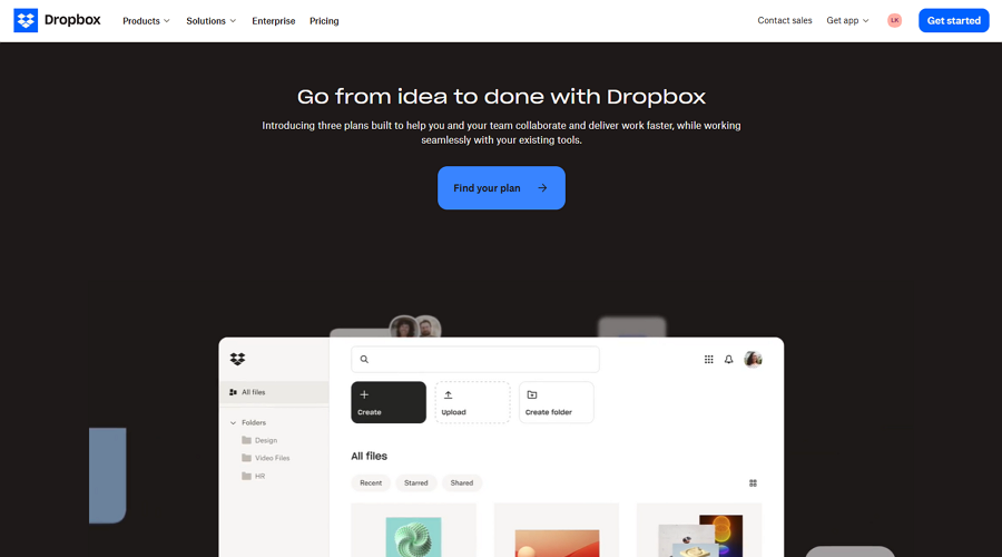
Dropbox had a clarity problem. Their website had grown messy over time—too many messages, mismatched visuals, and a layout that didn’t reflect their clean, productivity-focused mission.
So, they stripped it all back.
The new site focused on whitespace, clean typography, and soft visual cues. Navigation was simplified. CTAs became more focused. Even the illustrations told a story about working better, not harder.
It was a return to their roots—simplicity, ease, and clarity. And just like that, users understood what Dropbox could do for them in seconds, not minutes.
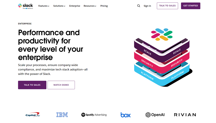
Slack’s early site had all the right intentions, but the design was starting to feel busy—especially for new users trying to figure out how it fit into their workflow.
The redesign brought breathing room.
Slack dialed down the visual noise, refined its messaging, and made it much easier to grasp what the product actually did. The new layout felt focused and friendly, with approachable illustrations and better onboarding flows. In the end, they didn’t just redesign their site—they redesigned how people understood Slack.
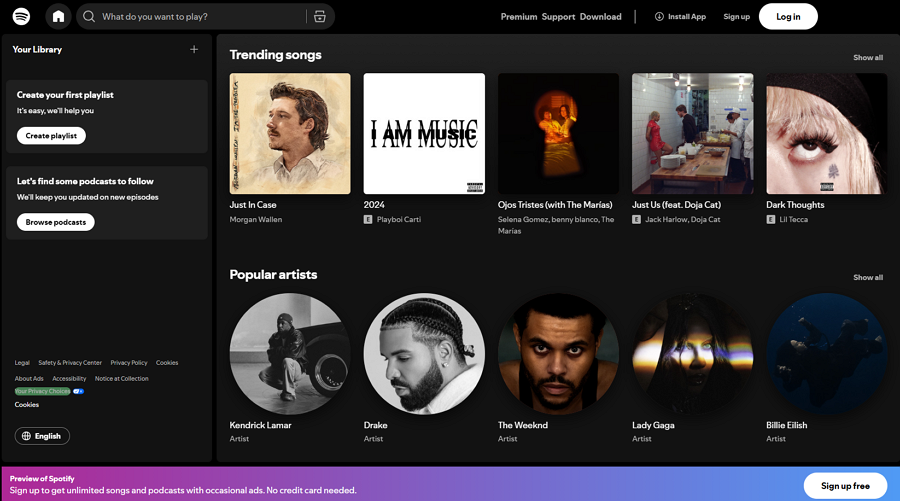
Spotify’s brand had always been vibrant and dynamic, but their web experience didn’t fully echo that energy. Worse, it lacked consistency with their mobile app.
So they aligned it all.
Spotify’s redesign was subtle but powerful—tightening the color palette, updating typography, and making their design language consistent across platforms. Accessibility was also improved, which opened the experience to more users.
Suddenly, the Spotify brand felt whole. And users noticed.
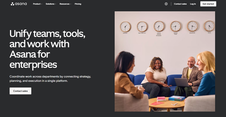
Asana’s platform had matured, but its website hadn’t quite caught up. It still had the light, playful vibe of a startup—but the company was scaling into enterprise, and it needed to look the part.
The redesign gave them that credibility.
The new site embraced clarity, structure, and professionalism. Components were modular and easy to scan. Messaging was direct and benefit-focused. But it still kept that little Asana charm with pops of color and motion.
The result? A site that says: “We’re still user-friendly—but we mean business.”
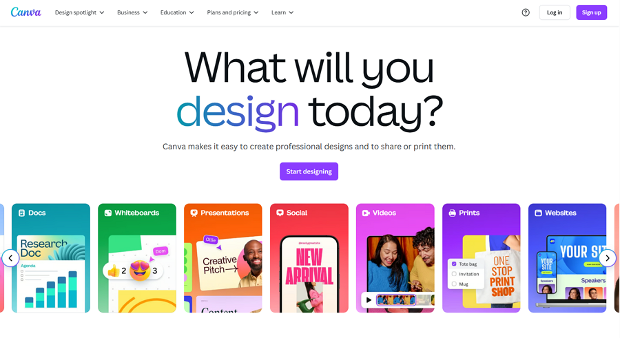
Canva was growing like wildfire, but its dashboard and interface were starting to feel overwhelming—especially for first-time users.
Their redesign aimed to simplify without dumbing things down.
They reorganized the dashboard, improved the search experience, and highlighted templates to help users get started faster. The visual language became cleaner and more modern, but still friendly.
Now, users felt confident the moment they logged in. The tools felt accessible, not intimidating—and users stayed longer because of it.
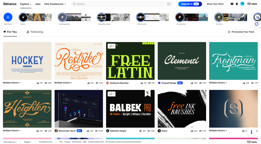
Behance had a goldmine of creative work, but discovering it wasn’t as smooth as it could be. The platform was starting to feel outdated, and users had to dig to find great projects.
That changed with their redesign.
Infinite scrolling, smart filters, and a curated home feed made it easier to browse and easier to be seen. The redesign put discovery at the center of the experience—exactly where it belonged.
For creators, that meant more visibility. For visitors, it meant falling down an endless rabbit hole of creative inspiration.
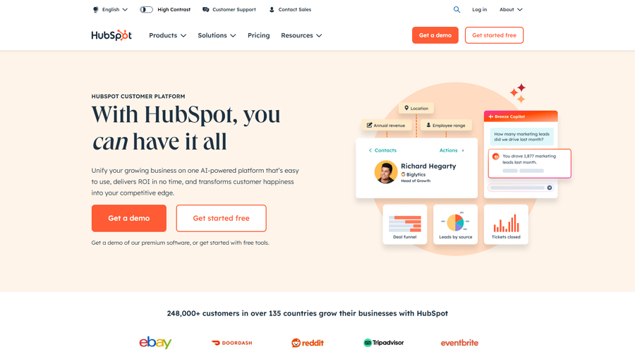
HubSpot had a content-rich website—but it was getting heavy. Navigation felt bloated, and first-time visitors didn’t know where to start.
The redesign cleaned house.
Menus were restructured. Content was organized by user goals, not internal silos. CTAs were given context. And the visual design got a much-needed modern touch.
The result? A site that speaks to everyone—from curious marketers to enterprise buyers—and guides them through a logical, value-driven journey.
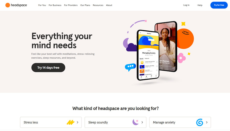
Headspace’s website felt a bit cold for a brand that promotes mindfulness. It had the content, sure—but it lacked the warmth and softness of the product itself.
That changed with the redesign.
They leaned into calming illustrations, friendly copy, and intuitive flows that made the site feel as relaxing as the meditations themselves. Accessing guided sessions became easier, and the storytelling brought the brand’s mission to life.
After the redesign, the website didn’t just talk about peace—it created it.
11.Webflow: Practicing What They Preach
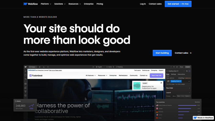
Webflow is all about visual web design—so their website needed to show what their platform could do. But the old site felt too product-heavy and didn’t do justice to the community and learning experience behind it.
So they rethought the whole thing.
They created more visual storytelling around real user projects, added educational sections for beginners, and restructured navigation to reduce friction.
The redesign wasn’t just a better marketing site—it became a live showcase of what Webflow could actually build.
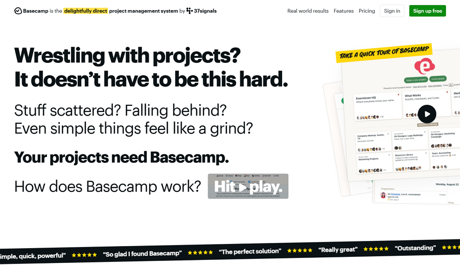
Basecamp’s original site was drowning in paragraphs. It made sense if you read everything—but most users never got that far.
The redesign embraced bold, direct communication.
Big headlines, focused benefits, and short, impactful copy helped users instantly understand what Basecamp was about. Product images showed the actual interface, and pricing was upfront and simple.
It made Basecamp feel confident, trustworthy, and transparent—qualities every B2B buyer looks for.
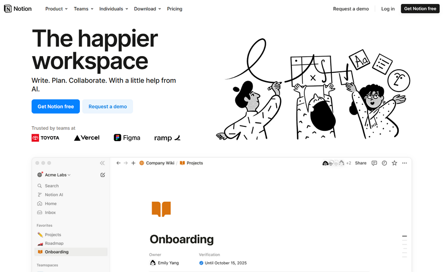
Notion always had a clean interface inside the product—but their website? It was almost too minimal. It didn’t communicate the power or flexibility of what Notion could do, especially for teams or businesses.
With the redesign, Notion stepped into its own.
They introduced storytelling around use cases, added beautiful animations that demonstrated product functionality, and layered in content that spoke to individuals, teams, and enterprises alike. The homepage evolved into a clear journey, not just a landing spot.
The result? Visitors now understand why they should use Notion—not just what it is. That clarity has helped the brand scale rapidly across industries and continents.
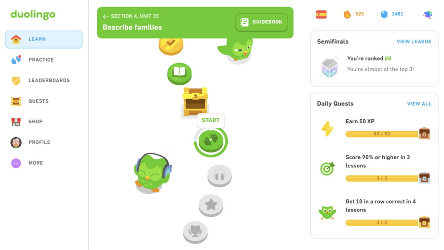
Duolingo’s original site leaned heavily into the functional—lessons, account setup, and language lists. But it didn’t fully reflect the playfulness and gamification that made the app so addictive.
That changed when they leaned into fun.
The redesign brought their beloved owl mascot to life, used lively micro-interactions, and made the UX feel like a seamless extension of the app. From the typography to the animations, everything felt bright, engaging, and gamified.
The refreshed website didn’t just delight users—it converted them. More people signed up, explored features, and committed to daily language practice.
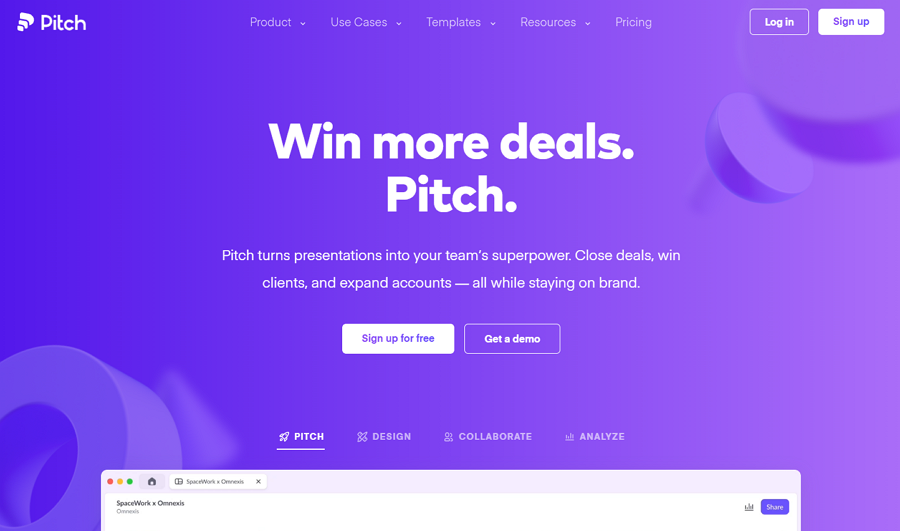
Pitch entered a competitive market with big players like PowerPoint and Google Slides. Their product was beautifully designed—but their website didn’t quite communicate just how different Pitch really was.
The redesign changed that.
They used sleek visuals, video demos, and bold copy to show that Pitch isn’t just another presentation tool—it’s a new way to collaborate on storytelling. Their new layout put product features and real use cases front and center, while their brand voice felt confident and fresh.
In the end, the site positioned Pitch as a serious contender in the space—and gave visitors a reason to make the switch.
Don’t rely on guesswork—use actual user behavior to guide your redesign decisions. Analyze heatmaps, session recordings, and feedback surveys to understand pain points, drop-off zones, and what users actually care about. Data should validate your design choices at every step.
Even the most beautiful design will fail if the site loads slowly. Optimize your images, use modern web performance techniques (like lazy loading and code splitting), and test frequently with tools like Google PageSpeed Insights or Lighthouse.
A faster site doesn’t just improve UX—it also boosts SEO rankings and conversion rates.
Your redesign should strengthen your brand identity, not confuse it. Use a consistent color palette, tone of voice, typography, and UI patterns across the site—especially if your redesign involves new visual elements.
This helps build trust and makes your brand instantly recognizable, whether someone lands on your homepage or a landing page.
A well-designed navigation system helps users find what they’re looking for quickly. Avoid overloading your menu or hiding key pages—users shouldn’t have to guess where to go next.
Use analytics to identify your top-performing pages and make sure they’re easy to access within 1–2 clicks from the homepage.
Don’t launch your new site and walk away. Run usability tests with real users, A/B test key pages, and gather both qualitative and quantitative feedback.
Iterate based on real-world data—because no matter how polished your design is, there’s always room to improve once it’s live.
There are far more tips and tricks you should always remember in mind, such as keeping everything well-documented—design decisions, feedback cycles, and version histories, mobile-first design, SEO-friendly design and more. The ones that best suits your styles and needs are the best!
A smooth website redesign doesn’t just depend on creative ideas and strong strategy—it also hinges on the tools you use. The right toolset can help you move faster, collaborate better, and avoid costly missteps.
Here’s a closer look at the types of tools you’ll need throughout the redesign journey—and some top recommendations that design teams love.
Before you touch a single pixel, you need to understand how your current website is performing. Analytics tools help you uncover what’s working, what’s not, and where users are getting stuck.
Google Analytics is a must-have to analyze traffic patterns, bounce rates, and conversion funnels.
Hotjar or Microsoft Clarity give you heatmaps and session recordings so you can actually see how users are interacting with your site in real time.
Want voice-of-customer insights? Try Typeform or Survicate for quick user feedback surveys.
Once you know what needs fixing, it’s time to sketch out solutions. This is where wireframing and prototyping tools come in—they help you map out layouts, test user flows, and iterate quickly.
Mockplus RP is a standout tool here. It lets you create interactive wireframes and clickable prototypes with ease—perfect for testing ideas before jumping into high-fidelity design.
Figma and Adobe XD are also popular for collaborative wireframing, especially if you're working with remote teams.
Redesigns often involve multiple teams—designers, developers, marketers, content creators. Staying aligned and on schedule requires a shared space for planning and progress tracking.
Trello or Asana are great for task management and progress tracking.
Jira is perfect for development-heavy workflows with sprints, backlogs, and detailed ticketing.
Slack (paired with the above) can keep communication flowing without overwhelming inboxes.
Even after launch, the work isn’t over. You’ll need testing tools to measure performance, validate assumptions, and continuously improve.
Use Google PageSpeed Insights or GTmetrix to monitor load times and core web vitals.
Crazy Egg or VWO allow you to run A/B tests and visualize where users are clicking or getting stuck.
Don’t forget accessibility checkers like WAVE or axe DevTools to ensure your new design is inclusive for all users.
A successful website redesign is more than a fresh coat of paint—it’s a strategy to align your digital presence with evolving user needs and business goals.
Whether you’re planning a full overhaul or subtle improvements, take the time to audit, prototype, collaborate, and test. And don’t forget—using the right tools can make the entire process faster, smoother, and far more effective.
We hope this ultimate guide has given you the clarity and inspiration you need to tackle your next website redesign with purpose—and make every click count.
 Mockplus RP
A free prototyping tool to create wireframes or interactive prototypes in minutes.
 Mockplus DT
A free UI design tool to design, animate, collaborate and handoff right in the browser.


 Sign up with Google