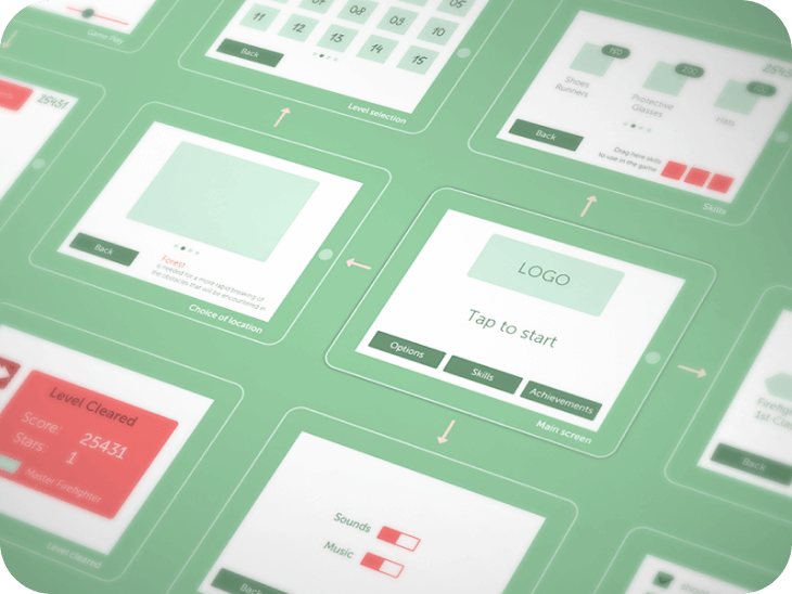
A design process is a series of steps a product team goes through to create a product. The process typically starts with an idea of a future product, and the product team turns this idea into a fully functioning product.
Prototyping is one of the most critical steps in the design process because, during this step, the product team makes the idea tangible so other people can interact with the design.
The definition of prototyping may be different in different fields. But if you get back to its roots, you will find the fun fact that the word prototype comes from the Latin words proto (original) and typus (model). So the name already gives it away.
A prototype is an interactive version of the design, a model of a future product with which other people can interact.A prototype is not a sketch, wireframe, or mockup; those are static design artifacts. A prototype is created using sketches, wireframes, or mockups—by turning them into interactive assets.
Here are six reasons for practicing prototyping in the design process:
Gaining stakeholders' approval on design is an integral part of any design process. Without stakeholders' approval, the design team won't be able to create a product. It's possible to communicate ideas to stakeholders in many different ways, yet visual communication is by far the most effective.
“If a picture is worth 1000 words, a prototype is worth 1000 meetings.” (IDEO)
People are visual learners, and when they can see and interact with an actual design, they can provide detailed feedback. A prototype will give stakeholders a clear idea of how the future product will look and function.
A quick tip: If you want to demonstrate a design to stakeholders, always share high-fidelity prototypes because it will help you solicit the most detailed feedback about your solution. Stakeholders will be able to evaluate visual language (visual styles such as font and color selection) and content.
Design is not for designers; it's for users.
Product design typically starts with user research, a step when a team aims to identify and learn the target user. But prototyping can move user research to the next level—it makes research much more focused. For example, when designers create a new page, they always think about the order in which they will show content on the page. They wonder how content should be categorized and labeled on the page. Content should always be categorized according to the user's expectations, and the best way to learn about expectations is to conduct card-sorting exercises.
By letting users group information in a way that makes sense to them, the team will create a much better user experience. The same approach works well when the team wants to improve the conversion rate.
When designers want to persuade users to take a particular action (for instance, click on the "Start for free"call to action button), they will try to learn more about factors that can impact the user's decisions. The product team conducts user interviews and field studies to understand what can motivate users to click the button.
"Test early, test often"is one of the main rules in product design.
The earlier we start to validate our design decisions, the more issues we will avoid down the road. Prototyping plays an integral role in design validation. Creating a fully-functioning product takes a lot of time and can be very expensive, but creating a prototype with only essential elements is much easier and cheaper. Product teams create prototypes and use them during usability testing sessions.
Test participants interact with prototypes and complete tasks that resemble real-world scenarios. The product team collects usability testing results, analyzes them, and understands what parts of a design work well and what is required refinement.
Product design is an iterative process. Once the team validates the design and gains valuable insights about user behavior, they use the insights to create a new version of a prototype and conduct testing once again. The team will follow the prototype-validate-learn cycle until they make a design that works well for the users.
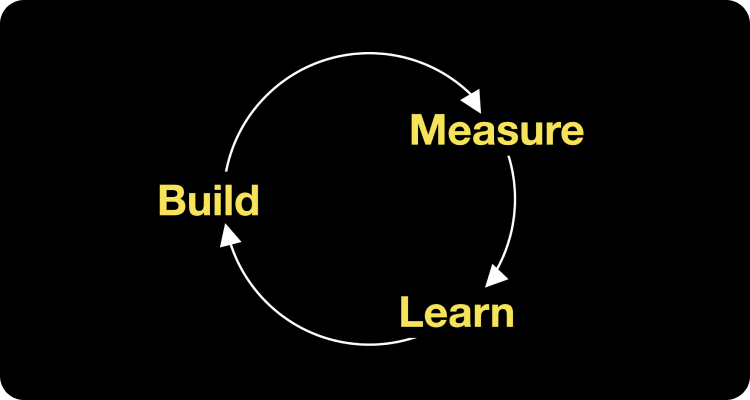
Build-measure-learn design cycle. First, you build a prototype, then test it with your users, and after that, you analyze the testing results so you can create the next prototype version. Image by Nick Babich.
Prototyping will also help to avoid confirmation bias, one of the most dangerous things in product design. Many product creators tend to favor information that confirms their beliefs or ideas and ignore all other information. As a result, they build a product for themselves rather than their users. No need to say that such products can easily fail on the market. Prototyping will help to prevent that because this practice constantly makes the team validate their design decisions with users.
“You are not your users” (Jakob Nielsen)
It's especially important to validate your design when you work on innovative design and want to introduce novel design patterns. Prototyping will help you to understand how quickly users can learn how to interact with your product and what additional assistance they need. It will help you design a proper onboarding process to speed up the learning process.
A quick tip: While it's possible to conduct usability testing with paper or digital prototypes, digital prototypes are better because they allow test participants to interact with the design without extra help. Also, the higher your prototype's fidelity level, the more detailed feedback you can collect from the testing. When test participants interact with high-fidelity prototypes, they don't see any difference between an actual product and a prototype.
Prototyping will help you to streamline the development process.
Prototypes will serve as live documentation to help the engineering team properly implement the design. Prototypes are especially valuable when the engineering team needs to develop a complex effect, such as an animated transition.
While it's possible to write a paragraph explaining the ease curve and timing of the animated effect, a textual description might not be enough for the engineering team to understand how this transition should work. "A picture is worth a thousand words." When developers can see the animation effect rather than read about it, they have much better chances of implementing it as intended.
Prototypes can also help to evaluate the technical feasibility of the design. Not all that designers create can be easily turned into code. The engineering team can review a prototype and find areas that will be hard or impossible to implement. It's recommended to use collaboration design tools so that design and development teams can interact with each other during design handoff. It will allow us to communicate design decisions in real time and find more feasible solutions.
Product design is a complex process. There are many things that the product team needs to consider when building a product, and it's relatively easy to forget something. All too often, it happens because the product team works with static mockups rather than prototypes.
Prototyping helps the design team shift focus from static screens to an interactive experience. When a team starts to create a prototype, they start to think more about how users will interact with individual screens and likely notice gaps in the design.
For example, they might notice that they don't have a specific state for a particular UI component (i.e., open state for the dropdown list) or even miss an in-between page (i.e., they want to add a page that appears on the screen while content is loading). The earlier the team identifies such problems, the more accurate design planning will be, and the less likely the team will have to introduce last-minute changes in design.
Design is a team sport, and prototyping is one of the exercises that teams can (and should) practice together. While it's possible to create a prototype by working alone, the outcome will be much better when specialists from different domains participate in this activity. Designers, sales & marketing experts, and developers have different perspectives on design, and when they work together on a prototype, they will enrich the design with their expertise.
Another reason why it's essential to invite people from different departments to the prototyping process is because it will help create a sense of ownership. When people feel responsible for a product, they are more motivated to make the most to create the best possible product.
The level of fidelity that prototype has can vary from low to high. Low-fidelity prototypes resemble only basic characteristics of the future product, while high-fidelity prototypes look and work just like a finished product.
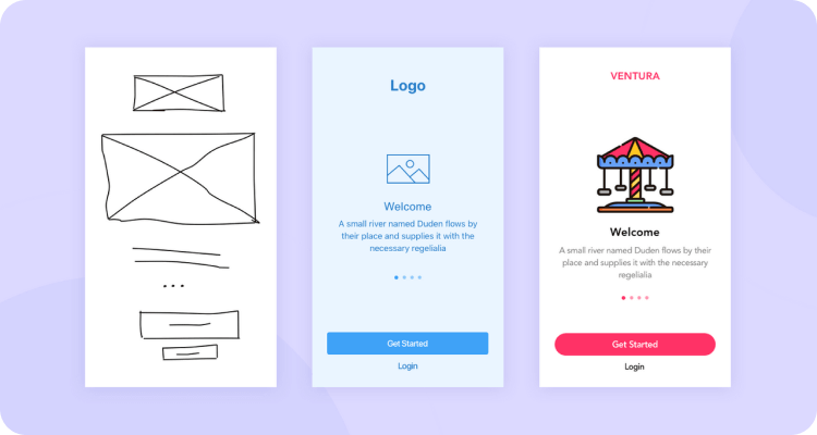
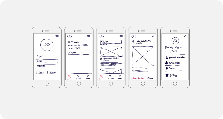
Low-fidelity prototyping, also referred to as paper prototyping, is the quickest way to translate design ideas or concepts into a tangible and testable design. Low-fidelity prototypes are often created with pen and paper.
Designers use low-fidelity prototypes to visualize the basic layout and test navigation quickly. Usually created with simple lines and shapes, low-fidelity prototypes are extremely time and cost-efficient. Designers are enabled to test different concepts easily at a low cost.
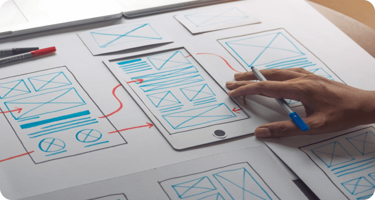
Medium-fidelity prototypes, called clickable prototypes, are the next level of low-fidelity prototyping. This kind of prototype is usually digital and provides some of the critical functionality and content used in the product. It has clickable parts that present the interactions and navigation possibilities.
Medium-fidelity prototypes, called clickable prototypes, are the next level of low-fidelity prototyping. This kind of prototype is usually digital and provides some of the critical functionality and content used in the product. It has clickable parts that present the interactions and navigation possibilities.
With Medium fidelity prototypes, designers are enabled to test the core usability, interactions, and the whole user flow of the product without creating unnecessary design elements that may end up being scrapped as you develop the final version.
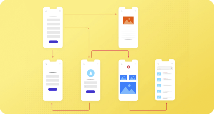
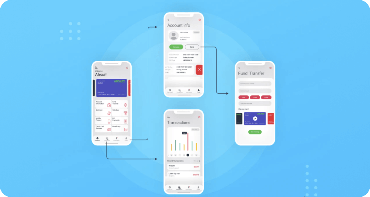
High-fidelity prototyping is where the final product begins to take shape. After many changes and revisions with low-fidelity and medium-fidelity prototypes, it is time to test high-fidelity prototypes with users prior to the development phase.
This kind of prototyping is created with lots of extra details. To create an immersive user experience that best simulates the real user experience, designers may use the high-fi prototyping tool to add colors, photos, interactions, transitions, and animations to make it realistic. It gives users or stakeholders a clear view and accurate sense of how the final product will look and how it interacts.
As we mentioned in this article, the Hasso Plattner Institute of Design at Stanford describes design thinking as a non-linear five-stage process: Empathize, Define, Ideate, Prototype, and Test. With this in mind, we can better summarize the prototyping process into 3 non-linear similar steps.
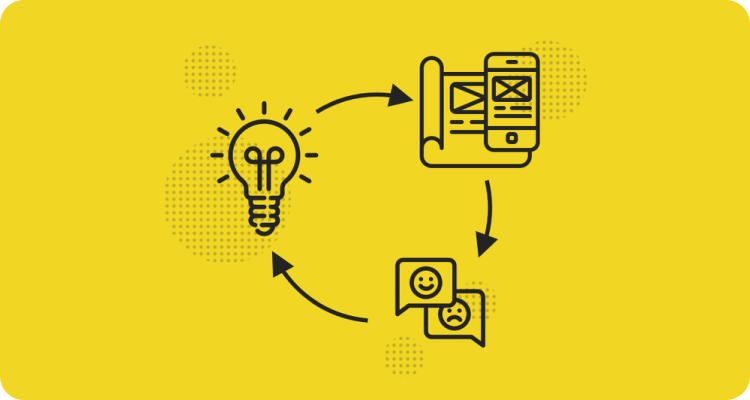
Before starting the prototyping phase, first, you have to research your target users, define their needs and problems that need to be solved, and then come up with as many possible solutions as possible.
Now, after you have clearly understood your target users' needs and come up with solutions, it's time to create prototypes to identify the best possible solution for each of the problems identified.
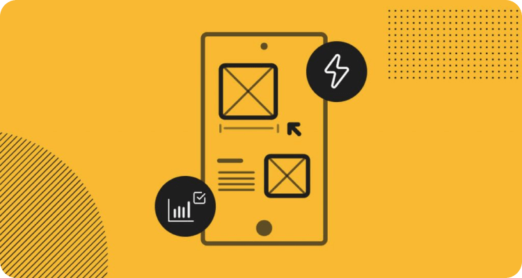
Once you’ve created a prototype, you’ll need to put it in front of real users and test the prototype’s functionality and compatibility with different devices and platforms. You’ll observe how they interact with the product in its current state and ask for feedback on how the experience feels.
Prototyping is an essential part of the product design journey. It can help the team to avoid severe design mistakes, create user-centered products and even improve the team spirit. But it only happens when the team has a clear strategy for prototyping. Sporadic prototyping won't give a team much value. Prototyping should be naturally integrated into the design process, so that team members understand why and how they create prototypes.