Nowadays, the ability to make prototypes has been one of the essential skills for more and more UI/UX designers, product managers as well as Internet entrepreneurs. Thus, the mastery of prototyping tools cannot be overwhelmed, especially the differences between each solution which helps to streamline work and improve efficiency. Here, we will make a dedicated comparison between the two great prototyping tools – Axure and Mockplus – on their Table feature.

When compared to Axure, Mockplus may be a relatively new name to most people, but it is a tool worth taking a closer look at. You may ask “What exactly are the differences between their features”? Well, there’s an interesting metaphor: if Axure were a powerful but bulky elephant, then Mockplus could be a nimble and quick gazelle. Back to the point, we will walk you through the differences between the prototyping tools on their Table feature in below. Firstly, let’s get started on the intuitive feeling that they deliver to us.
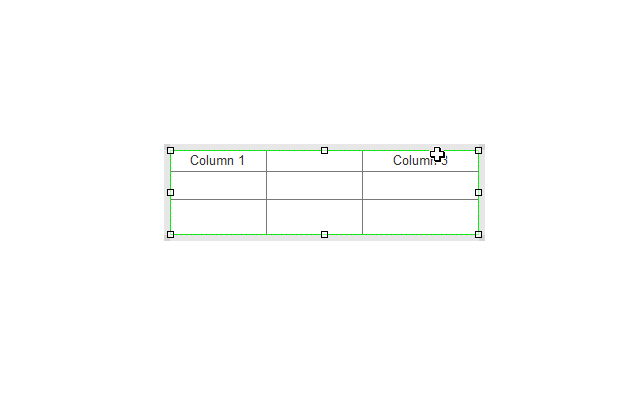
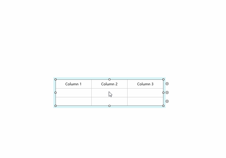
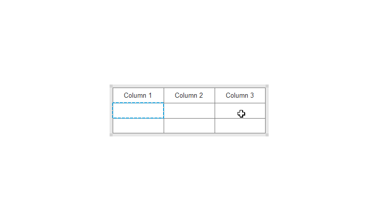
We can see, it requires to select the border to move the table in Axure, while the table of Mockplus can be dragged directly once you select any cell within it. Obviously, it’s much harder to drag and move the Axure table, while Mockplus makes it way easier.
Axure:
Mockplus:
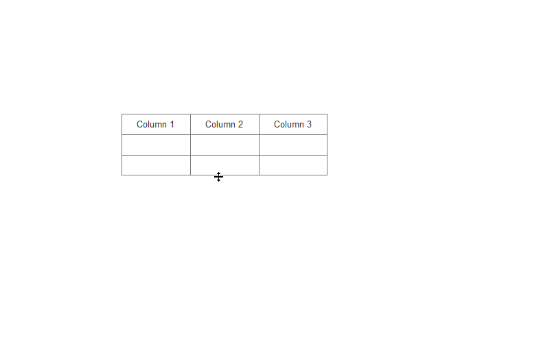
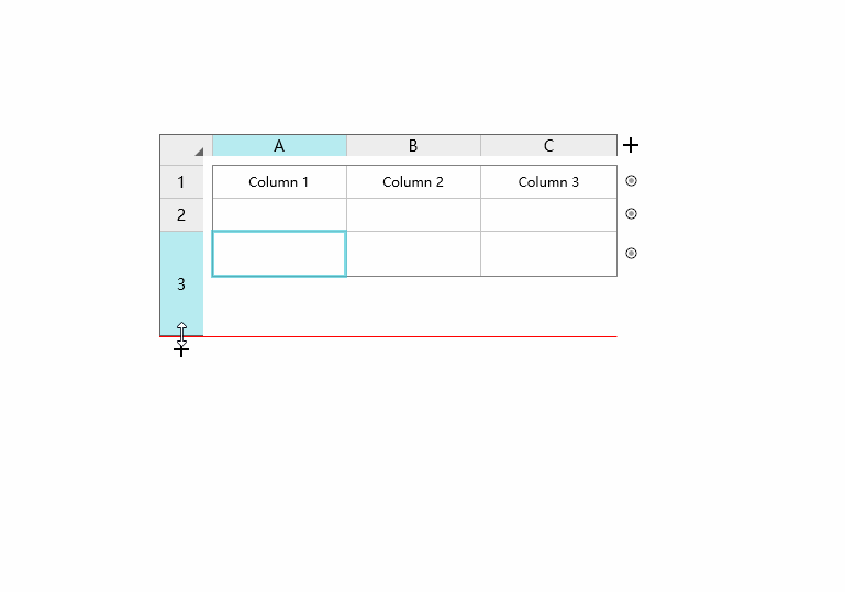
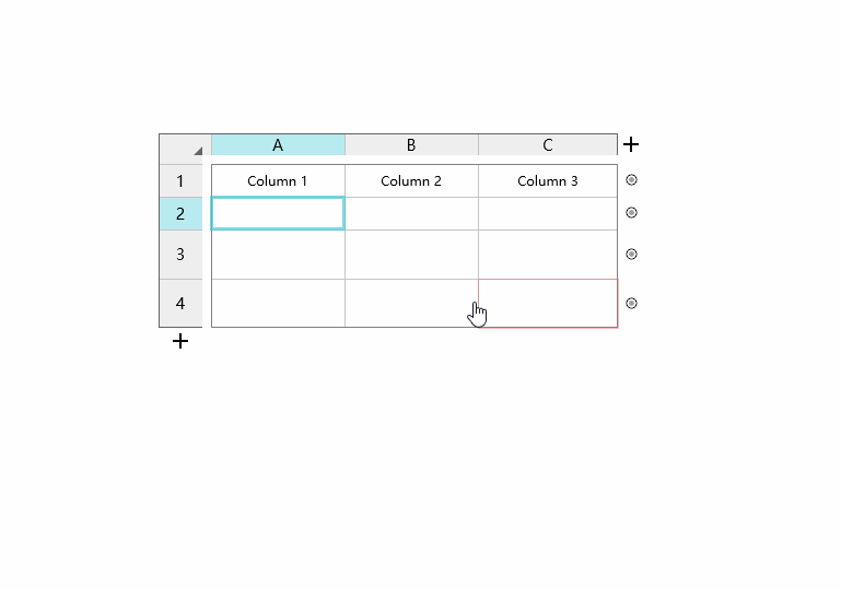
A big difference between them is that there is an auxiliary bar in Mockplus, which allows everyone to adjust the size of table column or row in an intuitive way. This works the same way as in Excel and is easy to get started. Furthermore, there will be a dark red line showing when dragging the table, which to some extent gives users a clear guidance.
Axure:
Mockplus:
Also, they are different when selecting a cell and hovering on the table:
Axure – there's no any change when we mouse in the table.
Mockplus – there will be dark red border tips when we mouse over a cell, which is pretty useful especially dealing with some complicated cells.
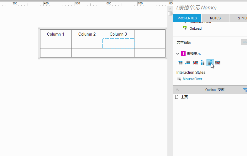
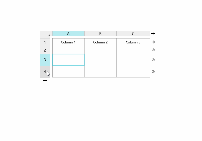
In Axure, it requires clicking the respective icons from the right properties panel for additions or deletions; while Mockplus allows users to quickly add one column or row by clicking on the "+" icon from the bottom or right side of table respectively. Furthermore, it’s possible to add columns/rows in batch by dragging the "+" icon, and there are figures indicating the number of current ranks. Of course, both of the tools support adding or deleting the cells from the drop-down menu after the right-click.
Axure:
Mockplus:
The interaction between tables and components of Axure require property settings from the right panel. It’s possible to set interactions on each cell independently.
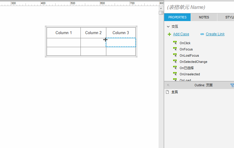
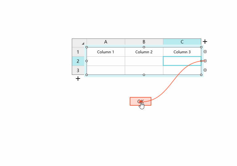
The way of setting interaction in Mockplus is what we like the most, as the interactive settings between components or pages can be simply done by drag-and-drop. This is totally WYSIWYG. A downfall is that it doesn’t allow to add interaction to each cell independently, which should be enhanced in the future release.
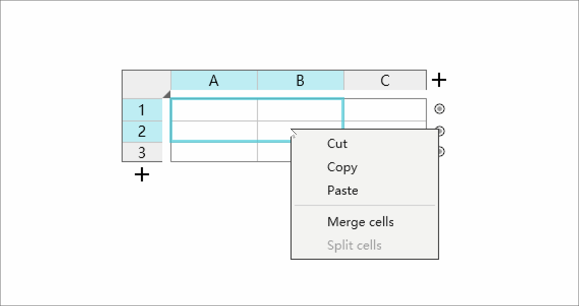
Merging cells is part of presenting the data in an understandable manner and an important feature for users. In Mockplus, you can merge or split cells freely. Axure doesn't provide such a feature so far.
Both of them support pasting text copied from Excel, and vice versa. In this way, the text between Excel and these tools are somewhat exchangeable. A problem is that when copying text in Asian language (such as Chinese, Japanese, etc.) from Axure to Excel, there will be garbled code.
The Table component of Axure has the ability to set interactions within each cell independently, which is unavailable currently in Mockplus, but the latter one is obviously much faster and easier to use. Overall, the Table component of Mockplus is way more user-friendly and visualized, providing a smoother and better user experience. From the point of my view, those who select tools based on their needs have the real understanding of the tools, what do you think?
 Mockplus RP
A free prototyping tool to create wireframes or interactive prototypes in minutes.
 Mockplus DT
A free UI design tool to design, animate, collaborate and handoff right in the browser.
