Our hard work never stops! This time, we've rolled out a bunch of new features, improvements, and bug fixes. While some may seem small, they all work together to boost your design efficiency. Never underestimate the impact of these seemingly minor changes.
Anyway, let's dive into the details!
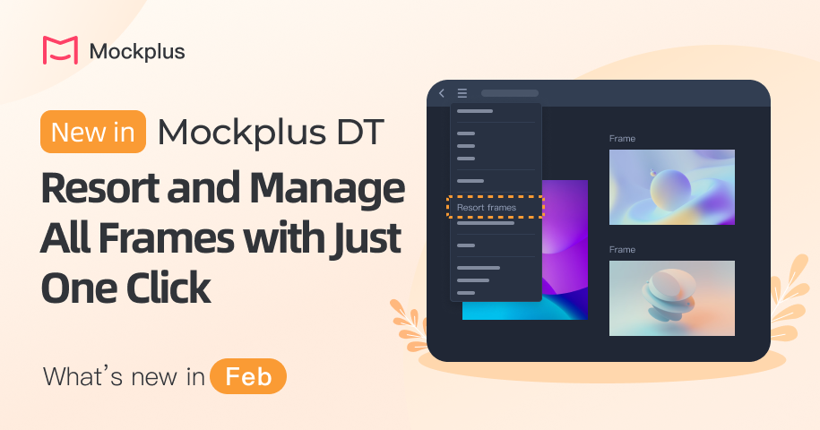
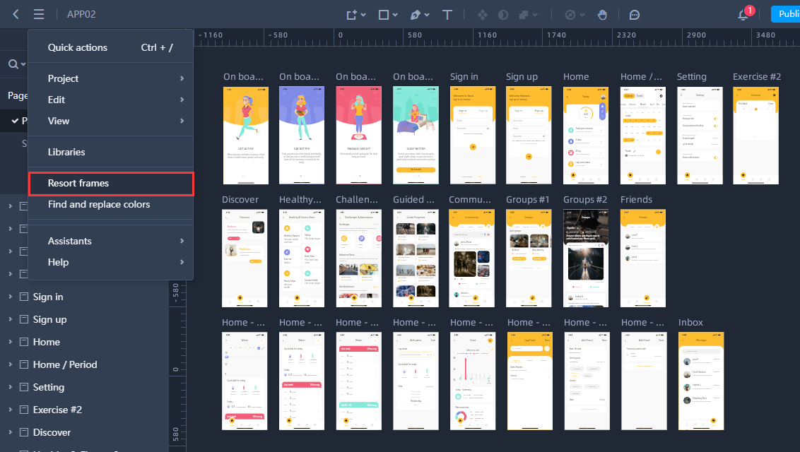
When dealing with numerous frames scattered across the canvas, finding an efficient way to organize and manage them can significantly save time and effort. To enhance the workflow for our valued users, we've added a new option, "Resort frames," to the main menus.
Once you click this option, all frames on the current page will be seamlessly resorted based on their coordinates on the canvas.

Apart from this new feature, we also fixed many other bugs. For example, we've fixed the issue where the transparent part of an image turned black upon exporting to PDF. You may read more Mockplus DT release notes.
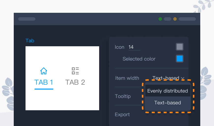
Components such as Tab Bar are frequently used widgets in web and mobile app design and prototyping. Previously, the item width of the Tab Bar was evenly distributed, which worked well in common cases.
However, this approach led to an issue where, with varying text lengths, the even distribution resulted in equal tab box lengths but uneven text spacing, impacting the layout's aesthetic appeal.
Now, components like Tab Bar support dividing items based on text length. You have full control over defining the style of each tab item. Give it a try and customize your tabs today!

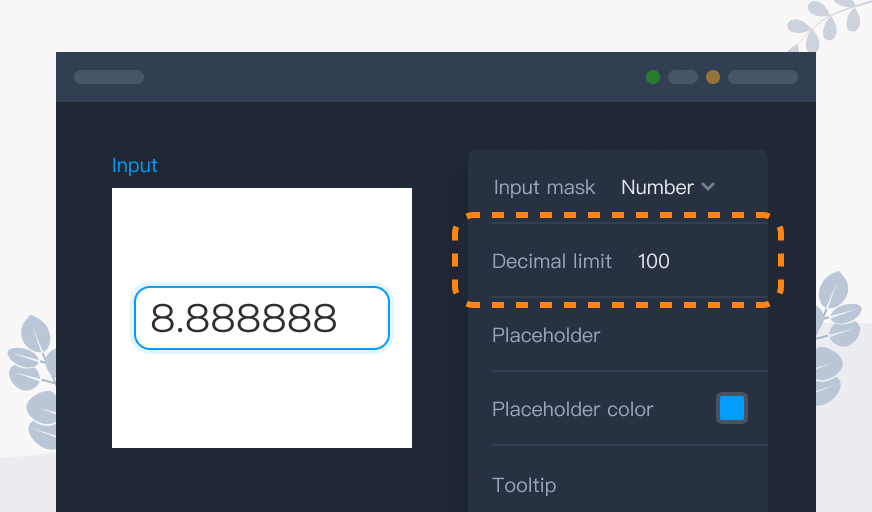
In this release, we've also improved the Number Input, Input, and similar widgets, allowing you to easily define the max decimal places.

This time, Mockplus Cloud focuses on several minor details in handoff and document sections, bringing a more fluent and efficient user experience!!!
Overall, if you want to read more details of all our products, go check our release note page.
 Mockplus RP
A free prototyping tool to create wireframes or interactive prototypes in minutes.
 Mockplus DT
A free UI design tool to design, animate, collaborate and handoff right in the browser.
