A wireframe for mobile apps is a schematic blueprint that enables designers or product teams to easily explore, iterate, test, and finalize their design ideas before they move to the development stage. Different designers create a wireframe and translate into a high-fidelity prototype in a different way.
In this article, we'll walk you through the basics of mobile app wireframes and learn how to wireframe a mobile app from scratch.
A mobile app wireframe is a skeletal blueprint that presents the main structures, flows, layouts, and UI content of a mobile app. It is a visual presentation of a mobile app using gray lines, boxes, shapes, colors, and placeholders, which makes it easy for designers, developers, and product teams to discuss macro design ideas without worrying about the cost.
Here is a mobile app wireframe example:
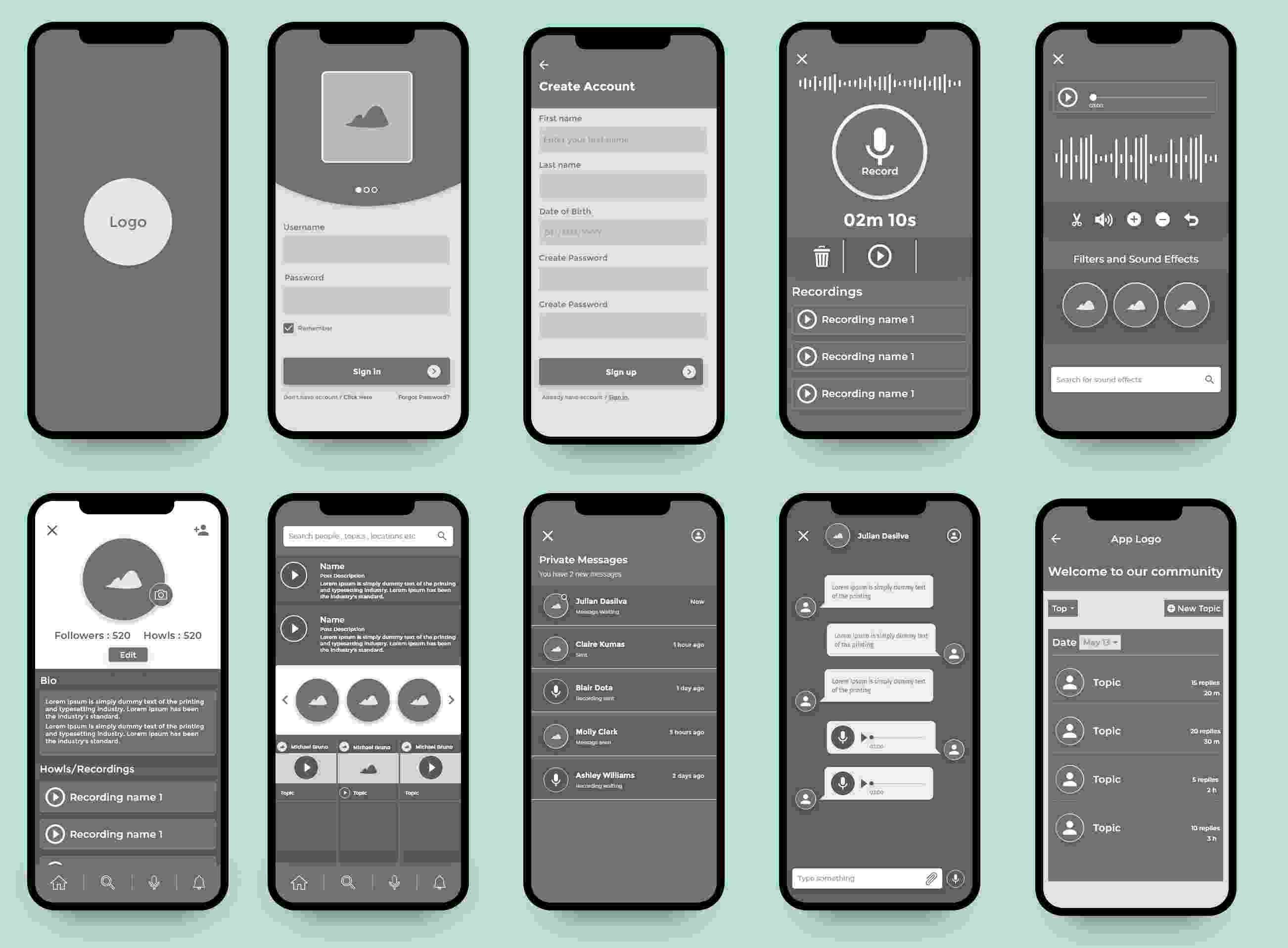
An effective mobile app wireframe includes:
All key pages such as Home, Login, Start, and Contact.
All key elements and CTA buttons
All key UI content
All key UI interactions
All key user flows
Key navigation systems
Main structures, layouts, and grids
Others
This does not mean that you have to show them all the time. You should learn to highlight some important elements or content by wisely omitting some of them.
When it comes to mobile app wireframes, people often talk about design fidelity levels and divide mobile app wireframes into two types: high-fidelity wireframes and low-fidelity wireframes.
These are the differences between the low-fi and high-fi wireframes:
A low-fidelity wireframe is a static model that includes the most basic content and layout of a mobile app. It is often used to map out the shell of mobile apps, its screens, and basic information architecture. Sometimes, to save time, it can be directly presented using pen and paper.
A high-fidelity wireframe is a wireframe that presents more UI details, visuals, and interactions of the final mobile app. It is often created using a digital wireframing tool and sometimes includes simple interactions, enabling designers to click and interact with pages or elements for communicating and testing their ideas.
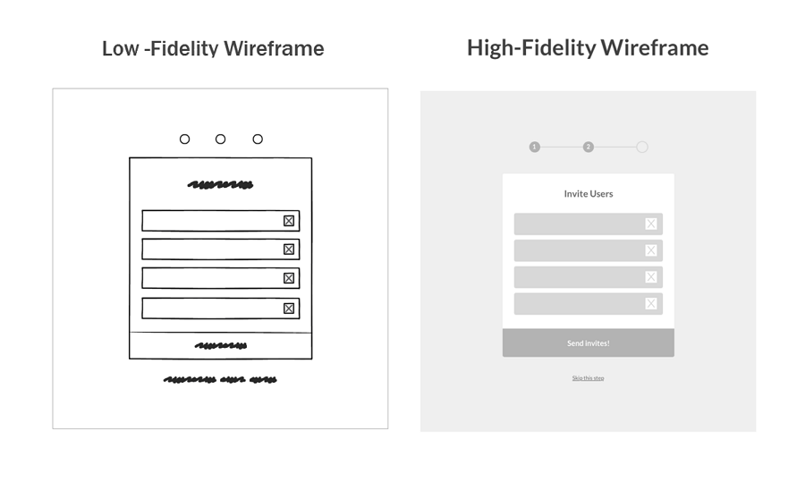
In short, high-fidelity and low-fidelity wireframes showcase different levels of details and functionality and should be used at different stages of app wireframing for designers to better communicate with each other.
While designing a mobile app, UI/UX design beginners confuse three terms: wireframes, mockups, and prototypes.
These are the differences between the three terms:
A wireframe is a basic and low-fidelity presentation of how a mobile app will look like. It outlines the main structures and layout.
A mockup is a static high-fidelity design diagram that shows nearly all possible UI details and visuals. It is a nearly completed presentation of the final product, except that it does not have any interactions.
A prototype is an interactive mockup that is very close to the final product with rich UI details, interactions, animations, and transitions. It behaves just like the final product and enables you to find all the possible issues that the final product may encounter in the future.
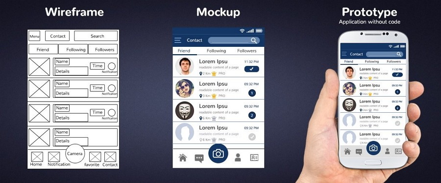
A wireframe, mockup, and prototype are mobile app models with different UI details and visuals. They are used at different stages of mobile app design for designers to better communicate and collaborate with other designers, developers, and other team members.
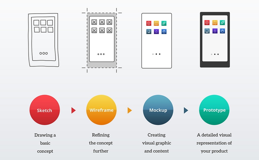
The process used for designing a mobile app is depicted below:
You can check more differences here: Wireframe vs Mockup vs Prototype, What's the Difference?
A good mobile app wireframe helps you visualize design ideas quickly and presents many UI details. So, it helps you:
Check how your final product will look like and iterate it quickly
See whether your product can meet the needs of users
Test the user flows of your product early on
Communicate and collaborate better with other designers and developers
Find potential issues and fasten the decision-making process
Save time and minimize cost as much as possible
In short, an effective mobile app wireframe can not only allow you to evaluate your design ideas early on, but also helps developers understand your design better. It helps streamline your entire design process.
Mobile app wireframing is one of the essential steps for creating a successful product. To hasten your design workflow, before starting to create a mobile wireframe, you should do the following:
If you are a beginner, you may not have a clear idea about everything in the beginning while working on a mobile app wireframe. To fix this, you may search related design resources on the internet, see others' work and use them as inspiration. Wireframe examples and templates are good resources that you can browse for inspiration.
Didn't find the desired information online? Skip to the "Best Free Mobile Wireframe Resources" section at the end of this article.
After viewing others' work, some ideas about how to wireframe your project may flash in your mind. Write them down and try to map out all the necessary key pages and user flows on a paper quickly.
A clear map presenting all key pages and user flows can guide you and your team to complete your project methodically and effortlessly.
If you are working alone, pen and paper is often the fastest option for wireframing a mobile app. However, if you are working with a team, a digital wireframing tool that enables you to collaborate and share designs is more suitable.
No matter what type of mobile app you are trying to create, the starting point of wireframing is often conducting user and market research.
User research
While doing user research, you should take your time to define and analyze your target audience carefully. This is the only way you can learn about their pain points and needs clearly to create a mobile app that can really help customers. Also, do not forget to create user personas for later use and analysis.
Market research
While doing market research, you are supposed to analyze the market and competitors and create a market report to know what challenges and opportunities you and your team may face in the near future.
Note that there are many skills and strategies that you can learn from competitors to enhance your product's UX.
After deciding what kind of mobile wireframe you are going to create based on user and market research, the next step is to sketch your wireframe.
These are the points that you should keep in mind:
Choose the way that suits you best
To record all the ideas flashing in your mind as quickly as possible, you can sketch all details using a pen and paper or draw everything using a digital wireframing tool. Just choose a way that suits you best.
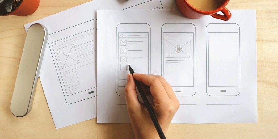
Ignore the wireframe quality - a low-fi wireframe is OK
In order to visualize as many ideas as possible, it is advisable to not pay much attention to wireframe quality. A low-fidelity wireframe draft that presents content priorities, interaction details, and user flows, etc, is good enough to make yourself understood within your team.
Want to learn more tips? 10 practical tips on sketching your wireframes can help fasten your design process.
After discussing the macro levels of a mobile app via a low-fidelity wireframe, you can move to the next step: add more details and create high-fidelity wireframes.
At this stage, you should remember several tips:
Add more details for better presentation
To make your ideas clear, you are supposed to add more details. Try to add details as you usually do: from top-to-bottom and left-to-right.
Of course, a wireframe is only a blueprint, not the final product. So, there is no need to add every possible detail. You should only add the details that can present your ideas and user flows well.
Don't forget interactions
To better present the user flows that users often follow on your mobile app to achieve their goals, you may add simple interactions to make them easier to understand.
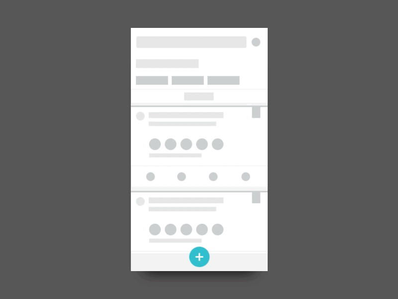
Do not forget interactions to present your design ideas more vividly and intuitively.
Make a wireframe checklist
To avoid forgetting something important, you may make a wireframe checklist in advance to improve work efficiency.
Discuss the wireframe details with your team and try to iterate it as many times as you can. A high-quality wireframe helps save a lot of time and effort when you move to the stage of mockup and prototype design.
After you've completed all the previous steps, the last step is to test your design, including testing the visuals, the user flows, and the interactions. You and your team members need to test every detail as if you are the end-users. You can also invite real users to see whether the wireframe meets their needs.
A good wireframe helps you create a solid foundation for the final mobile app. To build a product that can really solve users' pain points, you should put yourself in the users' shoes, design, and think from their viewpoint from the very beginning. If possible, you should let real users participate in the wireframing stage.
To build a user-friendly mobile app, while wireframing, you should consider many mobile platforms, such as Android and iOS, and many devices, like common tablets, iPads, iPhones, and other mobile phones, so that your app can perfectly fit screens of different sizes, the responsive design would be the best.
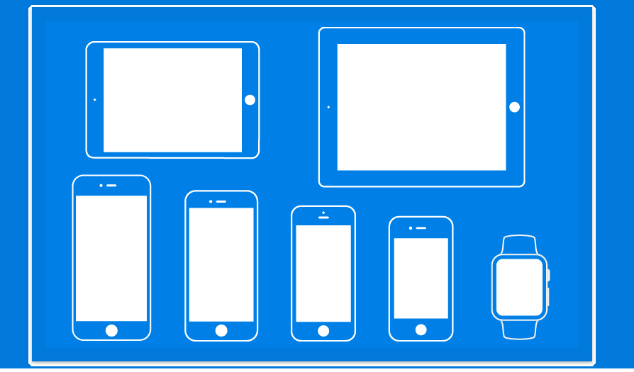
Design consistency is an important rule that you should follow to keep your team focused on the design itself, without being distracted by any mistakes or confusion. All elements, including colors, fonts, spacing, buttons, images and the like, should be consistent across every version and wireframe that you created.
To make a successful mobile app, team collaboration is essential these days. So, once you've created or updated a version, you should discuss and iterate it with your product team. Their ideas can help you improve it quickly. During the process, testing should also not be ignored.
Obtaining timely feedback from other designers, developers, customers, clients, and stakeholders is another reason for creating a wireframe. So, after completing your mobile app wireframe, you should remember to share it with your users and get their feedback.
These 10 do's and don'ts of wireframing can help you save a lot of time and avoid common mistakes.
30 best free sketch app resources list 30 of the best and latest mobile app design resources, including UI kits, wireframes, and plugins. Most wireframe templates are free, downloadable, and work well on the Sketch app.
16 iPhone wireframe templates list 16 of the best free wireframe templates for iPhone devices. They are good tools to create an iPhone wireframe quickly.
19 best wireframe kit resource introduces 19 of the best free Sketch wireframe kits that can help you wireframe a mobile app from start to finish. Most kit resources are highly customizable, enabling you to create your own wireframe with simple clicks.
50 free wireframe templates list 50 of the best free wireframe templates and UI kits. Many wireframe types such as Material Design, iOS, Web design, and UX design are included. You can freely download any of them based on your needs.
40 best mobile app wireframe examples list 40 examples of both mobile and website projects. No matter whether you are working on a mobile or website project, this collection can surely help you.
Wrap Up
The ultimate goal of mobile app wireframing is to outline the main structure and content of your app so that you and your team can follow the guide to make your desired app smoothly. It is an essential tool for you to communicate and collaborate better with your design team and development team.
We hope that these explanations, examples, templates, tools, and other information for mobile wireframing can help you create your mobile app wireframe with ease.
 Mockplus RP
A free prototyping tool to create wireframes or interactive prototypes in minutes.
 Mockplus DT
A free UI design tool to design, animate, collaborate and handoff right in the browser.
