Tooltips are crucial for user experience, especially during user onboarding, but their utility extends far beyond that. They always appear to provide instructions and additional information, helping to clear up doubts and confusions when users is navigating around.
A well-designed tooltip can easily guide users, enhancing the navigation experience, however, if the tooltip is not done right, it can obstruct users and create bigger issues.
In this article, we'll dive into its basics, explore the best practices for designing good tooltips and learn from the top-notch examples.
What is a tooltip in ui design?
In UI design, a tooltip is a small, informative text box that appears when a user hovers over, focuses on, or taps an element in the interface. It provides additional information or context about that element, helping users understand its function or offering tips on how to use it.
Tooltips are typically used to explain icons, buttons, or other interactive components without cluttering the interface.
Source Why to use a tooltip in web or app UI?
A well-designed tooltip serves several important purposes in web and app interfaces:
Provide context: Tooltips offer additional information about a feature or element, helping users understand its function without cluttering the interface.
Guide users: Tooltips not only help to assist with user onboarding and provide shortcuts, tips or even hints to guide users to use different functionalities of the app or website easily, delivering a much better user experience.
Clarify actions: When users confuse with the actions associated with buttons or icons, a tooltip can also timely appear to clarify the case.
Highlight new features: When new features are released, a tooltip placed near the associated element can effectively draw attention the update and also encourage users to explore and try it out.
Reduce errors: In some cases, tooltips are also used to give users immediate feedback or instructions, which would effectively reduce potential errors, finally smoothing the user experience.
SourceSo, tooltips are widely used in different parts of web or app interfaces, helping to provide a much user-friendly experience.
What is the difference between a popup and a tooltip?
Generally speaking, both tooltips and popups are used to explain context and provide feedback or additional information, but they differ in key ways:
Tooltips are small, context-sensitive hints or guides that appear near an element when hovered over or focused on, and they vanish when the interaction ends.
Popups are larger, more complicated components that overlay the content to present detailed information or prompt user actions, and they typically require a deliberate action to close.
Simply put, tooltips are much more lightweight and context-sensitive than the popups.
How to design a good tooltip for your web or app UI?
Here, we've compiled 10 of the best practices that you should follow:
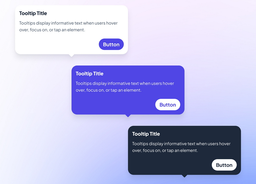
1.Make it short and clear
Tooltips often serve as a much more lightweight tool for contextual explanation and guidance in comparison with popups. To make it work as you wish, make it short and easy for users to understand. If you get a very long texts or complicated elements to present, consider using popups instead.To ensure the tooltip is short and concise, also include the minimal elements, such as the header, body text and buttons only or merely the header and body text.
A tooltip example from Saqib Chaudhry
Note: If you go with just the header and body text only, without any buttons, use hover triggers to make them appear or disappear.
2.Never block important elements
Even though tooltips is usually made to be as lightweight and minimal as possible, it would still take up space and can occasionally obscure other components. To avoid this, place tooltips close to the relevant elements and regularly test their positioning to ensure they don’t block any critical content or features.
So, place tooltips close to the relevant elements and timely test their positioning to ensure they don’t block any critical content or features.
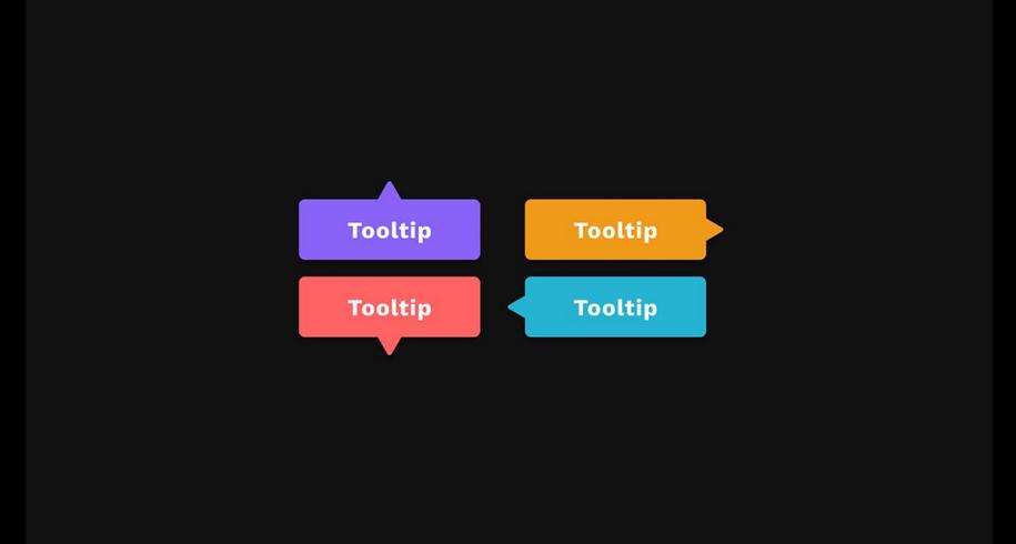
3.Ensure tooltips can stand out from the background
To smoothly draw the attention of users and successfully deliver the additional information and instructions, you should use effective visual elements, such as colors, shapes and spacing to create visual contrast, ensuring the tooltip content is easily distinguishable from the background.
Source
Use a different color or similar visuals to make the tooltip stand out from the background.4.Use a mouse cursor or arrow to indicate a tooltip
Imagine a scenario where a bottom toolbar displays a series of tooltips as you hover over each button. Without clear visual cues, users might find it confusing to understand which tooltip corresponds to which element.
Source
So, to improve clarity, incorporate a mouse cursor or arrow in the tooltip design that clearly points to the associated button or feature. This helps users quickly identify the relationship between the tooltip and the UI element it references.
Additionally, if possible, also consider adding a small icon, such as a "Question" icon, right next to the button to visually indicate that additional information or a tooltip is available.
5.Choose a consistent visual style
While designing tooltips, also choose a visual style that aligns with your brand and the overall design of your website or app. For example, use consistent color schemes, photography, iconography and more, to ensure that the audience can have a consistent and cohesive experience there, reinforcing a cohesive brand identity.
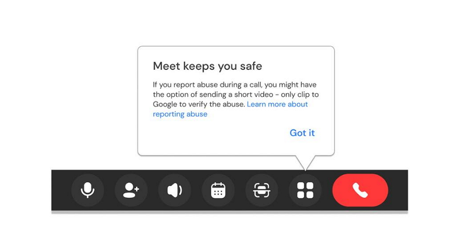
6.Allow users to close or exit with ease
Tooltips can be helpful when they first appear, but if they persistently show up on every hover, they may become annoying. To improve user experience, provide an easy way for users to close or dismiss the tooltip if they find it unnecessary.You can achieve this by adding a close button (e.g., "X", "Got it", "Read more") or allowing users to click outside the tooltip to close it.This approach ensures that tooltips remain useful without becoming a nuisance.
Source7. Choose a text tone, if possible
When designing tooltip text lines, also choose language tone to personalize the user experience. For example, make the tooltip lines fun, serious, playful or gentle, which would immerse the users and encourage them to read more or directly try the new features.
And one more thing, ensure that special tone would not conflict with the brand voice.
8.Consider animations or transitions
You may also try to add some animations or transitions to make the tooltips appear in a more natural way, such as adding a subtle fade-in or fade-out animations.
9.Keep testing and evolving
Whatever design solutions you finally choose regarding the tooltip text, placement, interactions, animations and more, make sure to timely test them. Also share it with your teammates and collect their feedback to ensure that all possible potential factors have been considered and thoroughly tested.To streamline this process, you can use our
free design and prototyping tool to quickly visualize, share, and test every aspect of your tooltip directly in the browser, with simple drag-and-drop functionality.
Make a tooltip design with Mockplus using just drag-and-drop actions10.Never overdo it!
Tooltips are helpful when users first come to your websites or apps. However, it does not mean that everything in your interface requires a tooltip. Only the buttons, elements or features which need an additional explanations or contexts will need the assistant of tooltips.Before adding a tooltip, consider whether it’s the best solution. If the information is critical and requires immediate attention, a popup or direct placement on the interface might be more effective, as tooltips may not be so direct enough.
20 best tooltip design examples for your inspiration
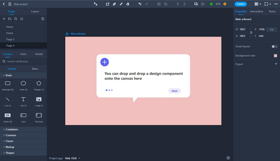
1.Widget Tooltip
This concept drop-down list presents a collection of widget options for the users. Each option is accompanied with tooltip designs featuring intuitive images and clear text explanations, helping users easily understand the functions and contexts.
It's an excellent example of how to incorporate tooltips into a user-friendly onboarding process or first-time user tour.
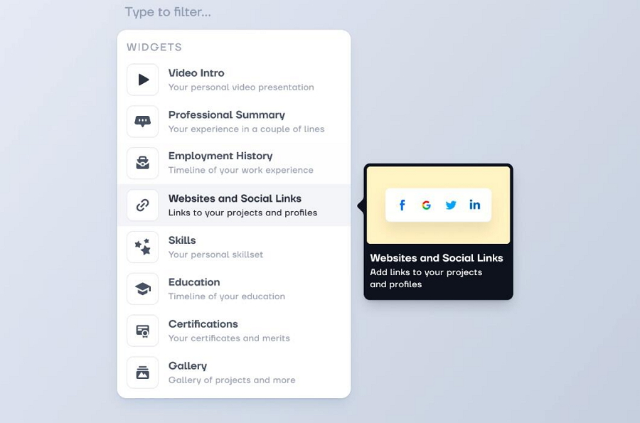
2.Sidebar Tooltip Design
Sidebars are commonly used in web and mobile apps to enhance user navigation. Icon-based sidebars, in particular, have become increasingly popular among designers for creating responsive navigation solutions. However, relying solely on icons can sometimes confuse users, leading to usability challenges. This is where hover tooltips come into play.
This example demonstrates how bubble-style tooltips can clarify the function of each icon button, providing design ideas for both
light and dark modes.
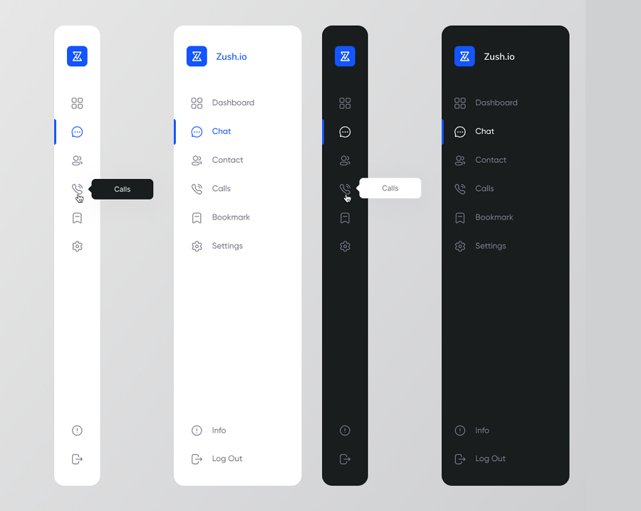
3.Chart Tooltips
In addition to sidebars, tooltips are also commonly used in various types of charts to present data more effectively. For instance, in this
spider chart design, a tooltip box with a clear and clean visual hierarchy is used to display detailed information for different key parameters.It would be a good inspiration to add the tooltip designs for your web or app charts, especially for the
dashboard design of your project.
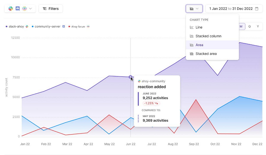
4.Area Chart Data Tooltip
This tooltip example showcases a data tooltip design for an area chart. Designers use varying font sizes and colors to establish a clear visual hierarchy, with red tones highlighting key data points.
5.Testimonial Tooltip Design for Mobiles
This
tooltip example from Dribbble illustrates a design concept for presenting testimonials on mobile devices. Users can hover over avatar images within the community description to reveal different user reviews. This approach minimizes interface clutter while enhancing the user experience.
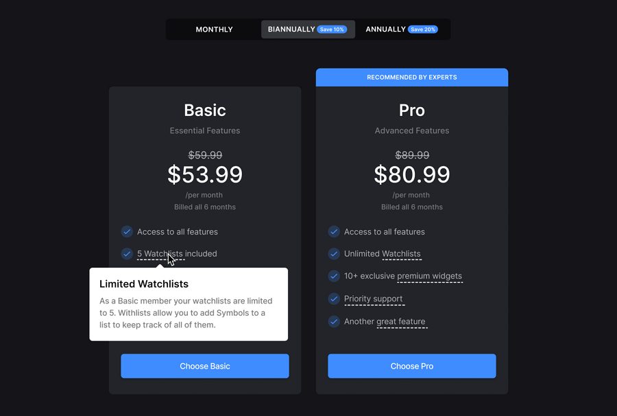
6.Pricing page tooltip design
This
pricing page design demonstrates how to design a tooltip for a dark-themed pricing page. Dotted underlines are used to indicate additional information, allowing users to hover and reveal the tooltip. The white tooltip contrasts sharply against the dark background, ensuring it stands out effectively.
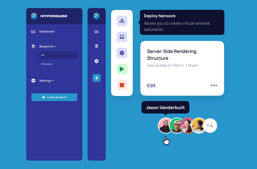
7.Infrastructure SaaS Product Redesign
Infrastructure SaaS Product RedesignThis
infrastructure redesign project showcases tooltip designs for the icon toolbar, update notifications, and user avatars. These examples can serve as valuable inspiration if you're working on similar design challenges
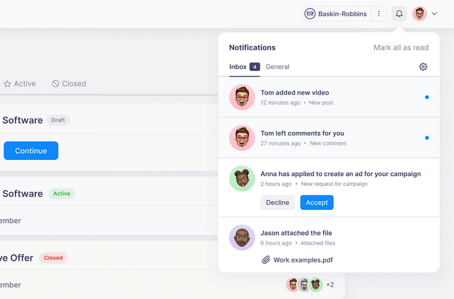
8.Krispy Notification Tooltip
Krispy demonstrates how designers have implemented a tooltip design for displaying notifications, triggered by a hover action. The notification design itself is also quite inspiring.
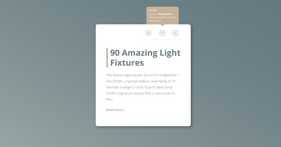
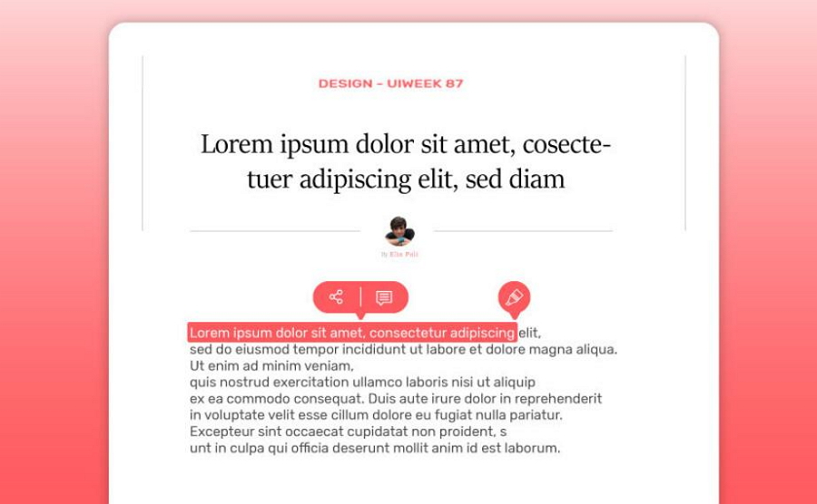
9.Tooltip Design Challenge
This tooltip design is part of the Daily UI design challenge by professional full-stack designer
Marijana Solari. It provides an example of how to use tooltips to explain the Share, Like, and Edit buttons on a floating blog post box or card format design widget. The explanatory text highlights the action words in bold to encourage users to do such actions.
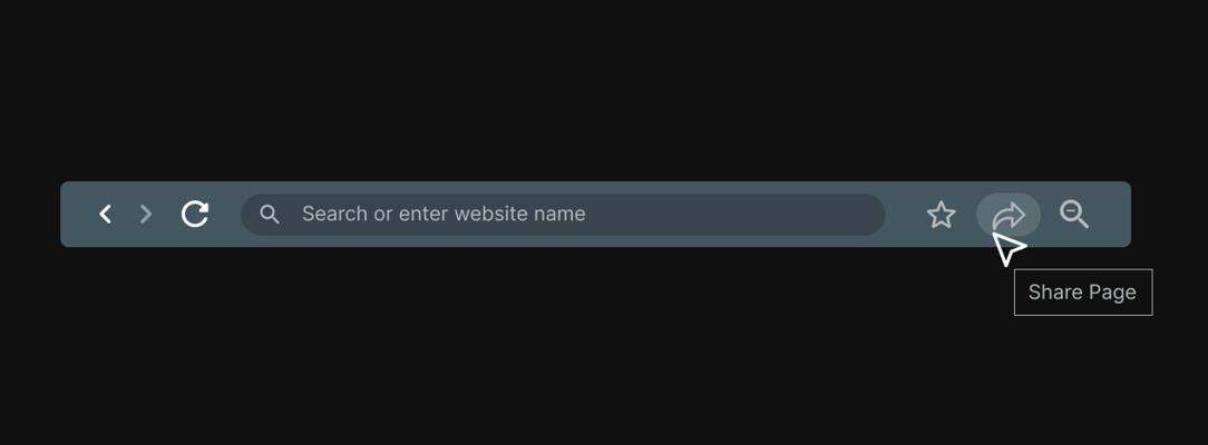
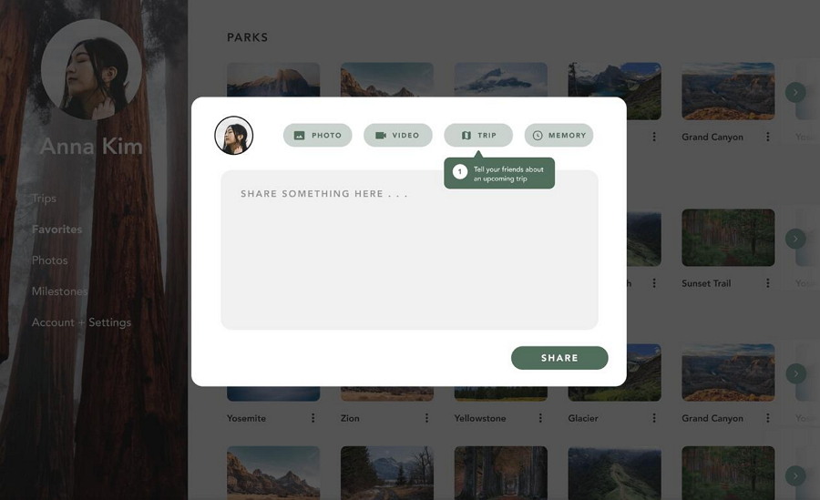
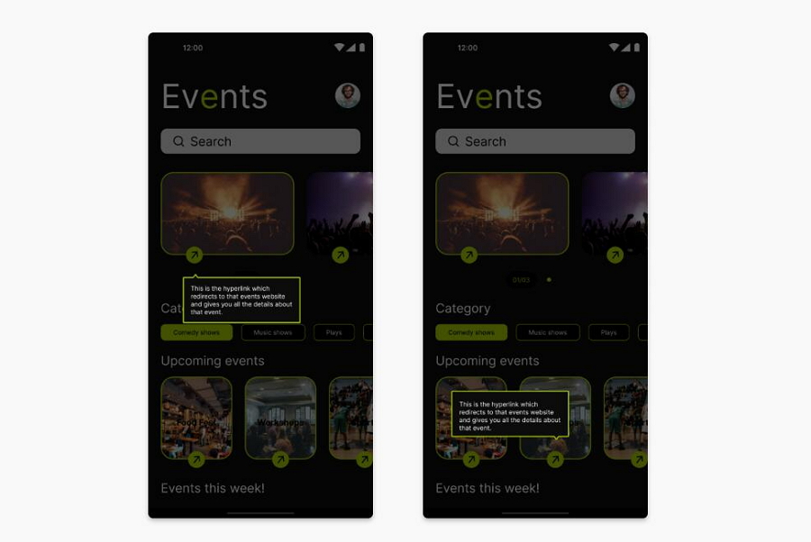
10.Share Box Tooltip Design
When designing a website or app, the share box is often used to share an event, project, product, or similar content. Making
this share box user-friendly is crucial, and tooltip designs play a key role in achieving that. This example demonstrates how to do it effectively. With carefully chosen positioning, slightly darker colors, and numbered labels, the tooltip becomes more noticeable and easier for users to understand within the given context.
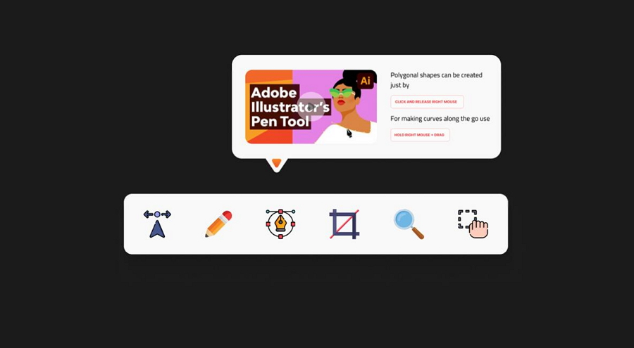
11.Toolbar Tooltip design
Looking for inspiration to add tooltips to a bottom or floating toolbar?
This design provides excellent ideas. It features a clear visual layout with eye-catching images and a well-structured text hierarchy. The colors are thoughtfully chosen to match the icon buttons the tooltip is trying to explain, ensuring design consistency.
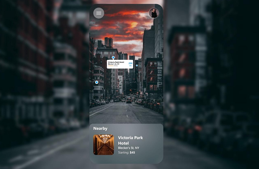
12.Location Tooltip UI Design
Location Tooltip UI DesignThis
location tooltip design is ideal for apps like hotel booking, travel, house renting, or any app that uses a map to locate places. Although it’s simple, it effectively presents all the key information you’d want to know about a hotel, including the name, rating, location, and distance.
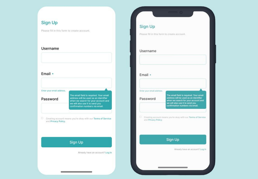
13.Sign Up Form Tooltip
When designing a
signup form, you can incorporate tooltips to guide users on the type of content they should input, as demonstrated in this
signup design. The designer uses a consistent green background color to create visual contrast, making the instructional content stand out.
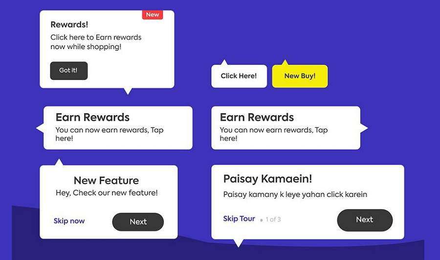
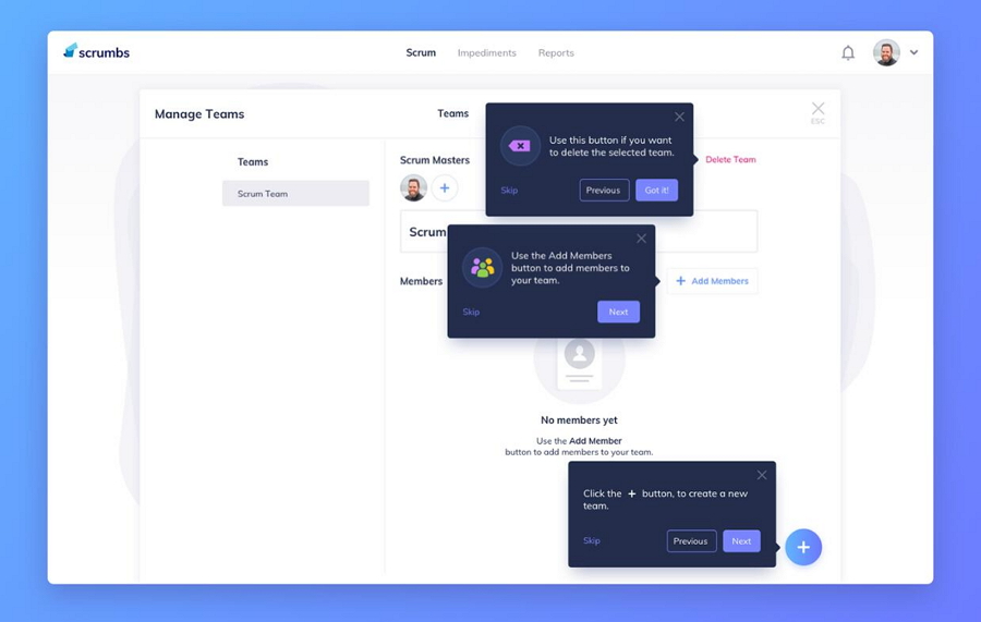
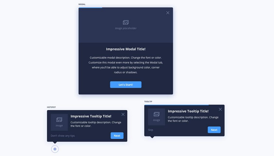
14.Onboarding Tooltip Design
This
onboarding design features a series of tooltips that guide users through the buttons and features step by step, helping to smoothly onboard the first-come users and also deliver a good user experience.
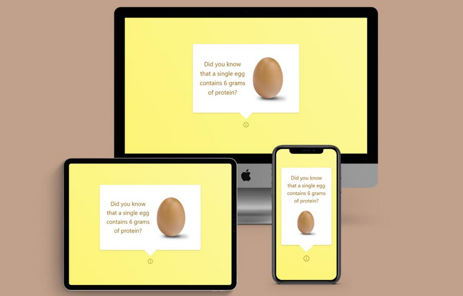
15.Responsive Tooltip Design
As responsive websites become increasingly important, it's essential that inner elements, like tooltips, are also responsive. This
Behance design gives a typical example of how to adapt tooltip designs across different devices by adjusting image and font sizes, line spacing, overall layouts, and more.
16.First user tour guide
Here’s another
tooltip design concept that could inspire you when creating a tour guide for first-time users. It is a tooltip design example especially made for mobile projects.
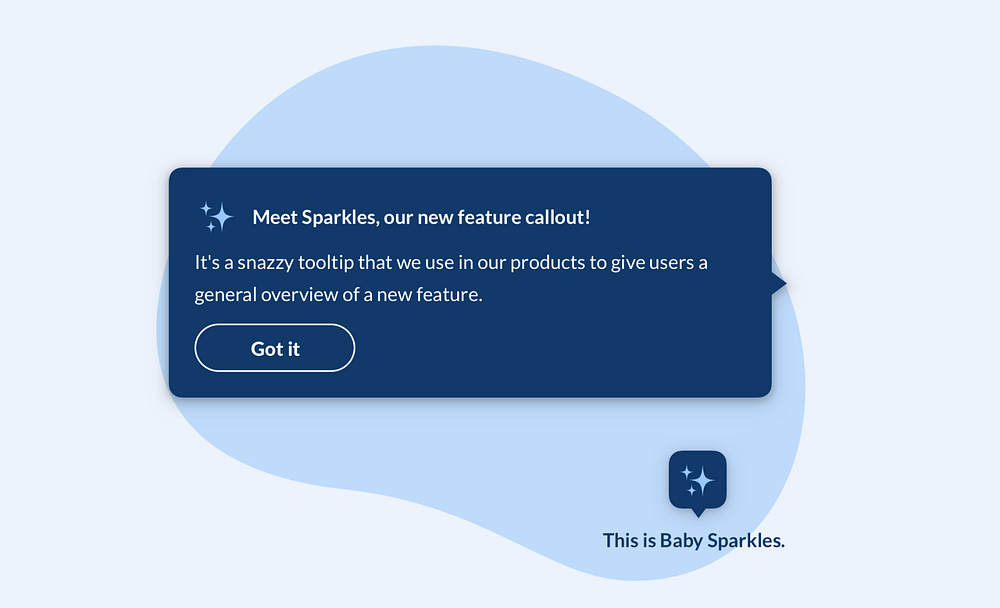
17.Dark Theme Tooltip Design
This
dark theme tooltip design is used to showcase new features. In addition to the title and descriptive text, it includes corresponding buttons that allow interested users to directly click and explore the newly introduced features.
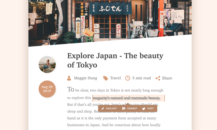
18.Selected Text Tooltip Design
This
design concept illustrates how to add a tooltip design that allows users to select text and quickly highlight, comment, or share it via social media like Twitter. Instead of using text labels as shown in this example, you can opt for well-known icons to represent the Share, Comment, and Edit actions more efficiently.
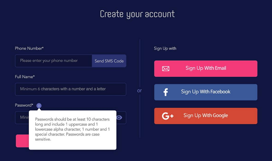
Use only icon buttons19.Password guideline tooltip
This tooltip design provides additional information for the password input field in a new account creation form. The white, bubble-like design makes the content stand out, and users can easily hover over the "i" icon to display or hide the tooltip as needed.
20.Minimal Tooltip Design for Charts
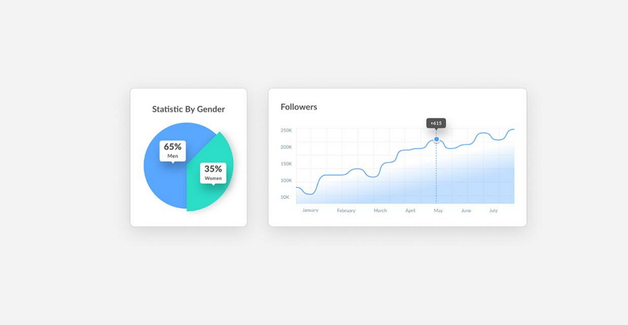
At last, let's explore a
chart design example that demonstrates how to create minimalistic tooltips for Pie and Line charts. Utilizing the minimal elements, such as numbers and number items, is also another efficient way to deliver the chart data.
Wrap up
Though tooltips may seem like small UI elements, they play a crucial role in helping users, especially first-time visitors, quickly understand a website or app’s features and get started.Whenever you are designing a website or app project, also incorporate tooltips to save time and efforts for users. We hope this article on the best practices and examples can inspire you somehow to create a better user experience.


 Mockplus RP
 Mockplus DT


 Sign up with Google
 Join our Discord community
 support@mockplusapp.com