An immersive yet well-structured UX case study helps UX professionals show off their design talents in portfolio websites, and let them communicate better with employers, designers and others easily.
However, as a UX designer, how can you write a perfect UX case study to easily get hired or communicate with others better?
Mockplus has handpicked 22 of the best UX design case study examples in 2022 to help you get inspiration, improve your portfolios and make your own things with ease. A step-by-step guideline about how to create a UX case study is also followed.
A UX case study tells the story of how you create a great website or app and, in particular, what you do to improve the UX of the site. UX designers—newbies and experts alike—will often share a case study on a portfolio website as a great way to get hired. Just like sending a resumé.
So, it is a lot more than just a copy of everything you've done while designing the project. To really showcase your design talent and the breadth of your abilities, you need to make sure the following are all included:
To this, you should feel free to add any further information that you think would help you stand out from the crowd.
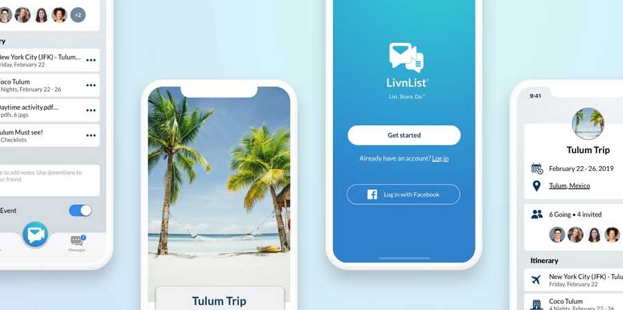
It is also worth remembering that UX case studies are a good resource for UX design beginners to learn more practical design skills and to gain from the real experience of others in dealing deal with difficult or urgent problems.
Whatever stage you’re at and whatever you are writing your case study for, these 22 top examples are bound to inspire you.
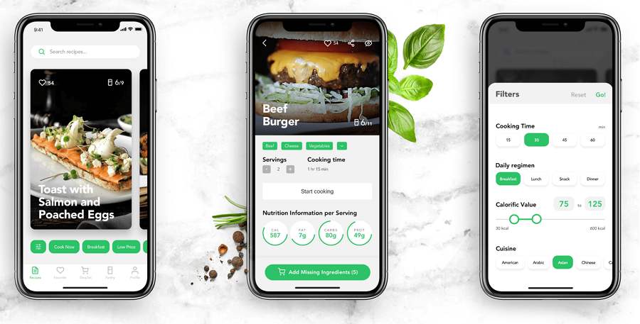
Designers: Marina Yalanska and Vlad Taran
Case Study: Perfect Recipe
This is a mobile application that enables users to search for food recipes and to buy what they need to cook different dishes.
Why did we choose this one?
This case study illustrates the entire UX design process is very simple, plain language. Many aspects of the process are included, along with some really inspirational ideas, such as product personalization, challenges and solutions, animated interactions, and other interface details.
Extra tips:
This example is from the Tubikstudio blog, which is very popular among designers. It regularly shares different branding, UI, and UX case studies. We would strongly recommend that you follow this blog to keep yourself up to date with the latest and most creative case studies.
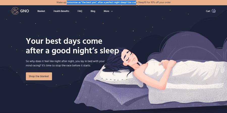
Designer: Marina Yalanska and Olga Zakharyan
Case Study: GnO Well Being
This is a creative illustration website that presents and sells a weighted designer blanket that helps you get a good night’s sleep, the first step to good health and a better life.
Why did we choose this?
This example is so much more than a great UX case study. In addition to the UX design, it gives you insight into many more key design issues, such as the logo, custom graphics, website pages, interactions and so on. There are many ideas here that you could copy for your own projects.
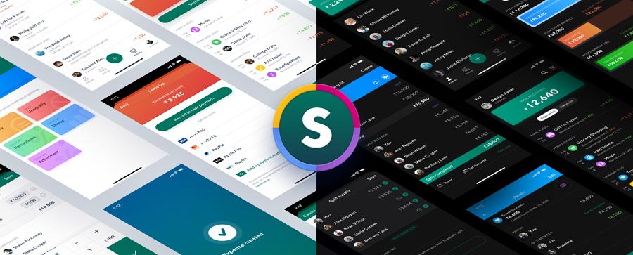
Designer: Chethan KVS (a Product designer at Unacademy)
Case Study: Splitwise
This is a concept mobile app that enables users to track and split expenses with friends. The designer has also given it another name, "Splitwise."
Why do we choose this?
This case study shares the designer's insights into key design decisions, such as why he chose this product, why he decided to redesign the logo, how to improve the onboarding and other pages, how to optimize the user flow, how to balance all pages and functions, how to enhance UX through bottom bars, interactions, gestures, view modes, and more.
Everything is explained using intuitive images, earning it thousands of “likes”. This is a great example that is bound to help you write a stunning case study on redesigning UX.
Extra tips:
This comes from a popular media channel called "UX Planet" that regularly posts examples of the best and latest UX case studies from around the world. Another great place to keep you up to speed with the latest UX designs.
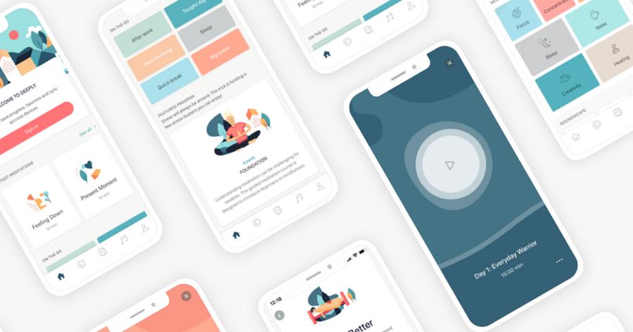
Designer: Sladana Kozar
Case Study: Deeplyapp
This is a health and self-care website app that helps users maintain mental well-being with meditations and exercises. This case study talks you through the design process of creating a user-friendly mobile app.
Why did we choose this?
This case study focuses on improvements to the UX and visual features of this mobile app. Many aspects are included to help you understand it better, such as the design background, what to build, UI flow diagram, discoverability design, visual balance, and much more. A full set of app interfaces are presented for you to study as well.
Extra tips:
You can also check out its Part 1 post for more details.
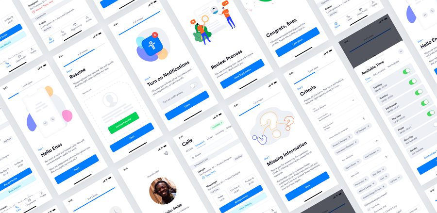
Designer: Enes Aktaş (Experienced UX designer)
Case Study: Talent Envoy
Talent Envoy is an intelligent job assistant that helps users find their ideal job and get to all the way to signing a contract faster and more easily.
Why did we choose this?
This case study firstly points out the biggest challenges and problems faced by job-seekers—the shortage of US recruitment markets. It then talks to you through the detail of how the designers optimized the recruitment process. You will also find information on the user research process, the UI flowchart design, the related wireframe and Sketch designs, the main page design, and more.
All the details have clear explanations and they offer a great example of how to use user research to solve problems and improve UI interfaces.
Extra tips:
This one comes from another hot media channel called "Muzli" which shares the latest ideas, designs, and interactions about websites or website apps from all over the world. Don’t miss out on this site if you want to stay ahead of the curve.
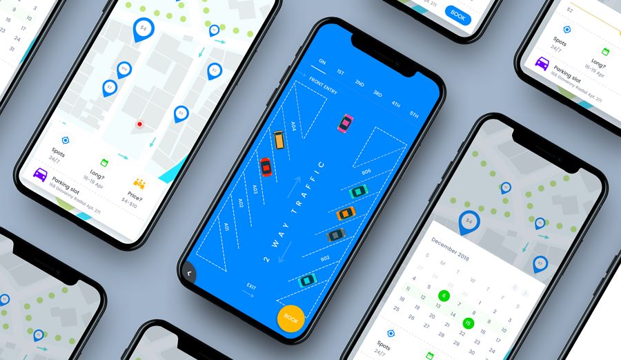
Designer: Johny Vino (Experienced UX and interaction designer)
Case Study: My Car Parking
This is a mobile app that can help people get parking slots easily even when they travel beyond their normal routes.
Why did we choose this?
This is a masterclass in how to write a case study that is simple, well-structured, and easy to understand. Many intuitive lists and images are used to explain the design ideas and processes.
It has received “claps” from over seven and a half thousand people and is a perfect example of how to write a well-structured and easy-to-understand case study.
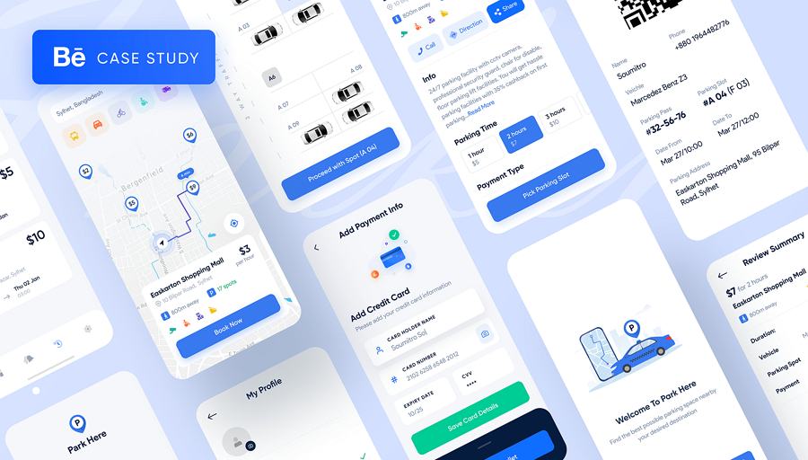
Designer: Soumitro Sobuj
Case Study: Parking Finder App
This is another concept mobile app that makes it easy for users to find parking slots even in big or overcrowded cities.
Why did we choose this?
This case study is beautifully presented and gives a good presentation of the whole design process. It covers nearly all the issues that a textbook UX case study should have, such as problems and solutions, user-centered design, design strategy, user flow, information architecture, interface wireframes and visual designs, and much more besides.
It is one of the best examples we have found of a case study that really teaches you how to write the perfect UX case study.
Designer: Jonathan Montalvo (Senior Designer, Branding, UXUI )
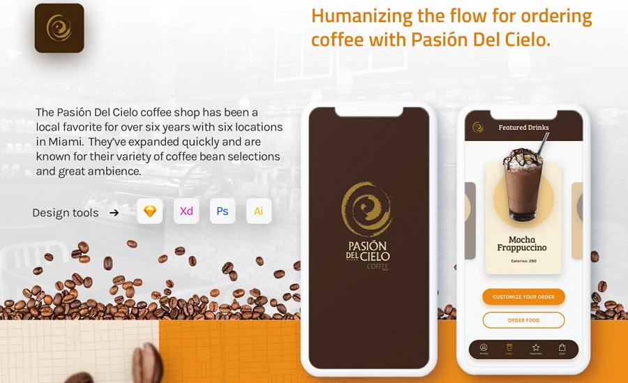
Case Study: Pasión del Cielo
This is a concept project about a real local coffee shop in Miami.
Why did we choose this?
This case study demonstrates effective ways to engage users with the Pasión brand and how a site can make it as easy as possible to turn page views into coffee sales.
There is a lot of analysis included to explain the entire design process, such as analyzing the competition, feature analysis, brand and interface improvements, and much more. Most important of all, many user personas have been created to evaluate and enhance the UX.
This is a good example to check for anyone looking to improve their own UX case study. Above all, it shows what can be done with rich images, bright colors, clear layouts, and well-crafted personas.
Designer: Rocket Pix (UXUI, web designer )
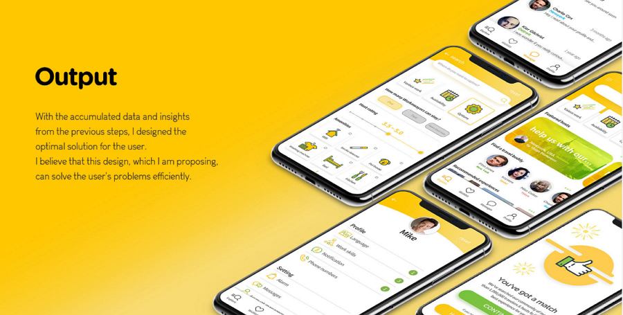
Case Study: Workaway App
This is a mobile app that provides international hospitality services; it helps users to contact each other to organize homestays and cultural exchanges.
Why did we choose this?
This UX design case study explains how the designer redesigned the Workaway App to make it easier for users. Many intuitive charts (pie charts, flow charts, line charts), cards, and images are used to illustrate the ideas.
It is simple and easy to follow, and also a good example of how to create an intuitive case study with charts and cards.
Designer: Dorothea Niederee (UX, UI designer )
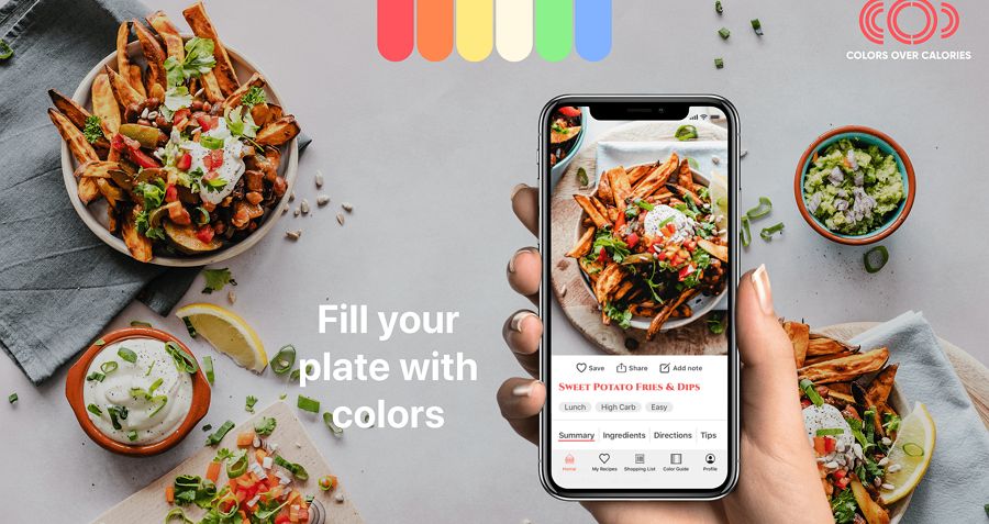
Case Study: Recipe App
This is a food app design offering inspirational recipes for anyone who wants to eat healthier.
Why did we choose this?
This case study gives a clear demonstration of the entire UI/UX design process. Three user personas are defined to present different users' needs. Some colors, typography, and UI elements are also shared.
This is a good example of how to define a detailed user persona in your UX case study.
Designer: Mustafa Aljaburi (UX, UI designer )
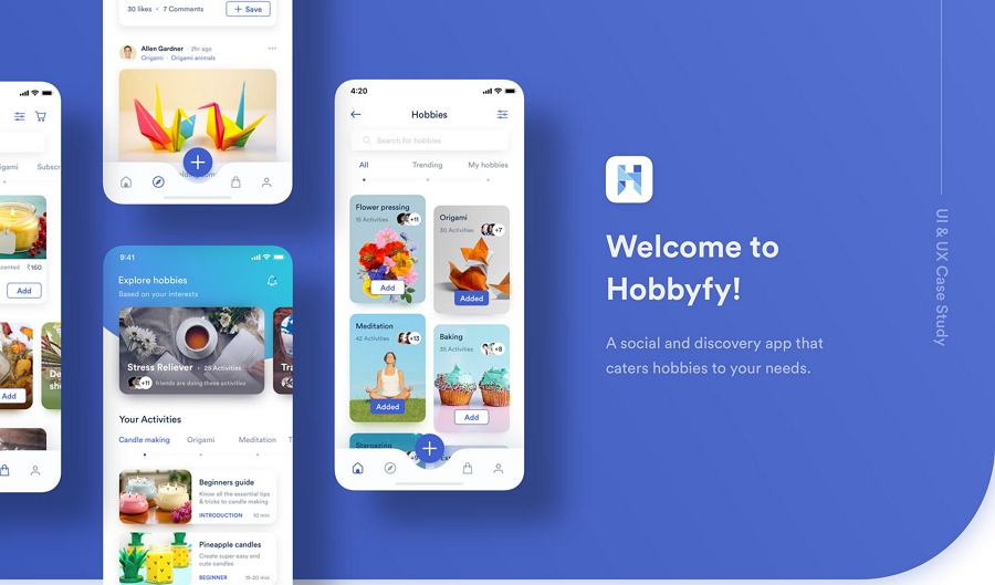
Case Study: Hobbfyy
This is a social and discovery app that makes it quick and easy to get everything you need for your hobbies.
Why did we choose this?
This case study aims to show how to develop a site that will provide its users with solutions, in this case to get what they need for their hobbies. Beautiful images, a storytelling style, and special layouts are used to explain everything.
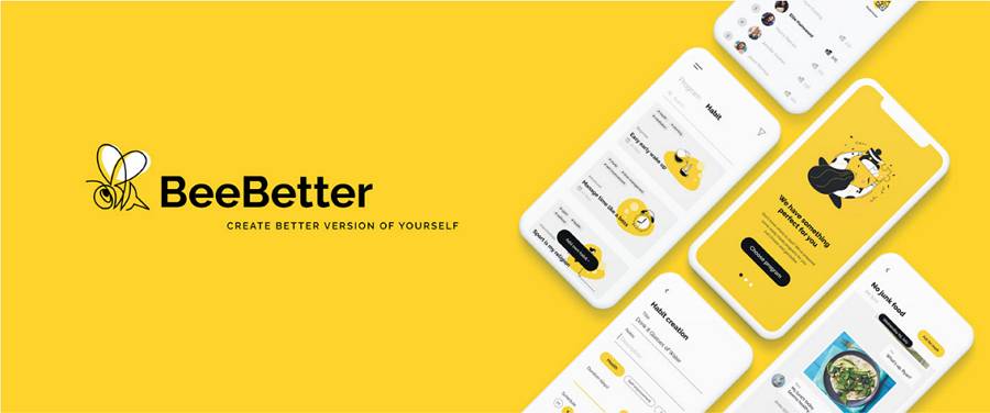
Designer: Anastasiia Mysliuk (UX, UI designer )
Case Study: Bee Better
This is a habit tracker app that makes it easy for you to develop new useful habits.
Why did we choose this?
This case study aims to solve problems associated with how we form and develop habits. It helps users find solutions and make habit formation more interesting; it motivates them to maintain their useful new habits. Many aspects of design, such as problems, solutions, the design process, discovery and research, user journey map, prototypes, and much more are illustrated and explained in simple language.
This would be a good example to follow if you are looking to create an easy-to-understand UX case study.
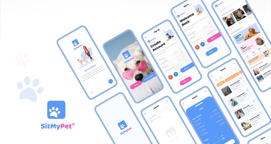
Designer: Aiman Fakia (UX, UI, visual designer )
Case Study: Sit My Pet
This is a pet-setting app that provides pet owners with a digital service that helps them connect with pet sitters.
Why did we choose this?
This UX case study describes a site that aims to make pet sitting more easily accessible for pet owners. It analyzes both its users and its competitors very well. The way solutions are evaluated, the user stories, and other related aspects are followed in detail to give you a better understanding of the project as a whole.
This is a good example of how to develop a UX design based on user needs.
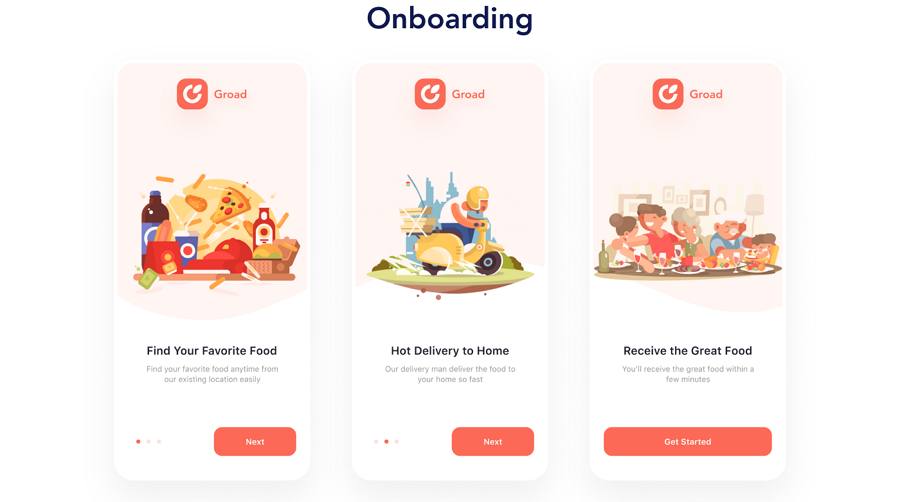
Designer: Phap (UI designer )
Case Study: Groad
This is a food ordering app offering food delivery services from stores, restaurants, cafés, fast food bars, and others.
Why did we choose this?
This UX case study uses beautiful illustrations and colors to explain the entire design process. As well as the usual parts of the design process—UI flow chart, UI showcasing—the related logo and icon designs, typography, and other aspects are included. This is a good example if you are looking to learn how to create an immersive case study with beautiful illustrations and colors.
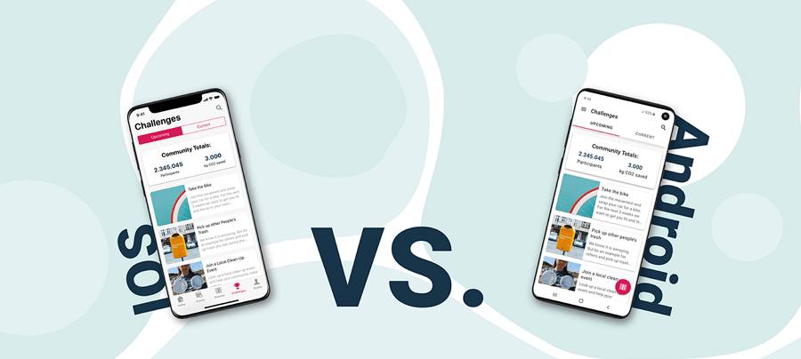
Designer: Johanna Rüthers
Case Study: Econsy
Here is another concept app that helps people live more sustainably by using a scanning process to give them information about the ecological and social impact of products they are thinking of buying.
Why did we choose this?
This case study explains the differences in the mobile app’s appearance when it is applied on the Human Interface Guidelines (IOS) and Material Design Guidelines (Android). This will help you to create an app that works well on both Mac and Android devices.
More UI/UX case studies & designs:
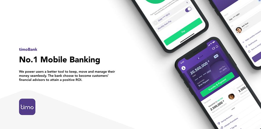
Timo Bank is a mobile banking app project produced by Leo Nguyen, a freelance designer and creative director. This case study aims to provide more intuitive transfer, payment, and money management solutions for mobile users.
This is a great example to consider if you are hoping to create a better banking app.
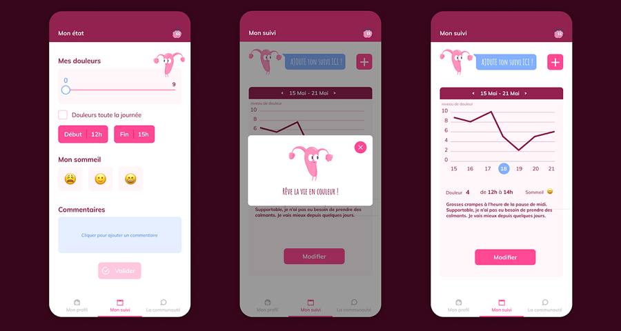
Endoberry Health App Design provides useful solutions for women suffering from endometriosis. In turn, this gives doctors a better understanding of individual cases. The design challenges, solutions, and UI details are displayed and explained to illustrate the design project.
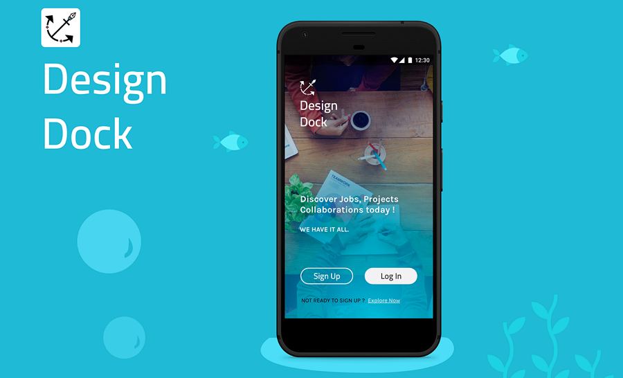
Job Portal App has been specially made for designers and freelancers. This case study uses cute illustrations, simple words, and clear storytelling to explain how the designer worked out the ideal job hunting solutions for users.
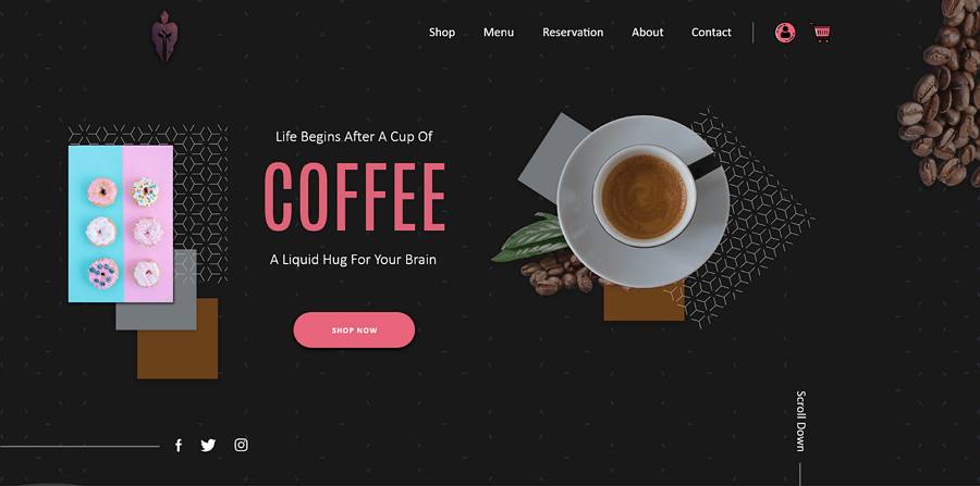
Café Website gives its users a great experience by making it quick and easy to order a coffee online. Many elegant page details are displayed.
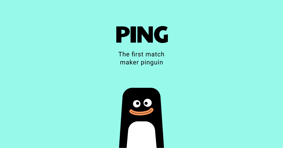
Ping is a dating app that offers users a unique and effective way to find their perfect match. As you can see, its mascot is really cute and this case study will show you how a cute mascot can enhance the UX.
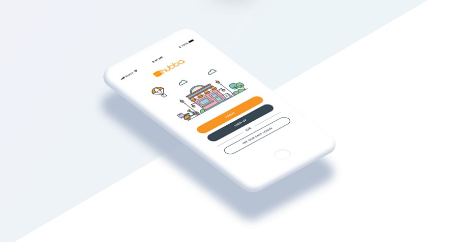
Hubba Mobile App is a B2B online marketplace where retailers can find and purchase unique products for their stores or shops. This case study aims to explain the process of creating a special mobile app for this online marketplace. It offers a beautiful and clear presentation of the entire UI/UX design process.
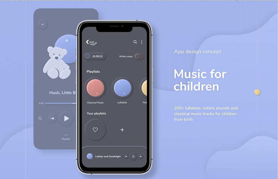
Music App shares the fancy UI and colors from a music app made for children. It is a good example that is sure to inspire you to create a distinctive children's app.
If you are still not entirely sure how to go about creating a distinctive UX case study, here are a few simple steps to walk you through the entire process from start to finish:
The final outcome will depend on what it is you are trying to achieve. So, before you start writing a UX design case, you should first figure out in detail what its purpose is. Ask yourself some basic questions:
In short, figuring out your purpose and setting a goal can make the entire design process so much easier.
Whatever you want to do, it is always a good idea to start with a plan. When it comes to writing a UX case study, you should also outline your entire UX case study and decide on what sections you want to include.
For example, nowadays, a good UX design case study often covers:
You might also want to add further sections:
Of course, if you are a newbie, and you still have questions, why not go online and search for UX case study templates that you can study and follow.
As we've explained above, the design process is always one of the most important parts of a good UX case study. You should always introduce clearly as many of the relevant parts of the process as possible. For example: show how you and your team communicate and collaborate effectively; demonstrate how you have developed ideas to address user problems; explain how you and your team have dealt with emergencies or mishaps.
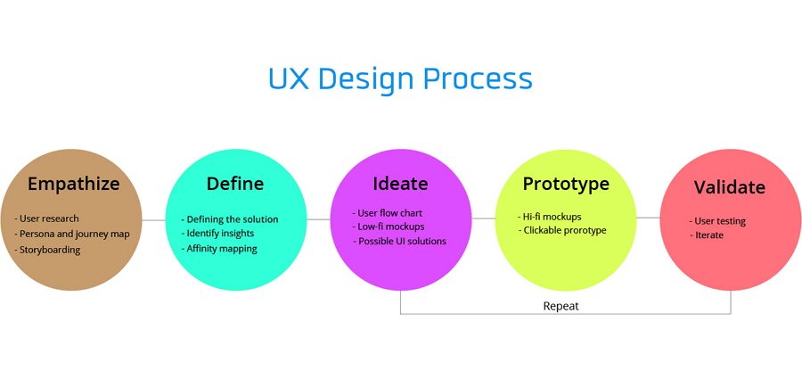
You can also introduce the UX design tools that you have chosen to simplify the entire design process. Mockplus, is an online product design platform, enabled us to adapt quickly and effectively to working from home during the recent Coronavirus lockdown. Prototyping our designs, sharing ideas, working together in an effective team, taking the process from design to handoff, it all works smoothly with this single tool.
The content should be the main focus of your case study—but not the only focus. To make the case study as good as possible, you also need to think about its readability and visual appeal. Here are some suggestions to follow:
The final visual effect can be make-or-break for whether your UX case study is going to stand out from the crowd. You should always take it seriously.
Every UX case study can be a good chance to practice and improve your design skills. So, in your conclusion, don’t forget to analyze the entire process and summarize the outcomes. Always take a minute to figure out what lessons you should take away from the process, what tips should be remembered, what should be improved, and—most important—what your next steps are going to be.
UX case studies are one of the most essential parts of a UX designer's portfolio. The ability to write a well-structured UX case study is also one of the basic skills that a competent UX professional should have. So, UX case studies play a very important role in UX designer's life.
We hope our picks of the best UX design case studies along with our step-by-step guide will help you create a stunning UX case study.
 Mockplus RP
A free prototyping tool to create wireframes or interactive prototypes in minutes.
 Mockplus DT
A free UI design tool to design, animate, collaborate and handoff right in the browser.
