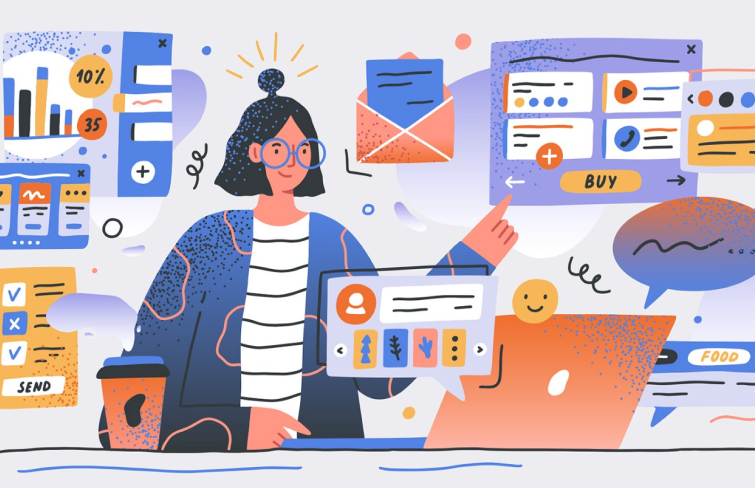
In today's digital world, where we're surrounded by all sorts of gadgets and apps, the user interface (UI) is like the bridge between us and digital devices. It's basically the place where all our digital adventures happen. Whether we're swiping through an app or browsing a website, it's the UI design that makes it feel smooth and intuitive. Moreover, let's be real, nowadays, we're always in a rush and pretty picky with where we spend our time online, so making sure every little detail is just right can make a huge difference.
Today, let's explore the magical world of UI design, what makes a good UI design, and check out some inspiring and innovative examples and UI design templates together!
In one simple sentence, UI design is the process designers use to build digital interfaces. Many people perceive UI design solely as the creation of visually appealing interfaces. However, its scope extends far beyond aesthetics. While aesthetics play a significant role, UI design encompasses a broader spectrum of considerations. At its core, it revolves around creating interfaces that bridge the gap between humans and technology. It involves the meticulous arrangement of visual elements, such as buttons, menus and icons to facilitate user interaction with digital products and services. UI designers strive to optimize the usability and accessibility of interfaces while aligning them with brand identity and user preferences, ultimately enhancing the overall user experience.
As we mentioned above, UI design is about creating an interface that enhances user experience and facilitates seamless interaction. A good UI design must strike a delicate balance between aesthetics and functionality, prioritizing usability, simplicity and consistency alongside visual appeal. It's all about making sure that users can easily understand, navigate, and use the interface, while also making it visually appealing as possible. Here are some key aspects that contribute to making a good UI design:
Usability & Simplicity: : At the core of a good UI design is usability & simplicity. Designers should strive to eliminate unnecessary complexity and clutter, focusing only on the essential elements that contribute to the user's goals. The interface should be easy to navigate, with clear hierarchy, controls and pathways to desired actions.
Intuitiveness: A good UI design should be intuitive. Its interactive elements should behave in a way that aligns with users' natural expectation, minimizing the need for explicit instructions and explanations. For example, the "Home" button acts as a primary means to navigate back to the device's main screen. This intuitive placement and function minimize the need for explicit instructions, as users naturally expect the home button to return them to the device's main interface.
Consistency: Consistent use of colors, typography, and layout elements across the interface creates a cohesive and harmonious user experience. Consistency in UI design fosters familiarity and predictability, making it easier for users to navigate through different sections of an application or website.
Aesthetics: A visually appealing interface can evoke positive emotions, increase user engagement, and create a memorable experience. Designers should strive to incorporate visual design principles to create interfaces that are visually appealing and emotionally engaging.
Responsiveness: In today's multi-device world, UI designs must be responsive and adaptable to various screen sizes and resolutions. A responsive UI ensures that the interface remains usable and visually appealing across different devices, whether it's a desktop computer, tablet, or smartphone.
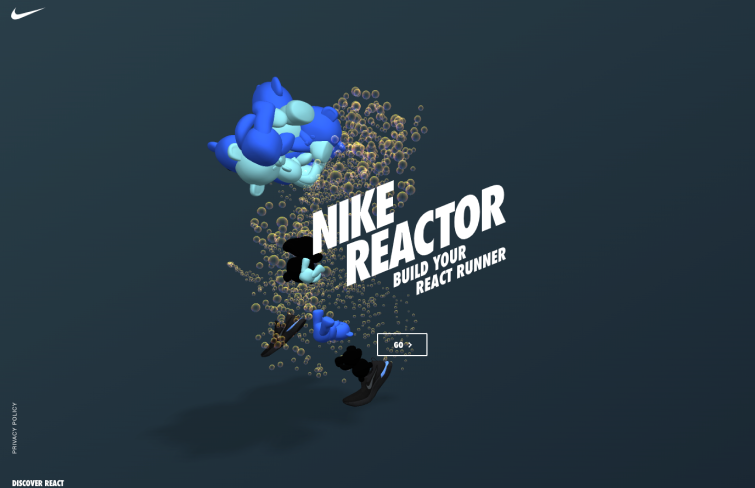
The Nike React store stands out by revolutionizing the sneaker-shopping experience through an innovative approach. Instead of the usual mundane browsing, users are greeted with a playful and futuristic AI interface that engages them in a series of quirky questions about their preferences. These questions cover everything from texture to running style and color, resulting in a unique and personalized recommendation.
By incorporating elements of fun and interactivity into the shopping process, Nike creates a memorable experience that goes beyond simply selling sneakers. But the brilliance of the Nike React store doesn't end there. By allowing users to name and download their curious creations, Nike encourages social sharing and interaction.
These user-generated content not only generates buzz around the products but also fosters a sense of community among sneaker enthusiasts. It's this blend of creativity, interactivity, and social engagement that sets the Nike React store apart and reinforces brand loyalty.
For those unfamiliar, Gumroad is a digital publishing e-commerce platform known for its exceptional user interface design. What sets Gumroad apart, particularly, is its vibrant color palette, reminiscent of the bold hues and abstract shapes popularized by the Memphis design movement of the 1980s.
Gumroad's design aesthetic not only sets it apart from other e-commerce platforms but also enhances the overall user experience, making browsing and purchasing products a visually engaging and enjoyable experience.
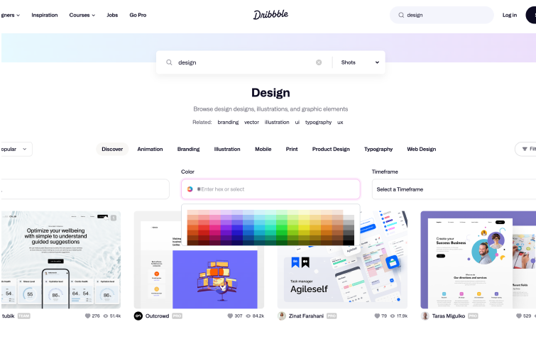
Dribbble stands out as a thriving and expansive hub for designers, making its UI design a standout success. At its core, Dribbble functions as a dynamic and extensive repository for design inspiration, attracting creatives from all corners of the globe.
One of the key features contributing to Dribbble's success is its use of cards, which effectively curate a visually striking gallery of diverse design pieces. This layout allows users to peruse a multitude of captivating designs at a glance. Moreover, Dribbble's intuitive search functionality further enhances the user experience by enabling users to explore designs based on specific color codes. This feature not only adds a layer of customization to the browsing experience but also empowers users to discover designs that align with their individual preferences and projects.
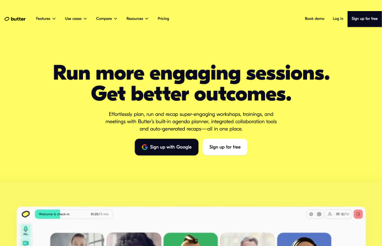
Butter's website boasts a user-friendly layout that skillfully embodies the brand's values of approachability, simplicity, and enjoyment. Through vibrant colors and charming visuals, Butter effectively communicates its brand ethos to users. The clean and straightforward user interface design, characterized by ample white space and strategic contrast, not only enhances visual appeal but also ensures ease of navigation.
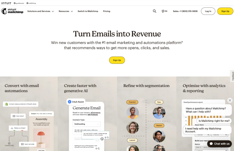
Mailchimp's website boasts a flat and clean web UI, focusing primarily on typography while incorporating visually appealing guides for new users. It has introduced a subtly animated pointer to direct users to clickable elements, enhancing usability and navigation.
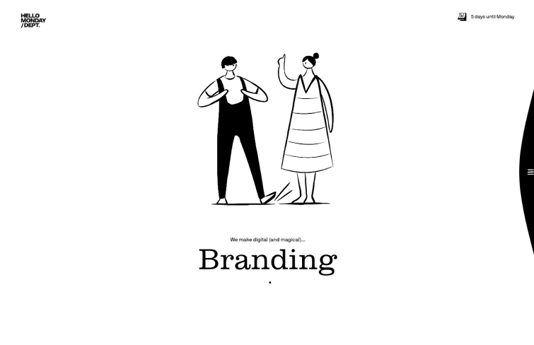
In the pursuit of creating exceptional user interfaces, capturing users' attention is paramount. Hello Monday has mastered this art through strategic use of white space, allowing elements to shine and stand out effortlessly. By surrounding each element with ample white space, Hello Monday effectively highlights key components, drawing users' focus and creating a visually engaging experience. This thoughtful approach to UI design ensures that important elements command attention without overwhelming the user with unnecessary clutter.
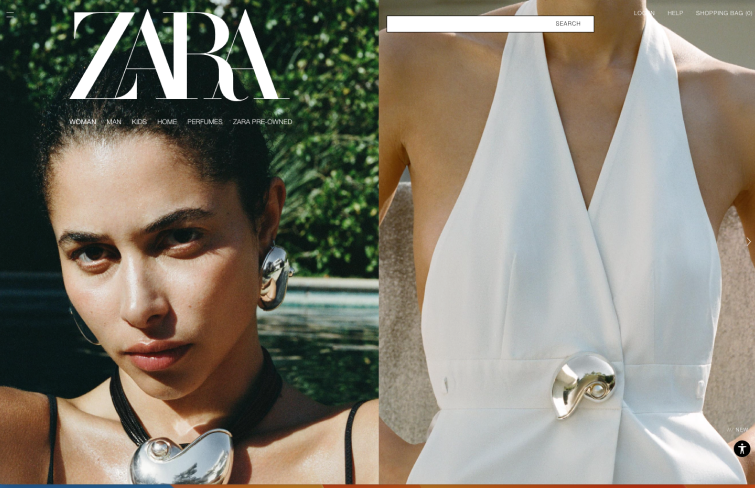
In a digital world filled with noise, Zara's online store stands out for its blend of elegance and functionality. Its sleek design and stunning images reflect the brand's dedication to quality, fashion, and innovation. The interface embodies Zara's modern luxury ethos, reinforcing its identity with every click. Beyond just a shopping app, it's a virtual boutique offering a luxurious fashion experience.
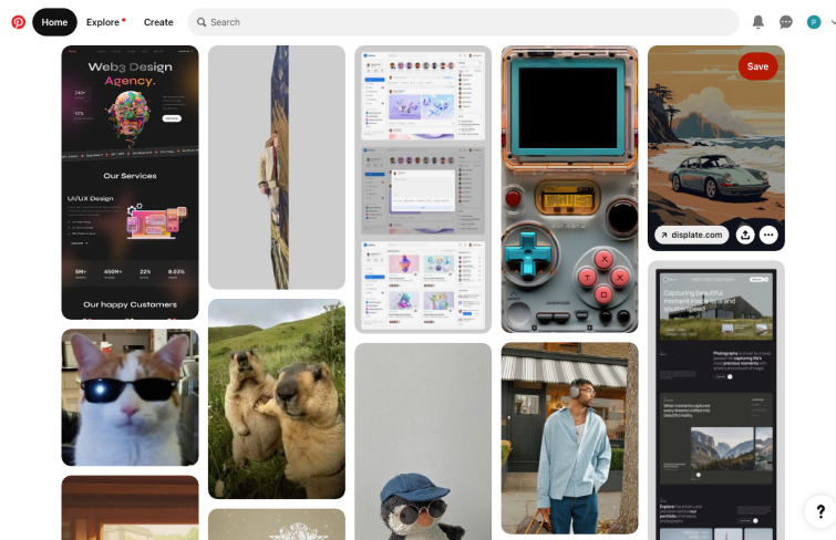
Pinterest's waterfall effect seamlessly blends water flow and card design elements, delivering a uniquely smooth user experience. Each card is subtly shaded upon mouse interaction, enhancing visibility and imbuing a perception of clickability.
This clever design choice not only enhances user engagement but also improves overall usability. By effectively combining aesthetics with functionality, Pinterest has set a high standard for user interface design, showcasing the importance of thoughtful design elements in creating a memorable and intuitive user experience.
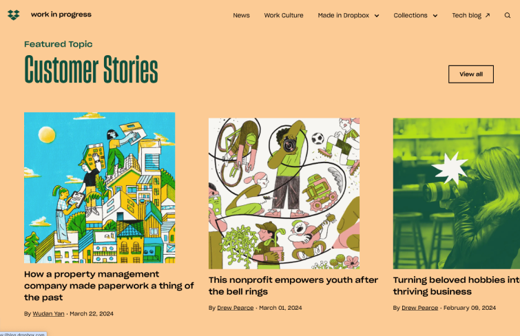
Work in Progress, the Dropbox blog, mesmerizes with its bold color choices. Its UI is an inspiration to all. Dynamic, vibrant, and undeniably unique, this example proves that bold colors and fonts can create a powerful user experience. The interactive content loading as users scroll also adds a youthful and daring touch.
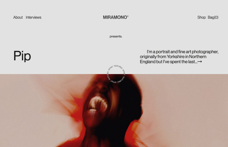
Photography, like UI design, holds the power to captivate and inspire. Miramacho seamlessly merges visual storytelling with skillful UI design, creating a modern and vibrant online magazine experience. Solid blocks of color lend an urban edge to the website, while high-contrast imagery establishes a clear hierarchy.
Miramacho skillfully captures the essence of each photographer's story, with microinteractions providing subtle feedback and enhancing usability. The judicious use of empty space also adds a dramatic flair to the showcased photographs, elevating the overall aesthetic.
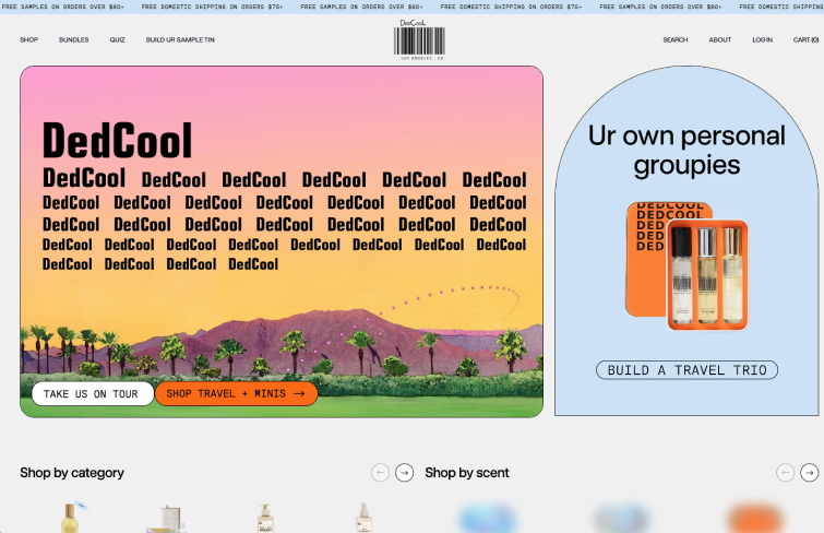
Dedcool's website UI design strikes a balance between classic and contemporary, making for an engaging and enjoyable shopping experience that resonates with their customer base. Its UI design exudes an editorial flair, reminiscent of old-school aesthetics revitalized for the digital age.
Vibrant orange accents draw the eye, while dynamic visuals create a sense of motion and energy. Its notable features include a well-defined hierarchy of elements, dynamic videos and images, and strategic use of color to guide user interaction.
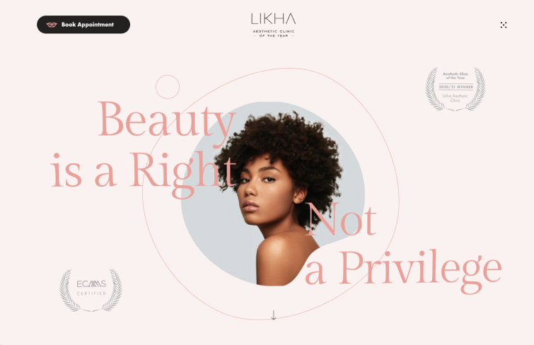
This feminine yet dynamic website captivates users with interactive elements that respond to cursor movements. Notably, details like the animations subtly mimic ocean waves, adding depth to the design. The intricate components evoke a sense of natural beauty and serenity, reminiscent of a tranquil spa experience.
Ample white space, stunning illustrations, and bold typography further elevate the UI, creating a unique and inspiring environment. Lihka's website serves as a testament to the harmonious blend of aesthetics and functionality, offering a visual feast that delights and inspires visitors.
This example showcases the power of minimal components in UI design, demonstrating how creativity and strategic use of color can create a visually striking and engaging user experience. The youthful vibe is evident in the bold font choice and dynamic components that add motion and energy to the interface.
As users scroll, the UI design takes on a more dramatic tone, transitioning from a smooth beige background to vibrant green and bold red sections. These color shifts strategically highlight key points in the sales pitch, capturing attention and engaging users effectively.
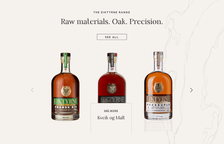
Eiktyrne, a Norwegian whiskey, serves as a stellar example of exceptional UI design. Beyond showcasing the whiskey itself, the website intricately weaves a compelling narrative. The design opts for solid backgrounds with subtle visual effects, allowing the Eiktyrne bottle images to steal the spotlight. With a clean and minimalist approach, the UI exudes elegance.
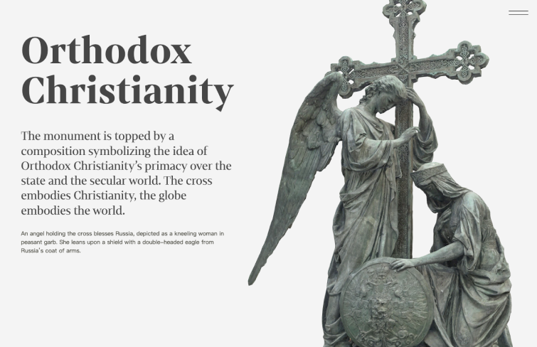
The Russian Pantheon website stands out as a masterpiece of artistic UI design, immersing users in Russia's rich heritage of 19th-century statues. Its dramatic color palette of black and varying shades of grey, coupled with captivating parallax effects, sets the stage for an unforgettable journey through history. The amazing effects when users scrolling down the page showcases stunning 360-degree shots of these statues, allowing users to witness their beauty from every angle.
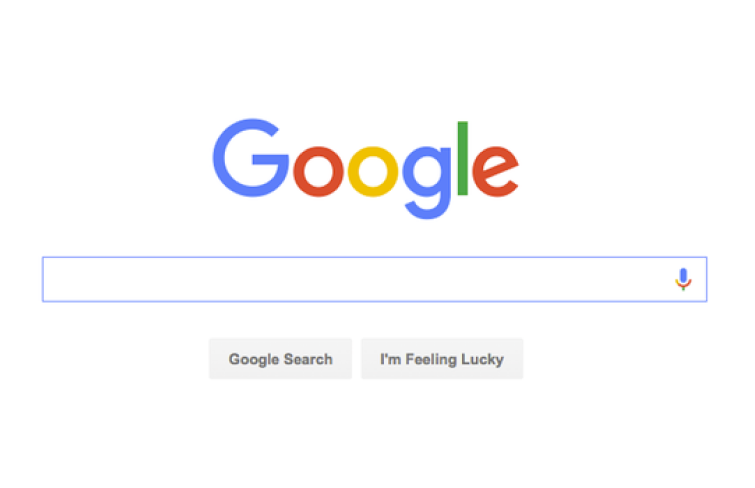
The design of Google's homepage sends a clear message: the user's time and attention are valuable, and every element on the page serves a purpose. Rather than overwhelming users with unnecessary information or flashy visuals, Google prioritizes functionality and efficiency. Google empowers users to accomplish their tasks with ease and efficiency.
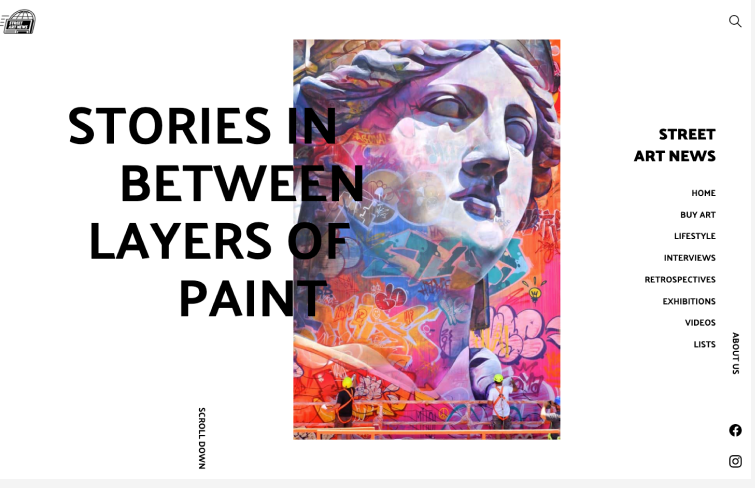
Street Art News exemplifies modern, vibrant, and youthful UI design. With a clean white background, the focus is solely on the content, ensuring easy readability and guiding the eye seamlessly through the page. A clear hierarchy organizes the content effectively, enhancing user experience.
The website incorporates subtle parallax effects as users scroll, adding a touch of sophistication. Smooth transitions, such as the menu sliding away and sections rising to cover previous ones, also elevate the overall design. Street Art News' UI design stands out for its boldness and user-centric approach, making it a standout example of innovative design.
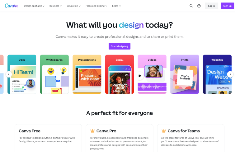
Canva stands out as a top-tier graphic design platform, empowering users to craft captivating social media graphics, presentations, posters, and more. Renowned for its exceptional web app design, Canva excels in utilizing color palettes, fonts, and graphics to convey messages and elicit emotional responses. Each image and template exudes expressiveness, reflecting the company's essence.
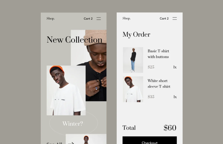
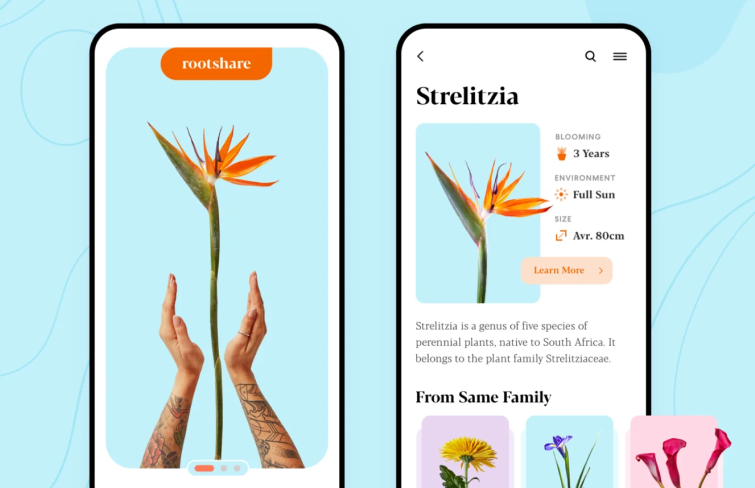
What sets this design apart is its unique broken grid layout, spacious use of empty areas, and clever layering technique. This shop app embraces minimalism in a big way, letting the products take center stage with crisp white space and standout fonts.
This design stands out for its incorporation of realistic graphics, immersive 3D elements, and a lightweight aesthetic. While data and numbers can often feel mundane, the UI designer of this sleek app has ingeniously infused them with life through lifelike images, personalized touches, and understated design. By visualizing data in a compelling manner, this app transcends the traditional confines of Excel sheets, offering users a more engaging and meaningful experience.
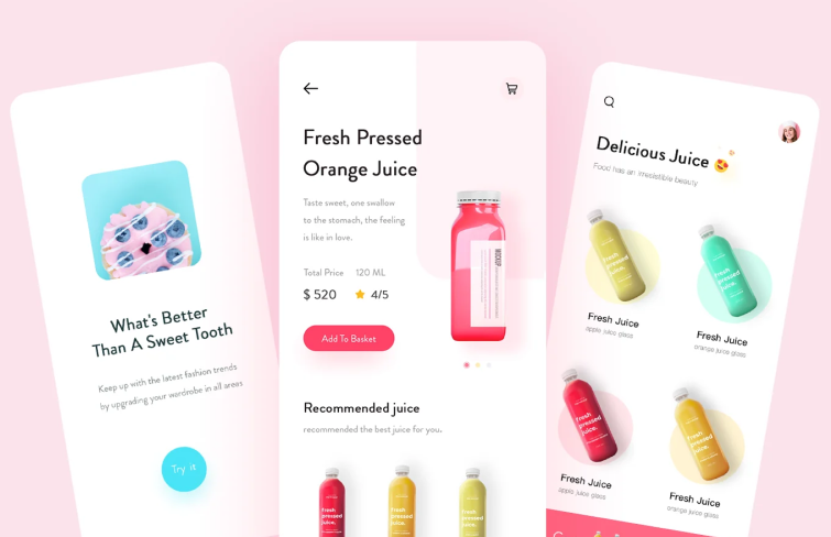
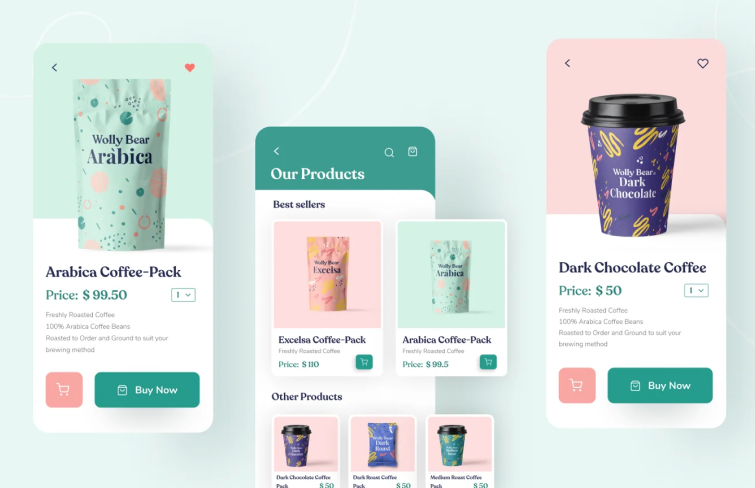
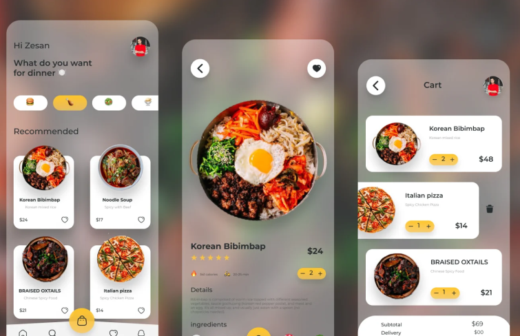
This design captivates with its vibrant colors, tidy layout, and standout CTAs. The newly crafted app design exudes freshness and energy, seamlessly blending sleek shapes, vivid hues, and captivating product imagery. It impeccably caters to its target market, placing sold items front and center, commanding attention where it matters most.
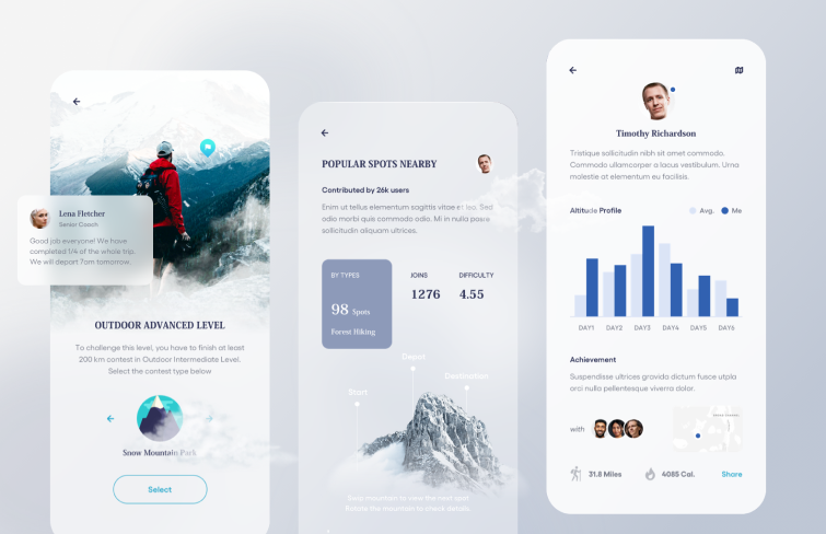
This design showcases a remarkable blend of elements: subtle drop shadows, a harmonious mix of serif fonts, and a cohesive brand identity. It's a stellar demonstration of a mobile app UI design that prioritizes functionality and user engagement. The legible font pairing and prominent buttons ensure seamless interaction with the product. What truly sets this design apart is its attention to detail, such as the soft shadows and floating visuals, which bridge the gap between the digital and physical realms, adding a touch of hyper-realism to the user experience.
This neat UI design impresses users with its stunning illustrations, rounded corners, and standout fonts. It utilizes full-screen visuals that delight the eye. Sometimes, simplicity reigns supreme, and aesthetics alone can captivate and retain mobile users' attention.
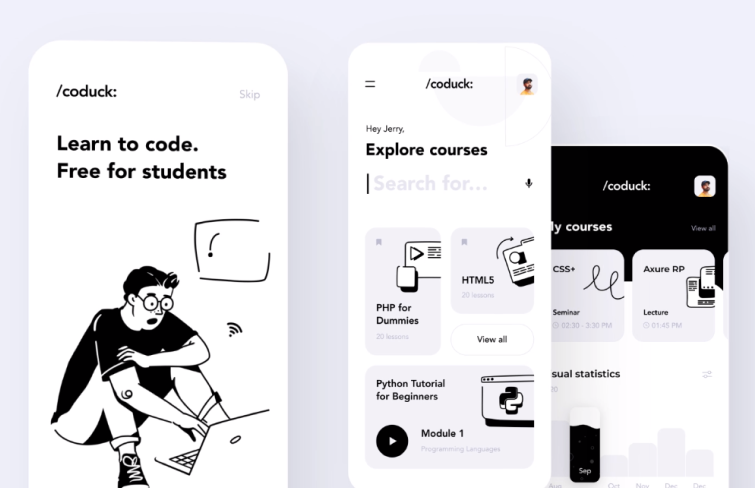
This design stands out with its comic strip-inspired UI, human-like writing, and minimalist layout. While the black and white aesthetic may not suit everyone's preferences, it's perfectly tailored to the app's target audience – aspires programmers. The uncluttered design, coupled with concise microcopy, ensures that the app commands the attention of its intended users.
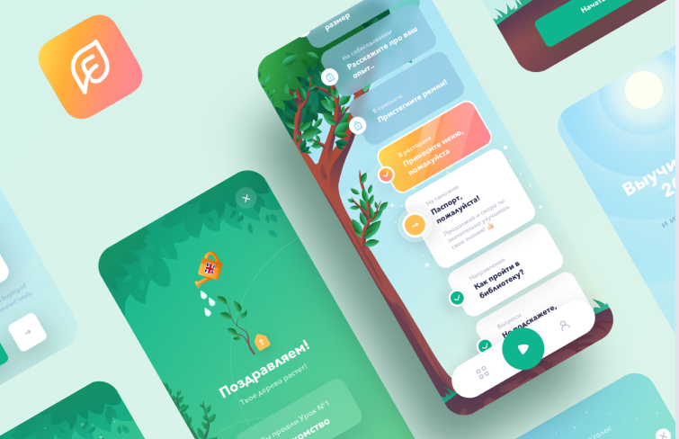
What captures our admiration is this design's embrace of visual storytelling, vibrant hues, and organic forms. In the realm of language learning apps, immersion and narrative play pivotal roles in enhancing learning outcomes. Here, we witness a refreshing approach to visual storytelling, where a dynamic interplay of colors and transparent UI elements fosters user focus and engagement.
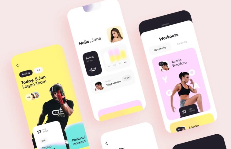
The lively colors alone evoke a surge of motivation, perfectly complementing the fitness app's purpose. Rounded, organic shapes harmonize effortlessly with minimalist, flat buttons, rendering the design both accessible and visually appealing. It's a captivating fusion of aesthetics and functionality.
This UI design features the frosted glass effect, stunning photography, and ingredient icons. A notable trend showcased here is glassmorphism, characterized by transparency, vibrant colors, and layered elements. When executed adeptly, as demonstrated in this app, glassmorphism lends a sleek and contemporary aesthetic, elevating the overall user experience.
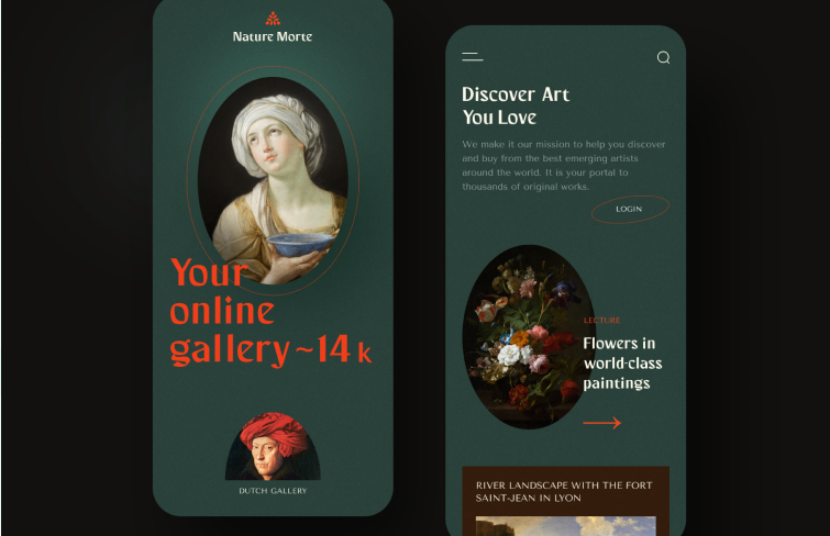
Nature Morte offers a fresh take on online art galleries. Earthy tones dominate the color palette, setting a serene backdrop for the artworks. The typography is also remarkable. It strikes a perfect balance between modern simplicity and a touch of Renaissance elegance. Key texts are highlighted in vibrant orange, drawing attention where needed, while the rest of the text adopts softer, muted tones. It's a subtle yet effective way to guide the reader's focus and enhance the overall aesthetic appeal of the interface.
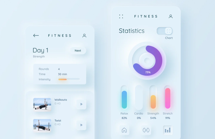
This design adopts a neumorphism style, a trend that gained momentum in 2022 and is set to flourish further since then. Characterized by minimal color contrast, rounded shapes, gradients, and subtle drop shadows, neumorphism offers a modern take on skeuomorphism.
This is a UI design of pure elegance! Not only does it rock an elegant color scheme, but it also keeps things sleek by minimizing those extra buttons. Instead, it lets you glide through the product catalog with smooth swipes and hand gestures. Still, rather than fully adhering to the buttonless trend, the design smartly incorporates buttons where really necessary, maintaining a balance between functionality and aesthetics.
As we wrap up, it's evident that UI design goes beyond mere aesthetics—it's about deeply understanding user behavior and crafting seamless digital journeys. Hopefully, the examples and templates highlighted in this article can serve as a springboard for inspiration, showcasing how designers can leverage UI design principles to create stunning UI designs and memorable user experiences.