Designers often use the word "fidelity" when they discuss visual design. Wireframes, mockups, and prototypes can be created in low and high fidelity. The higher the level of fidelity, the more the design looks and feels like a finished product.
In this article, we will focus on one particular type of visual asset—low fidelity wireframes—and learn what it is, when designers need to create this type of wireframes, and how to create low fidelity wireframes using Mockplus. We also have a small bonus for you at the end of this article.
A wireframe is a schematic representation of the future user interface created using simple objects such as lines, rectangles, and texts. The term "wireframe" is taken from the architecture discipline, where it is used as a tool to plan spaces such as houses. Like mockups and prototypes, wireframes can be created with low and high fidelity.
Low-fidelity wireframes share the following properties:
Wireframes are created using lines and boxes. All user interface elements in UI design are created of lines and boxes.
Black & white color scheme. Wireframes are created using only black/gray color.
Lorem ipsum texts. Instead of real content, designers use placeholder text (Lorem Ipsum, also known as dummy text).
Low-fidelity wireframes can be helpful at the early stages of the design process. When the team has a lot of ideas to explore, they want to minimize the time required to visualize individual ideas. Compared to other design artifacts such as mockups and prototypes, low-fidelity wireframes allow designers to create visual assets in minutes rather than hours. By making design tangible, designers help other people involved in the design process (i.e., developers, stakeholders, etc.) better understand the nature of the idea they want to build.
Easy to create. Low-fidelity wireframes don't require any specific tools and skills. They can be created by anyone who has a pen and paper.
Fast to create. It takes a few minutes to sketch a wireframe on paper. Wireframes can be created right during brainstorming sessions.
Excellent tool for collecting feedback. Low-fidelity wireframes look far from the finished design, making it easier for others to share their honest opinions about the design.
It can serve as design documentation. It's possible to make low-fidelity wireframes a part of design documentation. Adding notes to the wireframes helps others understand how something should look/work.
Wireframes can be created using pen & paper or digital design tools. When it comes to digital tools, Mockplus makes it easier to create both low and high-fidelity wireframes. The tool can also be used to create interactive prototypes, so you can potentially turn your low-fidelity design into an interactive prototype without switching a tool.
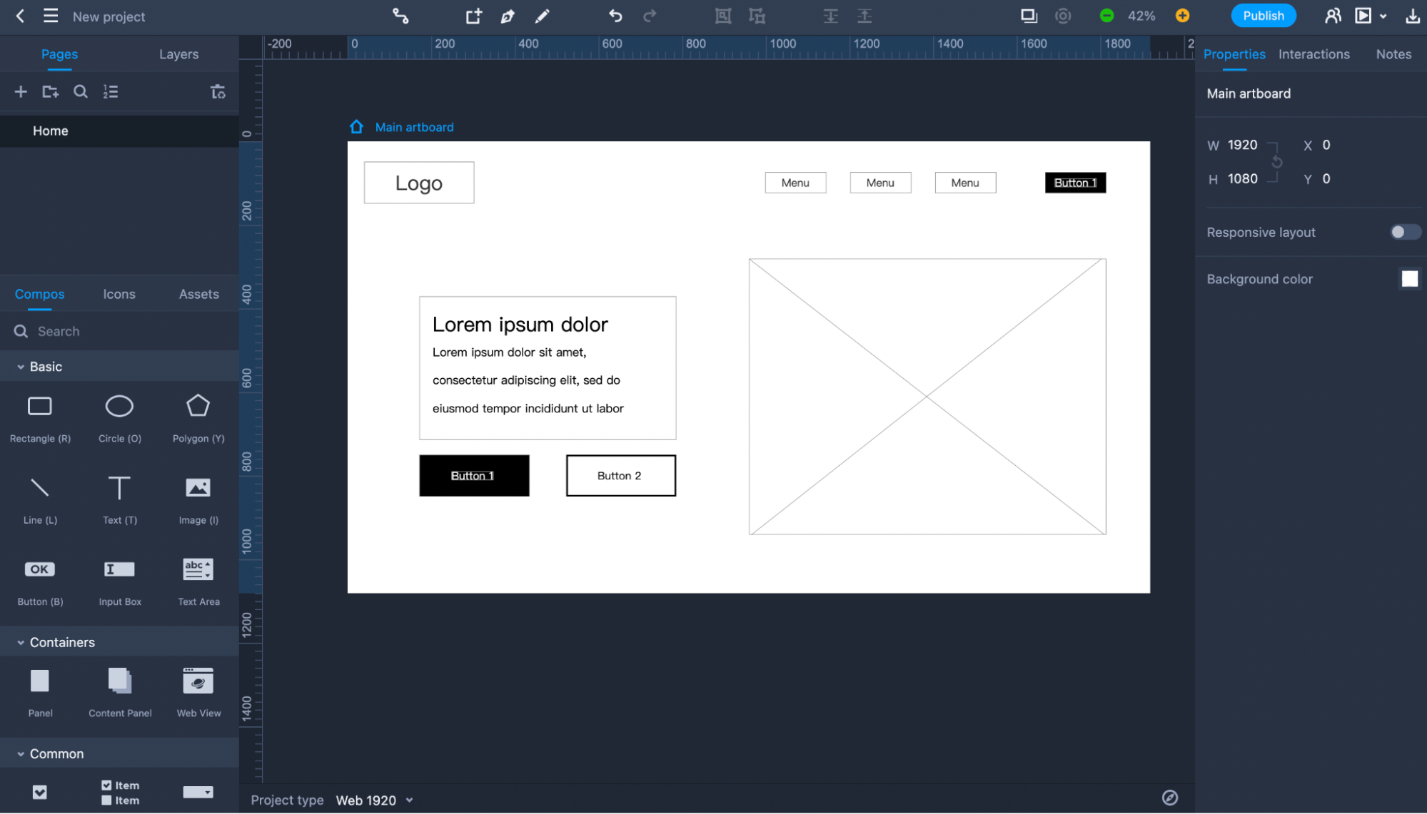
This quick tutorial will show how to design a low-fidelity wireframe for a landing page in less than five minutes.
The first thing we need to do is to launch Mockplus RP.
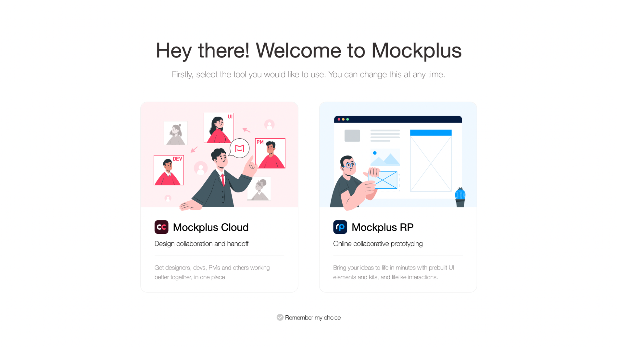
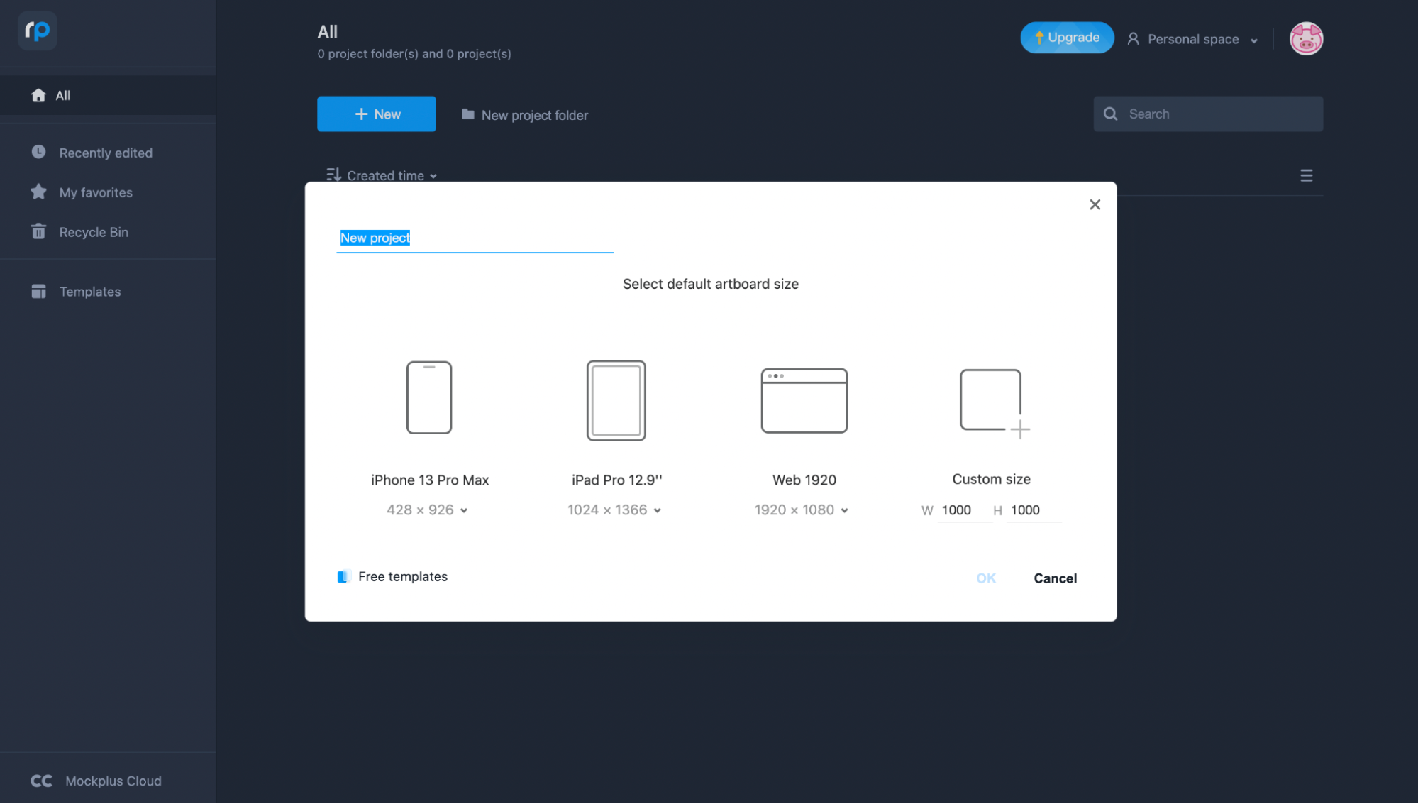
Next, we need to choose a type of project. Since we’re building a web project, we will select the Web 1920 project.
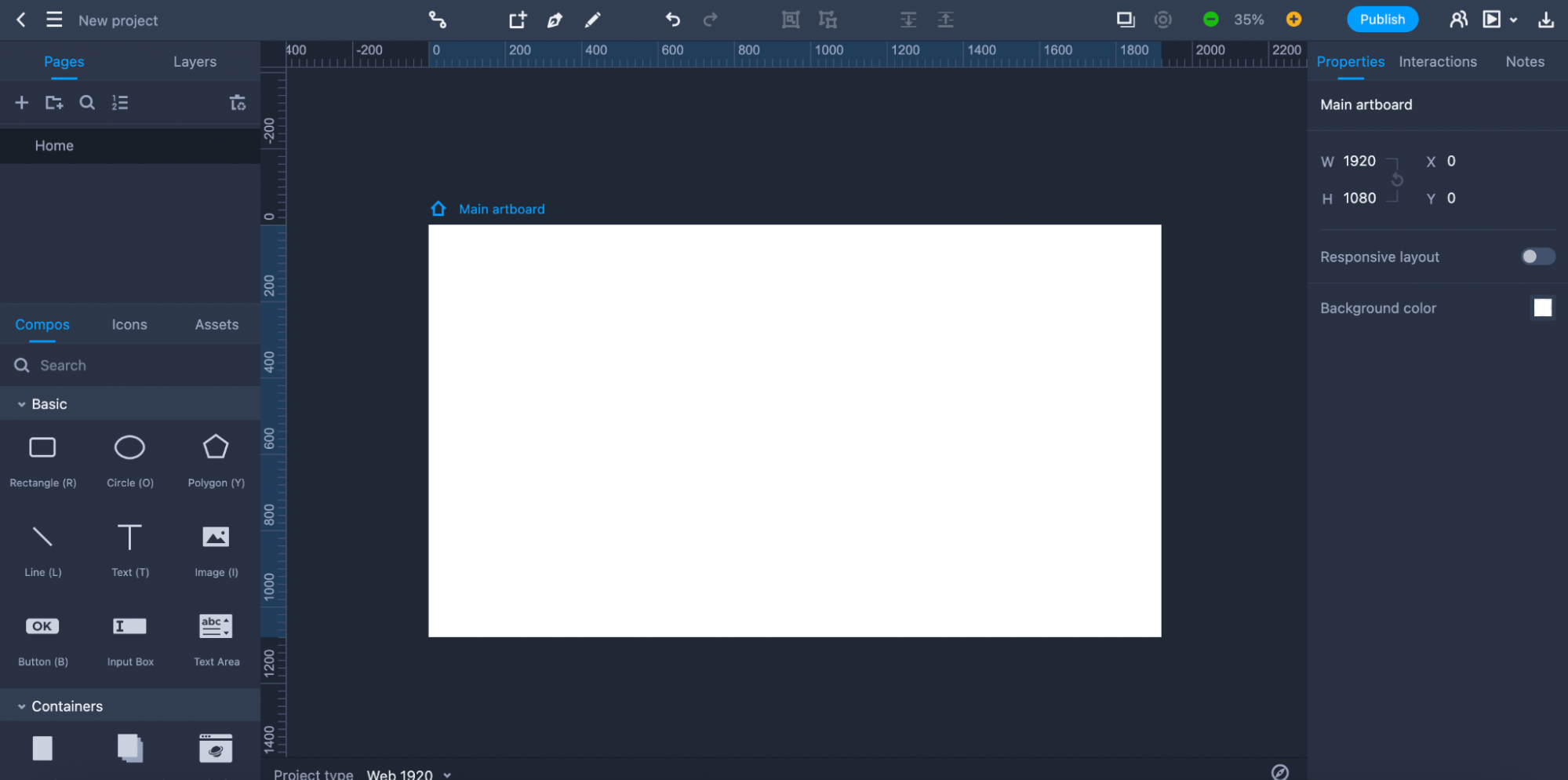
We're ready to create our low-fidelity wireframe. Mockplus RP is a web-based application, meaning we will design it right in a browser window. Once our project is created, we will see an editor with various basic elements in the Compos area.
Low-fidelity wireframes are created using elemental objects so we will use only Rectangles, Lines, and Text.
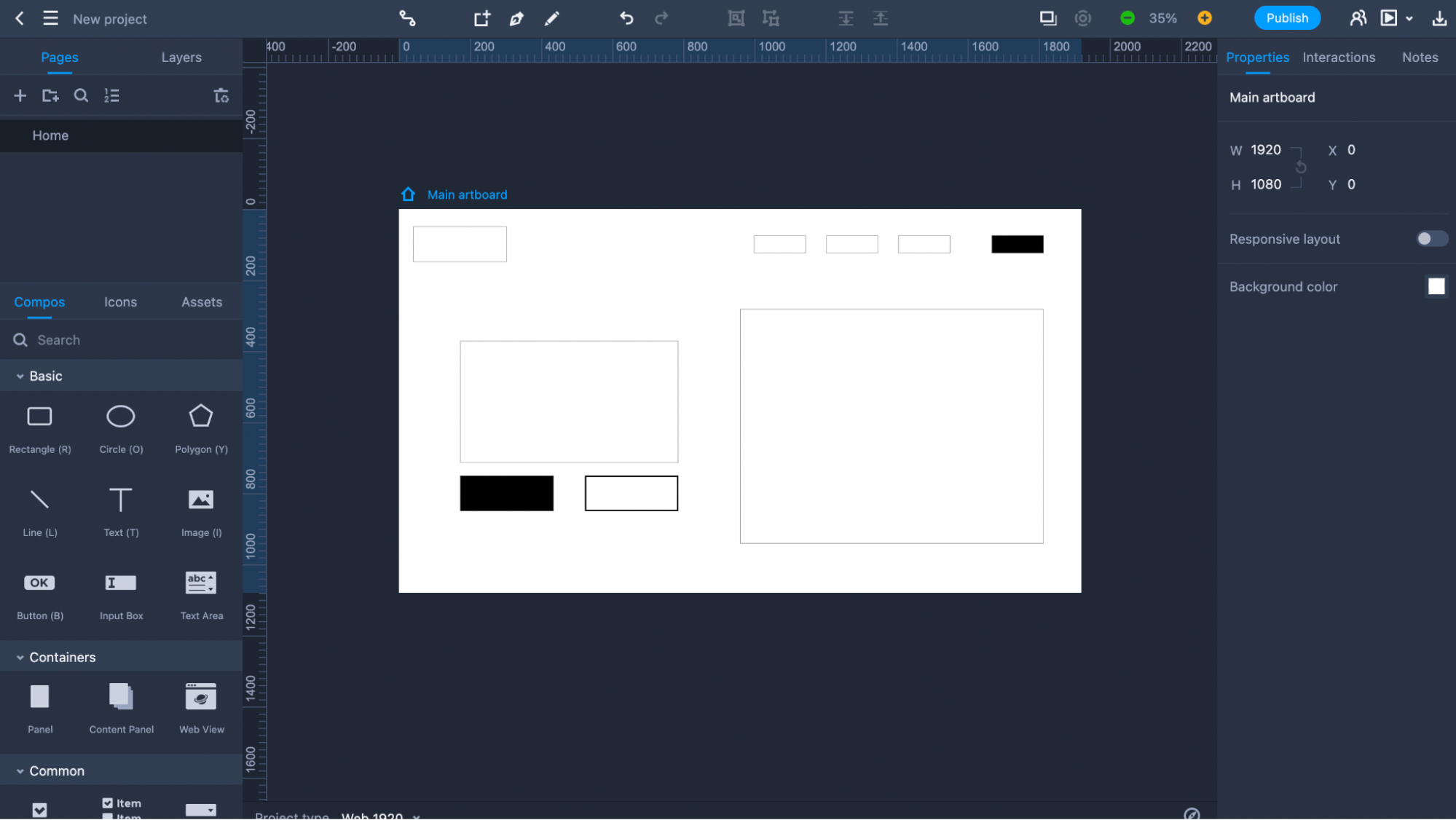
Let's create a low-fidelity wireframe of the hero section for our landing page. The hero section will feature the logo in the top left corner of the screen, a menu with a sign-up button at the top right corner of the screen, a text section with a header and description, and two call-to-action buttons in the center.
First, we will use rectangles to mark individual content blocks.
Now let's add text to mark individual objects. Notice that designers typically mark containers that will have imagery (photos or videos) as rectangular objects with the X cross inside. We will use a Line object to add the X cross. After we add the required changes, we should see the following design.
You might notice that elements in the artboard aren't perfectly aligned but don't worry about that; the low-fidelity wireframes shouldn't be pixel-perfect. Speed and simplicity are two integral properties of the low-fidelity design. The faster we can visualize our ideas, the better.
Here are our top three favorite examples of low-fidelity wireframes created by the design community:
Jinal Shah's design is a brilliant example of comparing low and high-fidelity wireframes. In this example, low-fidelity wireframes were created using pen and paper.
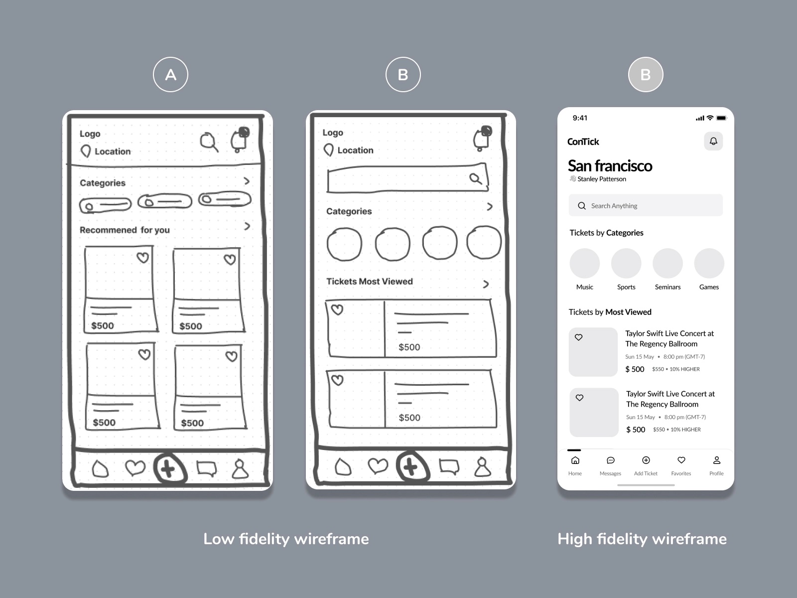
Image by Jinal Shah
Gus Jul shares low-fidelity wireframes of the Quto App, a barcode scan mobile app. He uses arrows to help viewers understand the transitions between individual screens.
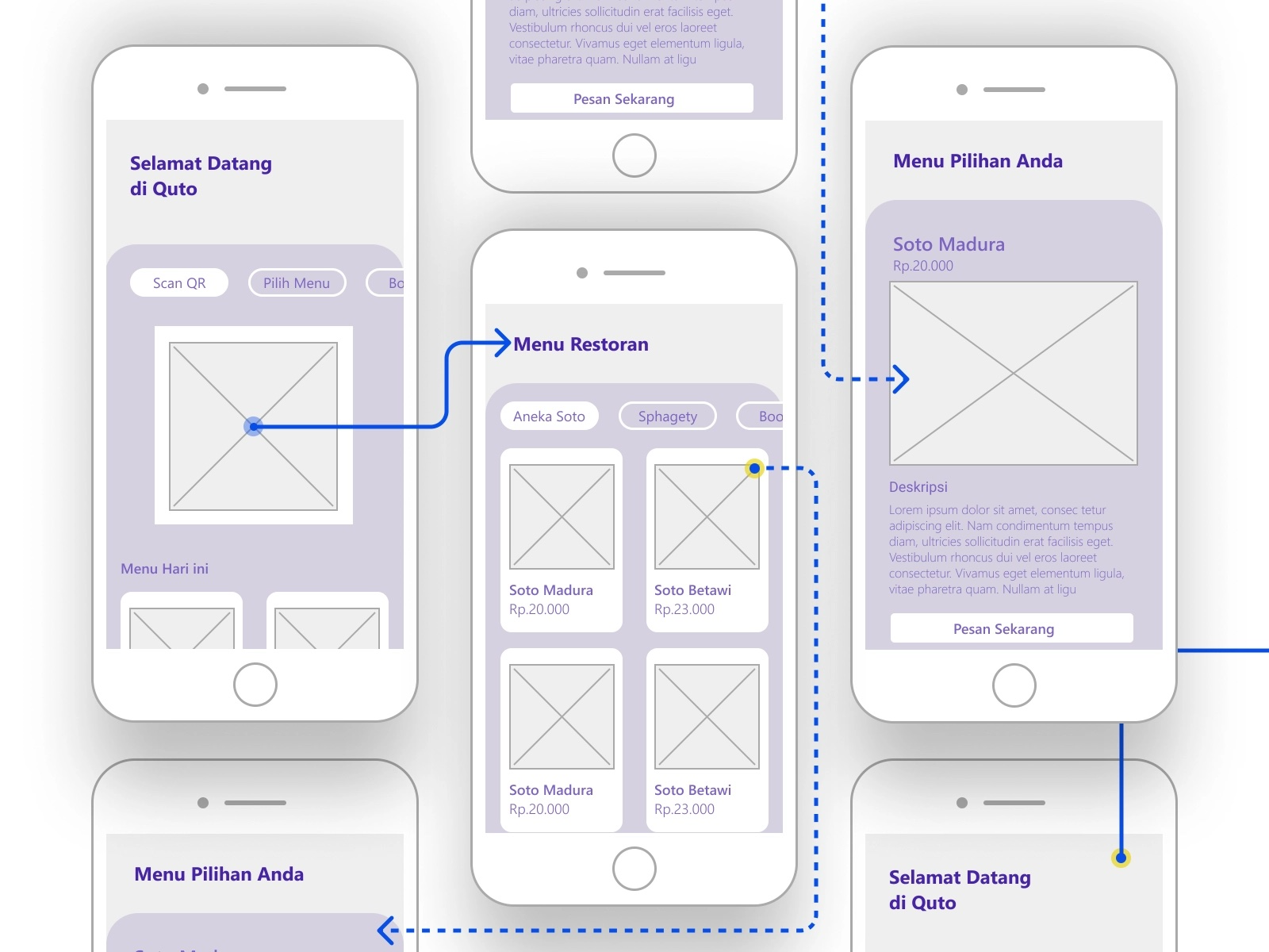
Image by Gus Jul
In his mobile app design, Armin Graca provides a step-by-step guide on how to move from low-fidelity to high-fidelity design.
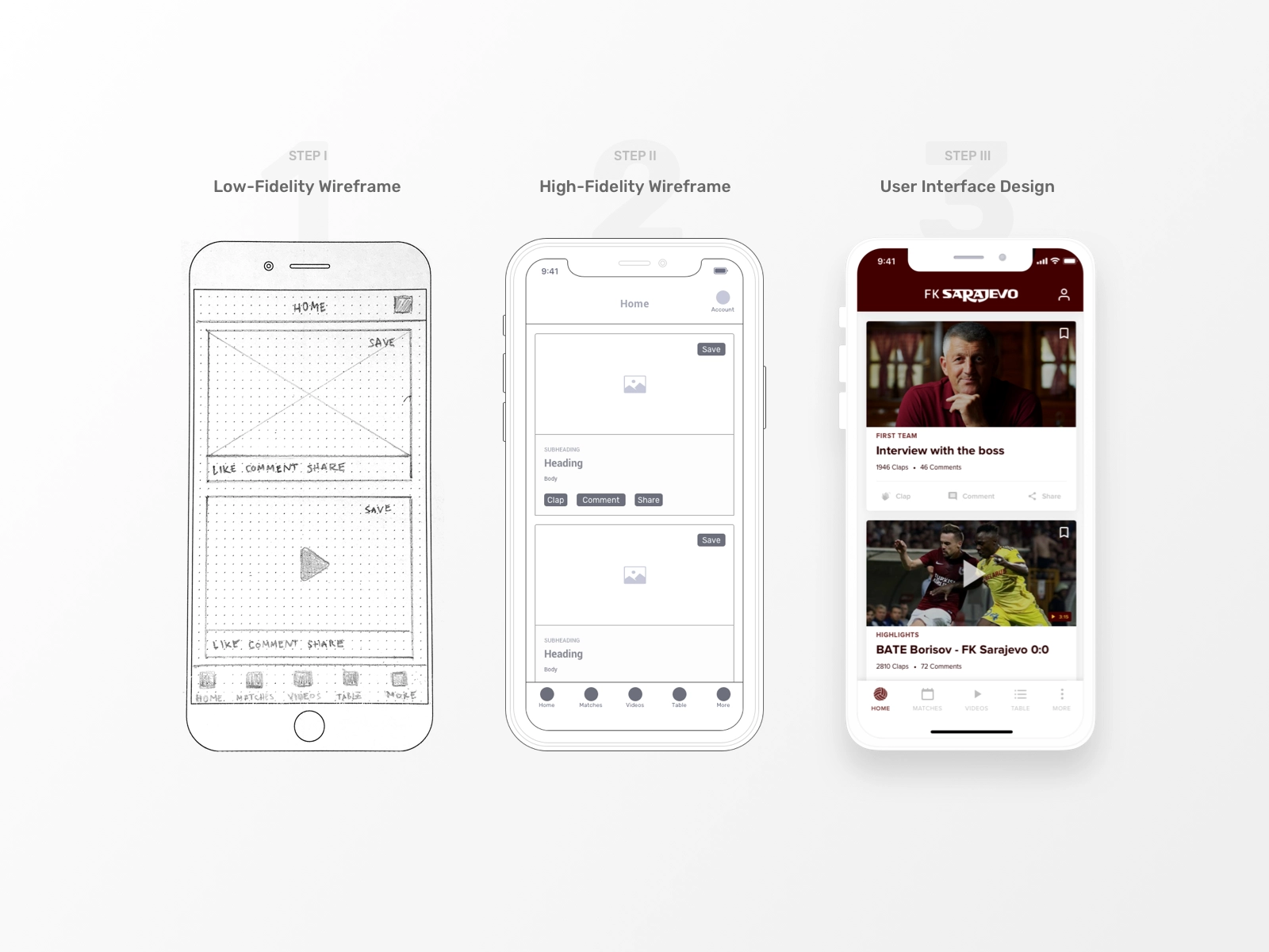
Image by Armin Graca