Many product design tools and techniques allow designers to create user-friendly products, but sitemaps and wireframes are two of the most critical tools in a designer's toolkit. In this article, we will look closer at sitemaps and wireframes, exploring their similarities and differences and providing guidance on when to use each tool in the design process.
A sitemap is a diagram or flowchart that outlines the various pages or screens the site or app has and shows the relationships between them. The purpose of a sitemap is to provide a clear overview of the content and functionality of a particular product and to help people involved in the design process understand how users will navigate through it.
Sitemap can also serve as a reference document throughout the design process. It helps a product team ensure that all necessary pages and functionality are included and organized logically for users.
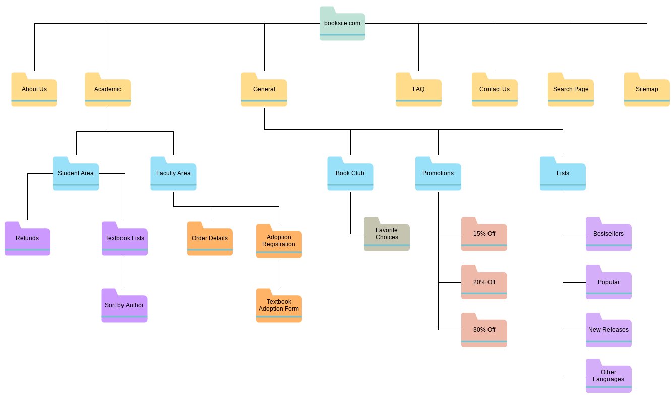
Example of a sitemap for a books website. Image by visual-paradigm
A wireframe is a visual representation of a particular web page or app screen that outlines its layout and functionality. Wireframes are typically created in low- and mid-fidelity because wireframing aims to communicate the structure of the page/screen (i.e., show where content blocks and functional elements will be located o a page/screen) rather than communicate specific visual design decisions. That's why wireframes are typically created in black & white or gray color schemes and use a generic typeface and content placeholders instead of real text and images.
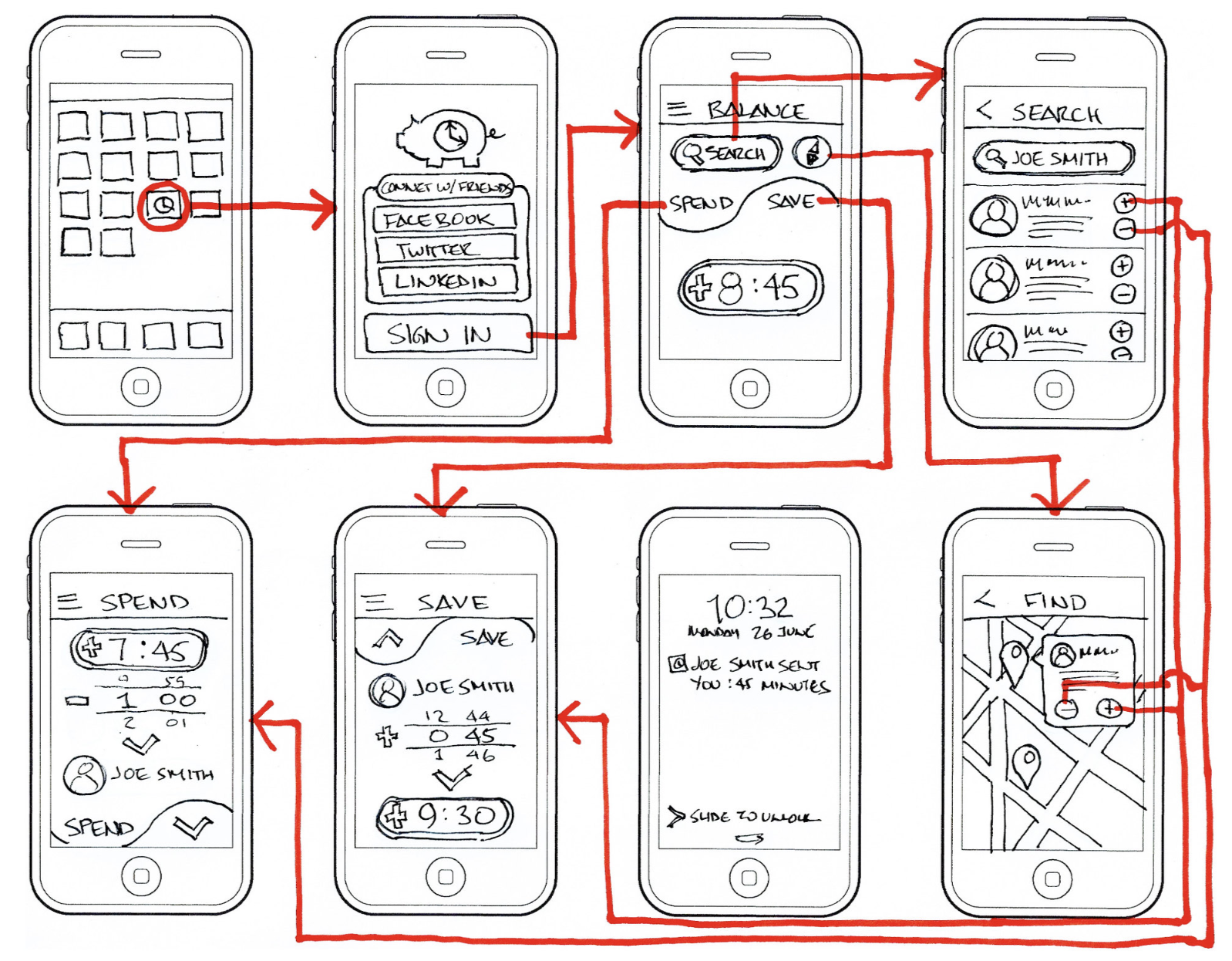
Wireframes of a finance mobile app. Image by Mark Congiusta.
Although sitemap and wireframe share one thing in common (they are both used to communicate design decisions), they are completely different design artifacts. Here are five main differences between sitemaps and wireframes:
A sitemap is used to show the hierarchy and organization of a website, while a wireframe is used to illustrate the layout and functionality of specific pages or screens within that structure.
Sitemaps are usually presented as a diagram or flowchart that outlines all pages/screens that the product will have, while wireframes are typically presented as a blueprint of a particular page/screen.
Sitemaps are typically less detailed and less visually oriented than wireframes, as they focus more on the overall structure of the site or app. On the other hand, wireframes provide a more detailed representation of the specific page or screen.
Sitemaps show general information about individual pages/screens (i.e., a sitemap can have an object called "About us" that suppose to be a page with information about a company), while wireframes show the specific content blocks of a page or screen, such as images, text, and interactive elements (i.e., a wireframe of "About us" page will have a few content blocks such as contact information, office address, etc.).
Sitemaps are primarily used by information architects and product designers to plan the overall structure of a site or app, while wireframes are used by designers, developers, and stakeholders to review and refine the layout and functionality of individual pages or screens within that structure.
Sitemaps are often created as part of the information architecture design, which involves organizing and structuring content in a product to support user and business goals. A sitemap serves as a visual representation of the hierarchy of a website or application. It becomes a basis for developing visual design artifacts such as wireframes, mockups, and prototypes.
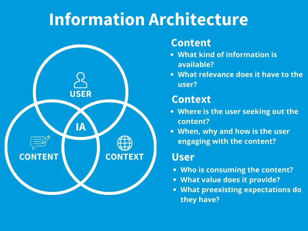
Information architecture is a discipline of organizing content according to user needs and considering the context in which this content is used. Image by IDF.
Wireframes are typically created during the early stages of the design process and are used to communicate and validate product design decisions. Once the team creates a sitemap that communicates the hierarchical structure of the product, it's possible to wireframe individual pages/screens in this structure. Since wireframes are easy and cheap to create, they help the team explore various design decisions without spending much time/money on design and understand what works best for their users.
In a conventional design process, the product design team creates a sitemap before creating wireframes. A sitemap establishes a foundation for a product design, on top of which a team builds individual screens/pages. The sitemap provides an overview of the website or application's structure and hierarchy, which can help inform the creation of wireframes.
When product designers use sitemaps when creating wireframes, they understand how a particular wireframe will fit in the hierarchical structure of a product. It prevents creating a fragmented experience (when users experience navigation problems because individual pages/screens aren't well connected) and dead-end pages (pages that don't lead anywhere).
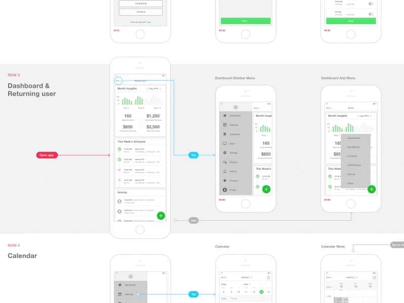
Showing how a user will navigate the design. Image Lukáš Straňák.
Yes, sitemaps and wireframes can and should work together in UI/UX design as they serve different purposes in the design process. Sitemaps provide a high-level view of the structure and organization of a website or app. At the same time, wireframes focus on the layout and functionality of individual pages or screens within that structure. By using both sitemaps and wireframes, designers can be confident that the overall structure of the site or app is effective while ensuring that each page or screen within that structure is designed to meet user needs and goals.
While it is not strictly necessary to create a sitemap or wireframe before starting a design, it is highly recommended as it can help to increase the chances of making a user-friendly product.
Creating a sitemap can help you plan the overall hierarchy of your website or application, which can inform the creation of individual pages or screens. Sitemap will help you to ensure that your content and features are properly organized and that your product is easy to navigate for users.
Creating wireframes can help you to plan the layout and functionality of individual pages or screens. By creating wireframes, you can test various layout options before committing to a final design, and since wireframes are easy to produce, it can save you a lot of time and effort in the long run.
As discussed above, we need to design a sitemap first, validate it, and only then create wireframes for individual pages.
Before creating a sitemap, you must understand what information and features you want to offer on your website. Depending on the nature and complexity of your website, it can be a few sections (i.e., if you design on a simple website) or dozens of different sections (i.e., if you design a large-scale corporate website).
If you create a new product, you should start by brainstorming the main pages that your website will have. For example, a company website might include pages like Home, About Us, Products, Services, Blog, Contact, etc. You need a clear idea of what content/features you will offer for each section/page.
If you redesign an existing product, you should do a content audit and content analysis first. Learn what content you currently have in your product and how it is distributed. Pair this information with data analytics insights to learn what your visitors find valuable (most visited pages) and match it with your business objectives (what you want your users to do on your website).
Once you have identified your website's main pages, organize them into a hierarchy or flowchart. You need to place the main pages hierarchically and create relationships between them. At the end of this process, you will have a structure with multiple layers of pages (top-level pages and sub-pages).
Once you have a basic hierarchy of pages, you need to validate it to ensure it works for your users. Think about the things people will do on your website as well as the different ways they navigate your site. For example, a visitor might have a goal to learn what products you offer. A visitor might land on a home page and navigate to other pages from it, or a visitor can land on a nested page. You need to ensure that:
The hierarchy you've created can help users find what they are looking for in a few clicks (ideally, 3-clicks).
This hierarchy supports adding new pages. Your website will likely grow, and you need to design a hierarchy that allows adding new pages.
Once you validate your sitemap, you're ready to do wireframing. But it will be a mistake to wireframe all possible pages/screens in your app. It's much better to focus on the core pages first because it will help you to validate key design decisions. For example, these might be the home page, a product page, or a contact form. A user flow tool can help you identify the most important pages. You need to create user flows for the top-priority tasks that the user will want to complete using your product, and it will help you to see what pages you need to wireframe first.

Creating wireframes according to the user flow. Image by Kelly Sikkema.
Wireframing aims to communicate critical design decisions—where each content and functional block should be located. That's why before creating a wireframe for an individual page/screen, you need to understand what you want to have on it. Again, a user flow will help you understand the role that a particular page plays in the scenario of interaction. For example, a primary purpose of a product description page on an eCommerce website is to communicate essential information about the product and convince the user to buy it. The information and functional elements on the page should be selected according to the goal.
Quick tip: When wireframing pages, follow a simple rule of thumb "one page, one goal." It means each page should be designed around one particular action you want your user to take. Keep this rule in mind when wireframing a page because it will make your design process more focused.
Bonus: To make things easier, Mockplus team prepared free website wireframe templates that you can use in your next project.
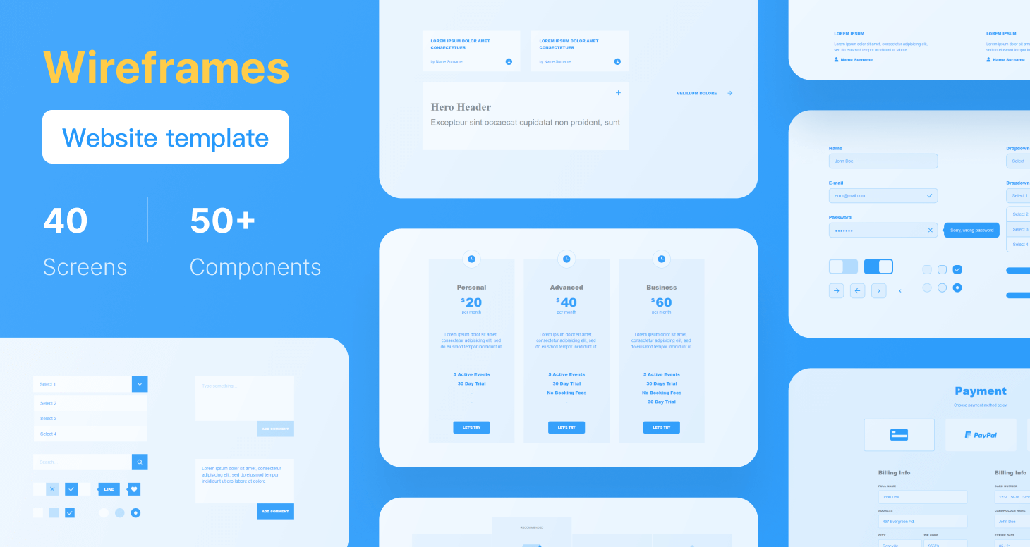
Free Mockplus Website Wireframe Templates by Mockplus.
Once you know what you want on a page/screen, it's time to open your favorite design tool and create a basic layout for this page. It's recommended to start with rough, low-fidelity objects such as rectangles and ovals representing individual content blocks and functional controls. This approach will help you focus on the visual hierarchy you want to create on a page. Once you finish creating an order, you will be ready to increase the level of fidelity by adding colors, typefaces, and imagery.
It's not enough to create wireframes and call it a day. You need to validate your design to ensure it works for your users. When it comes to wireframing, you must conduct usability testing with people who represent your target audience to prove that they can interact with a product without any problem.
While it is possible to validate both low and mid-fidelity wireframes, usability testing with low-fidelity wireframes can be tricky. Since low-fidelity wireframes contain bare minimum design details, it might be hard for other people to understand how to interact with a design. That's why usability testing should be moderated—a human moderator should be able to support test participants when they face problems.
Invite people who represent your target audience and ask them to complete specific tasks using your design. Ideally, you should offer clickable wireframes, a digital version of wireframes created in a wireframe tool.
The ultimate goal of product design is to create effective and engaging products. The tools and techniques we use during the design process can impact the time required to go from idea to solution. By mastering sitemaps and wireframes, designers can speed up the design process and take their design skills to the next level, creating functional, reliable, and usable products.