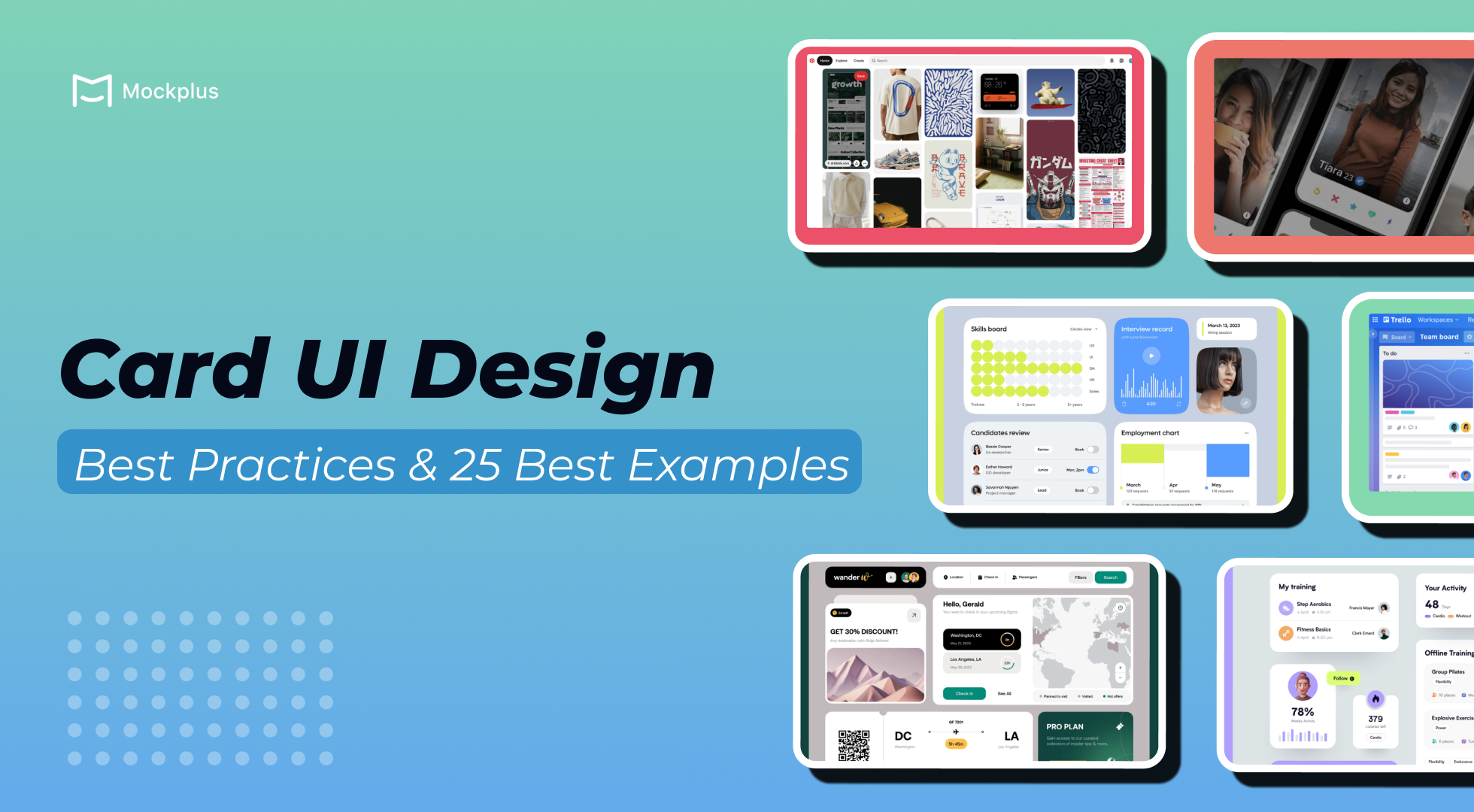
Card UI design has transformed from a rising trend in the mid-2010s to a core feature of modern interfaces in 2024. Its adoption took off with the introduction of Material Design by Google in 2014, which brought card layouts into the mainstream. Since then, card UI has become a go-to design for web and mobile applications, as it enables flexible and modular content presentation across industries.
Cards act as versatile information containers for elements such as text, media, and buttons. Unlike traditional UI patterns, card-based designs offer a personalized and scannable interface, dynamically adjusting to various devices and screen sizes. Their intuitive layout not only enhances usability but also delivers a visually appealing and consistent experience. As responsive design continues to dominate, designers must optimize card-based layouts to ensure seamless experiences across devices.
In this article, we will explore the significance of card UI design in both web and mobile applications, showcasing some excellent examples to inspire your next project. If you’re ready to start building your own card-based interface, you can easily prototype using Mockplus for free.
Card design, also known as Card UI, is a user interface component used to present content in a concise and visually structured way. Each card serves as a container that groups related information, creating a clear and easily digestible snapshot of content. These cards are often compared to physical cards, like business or trading cards, which have long been used to store and share small bits of information in a simple, accessible format.
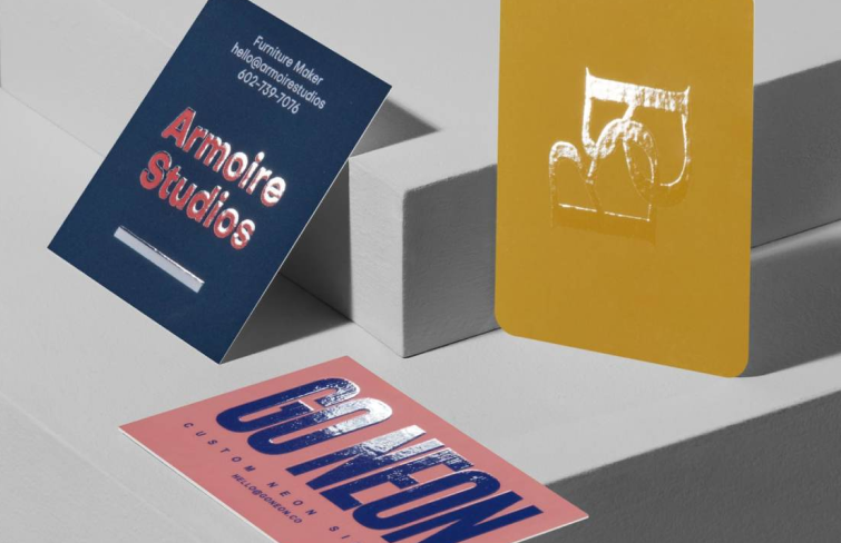
Physical business cards
In the digital world, card UI helps users navigate content quickly by breaking it into manageable chunks rather than overwhelming them with long blocks of text. In essence, card UI enhances both the visual organization of content and user experience by balancing functionality and simplicity. These versatile components are everywhere in modern design, from e-commerce websites to social media feeds.
In recent years, cards have surged in popularity as a go-to element for web and app navigation design. Their rise is no coincidence. Here are several key advantages of Card UI design:
First is Enhanced navigation. Cards break complex content into manageable, visually distinct sections, allowing users to rapidly skim through a page and locate key details without needing to dive deep into each section. It prevents overwhelming users, particularly on content-heavy websites or apps. For instance, a news platform might use cards to categorize articles into topics such as sports, politics, or entertainment, making it easy for users to find specific news of interest quickly.
Enhanced navigation
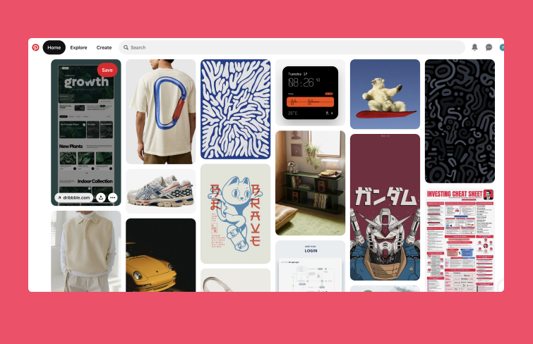
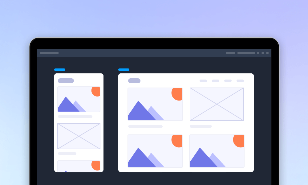
Another key advantage of card design is its responsiveness. Cards are designed to be adaptable across different screen sizes and devices, making them user-friendly whether you're on a smartphone, tablet, or desktop. For example, a social media platform like Pinterest and Instagram can automatically rearrange user posts in card format to suit the screen size, ensuring an intuitive and consistent experience for users across devices.
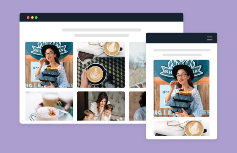
Card UI of Pinterest
Cards can present many types of media, making them ideal for showcasing varied content on websites and apps. For instance, while browsing social media, you may notice cards containing photos, posts, articles, or product recommendations.
Cards provide an excellent opportunity to highlight CTAs( Call-to-actions), drawing attention to specific actions users can take. Whether it’s encouraging users to click a “Buy Now” button or share content on social media, cards make these actions clear and inviting, which is crucial for engagement.
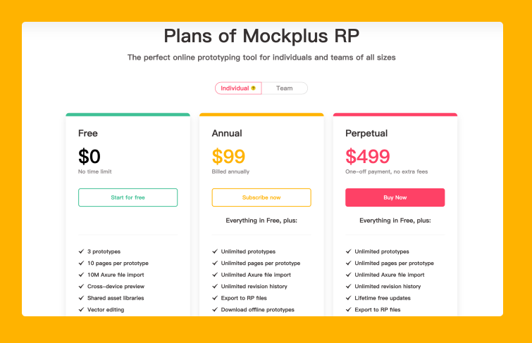
Card design of Mockplus RP's pricing page
To conclude, cards are a versatile design tool that enhance user experience by making content easy to navigate and interact with, which explains their widespread popularity in modern web and app design.
Card UI design is a versatile approach that offers many benefits, but it's not always the best fit for every project. Based on the advantages of card UI design that we summarized above, it’s easy to see that card UI design excels at presenting visual content and is particularly effective for browsing through information rather than searching, Here’s when using a card UI design works really well:
As we mentioned, cards excel when displaying diverse information types. For instance, if you’re designing a landing page, blog, or app with various categories like games, recipes, or articles, cards keep content visually distinct and organized. Each card can spotlight a single item, helping users quickly grasp and navigate through without feeling overloaded.
Card UI designs also excel in handling interactive content like videos, images, and other media. By encapsulating media within a card, users can easily interact with and navigate through the content. For instance, a card might display a video thumbnail with a prominent play button, clearly inviting users to click and view.
Card UI elements also excel in adapting to various devices seamlessly. Their flexible structure allows them to resize and rearrange fluidly, ensuring optimal performance across different screen sizes. Whether accessed on a desktop, tablet, or mobile phone, card components maintain visual consistency and usability, offering a cohesive experience across all platforms. If you are aiming for responsive design, Card UI design is an excellent choice
When creating card-based user interfaces, attention to contrast, spacing, and button prominence plays a pivotal role in user experience. Here are a few best practices to follow for more functional and aesthetically pleasing card UI design:
To ensure cards stand out from the background, you can outline them by adding borders or elevate them using colors or shadows. This clear separation enhances readability and guides the user's focus, making the interface more visually appealing and easy to navigate.

To make essential information stand out on something like a product card, you can use size, color, and fonts strategically.
Increase the font size for key details, such as the price or product name, to draw attention.
Use contrasting colors like red or green for the price to make it pop while keeping other details in neutral tones.
Bold fonts are ideal for emphasizing important elements, while italic fonts can subtly highlight additional information like discounts.
Highlight the important
Spacing between UI elements, like paddings, is crucial for maintaining visual structure and hierarchy. Defining a consistent spacing system not only improves the overall design but also simplifies the developer’s hand-off, ensuring that elements are well-organized and grouped logically.
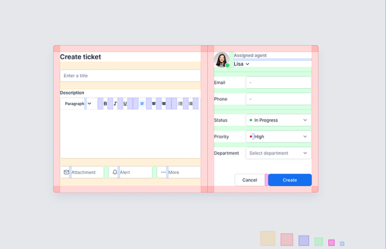
In cards with multiple buttons, make one button more prominent to guide user interaction. For example, a "Buy" button can be in a bolder color, while secondary buttons like "More" should be lighter in color, focusing attention on the primary action.
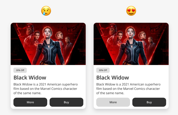
Highlighting Key Buttons
For a clean, modern look, reduce the use of excessive borders and dividing lines. Borderless cards create a more streamlined appearance, allowing content and images to shine while maintaining a minimalist, contemporary feel.
Boardless Card UI design
Real-world Card UI Design Examples for Websites
Google Play's Card UI design is a great example of Material Design principles, which emphasize clarity, hierarchy, and responsive interactions. The cards are used across the platform, not just on the homepage but also in app details pages. These card elements help structure information into neat, modular blocks, making the interface look organized and spacious. The use of color, typography, and animations also plays a key role in guiding users' attention and simplifying complex data.
Google Play – Material Design Cards
As a content website, what Quora should first consider is the flow of information. Namely, how to display the content of the webpage within its limited layout and balance the website design and user experience. The solution is cards! In terms of user’s reading habits, users prefer to read blocky and smooth content. Cards assemble information into little blocks, making it more suitable for reading.
Because cards extract and optimize the content into meaningful blocks, different types of content can be combined on cards as an organic, coherent aggregate. When compared to facing a longer article, short content lets users feel more at ease. This encourages readers to continue reading.
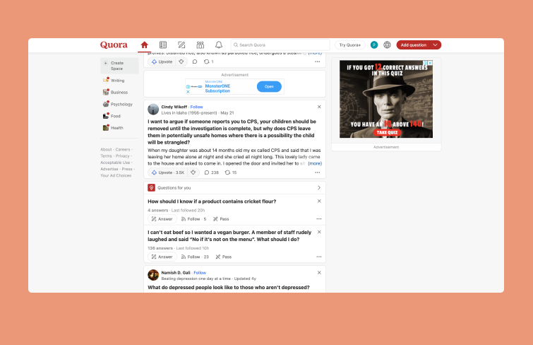
Quora
Pinterest's pioneering card design, particularly its waterfall layout, offers users a smooth, uninterrupted browsing experience by minimizing clicks and simplifying interaction. Material Design enhances these cards with soft overlays, especially during mouse interactions, adding depth and reinforcing their clickability, making elements stand out with an intuitive, touch-friendly feel.
Dribbble stands as one of the top examples of card UI design in action. With countless designers uploading fresh, creative work daily, the platform uses card-based layouts to showcase each piece. This visually engaging design draws users in quickly, as images tend to capture attention instantly. Dribbble's card approach is not only aesthetically pleasing but also a logical choice for presenting large volumes of visually-driven content.
Dribbble
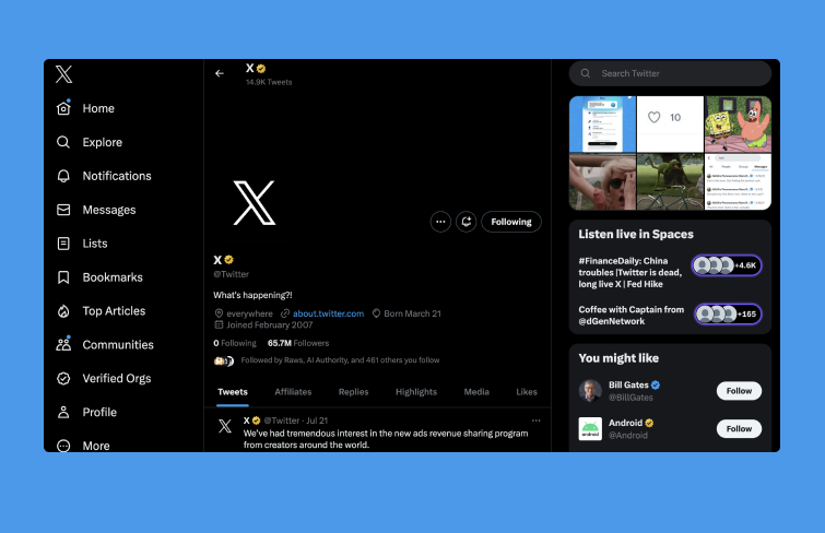
Cards are highly effective for presenting concise summaries of articles, posts, and other content. Platforms like X (formerly Twitter) leverage card-based UI to showcase posts efficiently. This format allows users to quickly digest key information, enhancing engagement and making navigation more intuitive across various platforms.
Behance ’s homepage features a collection of designers' works, neatly arranged in material-style cards. Visitors can easily browse for the most suitable visual solution for their product or explore inspiring professional portfolios. Each card, with its snapshot and concise title, delivers exactly the right amount of information to help users make quick, informed choices.
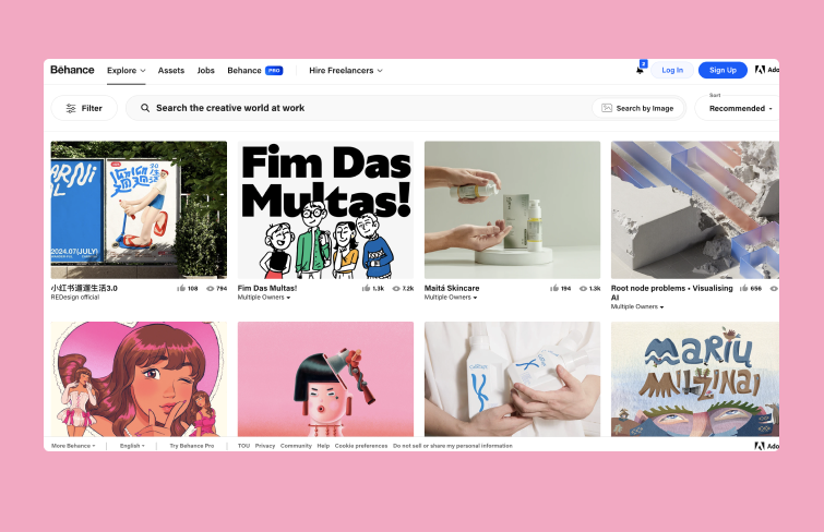
Behance
The Kanban method, where tasks are organized into "To Do," "Doing," and "Done" categories, is a familiar approach. Trello adopts this system by presenting tasks as cards, each containing a title, description, links, deadlines, and more. Users can manage tasks by moving cards across boards, grouping them, or sharing with others. Trello’s card UI design merges functionality and visual appeal, providing a user-friendly tool for efficient task management.
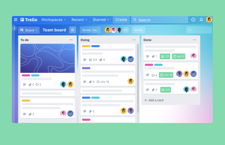
Trello
Cards are highly effective in media platforms, offering concise summaries of articles and posts. Major outlets like The Times and BBC embrace card-style UIs to organize vast amounts of breaking news into easily digestible layouts. The Times, for example, arranges news cards in symmetrical rows, with the most recent articles placed on the left. A standout feature is the "hot news" block, which is three times larger than regular articles and positioned at the top, creating a clear and intuitive information hierarchy.
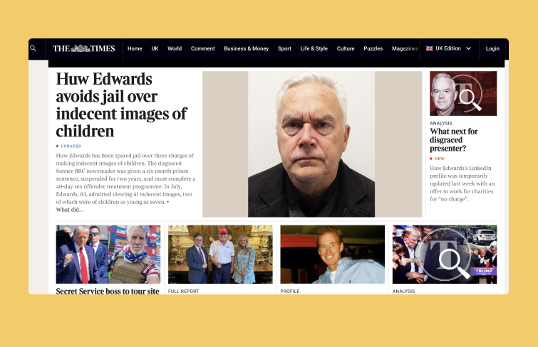
The Times
The e-commerce industry uses card UI to present products in a visually appealing and user-friendly manner. Despite Amazon's vast catalog of millions of items, the card-based design helps structure the content effectively, making it easily accessible.
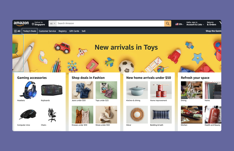
Amazon
Travel websites have long leveraged card UI effectively, and they continue to do so. For instance, Clickongreece’s homepage uses choice cards prominently, set against a full-screen background. The clean, spacious design of the cards complements the vivid imagery, making you want to book a trip right now.
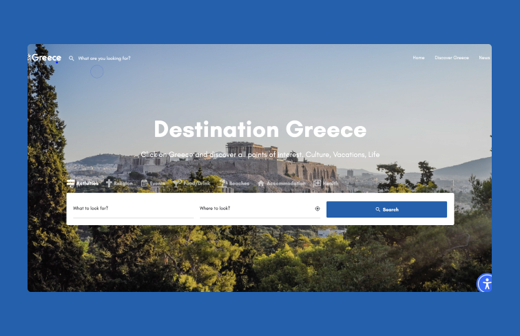
Clickongreece
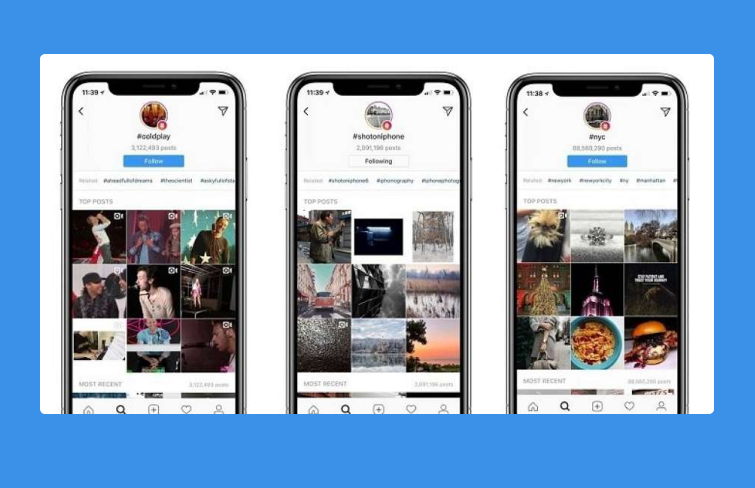
Card containers play a significant role in mobile app UI design, particularly in social media apps like Instagram. As a visual-based platform, Instagram standardizes all images in a square format, ensuring uniformity across the feed. Each card not only displays the image but also includes text and functional elements such as likes and comments when hovered over. Together, these components create a cohesive and interactive functional module.
Airbnb, as a rental platform, leverages visual design to captivate users. Its card UI design enhances user experience by simplifying content and making each listing stand out. Additionally, the use of frameless cards standardizes content through consistent, repeated information elements, creating a more cohesive and visually appealing interface.
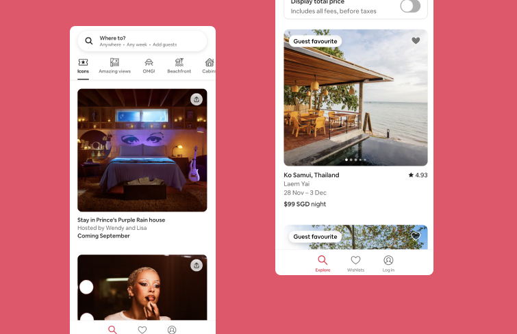
Airbnb
Tinder's dating app showcases user profiles through card-based UI. The swipe transition feature, which allows users to easily select potential matches, became so iconic that it inspired Tinder's well-known slogan, "Swipe right." This intuitive interaction enhances user engagement and has made the swipe gesture synonymous with the app itself.
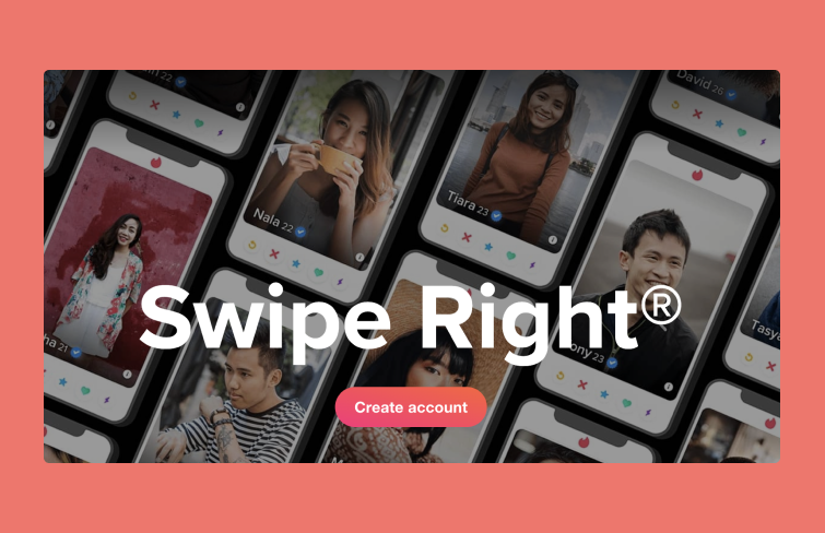
Tinder
Skyscanner’s app uses a card-based UI to enhance the travel planning experience.It displays each destination on a card featuring a photo and tailored captions like "Solo Travel" or "Kid Free," creating a more engaging and customized experience for users.
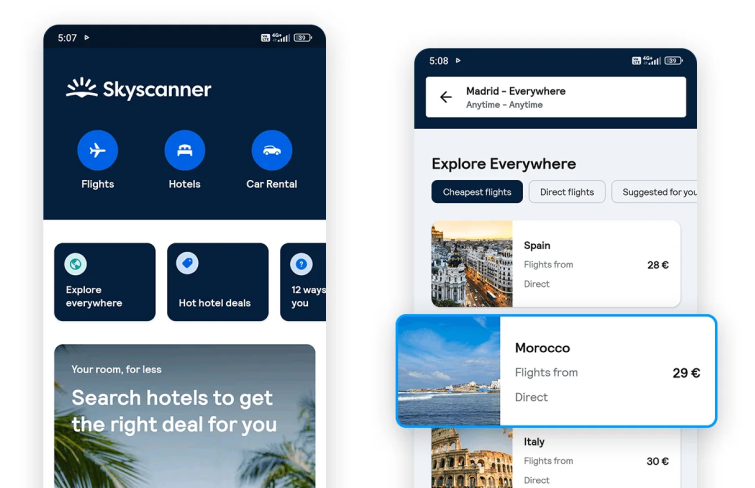
Skyscanner
AliExpress’ mobile app impresses with its card UI design, featuring streamlined product displays and price reductions in eye-catching red. This design effectively highlights deals and engages users efficiently.
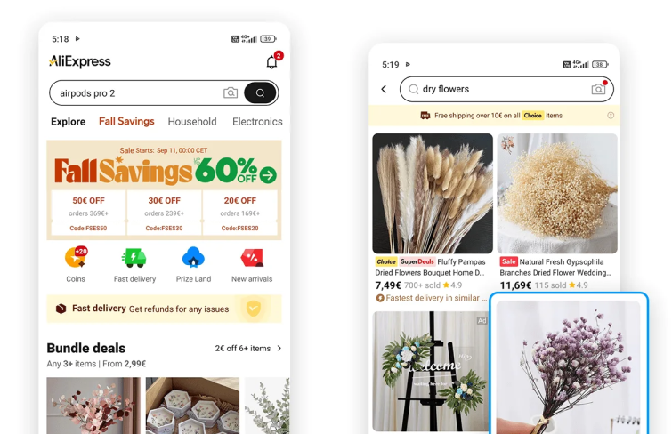
AliExpress
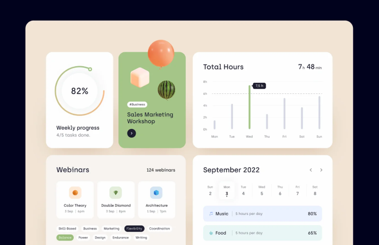
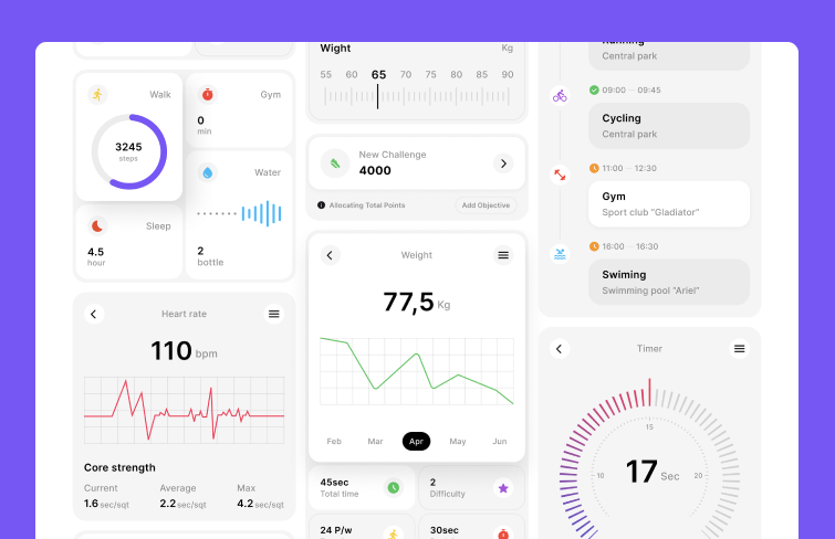
This productivity dashboard shows how card UI keeps things organized and easy to follow. Each card covers a different area, from tracking weekly progress and total hours worked to upcoming webinars and the monthly schedule.
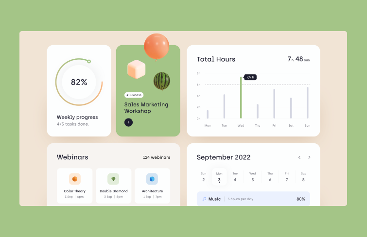
Skillex
In this example, by presenting each section in a separate card, users can easily navigate and manage complex data without feeling inundated. The clear organization ensures that information is accessible and manageable, enhancing overall user experience.
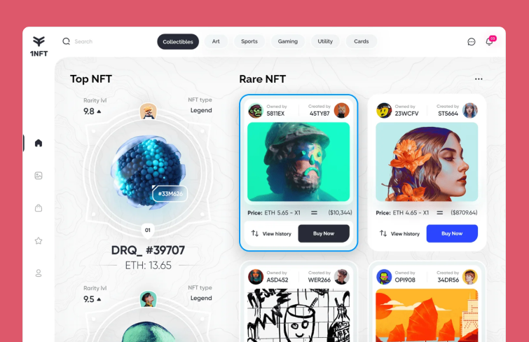
Each NFT is displayed on an individual card, showcasing key details such as price, owner, and the artist. The layout is clean and intuitive, allowing for easy browsing. Additionally, filters at the bottom enable users to quickly sort NFTs based on popularity or other preferences, making it effortless to discover items with just a click.
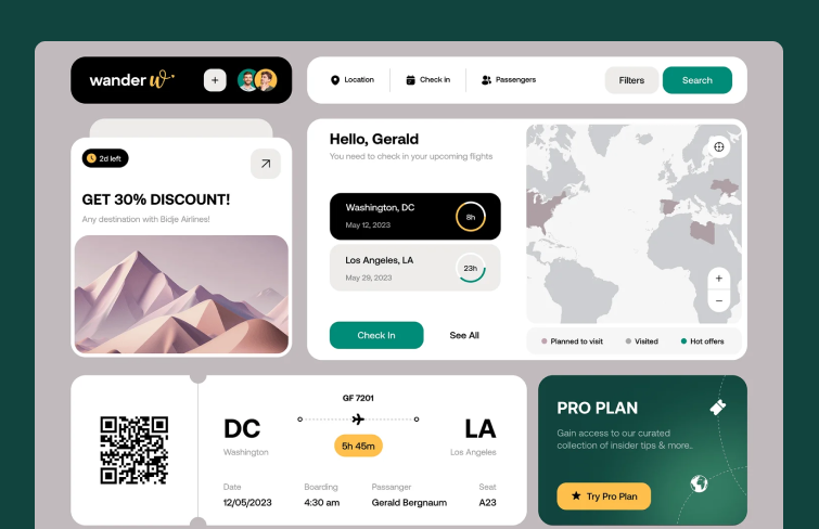
This travel booking dashboard excels at using card UI to consolidate all your travel information. Each card provides key details and even features a convenient map of your past or upcoming destinations.
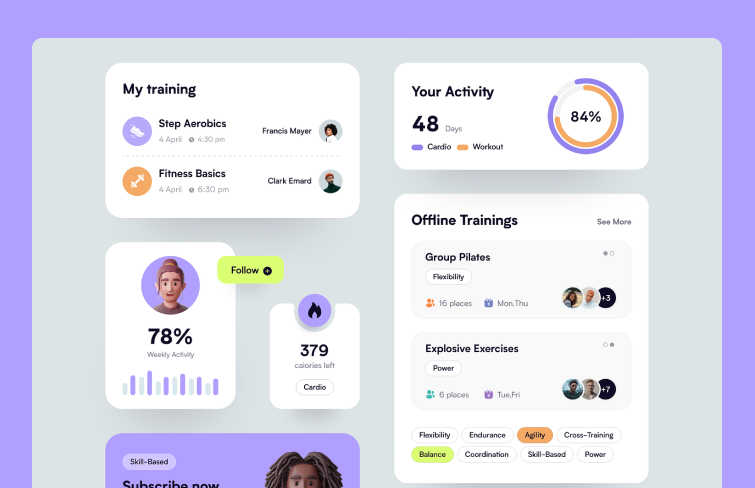
Fitboom is a mobile app tailored for fitness and wellness enthusiasts. It employs visually engaging and intuitive cards to offer users crucial details about their fitness goals, facilitate community interactions, and deliver motivation for maintaining an active, healthy lifestyle.
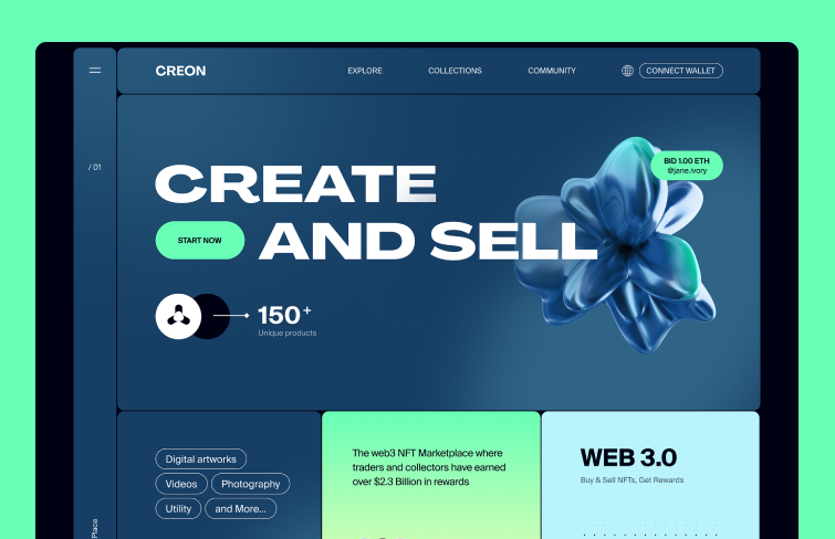
The integration of a card-based UI design in this NFT website provides flexibility by presenting each NFT in a compact format, featuring crucial details such as visuals, creator information, pricing, and a short summary.
The Health & Wellness card interface features essential components like a descriptive app title, intuitive icons, and personalized health information. Additionally, it showcases visual elements such as charts or performance metrics to illustrate progress in health tracking.
The Li-Fi card UI features straightforward toggle switches to turn Li-Fi connectivity on or off, along with visual indicators showing the current connection status. It also delivers real-time notifications to alert users of any connectivity changes.
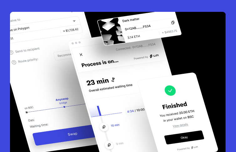
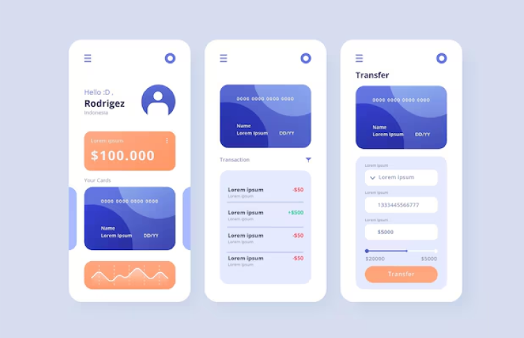
In payment-related websites or applications, card UIs effectively streamline the user experience by organizing transaction details clearly. These designs typically include input fields for payment information, recognizable credit card icons, and well-placed confirmation buttons. The structured layout guides users through the payment process smoothly, ensuring clarity and ease of use.
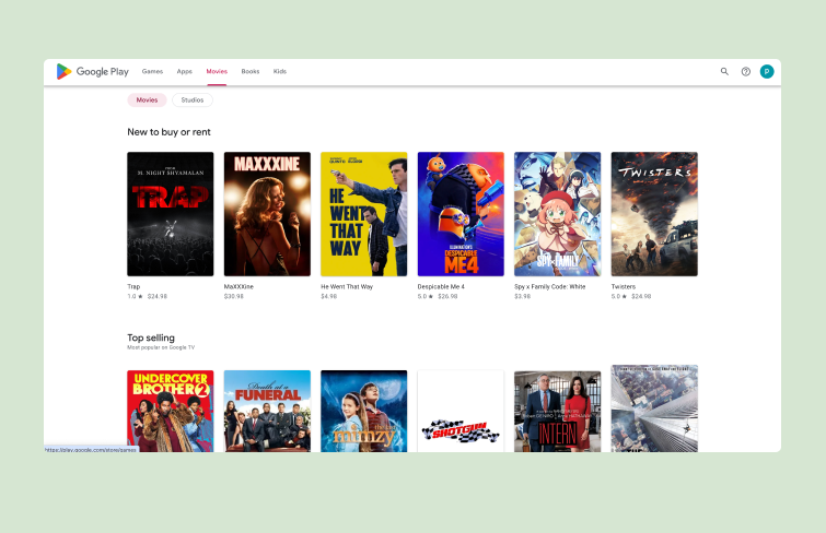
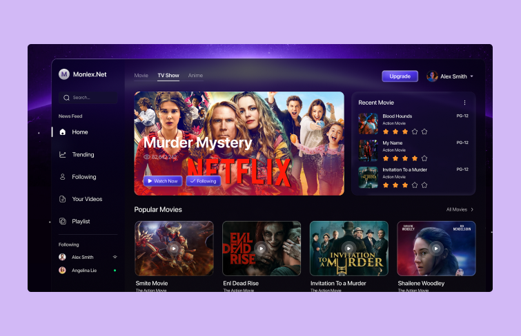
On entertainment platforms, UI cards are essential for displaying engaging content. Users interact with these cards to explore movies. Each card features eye-catching visuals, titles, and brief descriptions, allowing users to quickly browse and select content of interest.
There are many design tools available on the market for creating Card UI designs, and Mockplus RP is one I highly recommend. Mockplus RP is a free online design tool with a simple and intuitive interface, allowing even users without a design background to easily get started and create effective Card UI designs.
Mockplus RP
Here are several easy steps to create Card UI design in Mockplus RP:
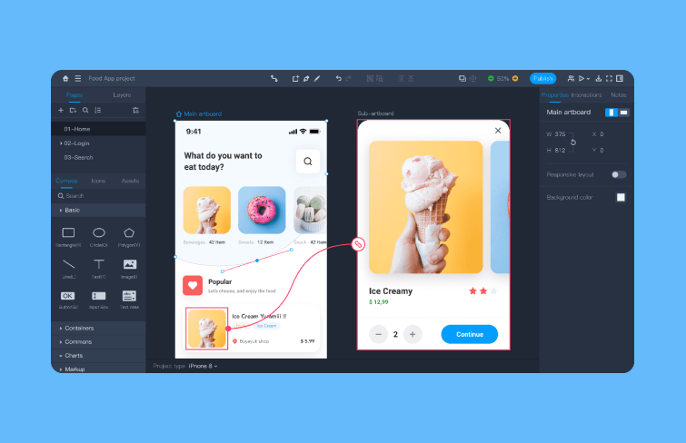
To design a UI card with Mockplus RP, start by creating a new project and setting up your artboards. Mockplus RP offers many commonly used artboard sizes for users to quickly get started.
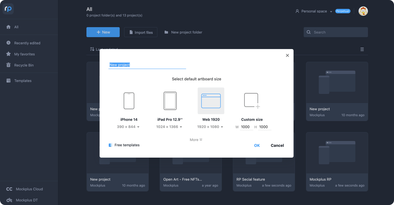
Create a project
Then it's time from the structure. Begin designing the card's structure by using basic shapes (like rectangles or rounded rectangles) to create the background and organizing content zones for text, images, or icons. Mockplus RP offers thousands of rebuilt static and interactive UI components, and delicate icons fit all design scenarios. Simply drag and drop these elements, eliminating the need for manual sketching and speeding up the design process.
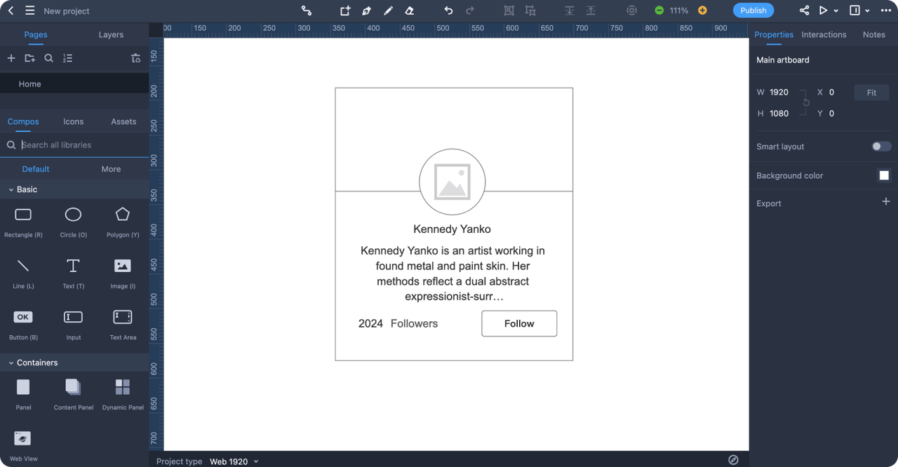
Design the card's structure
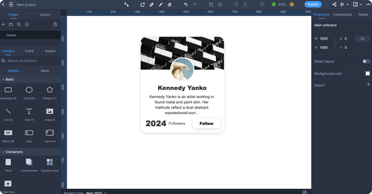
Once the structure is ready, add the necessary content elements like text, images, and buttons, adjusting colors, typography, and shadows to match your design.
Once the visual design is done, you can add interactions to mimic the real user experience, if needed. Mockplus RP offers powerful interactions and animations features, such as hover effects, clickable buttons, and transitions between card states.
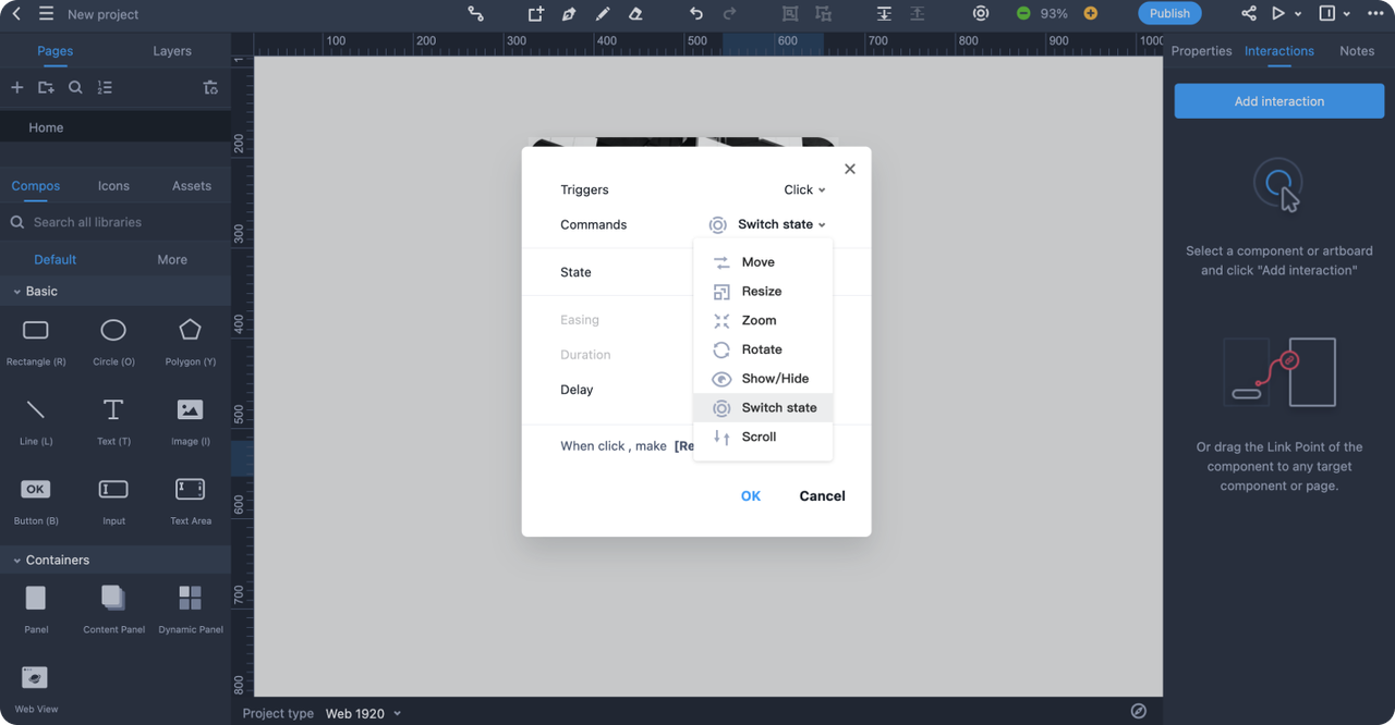
Add interactions (if needed)
In addition to using the steps mentioned above to make card UI, Mockplus also offers a rich library of reusable and fully customizable templates that allow designers to quickly create card designs. These templates save time and provide a solid foundation for customization, enabling designers to focus on refining and enhancing the card’s specific elements rather than building everything from the ground up.
Overall, cards are a versatile and creative tool for designers, offering more than just a materialized UI control element—they serve as a fundamental layout component for structuring high-quality content and enhancing user experiences. Whether you're working on a mobile app, website, or any digital interface, cards help in organizing information into digestible, visually appealing segments.
Throughout this article, we've explored the advantages and best practices of card UI design, and 25 inspiring examples that demonstrate their application in both web and mobile contexts. By following best practices and learning from these inspiring examples, you can create card UI designs that are both aesthetically pleasing and highly effective. For even more design inspiration and resources, platforms like Dribbble and behance are excellent places to explore new ideas and stay on top of the latest trends.
 Mockplus RP
A free prototyping tool to create wireframes or interactive prototypes in minutes.
 Mockplus DT
A free UI design tool to design, animate, collaborate and handoff right in the browser.


 Sign up with Google
 Join our Discord community
 support@mockplusapp.com