Wireframes, mockups, and prototypes are different types of artifacts that product designers create when they work on user interface and user experience design. The difference between the artifacts can be unclear for anyone making their first steps in product design. If you're one of them, don't worry. This guide will help you understand the meaning of each artifact and when and how to use them.
A "wireframe" is a term that came to the UX world from the world of architecture. When architects plan a new building, they create a scheme of the building first. This scheme is also called a blueprint and has a bare minimum number of visual attributes. The scheme becomes a skeleton for the future building.
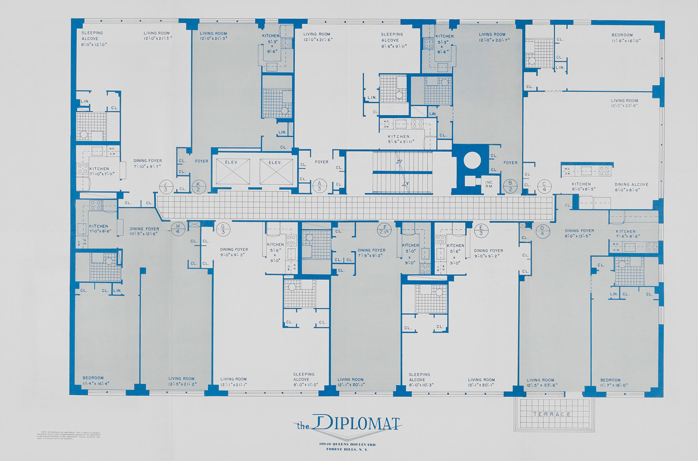
Blueprint of the building. Image by Michael Perlman
Wireframes look like they were designed with wires. That's how they got this name. Wireframes can be freehand drawings on paper or created using a digital wireframe tool. In both cases, wireframes provide a basic representation of the future design.
Here are a few notable examples of wireframes created by a fantastic design community:
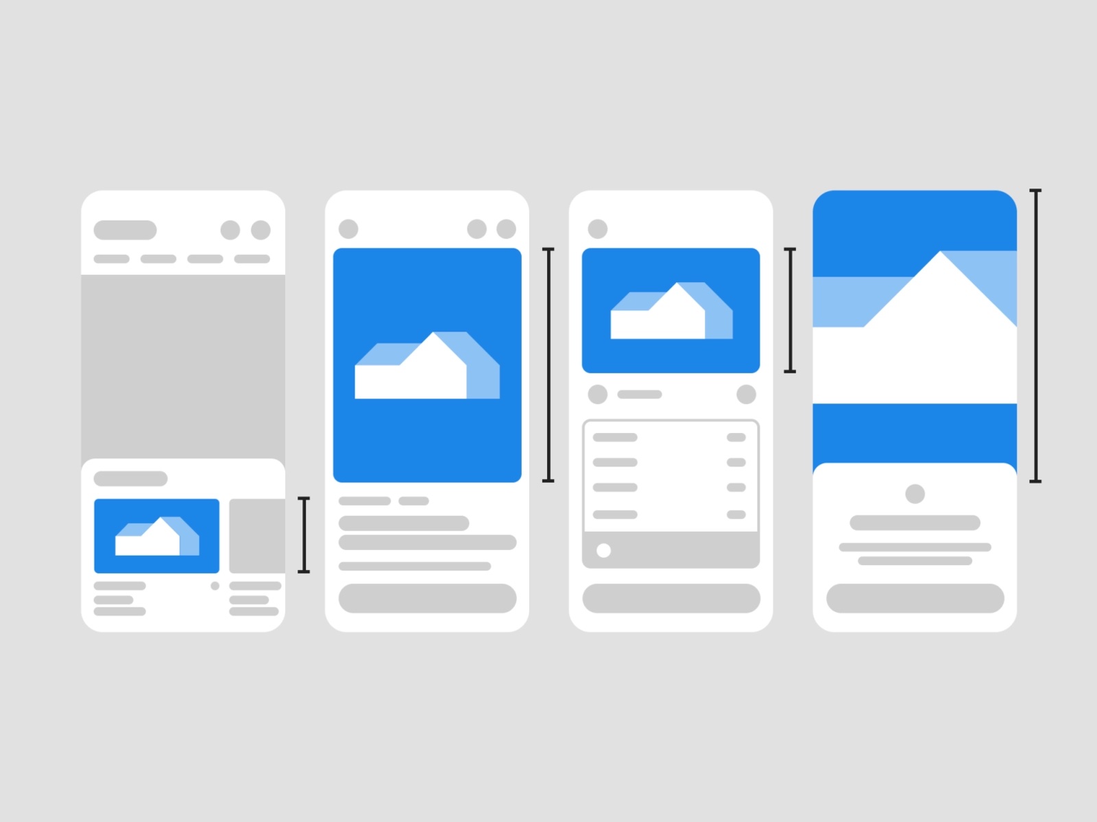
Immersive transitions wireframe by Nicolas Solerieu
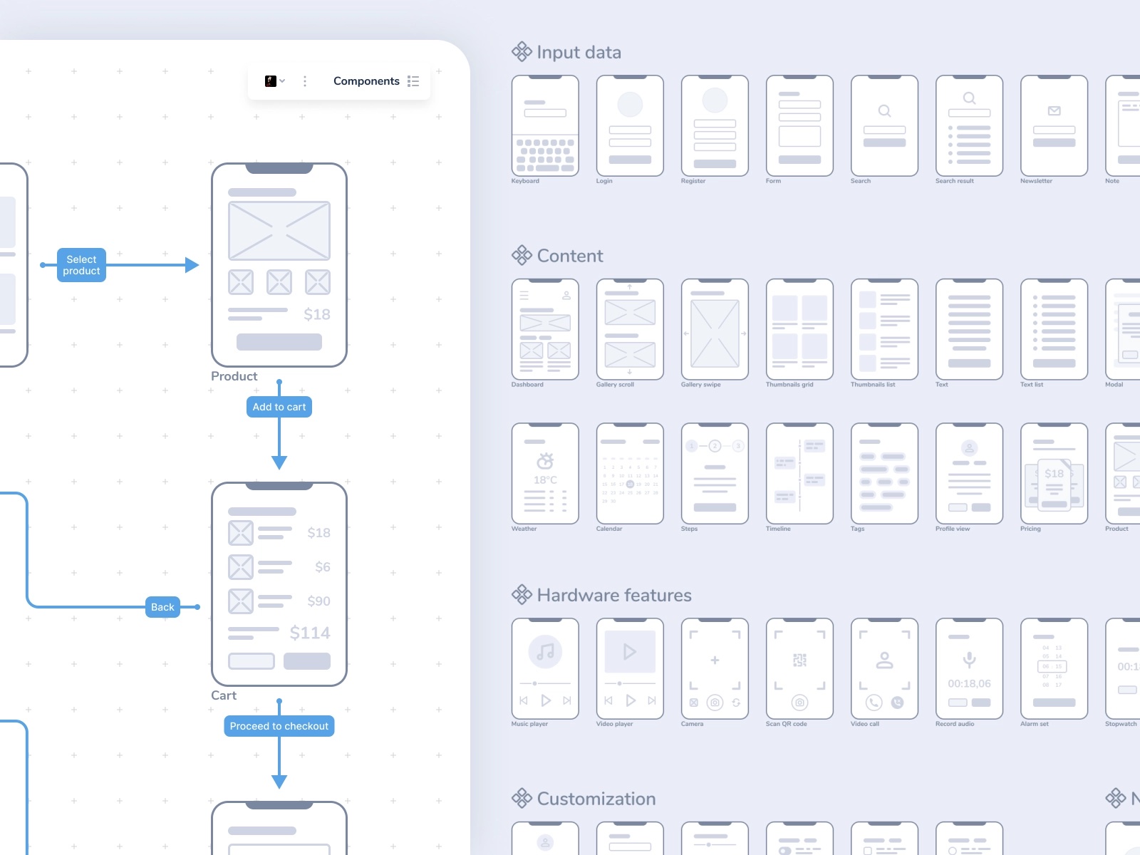
Mobile Lo-Fi UX wireframes by Michal Kulesza
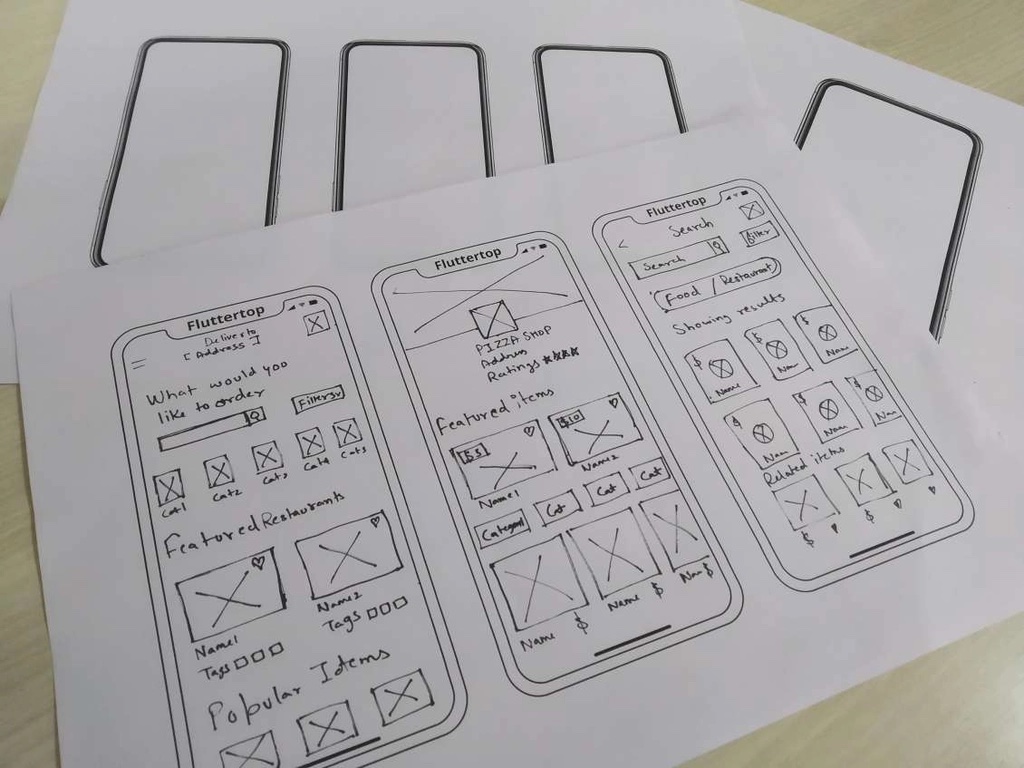
Wireframe design on paper by FlutterTop UI/ UX
Wireframes help the product team evaluate the structure of individual pages/screens and see how individual screens will work together. The product team can use wireframes to understand how the product will work. Apart from that, wireframes are:
Fast to create. Since wireframes have a bare minimum number of visual details, they can be created relatively fast (in minutes rather than hours or days).
No special skills or tools are required. As soon as you have a piece of paper or access to the drawing board, you can visualize how the future screen/page will look using basic objects such as rectangles, text, and arrows.
Wireframes are the barebone structure of the future product. The fact that wireframes have only a limited number of design elements creates a few downsides, such as:
Can be hard to imagine the future state of design. Since wireframes have only essential design elements, they require using imagination to understand how the future design will look and work. That's why it's not recommended to use wireframes for presenting a design to stakeholders because they will likely ask questions like "Why is this design black & white?" or "What does rectangle mean here?"
Aren't applicable for usability testing. If you plan to use wireframes to test your design, you should be ready to get biased test results. When test participants see wireframes, they will think they are looking at an unfinished design. Also, you will likely need to guide the test participants and explain each element's meaning as they interact with your wireframes.
Wireframes are especially valuable during the early stages of the product design process, such as the ideation phase. Team members create wireframes when they want to explore various design directions but don’t want to spend much time on each design solution.

Wireframes can be created during the Ideation phase. Image by Nick Babich.
Wireframes can be created right during brainstorming sessions. Once the wireframes are created, team members can discuss and evaluate the design together. The fact that wireframes are visual assets is what makes them so powerful. The old adage says, "A picture is worth a thousand words." It's much easier for people to evaluate the concept when they see a visual rather than read a text description.
No need to feature all elements that your page/screen will have. Try to add only essential elements that help other people understand what the screen is all about.
Wireframes are typically created in black or gray color. Yet, it's possible to use a contrasting color (such as red) to highlight specific areas in wireframe design. A contrasting color will create visual attention and guide the viewer toward a particular section or element (such as a call to action button).
When it comes to wireframing, pixel perfection is the last thing that you need to worry about. Creating rough wireframes is okay as long as they help others understand your idea.
People might be hesitant to create wireframes because they might think they don't have the required design skills. But the most significant benefit of using wireframes is that they require minimal design skills. As long as you can draw rectangles and arrows, you can create wireframes. That's why when you organize a brainstorming session, you should remind session participants not to worry about their art and craft skills.
"Crazy Eights" is a Google Ventures Design technique that allows team members to visualize a lot of ideas in a short period. When team members think about a solution for a particular problem (say, how to optimize the checkout experience), they aim to sketch eight ideas in five minutes. After that, team members collect all ideas, discuss them together, and identify the most promising solutions.
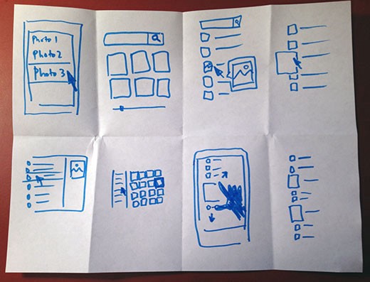
Example of wireframes created using the “Crazy eights” technique. Image by GV
Wireframes can be an excellent temporary solution to the product documentation. Wireframes with annotations can help others understand how the solution should look and work.
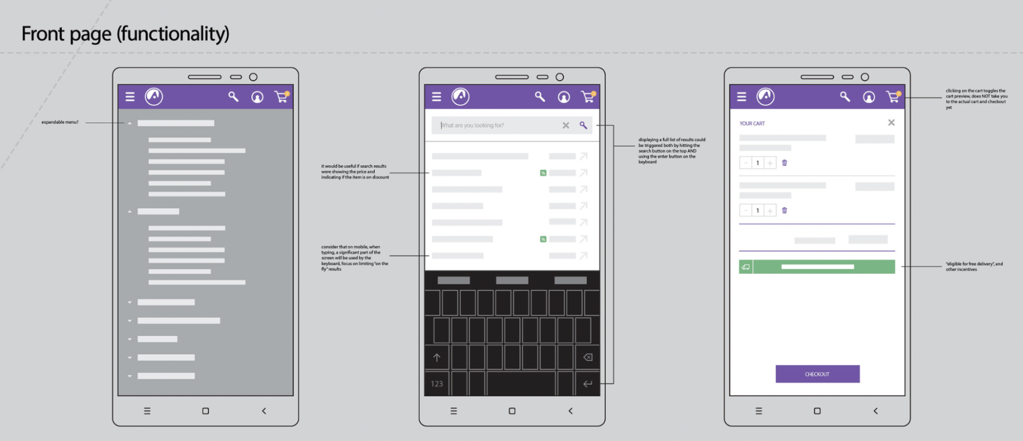
Example of the annotated wireframe. Image by Olivia Gardiner
Before we discuss mockups, it's essential to define the term "fidelity." Fidelity is a level of realism that design artifacts have. Wireframes are low-fidelity design artifacts, while mockups are medium- or high-fidelity visualization of your design. Compared to wireframes, mockups look much closer to the final version of the design.
Here are a few great examples of mockups created by a fantastic design community:
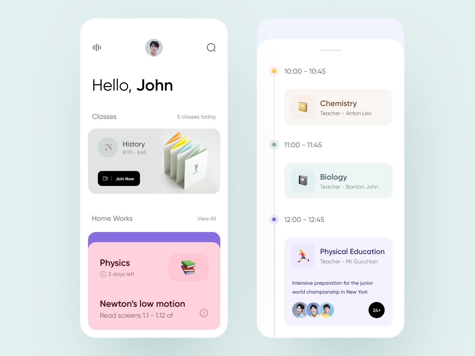
Online Courses Mobile App by Glow
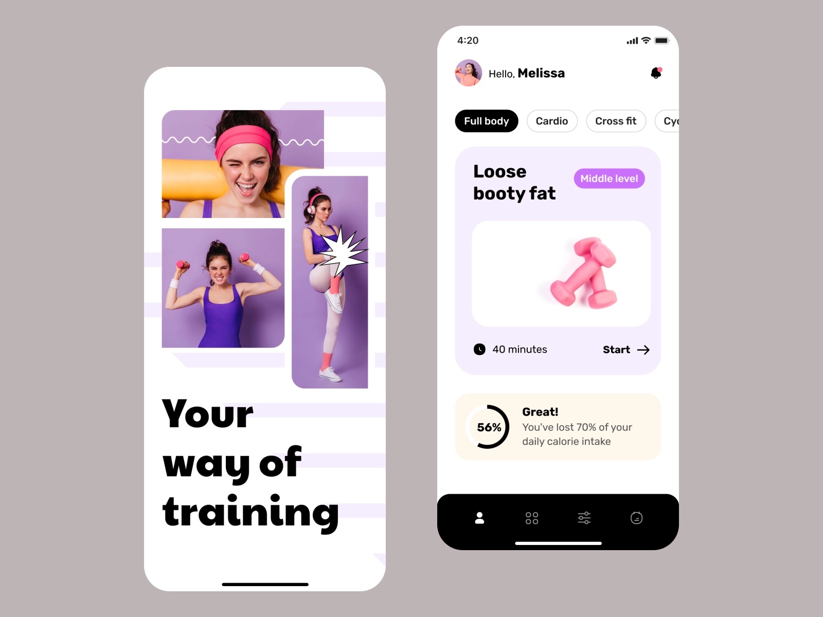
Sport mobile app by Taras Migulko
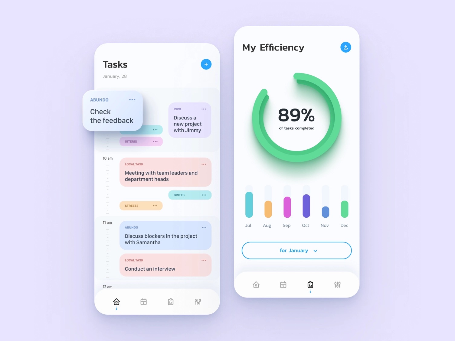
Productivity Mobile App: iOS Android UI by Ramotion
Mockups convey an idea of how the future product will look. They are great for:
Evaluating the look and feel of your design. It's much easier to imagine how the future product will look and work when you see mockups. Mockups are great for presenting a design to stakeholders.
Experimenting with various visual styles. Designers can try different font styles and color combinations when creating mockups to find the visual language that works best for the product.
Design inspection. Mockups allow designers to evaluate the visual consistency of your design (ensure that all screens have the same visual style). Mockups also are the primary artifact used for design handoff. Developers can inspect the mockups using tools like Mockplus Cloud and build pixel-perfect solutions.
Require more time to create. In comparison to wireframes, mockups take more time to create. Not only do they require special mockup design tools, but people who design mockups should have visual design skills. They should be able to find the right proportions of elements to create a balanced and eye-pleasing design.
Mockups are static. Mockups don’t have any interactivity, and this makes it hard to understand how visual transitions between states or screens will work.
Mockups are very valuable during the visual design phase of the design process. This stage comes after the Ideation phase and before the Prototype stage.

Mockups are great for the visual design phase. Image by Nick Babich.
Once the team knows what they want to build, they can create mockups to evaluate the visual design decisions. Mockups allow team members to assess how different visual design decisions work together in design.
Here are a few important things to remember when creating mockups:
Try to avoid dummy text. Designers typically use "Lorem Ipsum" texts when they create mockups. While dummy text can be a good solution during the early stage of mockup design, it's better to use actual texts as soon as you start to make the mocks realistic. It will help you prevent situations when content containers used in mockups aren't optimized for the actual copy.
Don’t fall in love with your design. When creating mockups, designers often stick to one particular design and try to perfect it. But the design solution you fall in love with might not be the most optimal for your users. That's why instead of increasing your design's fidelity level, it's better to create a few versions of the design in medium-fidelity and compare them side by side.
A prototype is a working model of an app or webpage that allows the simulation of user interactions. Unlike static design artifacts like wireframes or mockups, prototypes are always interactive. The level of fidelity of prototypes can vary from low to high, depending on the stage of the design process.
Here are a few great examples of prototypes created by a fantastic design community:
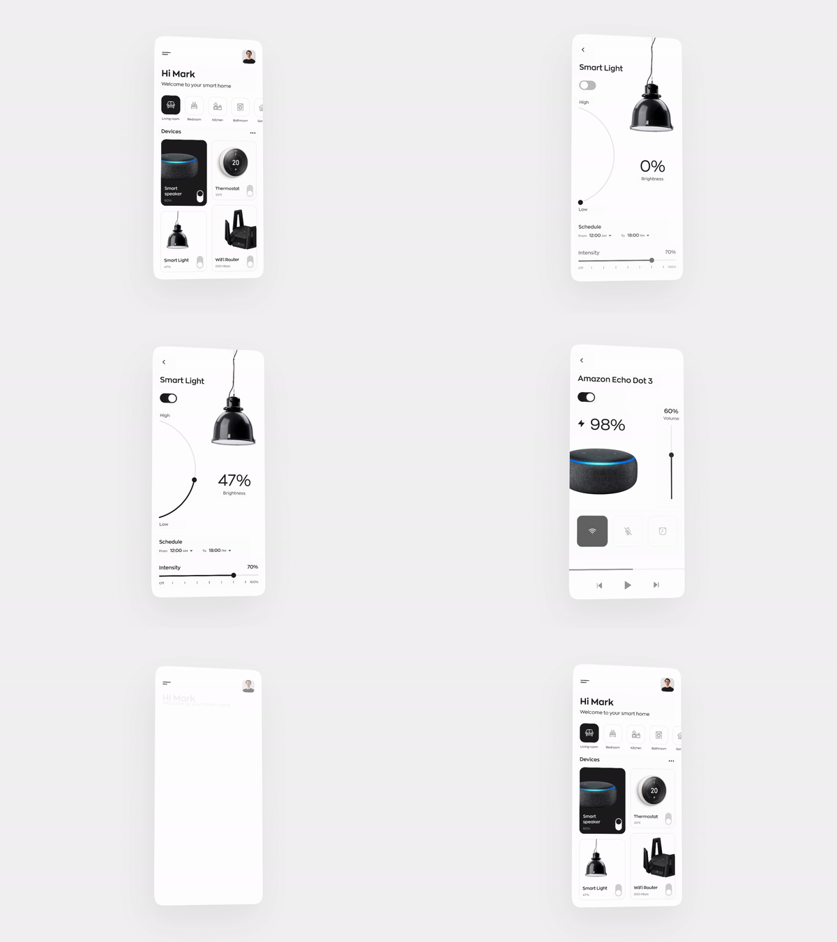
Smart Home App Interface animation by Alexander Kontsevoy
Interactivity helps to evaluate the design in action. Prototypes help to:
Evaluate user interactions. High-fidelity prototypes behave just like a finished product and make it easy to evaluate the usability of a product.
Test the usability of a design. Test participants won't see any difference between a high-fidelity prototype and a real product. It helps collect rich feedback during usability testing.
Analyze motion language. Team members can check animated transitions used in a prototype to ensure the design looks and works great.
Require special skills and tools. To create an interactive design, you must use special prototyping tools or code the design.
Prototypes are especially valuable during the Prototype phase of the design process. Once the team approves the mockups, they can turn them into an interactive prototype and use the prototype for usability testing or presenting a design to stakeholders.

When to create prototypes. Image by Nick Babich.
Select the right level of fidelity. As was mentioned above, prototypes aren't always high-fidelity artifacts. The level of fidelity should always be selected according to your goals. For example, if your primary goal is to evaluate the navigation scheme of your product, you don't have to create high-fidelity prototypes. You can turn your wireframes into a low-fidelity prototype and evaluate the scheme.
Create high-fidelity prototypes to visualize complex animated transitions. When it comes to complex animated transitions, it might not be evident to developers how certain animated transitions should work (i.e. what timings or ease curve they need to use). High-fidelity prototypes can be extremely helpful in this case.
Wireframes or mockups always come first. Once you know what you want to build, you can turn your static artifacts into a prototype to validate interaction design.
No, wireframes and mockups are two different types of design artifacts. Wireframes are low-fidelity artifacts, while mockups are medium- and high-fidelity assets.
The level of fidelity should be selected according to the goal you want to achieve. If your goal is to visualize a design concept and discuss it with team members, you can go for a low-fidelity design (such as wireframes). But if you want to create a design you can validate with your users, you should go for high-fidelity design (high-fidelity mockups and prototypes).
Yes, it's possible to turn wireframes into mockups. Once you have a wireframe, you can increase the fidelity level—replace rectangles representing content blocks with actual content, and add colors, spacing, and fonts to make the screen layout more realistic.
Yes, it's possible to create a low-fidelity prototype using wireframes. This type of prototype is also called clickable wireframes. You will need to use prototyping tools like Mockplus—import your wireframes into the tool and connect them to create a flow.